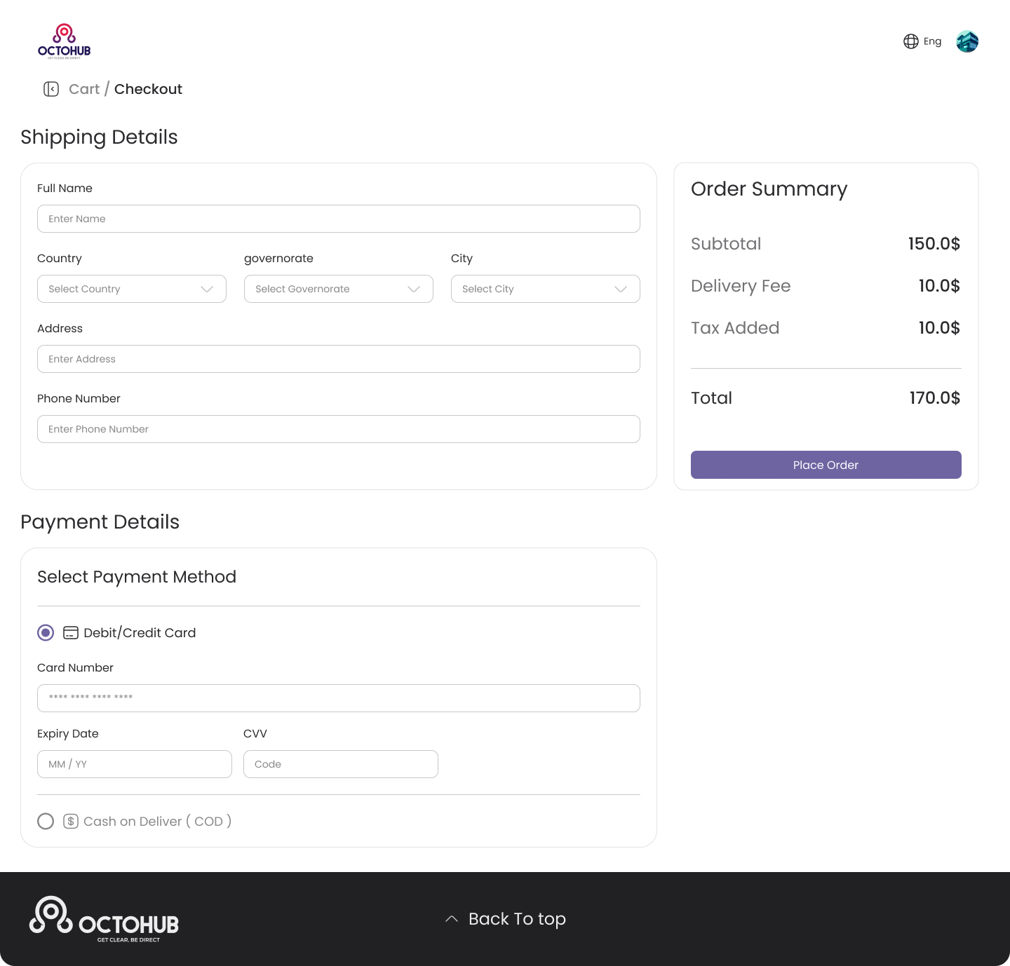
Checkout page for an e-commerce website
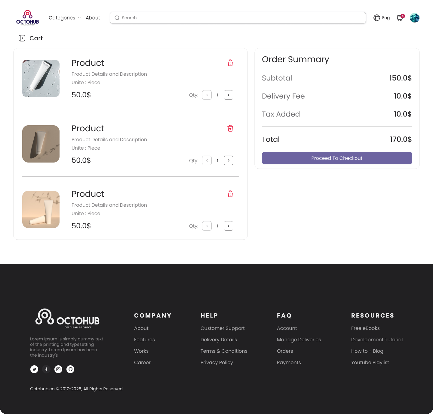
Cart design
Tools used
From brief

Topics
Share
Reviews
3 reviews

Clean and straightforward 👍
The layout feels clear and trustworthy, and the form is easy to scan step by step. The order summary is well separated and keeps things transparent. Nice, solid checkout design.

This is a good start, but I would have liked to see more clarity on what kind of products this company offers. The industry / type of products a retail store offers affects the visual design, this looks pretty generic and does not convey what kind of products this company offers.
I also would have liked to see more of the process: any research you did, sketches / lofi wireframes in ideation, and your design rationale for the choices you made.
Still has clear information hierarchy, clean UI, and good accessibility, just needs a bit more polish. Keep up the good work!

Hi Amr!
This checkout feels efficient. It doesn’t waste the user’s time, and that’s exactly what you want at the most sensitive stage of the funnel. The structure seems clear, and nothing appears to compete for attention which helps reduce last-minute doubt.
If I were to refine it further, I’d think about emotional reassurance. Small things like progress indicators, transparent fees, or subtle security cues can dramatically lower anxiety 💳🔐 Overall, it feels practical and business-aware which is the right energy for checkout.
You might also like

Smartwatch Design for Messenger App


Bridge: UI/UX Rebrand of a Blockchain SCM Product


Pulse Music App - Light/Dark Mode


Monetization Strategy


Designing A Better Co-Working Experience Through CJM


Design a Settings Page for Mobile
Interaction Design Courses

UX Design Foundations


Introduction to Figma

Design Terminology
