Checkout Page Design

Checkout Experience for Gird Flower Shop
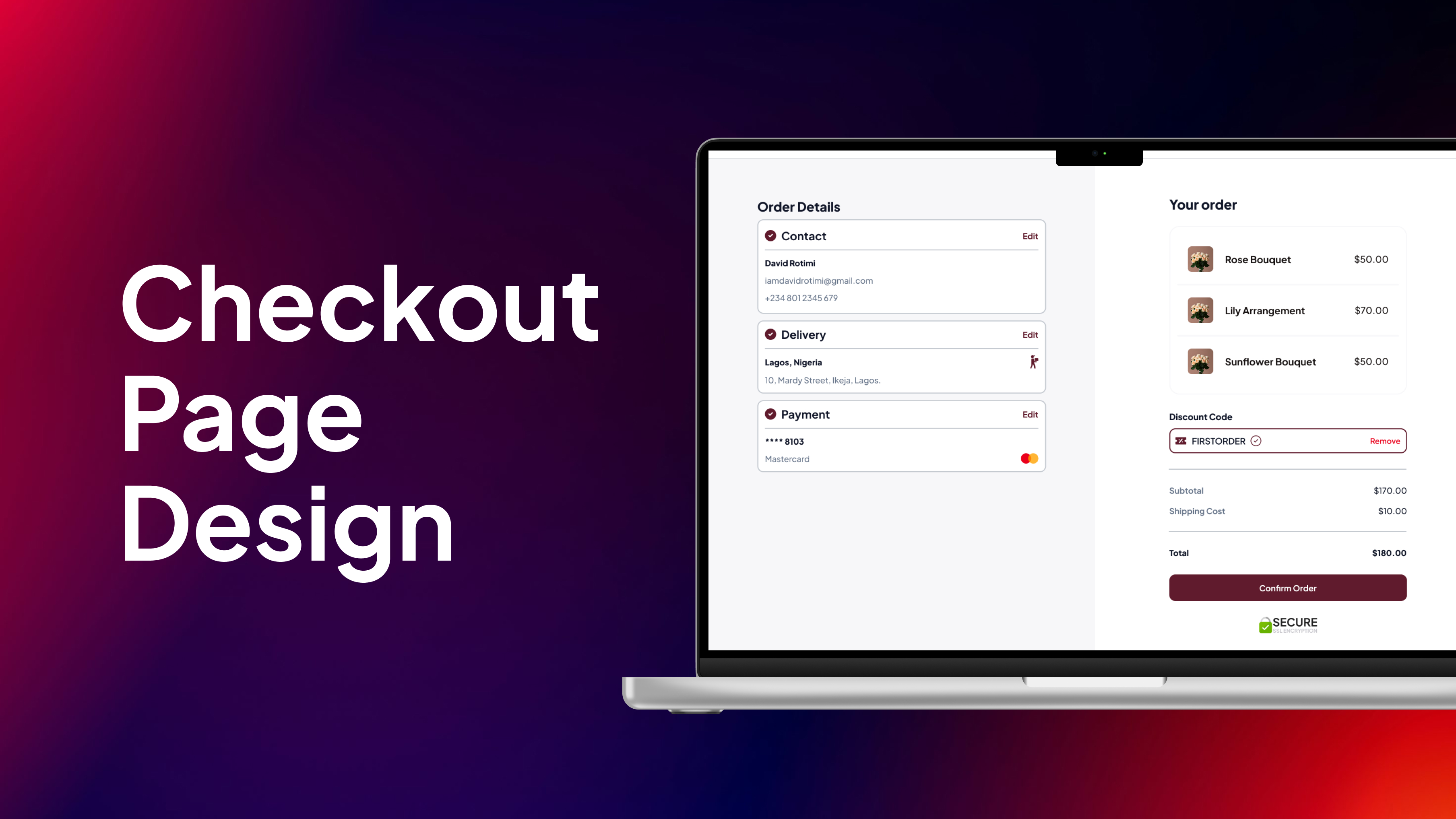
This presentation unveils my design for Gird's desktop checkout flow, specifically tailored to provide a delightful and efficient flower shopping experience on larger screens. My primary focus was on creating a process that feels intuitive, utterly friction-free, and highly trustworthy, ensuring customers can easily and confidently send or receive beautiful blooms with ease.
Given the desktop environment, I've leveraged the expanded screen real estate to enhance scannability with a clear, well-organized layout that presents information logically without overwhelming the user. I've integrated helpful microcopy at every step, not just to guide users but to also add a touch of Gird's charming brand personality. The clean, inviting visual design reflects the freshness and elegance of flowers, making the act of purchasing a visually pleasing experience in itself.
The aim is to streamline the entire journey, from selecting the perfect bouquet to confirming its delivery, minimizing clicks and maximizing clarity. This design isn't just about facilitating a transaction; it's about making the act of giving flowers as joyful, effortless, and delightful as possible, reflecting Gird's commitment to both beauty and customer satisfaction.

Reviews
1 review

Hi David, it's nice to see your showcase. The checkout page design is presented in a clean and visually consistent language. The way you included the rationale behind the design was also comprehensive.
I do have some suggestions that I hope would help for the project. As the ultimate goal is to reduce the cart abandonments during the checkout, the checkout process should be fast and friction-free as much as possible. I see some obstacles that potentially prevent the way to that goals:
- There are 2 "Sign-up and Checkout" buttons at the first screen. I think the first button copy should be "Checkout without signup" or "Checkout now"?
- The discount code field is not enabled until the end of the process. What happens if the users already own their codes and want to try using it as early as possible? It could be the whole motivation for their purchase.
- I don't see "Next" button at each "Contact", "Delivery" and "Payment" section necessary as we could progressively show each section after the previous one is completed with all compulsory field completed. Every CTA button used should be carefully minded as it will increase user's effort.
- The last page of "success order" could be more visually appealing with animation, gif,... that expresses the joyfulness of getting flowers.
Looking to hearing from you :D
You might also like

Smartwatch Design for Messenger App


Bridge: UI/UX Rebrand of a Blockchain SCM Product


Pulse Music App - Light/Dark Mode

Uxcel Halloween Icon Pack


Monetization Strategy


Designing A Better Co-Working Experience Through CJM

Interaction Design Courses

UX Design Foundations


Introduction to Figma

Design Terminology
