Checkout Flow for Shoe E-Commerce Platform

Project Context
For this assignment, I designed an e-commerce shoe platform focused on its checkout flow. The goal was to address common industry challenges with cart abandonment by reducing friction, improving clarity, and building trust so that more users would complete their purchases.
Device focus: Desktop
Platform focus: Shoe e-commerce site
Goals
- Create a friction-free, trustworthy checkout experience
- Ensure forms are intuitive and scannable
- Support users with helpful microcopy
- Provide clear feedback at every step
- Give users control over their information before confirming
Design Solutions
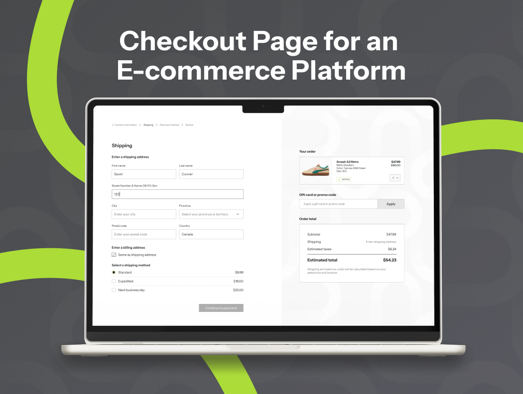
Progressive Disclosure + Breadcrumbs
- Checkout is broken into clear steps: Contact → Shipping → Payment → Review → Confirm
- Breadcrumbs show progress, completed steps, and what’s left.
- Rationale: reduces anxiety (“How long will this take?”) and makes the flow scannable.
Optional Fields Clearly Marked
- Only required inputs are enforced; optional ones (e.g., “Apartment/Suite”) are labeled.
- Rationale: avoids overwhelming users, reduces unnecessary effort.
Fast Checkout Option
- Alongside the standard step-by-step checkout, users can choose an express path with PayPal, Google Pay, or Shop Pay.
- Rationale: reduces friction by allowing users to skip form entry, builds trust through familiar payment brands, and accelerates checkout completion for those who prefer speed over account management.
Error Handling
- Inline validation and clear microcopy explain errors (“Please enter a valid email address”).
- Rationale: prevents frustration and abandonment.
Review & Edit Section
- Before confirming, users see a full order summary with edit buttons for each section.
- Rationale: gives users trust and control, minimizing costly mistakes.
Confirmation Screen with Animation
- Final screen uses a small animation to highlight and bring excitement to the order.
- Rationale: adds some fun, provides closure, and leaves a positive impression.
Outcomes & Rationale
- Usability: Clear progress, error prevention, and fast checkout reduce friction.
- Scannability: Breadcrumbs, optional field labels, and review summary make the flow easy to glance through.
- Visual design: Clean typography, consistent buttons, and animation at the end engage users without distraction.

Reviews
3 reviews

Shannon, you’ve done a great job explaining the flow and rationale, and adding more visuals or process steps will make your strong design story even more compelling!

Great work on this checkout flow. I like how you broke the process into clear steps and used breadcrumbs, it really helps users understand their progress and reduces anxiety.
Marking optional fields clearly and including a fast checkout option is smart, it reduces friction and gives users more control over how they complete their purchase.
The inline error messages and review section are strong additions. They provide reassurance and help prevent mistakes, which is key for building trust.
Finally, the confirmation animation is a nice touch. It adds personality without distracting from the flow, leaving users with a positive impression. Overall, it is a clean, intuitive, and user-friendly experience.

Great start with explaining your design rationale in depth and having a scannable layout. I would have liked to see a lot more screenshots of the deliverables tied to the descriptions of the flows and design rationale. I would have also liked to see more of the process: sketches, research, user flows, etc. The UI in the thumbnail does look clean and organized.
You might also like

Smartwatch Design for Messenger App


Bridge: UI/UX Rebrand of a Blockchain SCM Product


Pulse Music App - Light/Dark Mode


Monetization Strategy


Designing A Better Co-Working Experience Through CJM


Design a Settings Page for Mobile
Interaction Design Courses

UX Design Foundations


Introduction to Figma

Design Terminology
