Settings, Simplified: Elevating Learning App UX through Smart Structure & Personalization

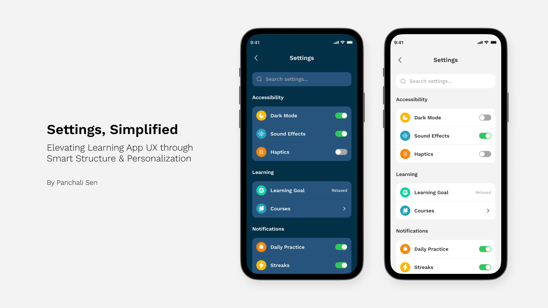
Settings pages often go unnoticed, but when they're bad, users feel it immediately. Too many options, too many taps, and not enough structure. This design aims to explore what a user-friendly, education-focused settings page should look like.
The Problem: Settings That Distract Instead of Support
Most learning apps treat settings as an afterthought. They're packed with preferences, often in a flat list, with little regard for how learners actually use them. During my research, I looked at popular apps like Duolingo, Coursera, Brilliant, and Preply. Across the board, I found common issues: no search, inconsistent grouping, and poor visibility of critical options like privacy or learning notifications.
These friction points led to a simple question:
How might we turn the settings screen into a quiet but powerful enabler of learning?
My Approach: Focused, Familiar, Flexible
I started by mapping common complaints from app store reviews, UX blogs, and user sentiment on social media. Then, I synthesized these insights into three key goals:
- Make high-frequency actions accessible in one tap
- Group related settings to reduce decision fatigue
- Offer both visual and functional clarity through themed modes
With that direction in mind, I created two visual variants of the settings UI, a light mode for day-time learners and a dark mode for low-light or night-time use.
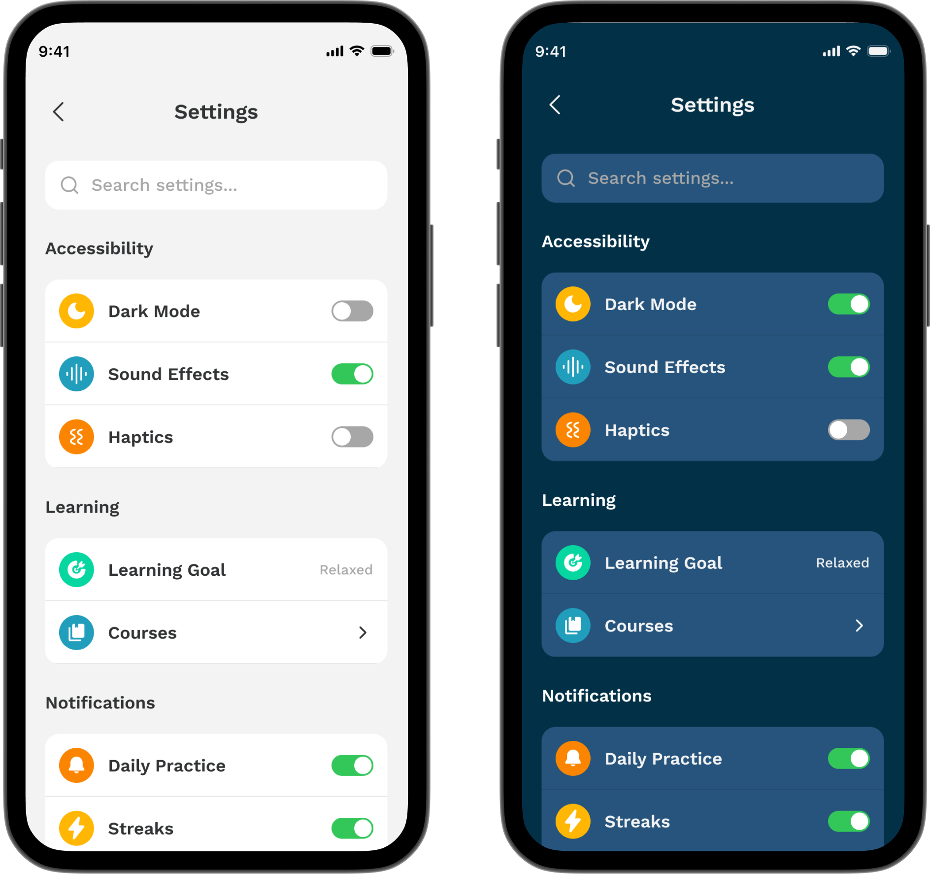
Two distinct themes for different learning environments
A Closer Look at the New Design
The layout is structured around how people actually use settings. Instead of a long, intimidating list, I organized the screen into clean, sections, Accessibility, Learning, Notifications, Account, and Support.
At the very top sits a search bar, designed to cut through clutter instantly. Whether users want to toggle dark mode or change their email, search helps them jump straight there.
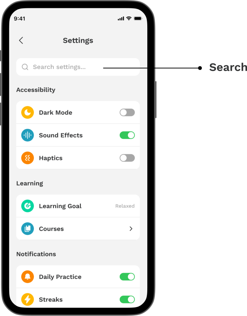
Global search to reduce friction and tap fatigue
Accessibility that Adapts to Learners
The Accessibility section includes quick toggles for Dark Mode, Sound Effects, and Haptics. These features are grouped together not just visually, but conceptually as they shape how the app feels to different learners.
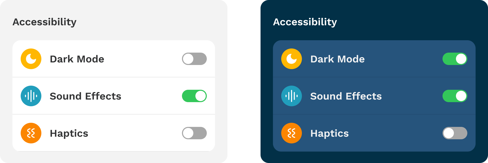
Comfort-first toggles with intuitive icons and large touch targets
Putting Learning First
Right below accessibility, users can set their learning goal, explore courses, and manage notification settings like Daily Practice, Streaks, and Leagues.
These cluster serves casual learners and power users alike.
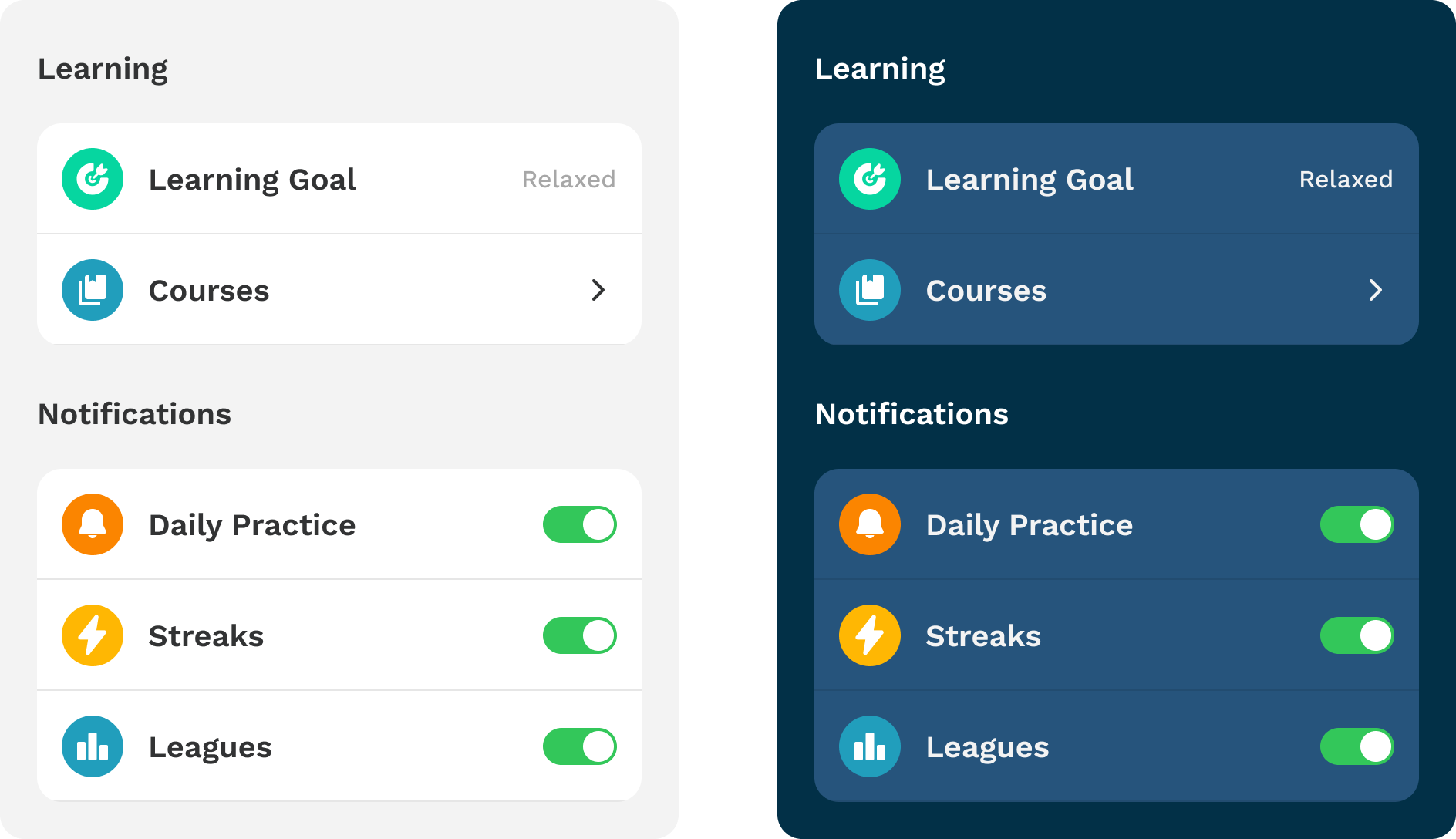
Learning tools, clustered together
Profile Management
Account management is typically buried or too complex. Here, it's streamlined. Tapping on Profile opens a dedicated screen where users can update their name, username, email, phone number, or password.
The Delete Account button is intentionally styled in red to signal seriousness, without being dramatic. It's there when users need it, visible but not intrusive.
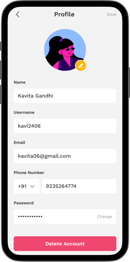
Edit details or take action
Support, Privacy, and Language
Lower on the page, I’ve included global functions that aren’t used daily but still matter. Privacy, App Language, FAQ, and Customer Support are grouped under respective sections. By placing them toward the end, I maintain visibility without overwhelming the primary user tasks.
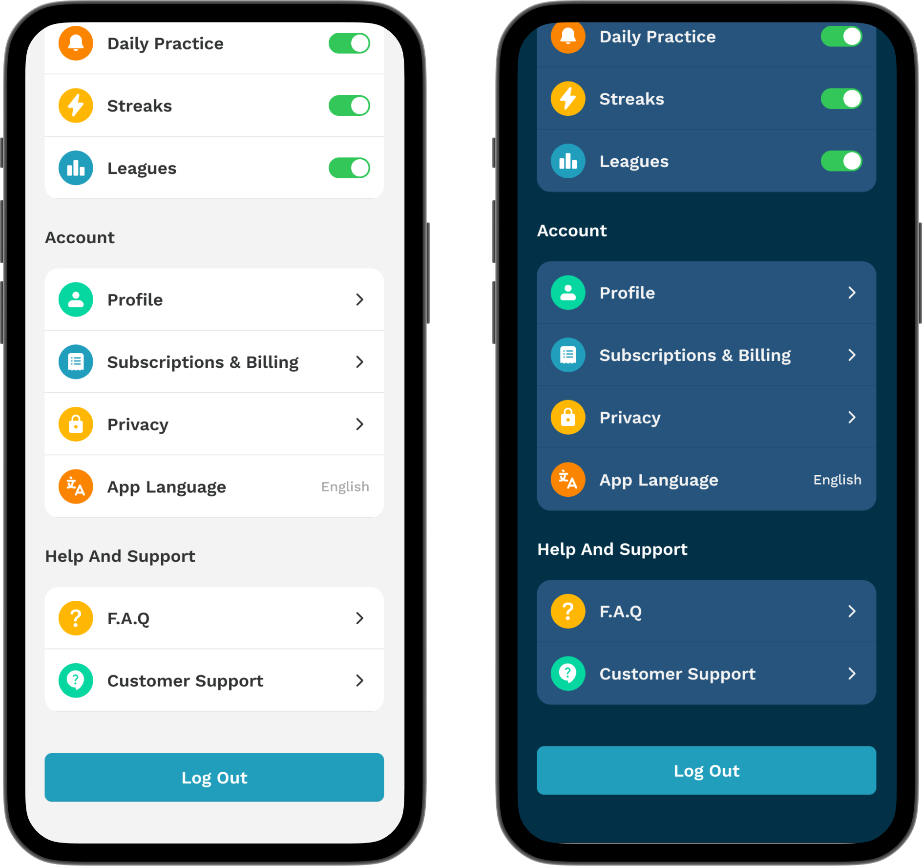
Secondary actions grouped and placed where they make sense
Why Two Themes?
The dark mode uses deep blues and soft accents, reducing eye strain while preserving contrast. The light mode leans into clarity, with neutral grays and bright highlights. Both respect accessibility guidelines and user preference which is especially important in education apps, where usage can happen at all hours.
Outcome: Simplicity That Scales
By rethinking the structure and visual layout of the settings page, I was able to:
- Reduce cognitive load through grouping and visual hierarchy
- Improve task speed by introducing a global search
- Support accessibility with contrast-friendly themes and larger tap areas
- Prioritize the most important actions
Tools used
From brief

Topics
Share
Reviews
4 reviews

Hi Panchali!
Very good presentation, your design is clear, minimalist and on point. I went through your Figma file as well and liked that you did your research on some of the existing similar applications (for learning).
Very nice addition you thought about is the search bar, the categories you used for organising the settings are clear to me and it's nice you also thought about the profile settings.
On the visual design side I like the iconography you used, the typography choice and the blue colors you chose for the dark mode.
Small detail for you to check and change - when clicking through the prototype and switching from light to dark mode there is a slight flicker (caused by a little 8px missalignment in your dark mode screen).
Keep creating, you're doing great!

Great job Panchali!
You explained your design decisions and the problems they are based on very nicely.

What a work, Panchali! I think you nailed all the details when creating the Settings interface. I love the icon selection, the colors you've chosen, and the fonts; they also give a playful vibe! One thing that could be improved is the color of the delete account button. It seems that it doesn't communicate the "danger" action very well, as it resembles a primary color button for me. Also, change the password form. How's the interaction? Is it when I click the 'change' text button that it will go to another page dedicated to changing the password, or do I just tap the form and change the old password, and then I tap the 'change' text button to confirm my new password? Otherwise, it's a really nice design!

When designing settings, you hit the right direction - the structure is logical, sections are well grouped, and the search bar at the top is a must-have that's missing from most educational apps. Dark mode looks really solid, especially in terms of contrast and readability.
The Profile screen looks OK, but the Delete Account button doesn't quite feel like a threat – that saturated fuchsia works more like a CTA than a warning.
I'm also wondering if all elements in the Account section need chevrons - App Language probably doesn't require a separate screen, just an in-place picker. And one more thing: I don't see any empty states, errors, or loading states in the screens, which are crucial in real products.
But overall? This is solid work. 💪 You can clearly see that you thought about hierarchy and user needs. With some detail refinement, this could be a really strong case study. 😊❤️
You might also like

Smartwatch Design for Messenger App


Bridge: UI/UX Rebrand of a Blockchain SCM Product


Pulse Music App - Light/Dark Mode


Monetization Strategy


Designing A Better Co-Working Experience Through CJM


Design a Settings Page for Mobile
Content Strategy Courses

UX Writing


Common UX/UI Design Patterns & Flows


Building Content Design Systems
