Bumble A/B Test

Enhance onboarding profile completion (bio) by utilizing behavior-based nudges, AI assistance, and meaningful rewards.

Reviews
3 reviews

Hey Martina,
I really enjoyed reading your submission, everything was clearly articulated and reasoned. Sounds like a good A/B test plan!
You identified 3 potential solutions to explore (behaviour nudges, AI-assisted completion and rewards) and I think that they could work separately or together. As an improvement to your submission, you could go one step further and make sure of what works and to which degree without ambiguity. For that, I would really focus on one at a time. On your proposal you might want to consider dropping the reward, and then the experiment would really give you insights on how behaviour nudges perform. Then after introduce rewards as their own experiment, and again with AI-assisted completion. You could even run 3 small experiments in parallel and then combine features (or drop them).
Thanks for sharing! 🙌

Hi Martina
From a product experimentation lens, this is a strong direction. Framing it as an A/B test shows you’re thinking beyond visual preference and into measurable behavior change which is exactly how growth-focused teams operate.
What matters most in onboarding experiments like Bumble’s is clarity of hypothesis. If you’ve articulated what user action you expect to improve profile completion, first match, swipe engagement and why your variation influences that behavior, that demonstrates analytical depth rather than surface redesign.
To strengthen it further, I’d make the success metrics and potential risks more explicit. What trade-offs might this variation introduce? How would you validate results over time? Overall, this reflects a mature, experiment-driven mindset with strong product instincts behind it.

Martina, honestly? This is solid work. The brief is well thought through, and the screens logically reflect the test assumptions. 😊👍
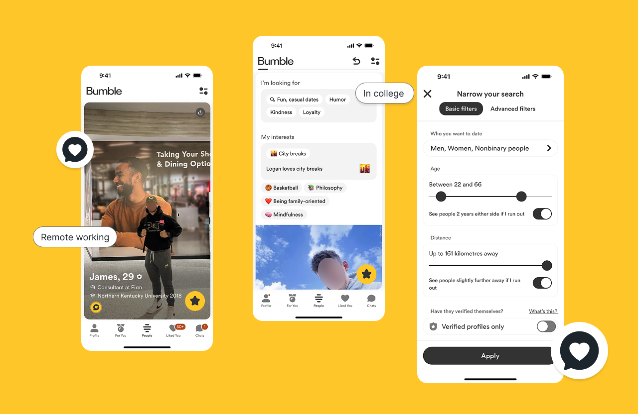
The flow is clear and non-invasive. The nudge after 10 swipes is a smart moment, the user has already felt the app's value. The AI draft with a forced edit requirement is an elegant solution to the "empty bio" problem. The reward screen clearly communicates what the user gets and when it expires.
What I'd refine: on the Bio Editor screen, there's no clear indication that editing is required. The text "Edit at least one word to save" is too subtle and might be missed. I'd also consider whether the "Adjust tone" buttons distract from actually editing the content.
One thing I don't see... what does the nudge screen look like before the first message? The brief mentions it, but the mockups only show the "after 10 swipes" variant.
Overall, the direction is very good and the hypothesis makes sense. With minor tweaks to information hierarchy, this could be a test that genuinely lifts completion rate. ❤️💪
You might also like

Smartwatch Design for Messenger App


Bridge: UI/UX Rebrand of a Blockchain SCM Product


Pulse Music App - Light/Dark Mode


Monetization Strategy


Designing A Better Co-Working Experience Through CJM


Design a Settings Page for Mobile
User Research Courses

Ethical & Responsible Product Design


Product Management Foundations


The Product Development Lifecycle & Methodologies
