Chat App | Landing Page Design
The landing page features a clean and modern design, with a focus on showcasing the messaging app's key features, such as its ability to send text, images, videos, and audio messages.
Reviews
2 reviews
You're so incredible talented! Love the design and the animations!
I don't know if you've gathered inspiration from TailwindUI or not. If not, please look thru their component library and expand your work perhaps?: https://tailwindui.com/components
The CTAs are present and clear, which is great. However, the "Join Now" button could use more emphasis since it's a primary action. Consider making it slightly larger or giving it a more contrasting color.
The main header text "Stay connected with your family and friends" is clear and well-placed, but it could benefit from a slight increase in font size to stand out more and emphasize its importance.
The secondary text under the main header is well-placed, but consider increasing the line height slightly to enhance readability. This is particularly important for users with different visual capabilities.
The footer is well-organized, but adding icons next to the text links could make navigation more intuitive. Also, consider increasing the padding in the footer to balance it with the rest of the page's white space.
You're not using semantic tags, such as: <header> , <section> , <footer> , <article> ... This will impact accessibility AND SEO badly. So I would highly encourage you to read up on how to use these tags within your design. It's an easy win.
Language hasn't been added; which becomes a big issue for both accessibility and SEO.
https://wave.webaim.org/report#/https://talkinger.webflow.io/
Some images elements do not have explicit width and height. That can impact rendering and "flickering" when loading if the user has started to scroll.
Please use next-gen image format such as .WebP
https://pagespeed.web.dev/analysis/https-talkinger-webflow-io/mfa9dh1a51?form_factor=mobile
You could probably fix so that the imagery of the "social cards" are more inlined with what you want it to be:
https://socialsharepreview.com/?url=https://talkinger.webflow.io/
Overall, the design is very clean and user-friendly, with a modern aesthetic that aligns with contemporary design trends. With a few adjustments focusing on contrast, spacing, and interactivity + fixing some of the frontend tech stuff; the website could offer an even better user experience for a bigger variety of users.
Absolute privilege and pleasure to see your work! Keep it up!
Your dedication and hard work truly shine through in the final results. Everything looks perfect! Keep up the great work!
You might also like
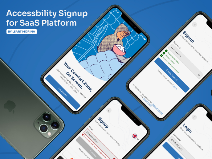
Accessible Signup Form
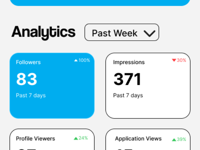
Entrant - Analytical Dashboard
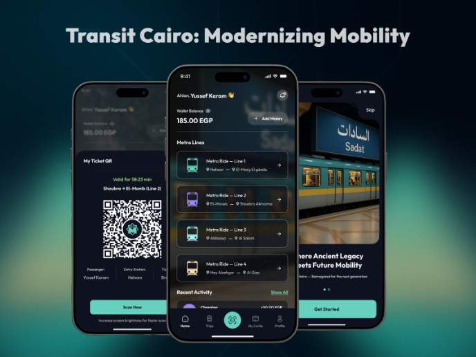
Transit Cairo — Digital Mobility Redefined
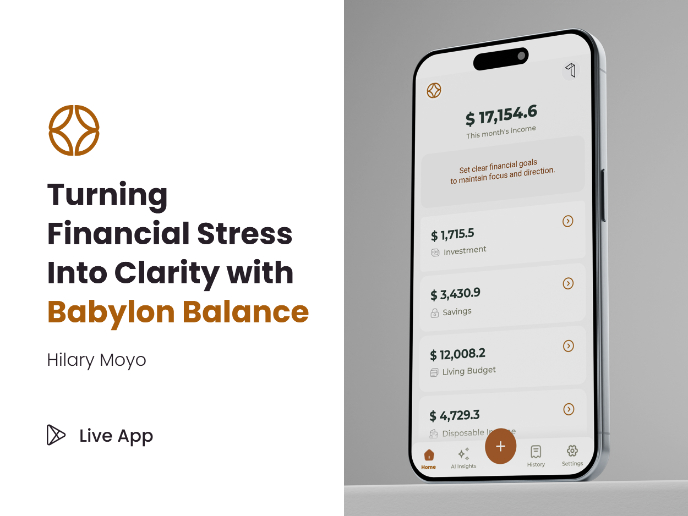
Babylon Balance - Designing Financial Clarity Through Constraint
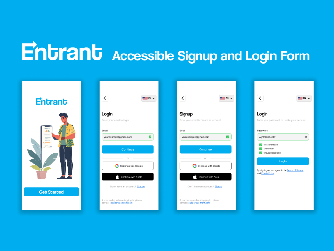
Entrant Accessible Signup and Login Forms
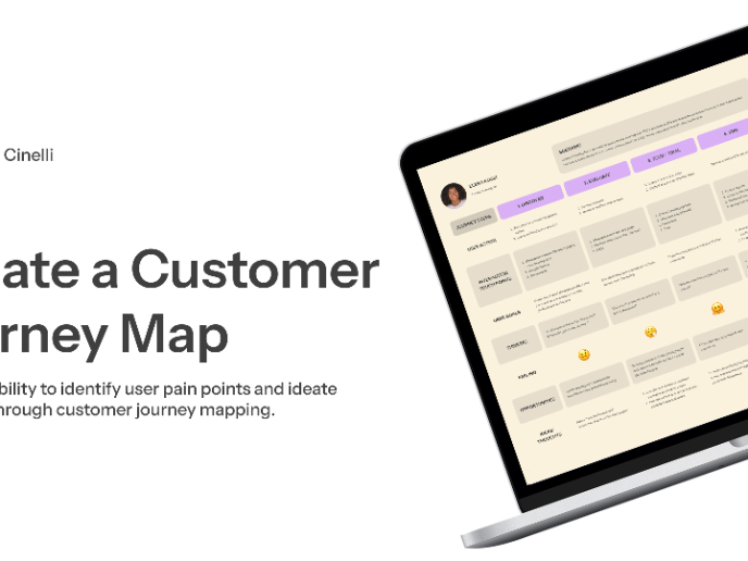
CJM x Mindspace case study - Ester Cinelli
Popular Courses

UX Design Foundations

Introduction to Figma


