Chandra app landing page

A basic landing page for a sports app focused on yoga.
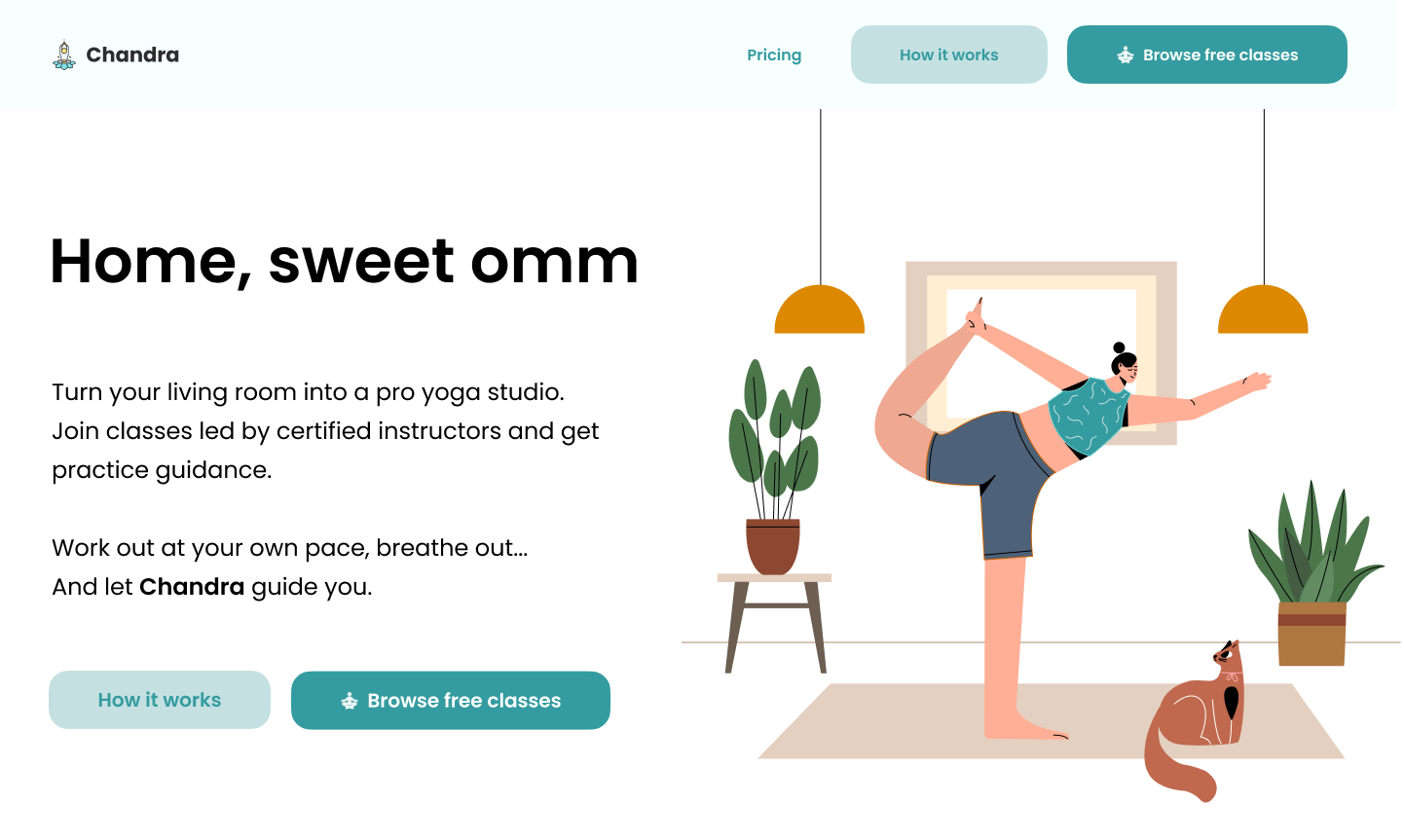
The product is an app that lets users participate in online yoga classes via video call. A certified instructor demonstrates the poses and guides the participants.
Chandra is not about strict rule-following but getting in touch with your body and mind at your own pace. The app's voice is easy-going, playful, and mindful.
The short copy above the fold focuses on the platform's benefits and offers a tempting CTA to encourage user engagement.

Reviews
7 reviews

The copy is really witty and fun! I love the "Home, Sweet Om" headline. It’s very clever and memorable. The CTA buttons are also clear and well-placed, guiding users to take action without hesitation. The rest of the body copy is concise and straightforward, which is great for keeping visitors engaged. You’ve also done a superb job of communicating the value proposition so users know exactly what they're getting. Overall, it’s well-written and nicely presented.

I like the title, it’s short, punchy and playful. The illustrations look nice and clean and with the pet at the bottom, it drives the point of yoga “at home”. The CTA “Browse Free Classes” is strong, because it invites engagement while also enticing the user with a “free” offering.
On the whole page it isn’t clear to me that this is an app (no “download via App Store” buttons for example) and there is no information that this is a video type of service. Also “let Chandra guide you” confuses me a bit as it seems that it’s a human instructor named Chandra, but that’s just the app. Overall the design is nicely spaced and laid out with a clean design which also sells the idea of a calming experience. I am just missing some more details about what is actually being advertised.

I appreciate the overall aesthetic and clarity of the design. The visual elements effectively convey the intended message.
- CTA Consistency: Consider diversifying the CTAs (Calls to Action) used in the header and hero section. While the current CTAs are relevant, using different copy in each area could provide more context and guide users towards specific actions.
- Header Enhancement: In the header, you might explore adding a dropdown menu with options like "Services," "Classes," or "About Us." This would offer users a more streamlined way to navigate the site and discover the various offerings.
I believe these suggestions could further enhance the user experience and make the design even more effective.

My first impression: approachable, calm, mindful, yet playful.
You’ve created a strong, well-branded landing page that clearly speaks to the target audience of yoga and mindfulness app users. The tone is confident yet gentle, the design is clean, and I really like the title you come up with! With a few refinements like adding trust and testimonials, adding more navigation depth, you’ll elevate the experience and conversion potential even further. 🙌 🙌 🙌

Well done on the design it is really nice and clear and I agree the copy is well written! With the how it works button the colour contrast would not pass AA standards so might be worth experimenting with that! Other than great work!

I love the "Home, Sweet Omm" heading. It inspired the tone for my own project.
The copy and CTA is also clear. Overall, you did a fantastic job. Well done!

Aleksandra! I like how clean and simple your design is. Less is more. The header, Home, sweet omm is creative and perfect for the message the brand is trying to convey.
With that said, I think you had a great opportunity to tell your potential clients a bit more about the site.
You might also like

Smartwatch Design for Messenger App


Bridge: UI/UX Rebrand of a Blockchain SCM Product


Pulse Music App - Light/Dark Mode


Monetization Strategy


Designing A Better Co-Working Experience Through CJM


Design a Settings Page for Mobile
Content Strategy Courses

UX Writing


Common UX/UI Design Patterns & Flows


Building Content Design Systems
