"Candle house - Landing page"


Designed a candle e-commerce website focused on warmth, simplicity. This project explores how thoughtful UI/UX design, clean layouts, and strong visuals can enhance product discovery and create a seamless shopping experience.
Reviews
1 review

Really beautiful project, Alaa.
I like the color palette you used on the website. The colors fit the concept very well and you paired them nicely.
The text in the hero section feels a bit awkwardly placed. It makes sense that you positioned it where the background is cleaner, but it’s not very noticeable at first glance. You could consider adding an overlay on top of the image so the text stands out more. That would also allow you to move the CTA closer to the text and create a clearer, more logical grouping.
I also noticed some empty space between the last section and the footer. Since it doesn’t seem to serve a specific purpose, it’s worth questioning whether that space is really needed.
One more thing I’m curious about. Did you design other pages as well, or just the homepage? I’d love to see how the rest of the site turned out and to read more about your design decisions if you expand on them in text.
You might also like
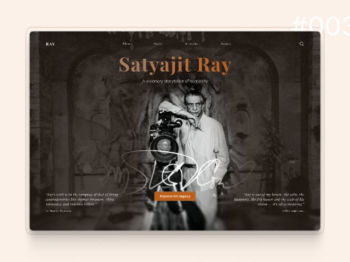
Satyajit Ray Memorial Landing Page - Daily UI 003

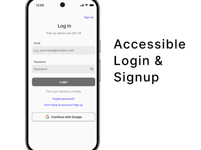
Florish Accessibility Signup Form

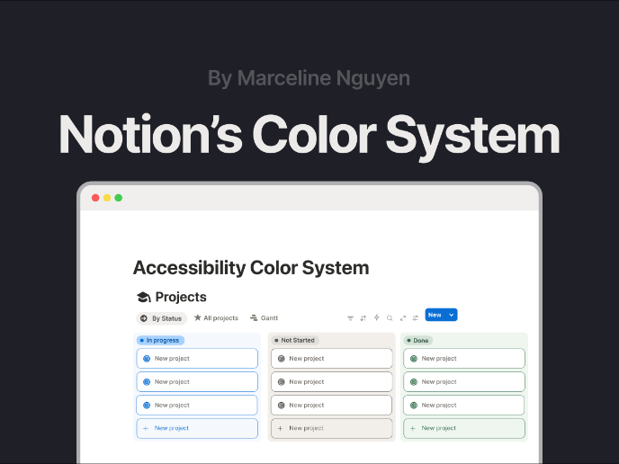
Notion - Accessibility Color System

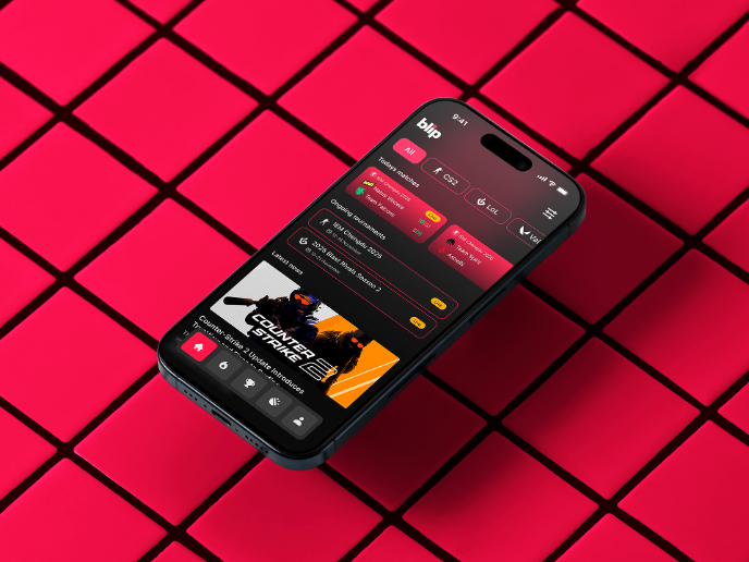
Blip - Esport app design (Light & Dark UI)


Reimagining Asana's Color System


Customer Journey Map for a Co-Working Space

Popular Courses

UX Design Foundations


Introduction to Figma

Design Terminology
