Calm sign-up page accessibility optimization

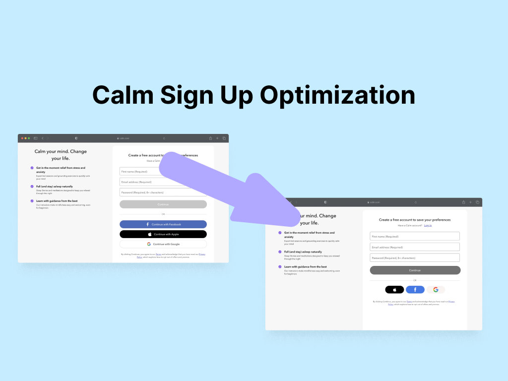
This project focused on optimizing the accessibility and user experience of the Calm sign-up page. The original page had some issues with accessibility and usability which needed to be improved.
Key issues:
- Accessibility errors: The page did not meet WCAG standards, with issues such insufficient color contrast, insuffiecient labelling and poor error states.
- Misleading password requirements: The initial password field only displays minimum characters first 8 minimum characters, after typing the password changes to at least 6 characters, causing confusion.
- Lacking abbility to view password: The password field doesn't allow to view the user's password.
Implemented Solutions:
- Increased contrast of button to meet WCAG AA requirements.
- Improved error states by increasing color contrast, adding warning icons, and widening field borders.
- Implemented a real-time, updatable list for password requirements.
- Improved error states by adding clearer descriptions of the potential errors.
Conclusion:
- This project shows the importance of accessibility and usability in design. By implementing simple changes, the sign-up page is now more accessible and easier to use while complying with the WCAG standards.

Reviews
3 reviews

I really liked the way you presented your work and highlighted all the key pain points regarding accessibility.
From a UX writing perspective, I was impressed with how you handled error states, especially those related to password requirements. It’s convenient for users to see their progress while creating a password, and the wording is clear and concise.
A few things I'd like to highlight: adding "required" to every placeholder/field label felt a bit excessive. I'd suggest removing it. It’s a common practice to include only the required fields, especially in the sign-up flow, as it helps reduce cognitive load and prevents users from feeling overwhelmed by too many fields, thereby encouraging them to complete the sign-up. Another approach could be to add "optional" for any fields that are not required (if there are any in your flow).
Lastly, I noticed one issue: in the error state for the email address field, some letters are missing, and extra spaces have been added.

I like how you made the like account link buttons smaller but I worry about removing the clarifying text. Have you considered adding the clarifying text to the page divider after “or” as making it "or continue with.”
The button after the input fields makes me think that the button is clickable when it is not due to it being darker. Do you have any other solutions you have tried?

please create clear design
You might also like

edX Sign-Up Page Redesign


Beautify Login page WCAG principles


Design Prioritization Workshop


Sanyahawa - Personal Portifolio_login page

Uxcel Halloween Icon Pack

eWallet App Development Project

Visual Design Courses

UX Design Foundations


Introduction to Figma

Design Terminology
