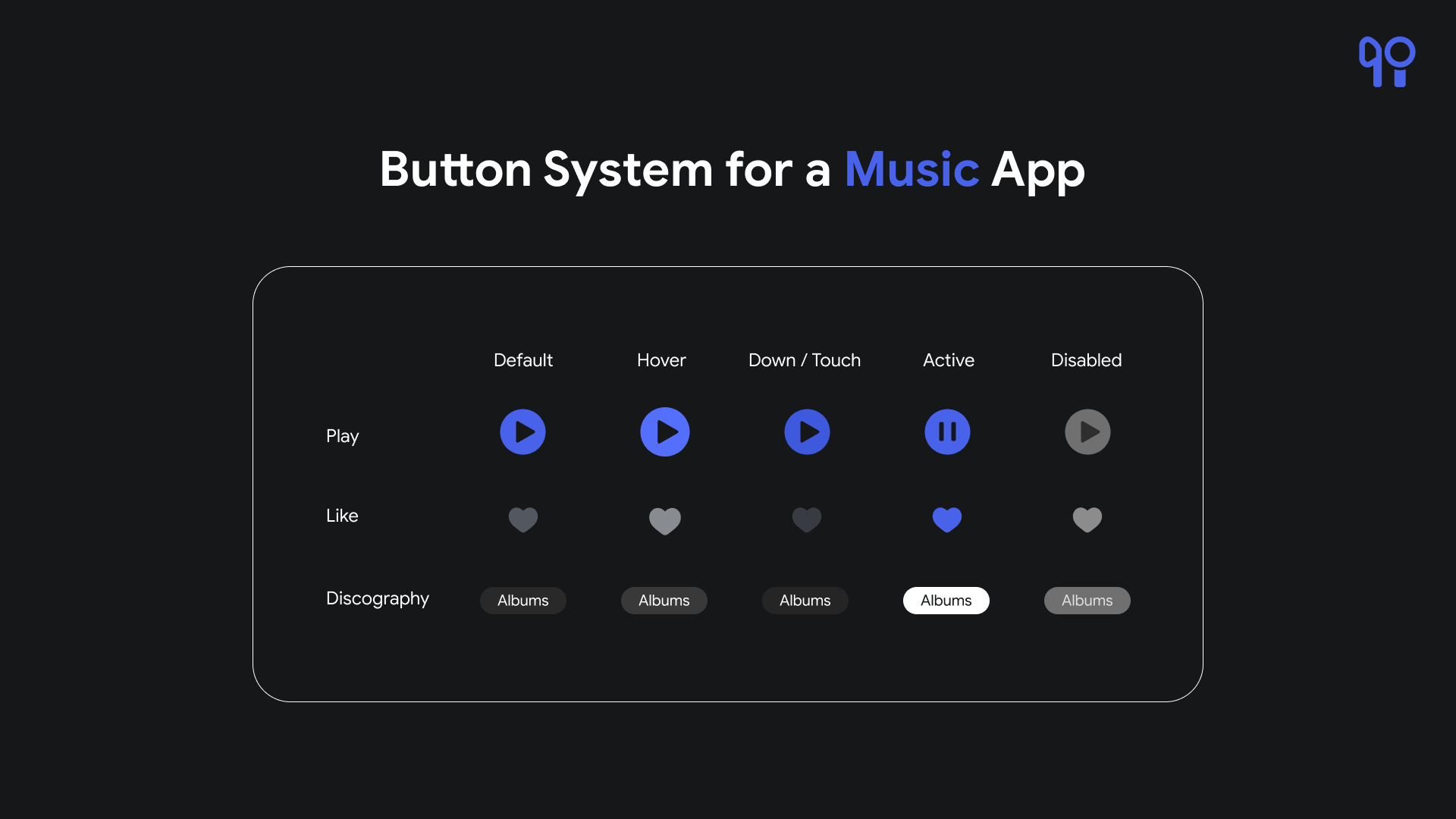
Button System for a Music App
Button System Design Explanation
1. Play Button (Primary):
Default State: The play button features an iconic triangular "play" symbol. The button background is #4863EA, and the symbol is #161719.
Hover State: Upon hovering, the button background slightly lightens to #536FFC, offering visual feedback.
Down State: When clicked, the button momentarily darkens to #3F59DC, indicating user interaction.
Active State: During playback, the button remains in its default state and changes the icon appropriately, visually reinforcing the active playback status.
Disabled State: When playback is unavailable (e.g., no song selected), the button fades to #707070, indicating its inactive state.
2. Like Button (Secondary):
Default State: The like button showcases a heart icon in the color #53575F.
Hover State: Hovering over the like button prompts a subtle color change in the icon to #888B90.
Down State: Clicking the like button momentarily darkens the icon to #383B42, indicating user interaction.
Active State: When a song is liked, the button changes color to #4863EA, visually indicating the liked status.
Disabled State: If the liking functionality is unavailable (e.g. if you are not logged in), the button fades to #707070.
3. Discography Button:
Default State: The discography button features the text of what the user is selecting. The button background is #292929 and the text is #FFFFFF.
Hover State: Hovering over the album button subtly lightens the background to #393939, providing feedback.
Down State: Clicking the album button darkens the background to #252525, indicating user interaction.
Active State: If the album is selected, the button background changes color to #FFFFFF, and the text is #161719 to indicate the active state.
Disabled State: When the album is unavailable (e.g., not in the user's library), the button fades to #707070.
This design ensures consistency and clarity in button interactions within your music app, enhancing user experience and engagement.

Reviews
1 review
At first glance, your button system shows promise and suits the image of a music app. However, the presentation format makes it challenging to review thoroughly. The explanations positioned below the screen aren't user-friendly, as they require constant scrolling up and down.
Additionally, a standard button system should clearly display the primary button styling in all its states, along with secondary, tertiary, and system buttons. It's important to visually and verbally articulate why you chose specific styling for these button types. Evidence of WCAG compliance should also be included.
From the single screen submitted, it’s difficult to evaluate all these parameters comprehensively. I encourage you to explore the showcase works of other users for inspiration and guidance.
You might also like
Loginino

Notification microcopy - Project

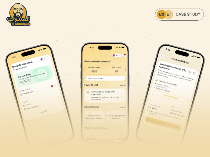
El Mandoub-GovTech App

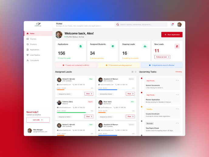
MalishaEdu Counselor Workspace

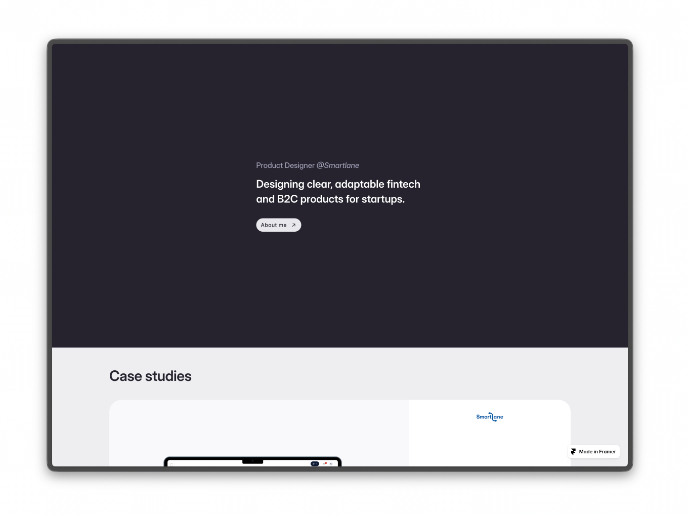
Portfolio website

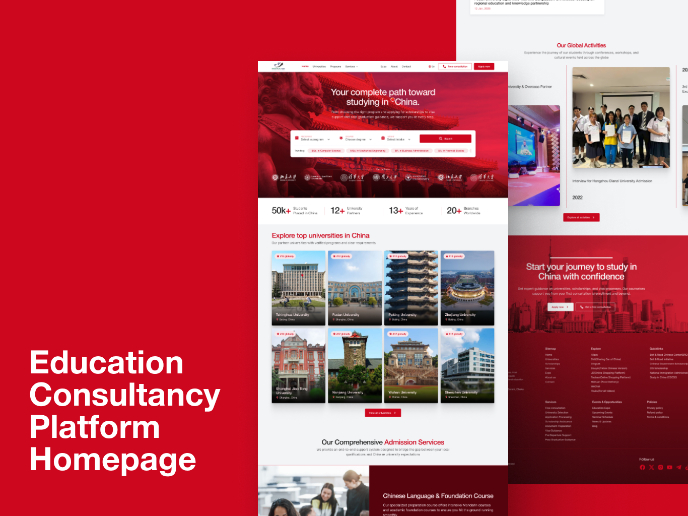
MalishaEdu - Website Design
Visual Design Courses

UX Design Foundations


Introduction to Figma

Design Terminology
