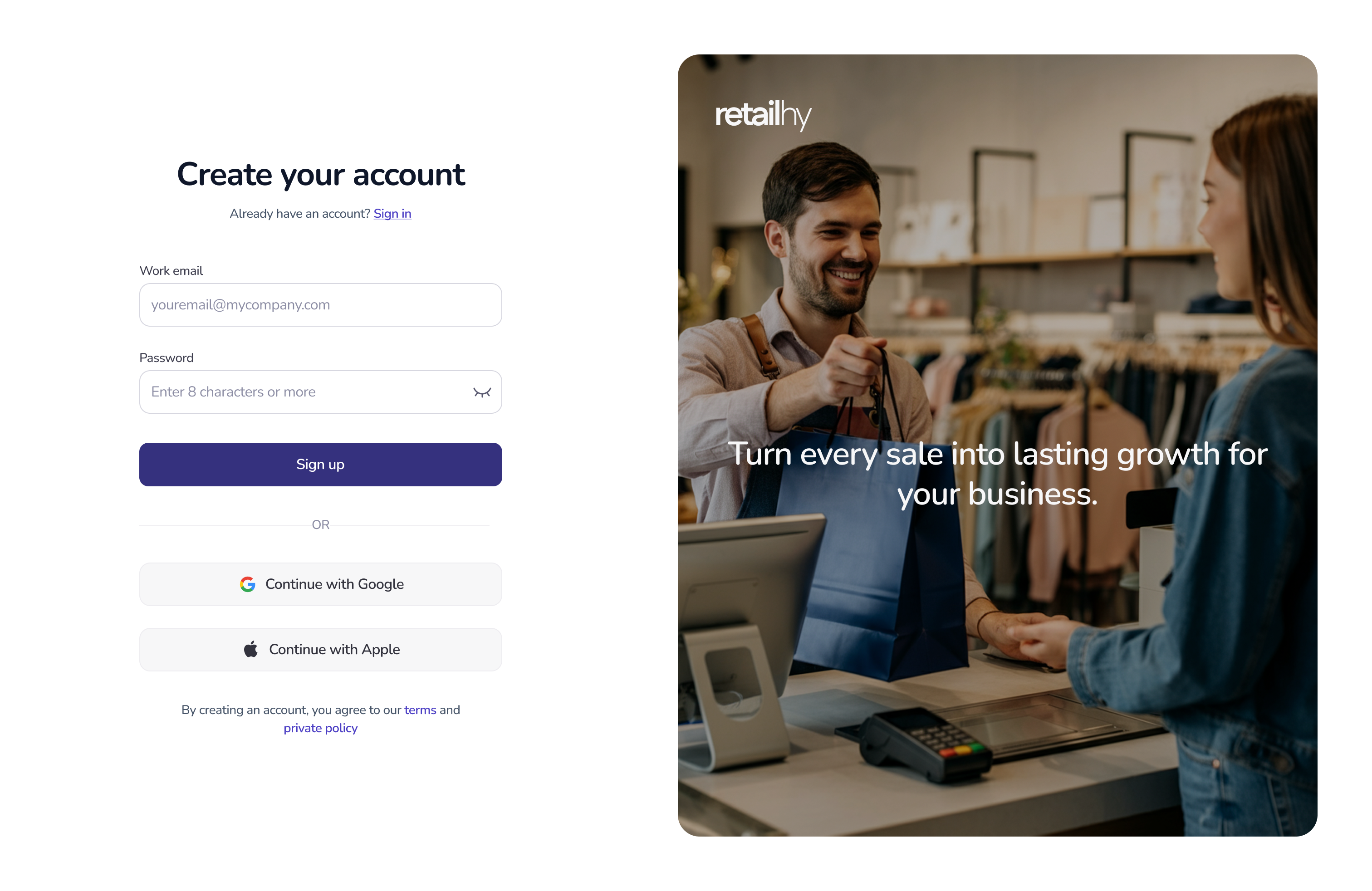
Web SaaS Sign-Up Flow
✅ Progressive field validation: real-time email and password checks with clear error and success states.
✅ Password strength indicator: dynamic checklist + color feedback (red → green).
✅ Visual hierarchy: bold headline, lighter secondary links, strong primary CTA button.
✅ Login alternatives: Google and Apple buttons styled with official branding.
✅ Emotional imagery: retail photo + growth message to connect with business value.
✅ WCAG contrast compliance: dark text, strong accent colors, and error states designed with high contrast for readability and accessibility.
Reviews
6 reviews
Very impressive work, Victoria! I absolutely love it, everything feels so polished and thoughtfully crafted. Honestly, there’s nothing more to add here.
Clean and crisp, Victoria 🛍️
Not only did you check all of the criteria, but you also delivered refined and engaging visuals while adhering to their design principles. What I really appreciate most is this part, “Emotional imagery”. The signups alone might have been enough, but you amped it up with this idea.
Altogether, it’s a thoughtful execution that elevates both function and feeling.
Victoria, this is super polished and accessible — maybe explore adding a tiny microinteraction to make it even more delightful, but overall it’s a really strong sign-up flow!
Super polished work, Victoria 🌟 The progressive validation, password strength feedback, and clean visual hierarchy really make the flow both usable and accessible. I especially like how you paired WCAG compliance with emotional imagery — it balances trust and engagement beautifully. 👏
Great job Victoria. The sign-up flow feels clear and user-friendly. I like the real-time checks and password strength indicator, they make the process simple for users. The layout has good hierarchy, and the Google and Apple buttons are a nice touch for quick login.
The use of imagery and focus on accessibility also add value. You could explore adding a short progress hint or step indicator if the flow grows longer. Overall, very solid work.
I love the neatness and placement. Better if you could make font size on image Bigger and Bolder.
You might also like
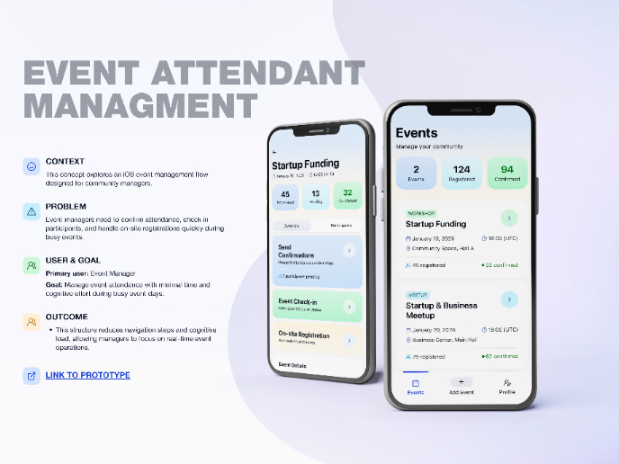
Events Managment App
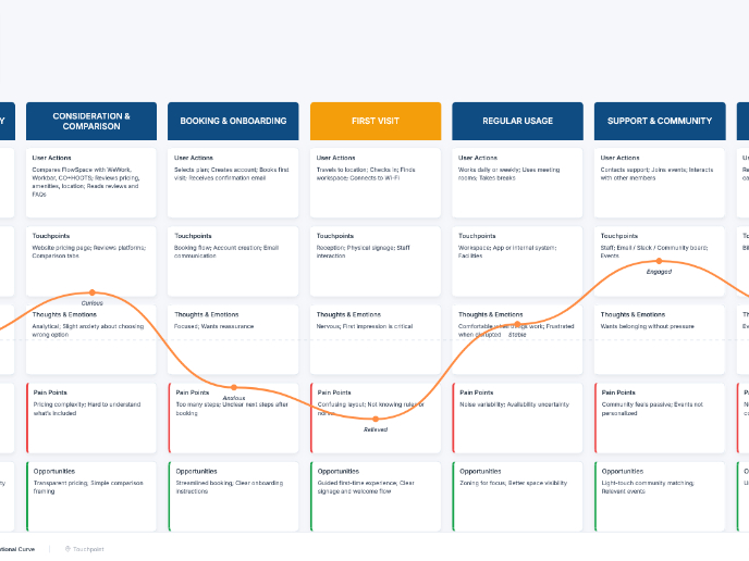
Customer Journey Map — Offsite Co-Working Experience
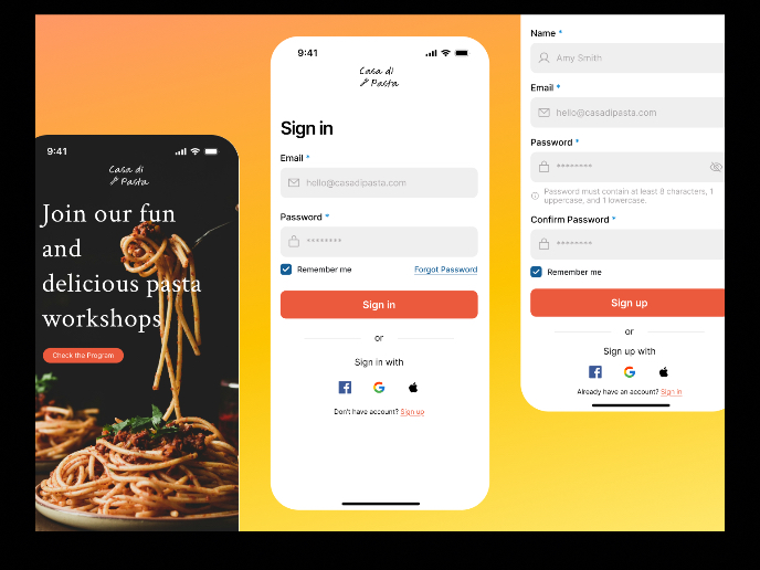
Mobile Onboarding: Casa di Pasta
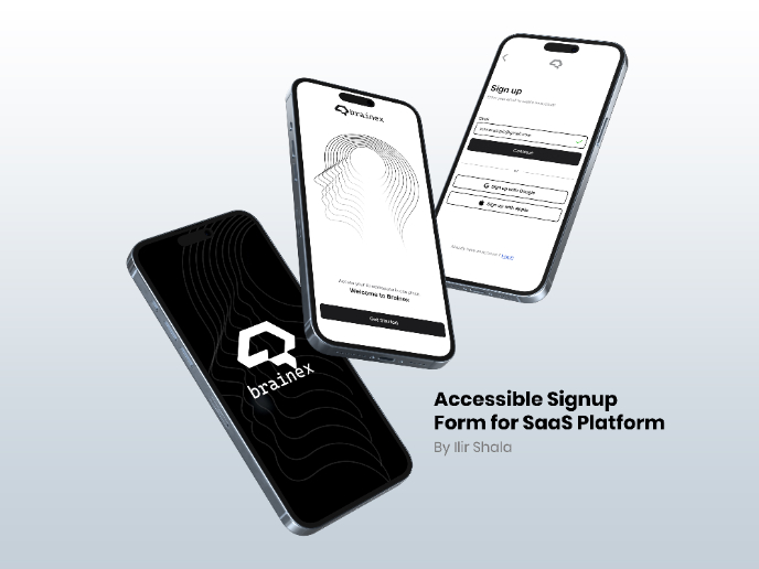
Accessible Signup & Login Experience — Brainex
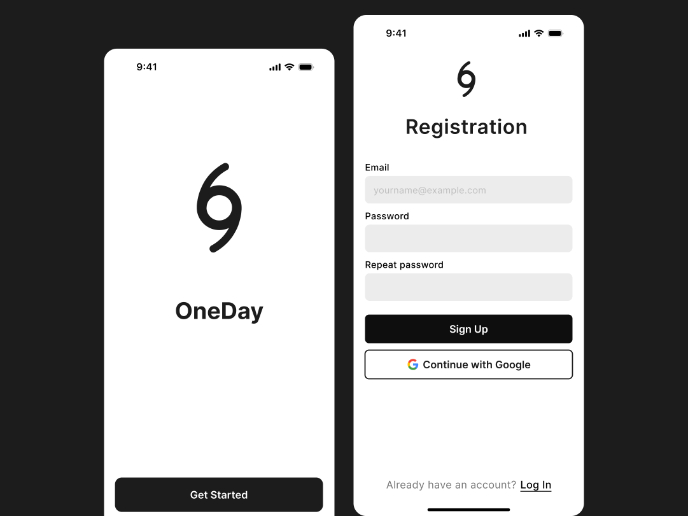
Accessible Signup Form
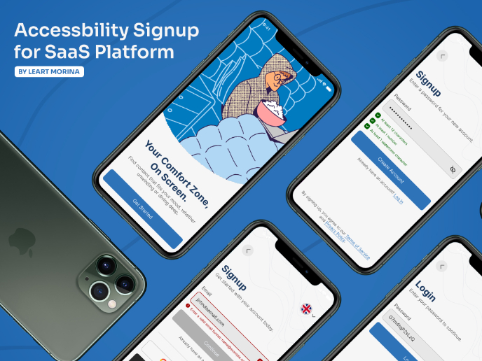
Accessible Signup Form
Visual Design Courses

UX Design Foundations

Introduction to Figma


