Button System Design – Libby Mobile App
Tech Platform: Libby (by OverDrive)
Device: Mobile (iOS/Android)
I made a button system for the Libby mobile app, a platform for borrowing and reading digital books and audiobooks. I tried to create buttons that fit well with the app's friendly aesthetic.
Button Priorities & Types:
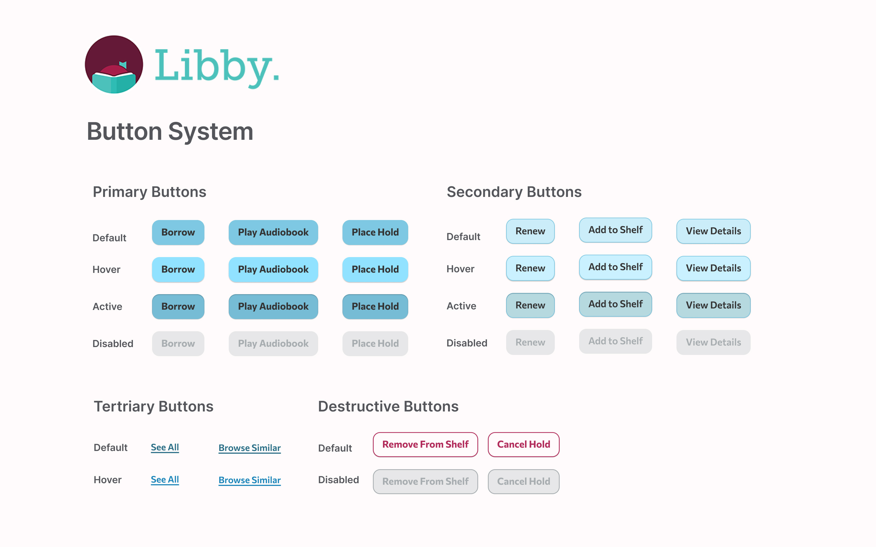
- Primary Buttons (Filled): Key actions such as Borrow, Play Audiobook, and Place Hold
- Secondary Buttons (Light Fill with Border): Support actions like Renew, Add to Shelf, View Details
- Tertiary Buttons (Text Only): Passive actions like See All, Browse Similar
- Destructive Buttons (Outlined Red): Caution-required actions like Remove from Shelf, Cancel Hold
Button States:
- Default
- Hover
- Active
- Disabled
Button Parameters:
The system outlines consistent parameters for:
- Padding and sizing for mobile touch targets
- Corner radius that matches Libby’s rounded, friendly UI
- Color and text contrast that exceeds WCAG AA standards for accessibility
Design Rational
The button styles use soft blue colors and simple typography to promote readability, accesibility, and a calm inviting reading experience.

Reviews
2 reviews

Hi Nat,
Thanks for sharing your Button System design for the Libby mobile app! You've clearly put some effort into this. I’ve taken some time to review your work in detail and wanted to share a few thoughts and constructive feedback points that I hope will be helpful:
- Platform Alignment (Mobile UX): Since the design is for mobile (iOS/Android), hover states aren't applicable. Instead, mobile interfaces rely on default, focus, pressed, and disabled states — it would be great to see these reflected in your system.
- Destructive Button Colour: The use of burgundy (Libby’s brand colour) for destructive buttons might not be ideal. Destructive actions are typically represented in red, to match platform conventions and signal urgency more clearly to users.
- Primary vs Secondary Contrast: The visual difference between primary and secondary buttons is quite subtle at the moment. Consider using fill vs outline, or more distinct colour contrasts to make the priority clearer at a glance.
- Tertiary vs Link Buttons: The "Tertiary Buttons" look more like link-style buttons. In mobile UI systems, there’s usually a difference between text buttons (which resemble standard buttons without fill) and link buttons (often underlined and blue). Clarifying this distinction would improve consistency.
- Too Many Button Examples: Displaying “Borrow”, “Play Audiobook”, and “Place Hold” separately feels a bit redundant unless you're showing them in context. For a system overview, one generic label (e.g., "Button") per style would suffice — or better yet, include a UI mockup to show them in use.
- Icon and Icon-only Buttons Missing: Mobile UI's often include buttons with icons and icon-only buttons (e.g., arrows, close icons). Adding these variations would round out the system nicely and reflect more realistic scenarios.
- State Completeness: Again, for mobile apps, it's essential to show all expected interaction states: Default / Focus / Pressed / Disabled. Replacing hover with these would better support touch interactions.
Thanks again for sharing this! I’d love to see how these buttons look in actual context, maybe consider adding a few usage examples or mock screens. That would help bring the system to life and highlight how your components support the broader UI.
Keep up the great work!

Perfect
You might also like

Improving Dating App Onboarding: A/B Test Design

FORM Checkout Flow - Mobile


A/B Test for Hinge's Onboarding Flow


Accessibility Asse


The Fitness Growth Engine

Uxcel Halloween Icon Pack

Visual Design Courses

UX Design Foundations


Introduction to Figma

Design Terminology
