Button System Design for Cognitive Impairments

This project presents part of my paper entitled 'Advancing Accessible Interfaces: Evaluation of Design Patterns and Recommendations for Users with Intellectual Disabilities', published by the Association for Computing Machinery (ACM) Digital Library, as part of the proceedings of the 11th International Conference on Software Development and Technologies for Enhancing Accessibility and Fighting Info-exclusion (DSAI '24). This work is focused on the redesign of a museum mobile app for individuals with intellectual disabilities ACCESS+, aiming to rethink its information architecture and a new, dedicated design system that addresses the needs of individuals with cognitive impairments.
Read the full paper: https://dl.acm.org/doi/10.1145/3696593.3696613
Research
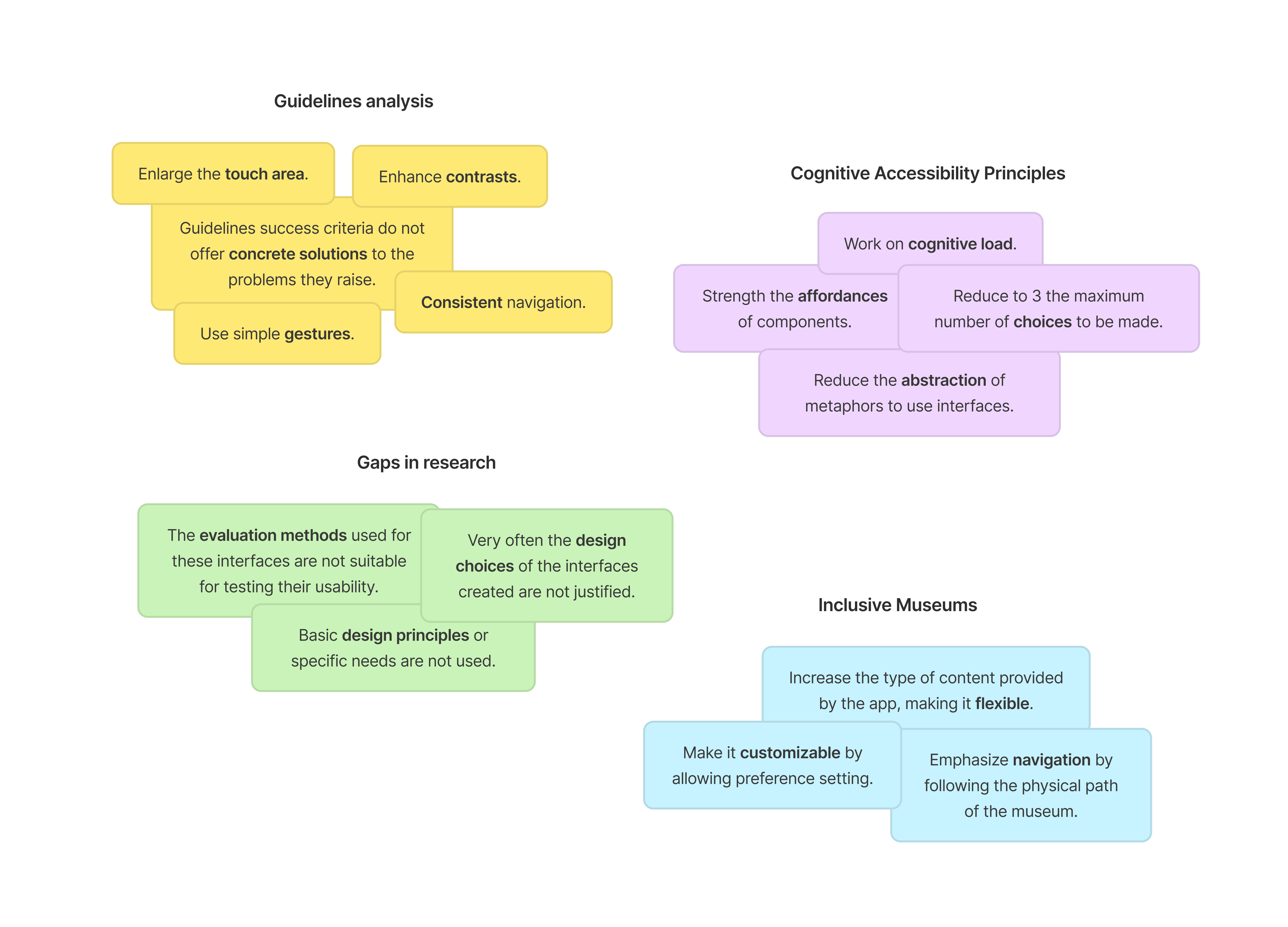
Together with my co-authors, I conducted research to identify the current issues and potential improvements of the existing application. Based on these findings, and in compliance with the WCAG guidelines, we subsequently designed new buttons.
Color Palette
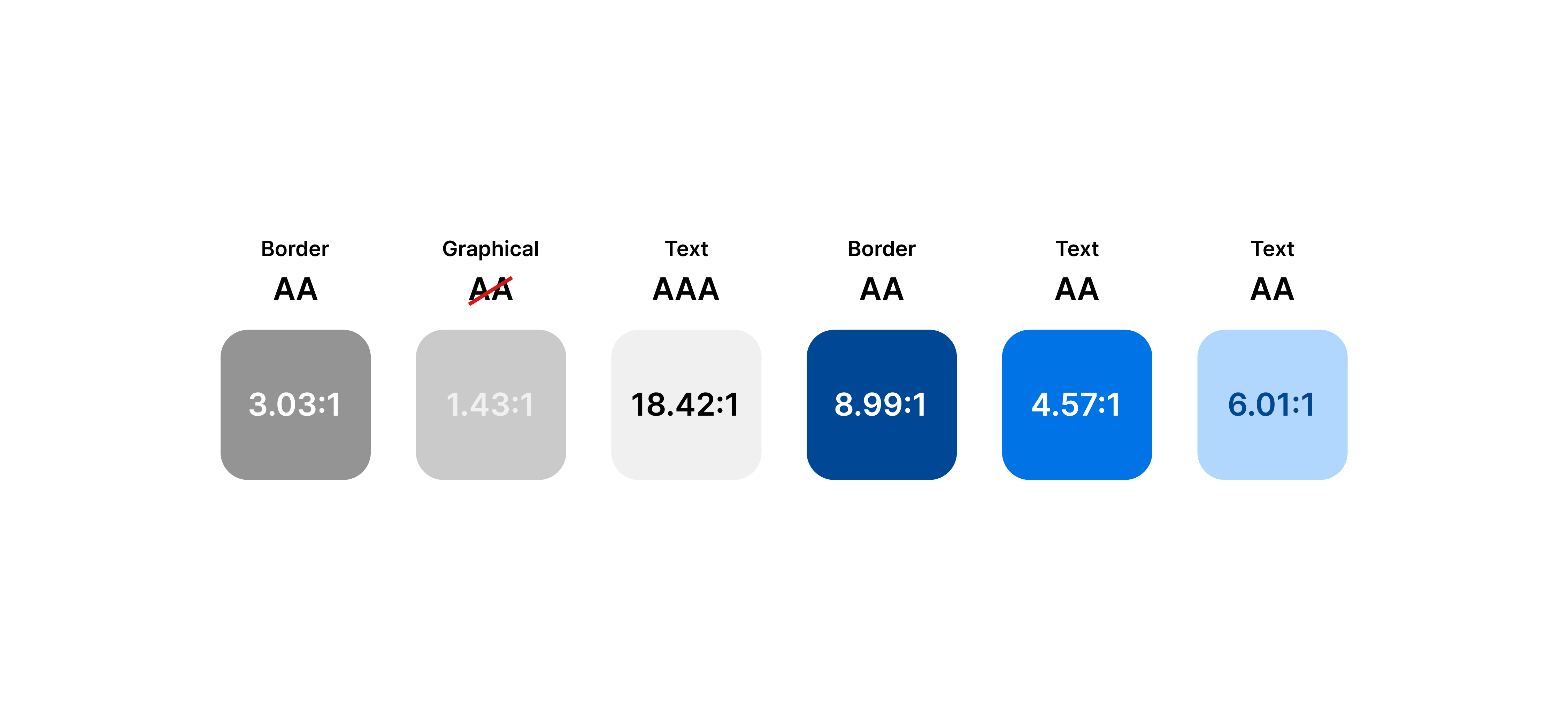
We carefully selected a color palette that fully complied with the WCAG guidelines, paying close attention to text, background color, button borders, and accent colors. The interface predominantly features a white background with black text to ensure maximum contrast. Additionally, buttons utilize shades of gray to prevent the UI from becoming visually heavy and overwhelming for users.
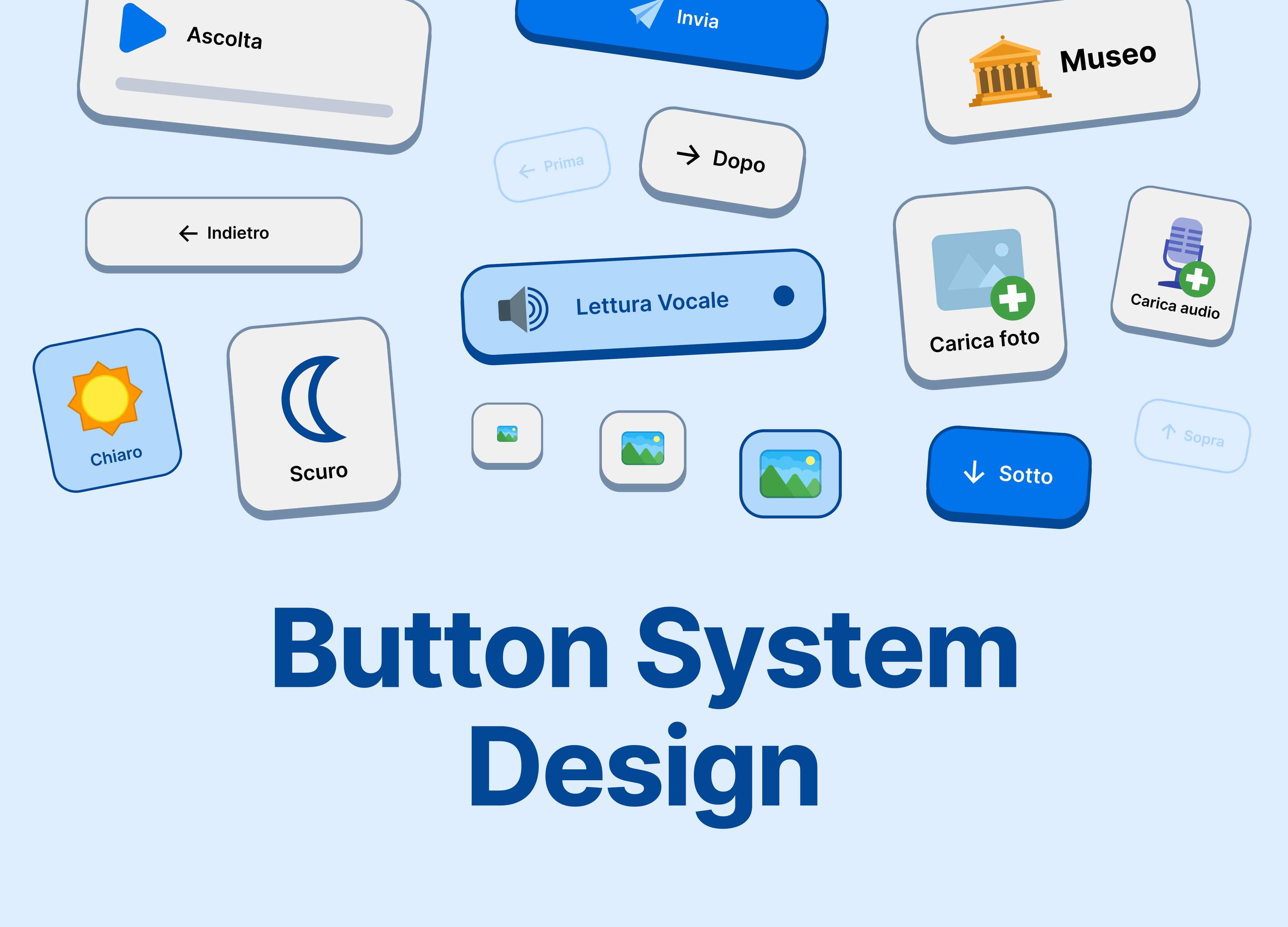
Buttons
Each button is outlined with a gray 3px border that defines the clickable area and has a minimum height of 90px, making it significantly more spacious than required by the WCAG. The style draws inspiration from Duolingo to reinforce the abstraction of digital buttons with their physical counterparts; accordingly, each button includes both a clickable state and a clicked state. The minimum text size used for microcopy is 21px semibold with the Inter typeface, ensuring readability even for visually impaired users. The language is concise, featuring short texts and easily understandable terminology.
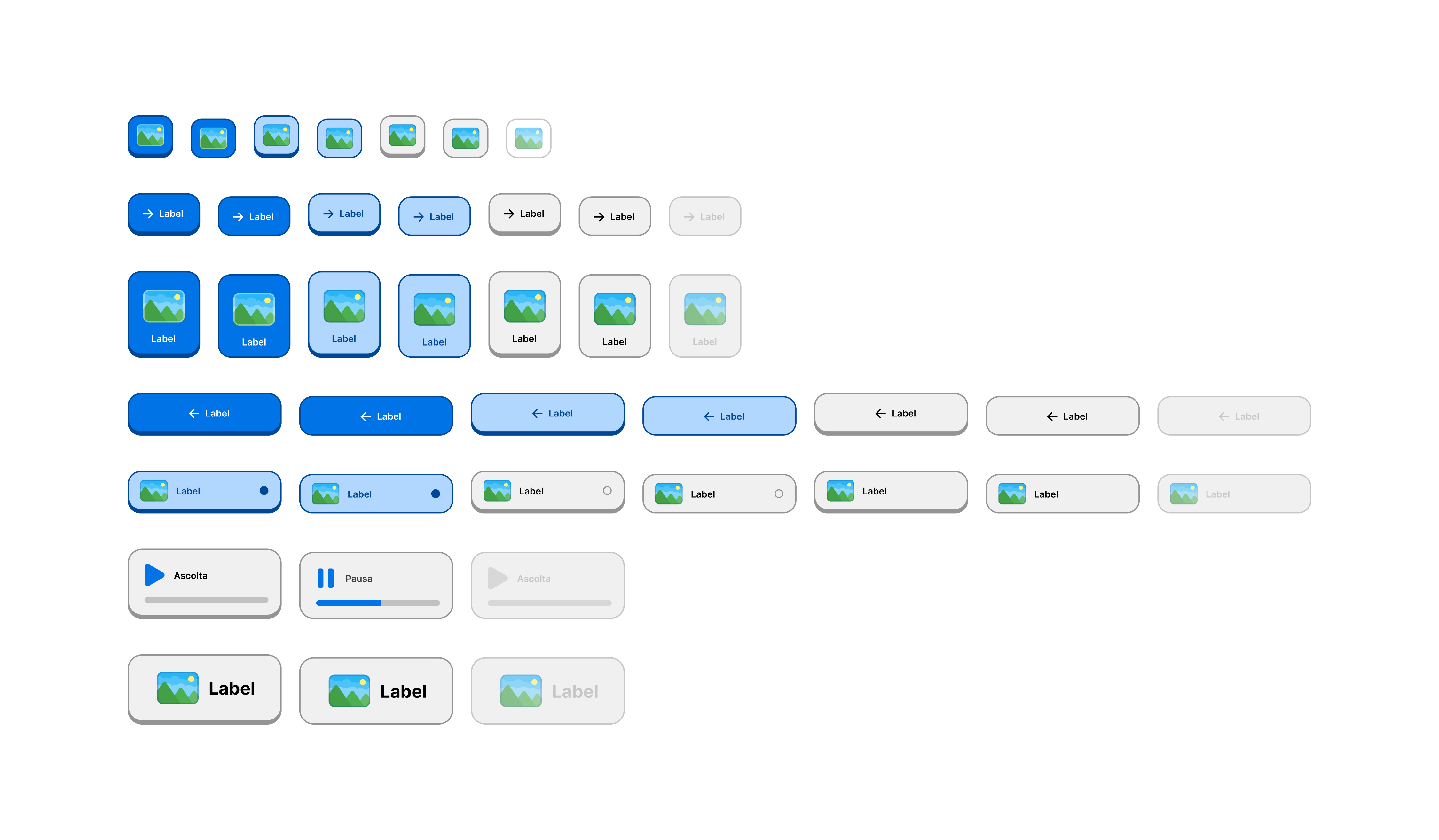
Button States
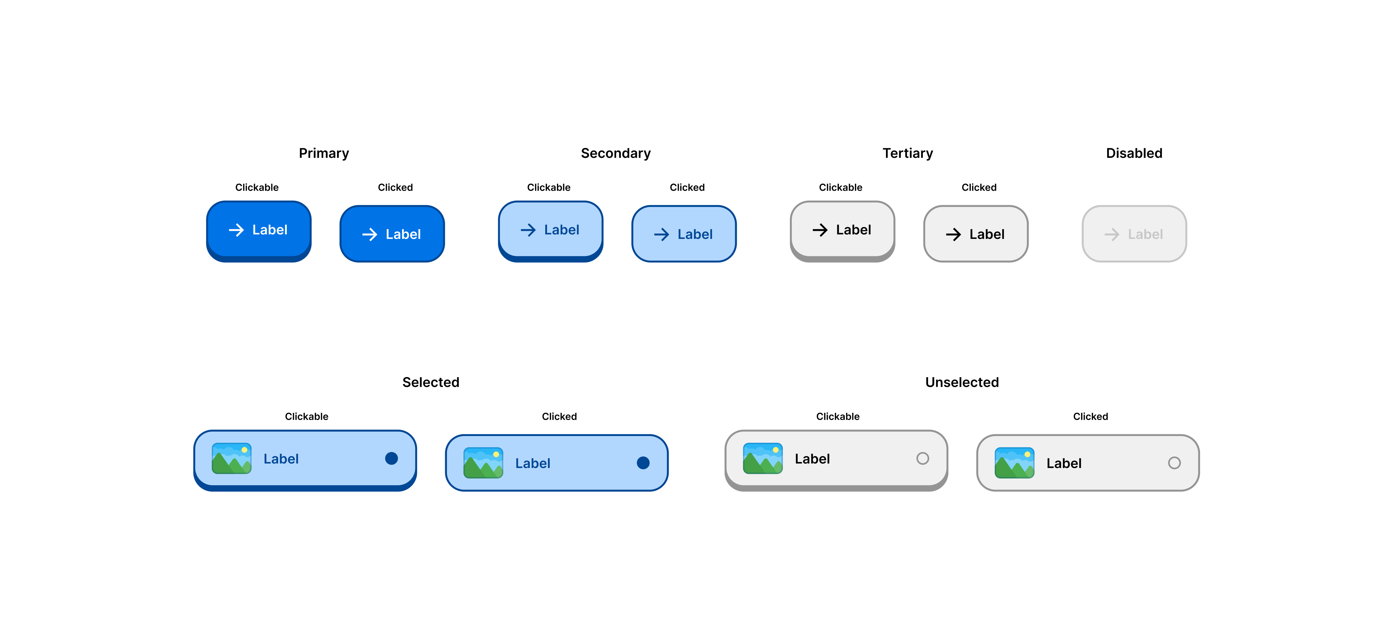
There are four possible states: Primary, Secondary, Tertiary, and Disabled. The sub-states — clickable and clicked — are used to display an animation confirming that the button has indeed been pressed. When a choice needs to be made (e.g., radio buttons), the button changes to the secondary style to indicate that it is not only clicked but also selected in comparison to others. Finally, if a selected button can be deselected (e.g., checkboxes), it will display a filled circle and maintain a clickable appearance to signal that the click action can be performed again.
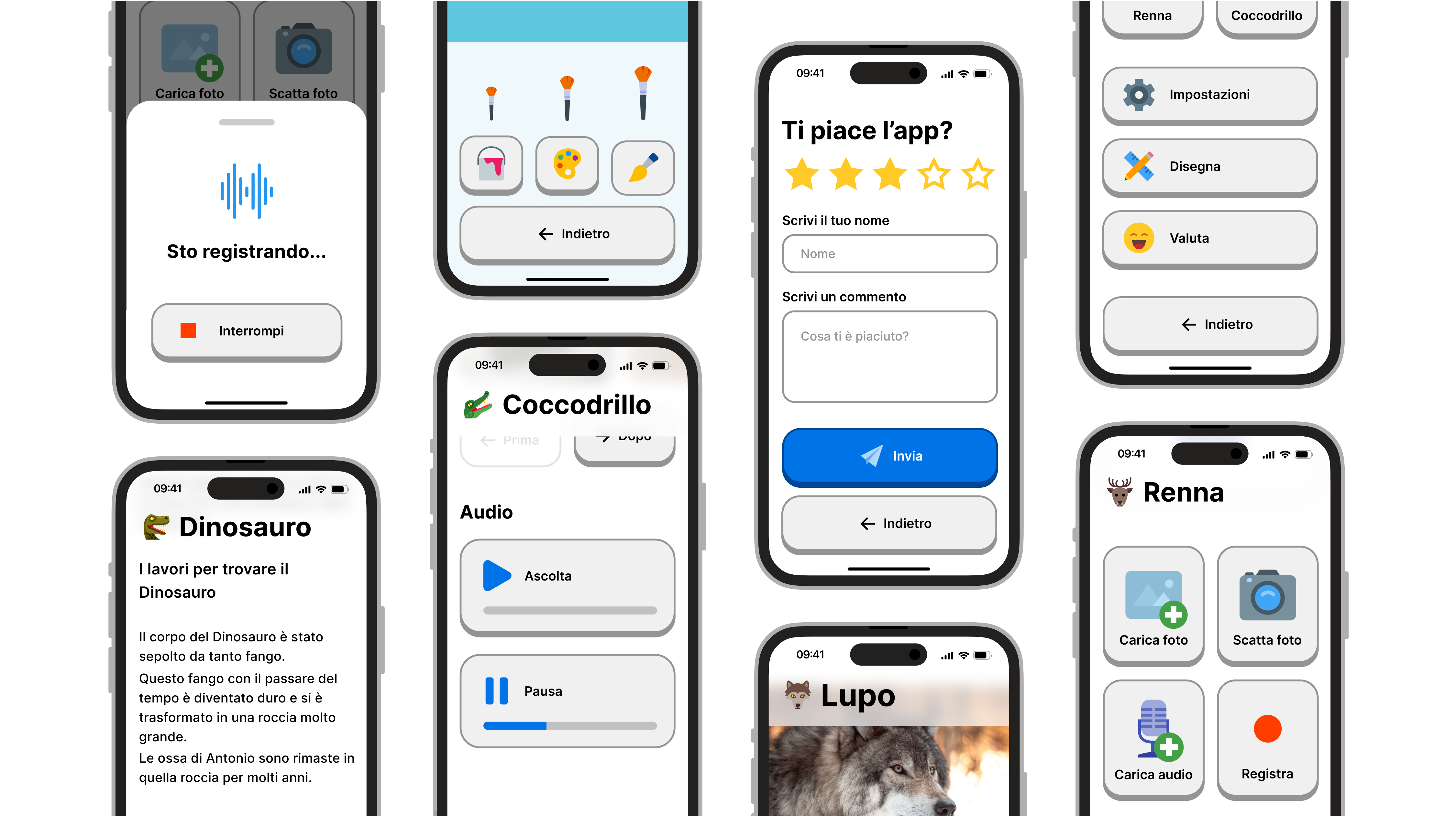
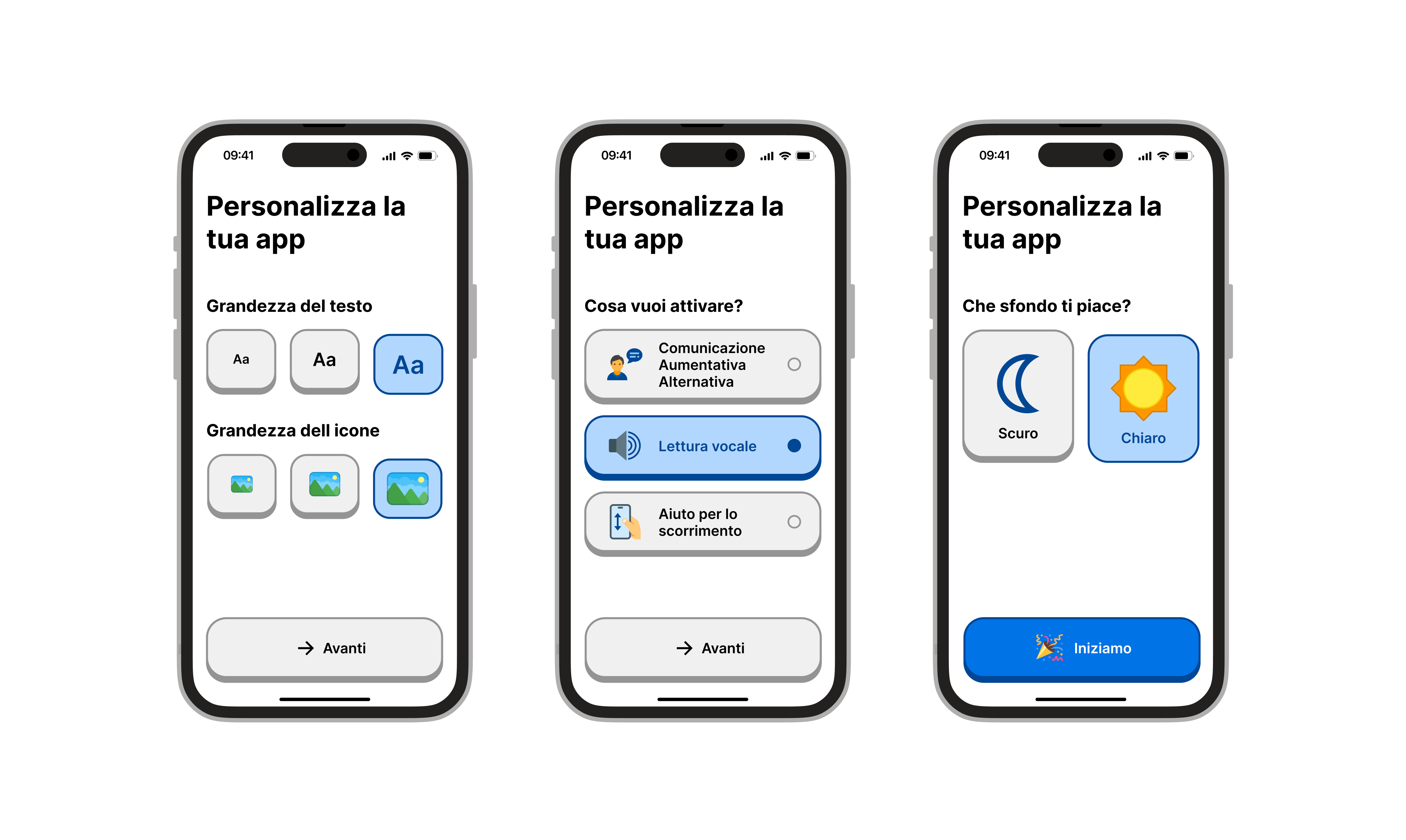
Below, you can see the complete application with all its interfaces. You are also welcome to view the full project if you wish.
Tools used
From brief

Topics
Share
Reviews
3 reviews

First, I want to say the work you have done shows strong dedication and design craft. You’ve clearly put time into polishing visuals and building a structured presentation.
Below is my feedback as a mentor to help you push these case studies to the next level:
What you did well:
- Choosing such an important and underexplored focus — cognitive accessibility — is impressive and meaningful.
- Your research depth and attention to different user needs gives the project strong credibility.
You clearly have design skill and care about details. To make them stand out more:
- Add more process, less polish-first → sketches, iterations, decision points.
- Always link features back to user problems.
- Include impact and validation (metrics, quotes, or even hypothetical improvements).
- Sprinkle in accessibility awareness — this will set you apart as a thoughtful, senior-level designer.

I'm curious about those who have been using a tablet or mobile device for >10 years<. How do they use it normally? Some even hesitated to interact with your redesign; was the difference so distinct?
Also, I must have skipped this part, did you build the new ACCESS+ app for testing, or was it just a Figma prototype?

Andrea, your Button System Design shows impressive attention to accessibility—clear contrast, large touch targets, and concise language make it genuinely user-friendly while still feeling modern and approachable.
You might also like

HealthFlow: Designing a Simple and Insightful Wellness Dashboard


Improving Dating App Onboarding: A/B Test Design

FORM Checkout Flow - Mobile


A/B Test for Hinge's Onboarding Flow


Accessibility Asse


The Fitness Growth Engine

Visual Design Courses

UX Design Foundations


Introduction to Figma

Design Terminology
