Button System

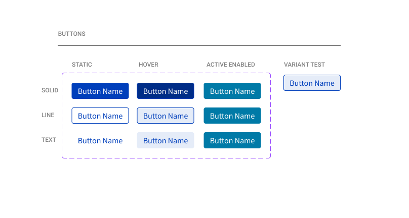
I created a button system focusing on accessibility for users that use screen readers or they keyboard to navigate tech websites. For each button type, there are static, hover and active states so that users have visual reinforcement of where they are while navigating the website. I also have three options for buttons; primary, secondary and text.

Reviews
2 reviews

Marissa, it's clear that you have a solid foundation and have experience creating buttons. However, it would help to provide more context about the type of button and its purpose. Overall, I’d say this is a good start, but there’s room for improvement.
When creating buttons, it’s essential to determine if you need variants and, if so, their purpose and hierarchy. Visual cues, like icons, can also enhance buttons, especially in different contexts. I noticed you’ve included button states, which is great. However, since you have an active state, it’s important to also showcase how the button would look in inactive or disabled states for better clarity.
Additionally, there’s a bit of ambiguity about the variant test. Are you testing an existing button, or is this part of creating a new one? If you’re looking to test how the button behaves in different states or scenarios, I’d recommend using Figma’s prototype feature. This will allow others to interact with your button and provide more insightful feedback.

I hate design systems with dozens of button states and colors. This feels like a complete set for a small SaaS or similar site.
It would be good to have some explanation for each button.
You might also like

SONZ - Entertainment platform


Camp & Travel Explorer - App Design


Solar system Dashboard Utility

Uxcel Halloween Icon Pack


Color System

Duolingo Halloween Icon Pack

Visual Design Courses

UX Design Foundations


Introduction to Figma

Design Terminology
