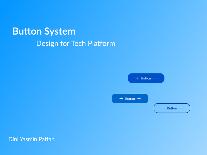
Button Design System Tech platform-Tiket.com

Project Inspiration:
This project was inspired by Tiket.com, a travel platform known for its blue brand identity.
Button Hierarchy:
I built a carefully structured button hierarchy that includes Primary, Secondary, and Tertiary buttons, which are available in small, medium, and large sizes respectively. These considerations were designed to maximize user interaction and navigation.
Button Variants:
Each button in the system is designed with a variety of variants, including Default, Hover, Focus, Pressed, and Off. This is done to ensure a smooth and responsive user experience with every interaction.
Visual Compliance with WCAG:
Buttons designed in compliance with WCAG's strict standards at AA and AAA levels. This not only ensures strong visual appeal, but also ensures optimal accessibility for all users. This design approach aims to improve inclusivity and overall usability.
Adaptation with Light and Dark Modes:
Adaptation of buttons to light and dark modes is an important aspect of design. Ensuring buttons are well-adapted in various display conditions, thus ensuring optimal visibility and aesthetics. This contributes to a well-rounded user experience and improves reading clarity.
Font Selection:
The font chosen was Lato, which is known for its readability and consistency in the interface. This choice not only considers readability, but also maintains aesthetic consistency in the overall design.

Reviews
0 reviews
You might also like
Notification microcopy - Project

El Mandoub-GovTech App

MalishaEdu Counselor Workspace

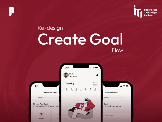
Goal Creation Flow
Portfolio website

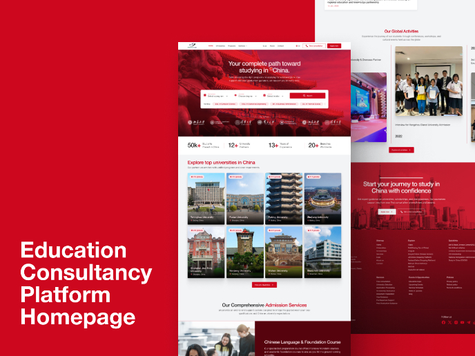
MalishaEdu - Website Design
Visual Design Courses

UX Design Foundations


Introduction to Figma

Design Terminology
