Button design System for tech Platform
Hello, I'm Dylan HENOCQUE, and I'm excited to present my Button System Design project: The NeoMinimal Kit. This system embodies the principles of minimalist neobrutalism, offering a bold, functional, and adaptable button solution for modern tech platforms.
The NeoMinimal Kit is designed with a focus on:
- Cross-Platform Versatility: While initially optimized for mobile interfaces, the system is engineered to seamlessly adapt to desktop and mobile environments. The design maintains its integrity across various screen sizes and interaction methods.
- Brutalist Simplicity: Embracing the raw aesthetics of neobrutalism, the buttons feature stark contrasts, bold typography, and a stripped-down design that prioritizes function over ornate decoration.
- Intuitive Interaction: Despite its minimalist approach, the system incorporates clear visual feedback for different states (hover, pressed, disabled, focused), ensuring users always understand how to interact with the interface.
Key Features:
- Adaptive Sizing: Buttons dynamically adjust their size and spacing based on the device and screen size, ensuring optimal usability across platforms.
- High Contrast Color Scheme: Utilizing a palette of bold, high-contrast colors that not only aligns with neobrutalist principles but also ensures excellent accessibility and readability.
- Responsive Typography: The system employs a sans-serif typeface that scales proportionally across devices, maintaining legibility from mobile to desktop.
- Contextual Examples: As demonstrated in the e-commerce product page mockup, the buttons are designed to integrate seamlessly into various application contexts while maintaining their distinctive style.
The NeoMinimal Kit represents my interpretation of how brutalist design principles can be applied to create a functional, accessible, and visually striking button system for modern tech platforms. It's an exploration of how simplicity and boldness can coexist in user interface design, adapting to the needs of various devices while maintaining a consistent visual language.
I welcome any feedback on how this system can be further refined or expanded to meet the evolving needs of cross-platform design in the tech industry.
Play Prototype: https://shorturl.at/scuvt
View Figma File: https://shorturl.at/sMPXz
Reviews
1 review
Great to see interactive prototyping!
I think your presentation just needs some refinement and explanation to explain exactly what you are presenting on each page, and you have some spelling errors that need to be fixed.
You might also like
Pulse — Music Streaming App with Accessible Light & Dark Mode
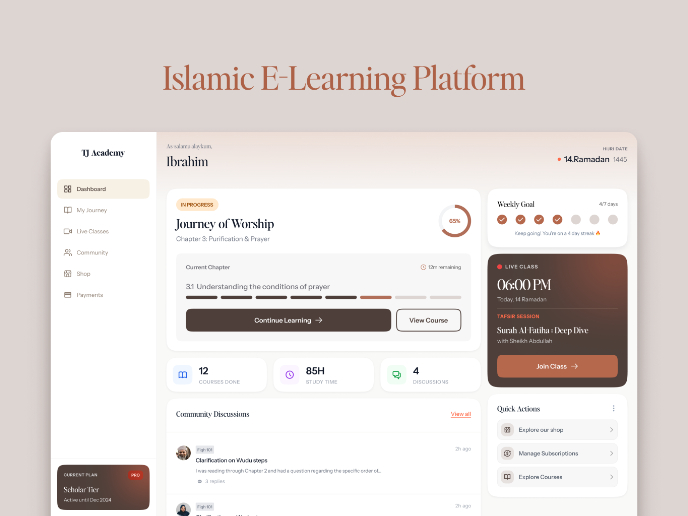
Islamic E-Learning Platfrom Dashboard
SiteScope - Progress Tracking App

FlexPay

Mobile Button System
CJM for Co-Working Space - WeWork
Visual Design Courses

UX Design Foundations

Introduction to Figma


