Button Design System
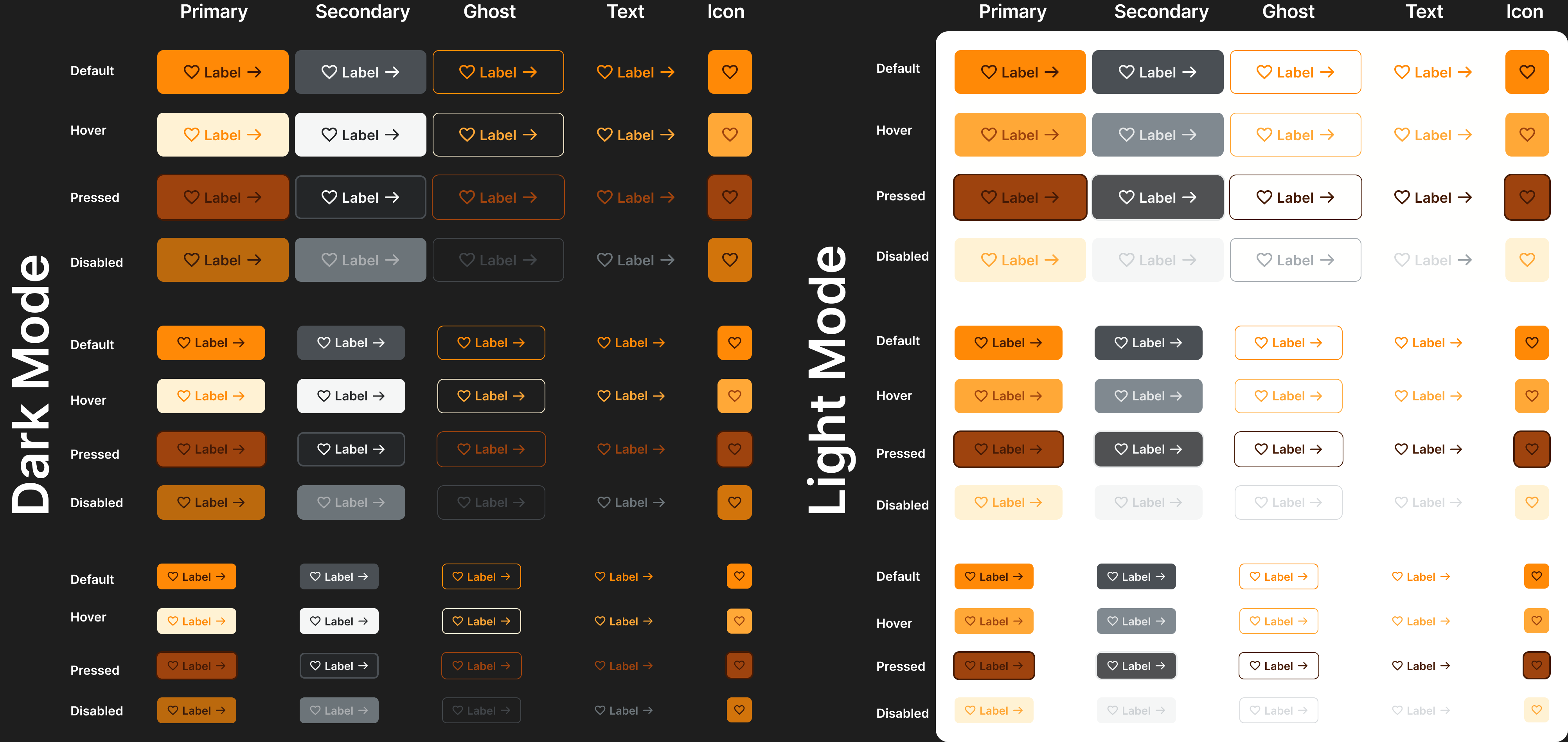
I created a button design system that has three sizes Small, Medium, and Large. The system contains Primary, Secondary, Ghost, Text, and Icon only. Also available in Dark and Light mode.

Reviews
1 review
Great work on this button design system! I really like how you structured the different sizes and made sure to include both Light and Dark modes. The color palette has a nice fall vibe, which makes the buttons feel warm and inviting.
I’d love to see more of your thought process behind the color choices and button specs—what led you to these decisions? Also, it would be great to see some examples of the buttons in an actual UI to get a better sense of how they work in context.
One thing to tweak is the spacing between the icons and text labels. Right now, it feels a bit too tight, making the buttons look cluttered, especially since the padding around them is more generous. You might also consider adding variations with an icon only on the left, one only on the right, and one with just a text label for more flexibility.
This is a solid foundation, and with a few small refinements, it’ll be even stronger!
Thy Nguyen
You might also like
Loginino

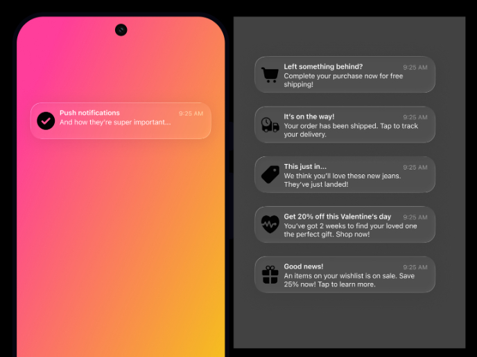
Notification microcopy - Project

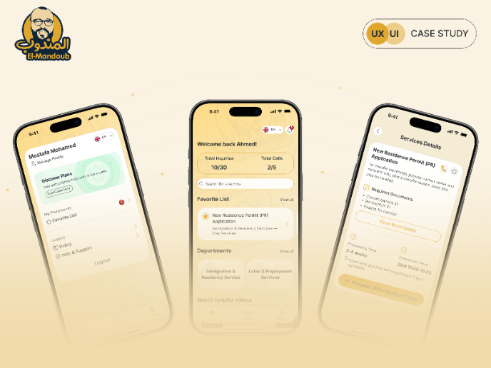
El Mandoub-GovTech App

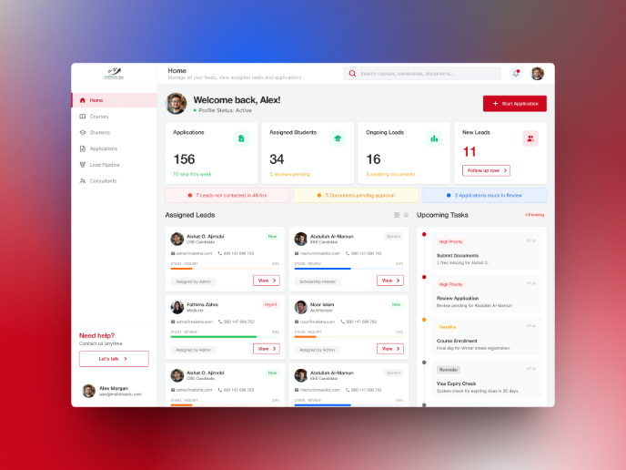
MalishaEdu Counselor Workspace

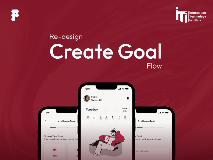
Goal Creation Flow
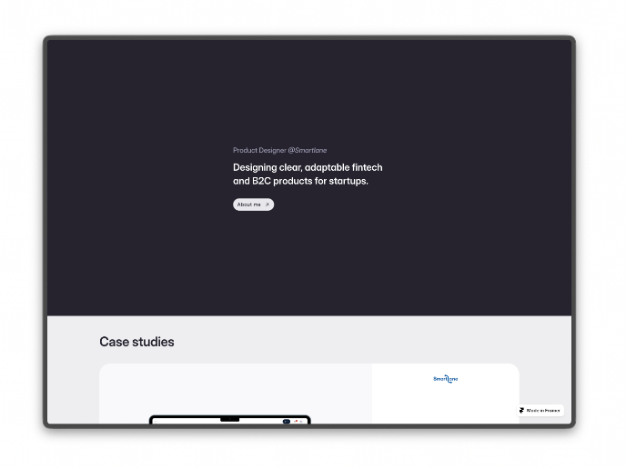
Portfolio website

Visual Design Courses

UX Design Foundations


Introduction to Figma

Design Terminology
