Bloom Buddy app | Button Components

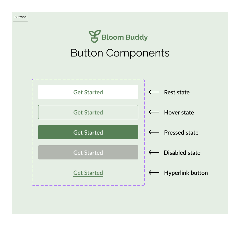
Bloom Buddy is a plant care tracker. Here are the button components for Bloom Buddy's design system.

Reviews
3 reviews
The colors chosen are very appropriate for the brand chosen.
Here are some improvements for your work:
1. Increase the contrast of the text in the conpacks for accessibility.
2. Add states for the link button.
3. Enhance your presentation. There is not enough explanation of color choices.
Good luck!!!

in my eye rest and hover should be replaced. hover must be clear than rest

You make good use of your apps color schemes for the buttons and you make consideration for various states of the button covering the various interactions a user might take on your app. However I feel you could expand this component list a bit more to include more hierarchies of the buttons and better improving the visual language between the button states.
Hierarchies:
- Your current design lacks distinction between button hierarchies such as primary, secondary, and tertiary style buttons.
- Including multiple hierarchy levels will allow for better iteration across your design with different levels of visual weight for distinguishing button actions
- Without these hierarchies buttons next to each other will be at the same level of importance for you users, leading to more errors.
Improving button states:
- Having different states for each button is a great first step however there is no natural progression between each state, leaving each state feel like they are unique buttons in their own right.
- You should look to avoid changing the whole color of a button when pressed as it could lead to slight user confusion. Instead think to make the pressed button darker to create a subtle showcase of reaction when the user interacts with the button
- Tailor your buttons for the device users will use, as you are designing this button system for a mobile app most users wont be hovering over buttons like a traditional website so dont have to prioritize that state.
Overall however this button design system is a very impressive start with good choices made to each buttons padding and typeface selection. With colors that stand out but don't distract the user from their primary action. Great Work!
You might also like

Notification microcopy - Project


El Mandoub-GovTech App


MalishaEdu Counselor Workspace


Goal Creation Flow


Portfolio website

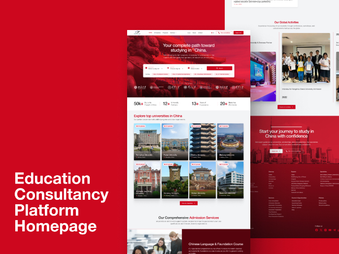
MalishaEdu - Website Design
Visual Design Courses

UX Design Foundations


Introduction to Figma

Design Terminology
