Before and after IAP Screen

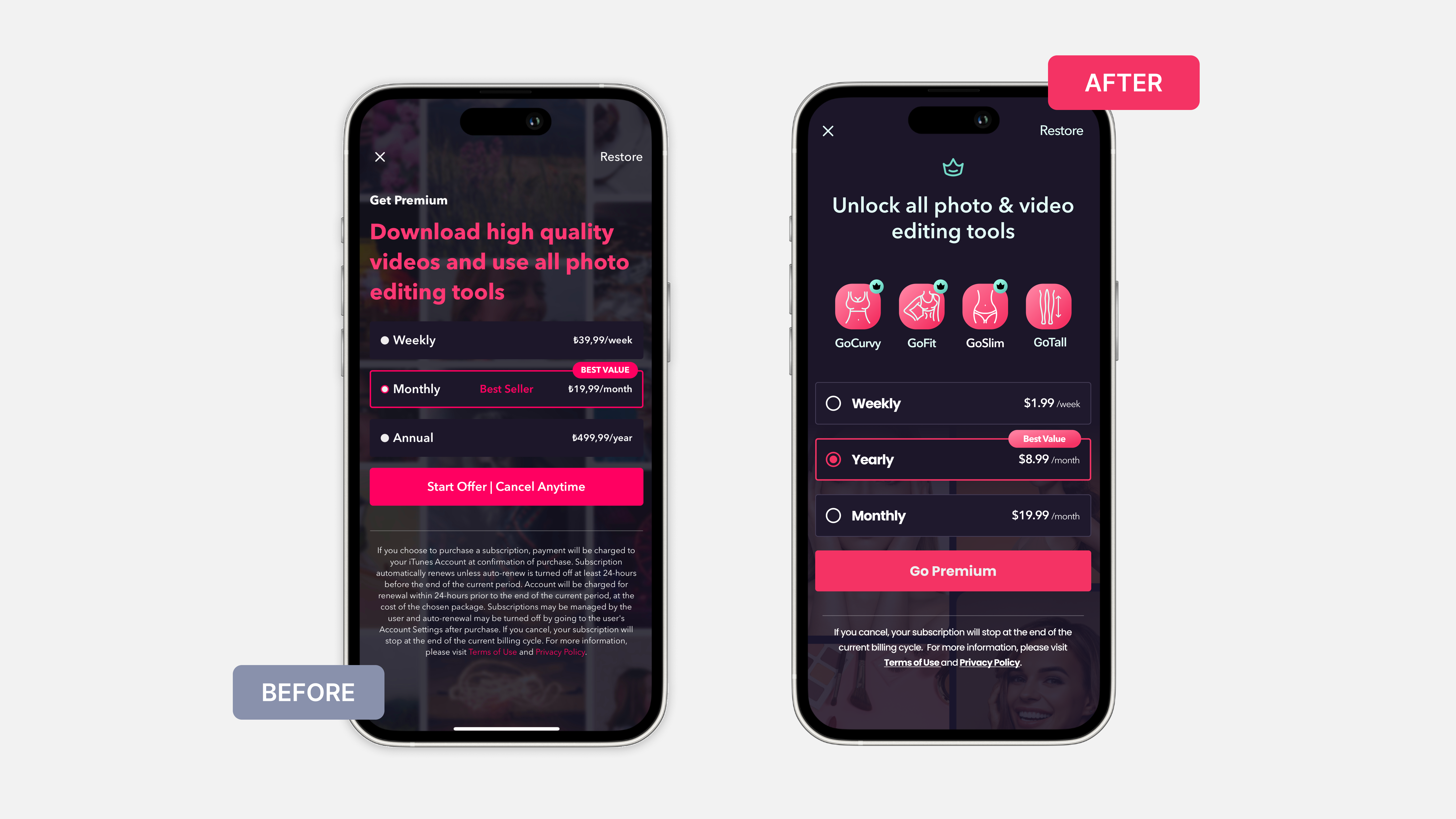
Before and after the GoSexy In-App Purchase Screen!
Key points I aimed to address with the IAP page redesign:
- Introduction of feature-specific icons (GoCurvy, GoFit, GoSlim, and GoTall) to visually communicate the benefits of the subscription.
- Icons make the offerings more tangible, improving the user's understanding of what they are purchasing.
- The placement of the yearly plan before the monthly plan guides users toward choosing the most cost-effective option.
- Aims to increase customer retention by promoting longer-term commitments.
- Displaying the Yearly plan's price as a monthly rate is a subtle strategy to highlight the discount, making it more appealing when compared to other options.
Reviews
2 reviews

Hi İdil! Great start by adding more visuals and colours to the page! However, some things can be adjusted.
- Simplify Page Design: The page appears cluttered due to the use of small elements and icons. The background is distracting and makes it harder to focus on the main content. Additionally, gradients on badges and CTAs add unnecessary visual weight.
- Text Alignment: As a general rule, if the text is longer than three lines, it’s better to use left alignment. Consider shortening the copy where possible for clarity.
- Contrast and Readability: Use a monotone background or a single image instead of a collage to enhance readability. Avoid gradients, as they can make small components less legible.
- UX Copy for Choices: Align the values for "month" and "week" to make comparisons easier. Currently, it’s difficult to compare different amounts over various time periods.
- Improve Radio Button Component: The selected radio button is hard to distinguish. Consider using a dot style to make the selected option more prominent.
Great job!
/Yuliia
Hi Yuliia,
Thank you for your constructive feedback. I agree with all and will update my design as soon as possible.
Nice direction, but few things to improve:
- Try reducing qty of text, screen looks too busy
- The CTA label feels confusing when has "cancel anytime" in it. A good practice to have such supportive text somewhere near the button
- The teal color for links and separator lines catches too much attention to it. Seems you can easily go with a neutral color for the separator (opaque white) + just white underlined links
Feel free to revise the designs & I'll be happy to adjust the review.
Also, please check project link, it doesn't work.
Thank you so much for your insightful feedback!
Your suggestions are really helpful, and I appreciate your time reviewing my project which is an old design that I made. Also with your review, I immediately improved according to your suggestions.
I just couldn't succeed with the reducing text part because every part feels essential. Maybe I need to change the background or change the whole design.
I removed the link because normally it needs to be sent to my dribble account, but it isn't public yet.
Again, thank you for your time.
7 Claps
Average 3.5 by 2 people
You might also like
Project
Customer Journey Map for a Co-Working Space

In this project, I made a Customer Journey Map (CJM) for a co-working space. The goal of this project is to understand how customers feel an
Project
Blip - Esport app design (Light & Dark UI)

Bonjour, comrades! Today I present the case of Blip - an esports hub app for gamers where you can check esports news, learn about upcoming t
Project
Reimagining Asana's Color System

I created a color system based on Asana's current project management tool. Accessibility and the emotions the colors evoke were the primary
Project
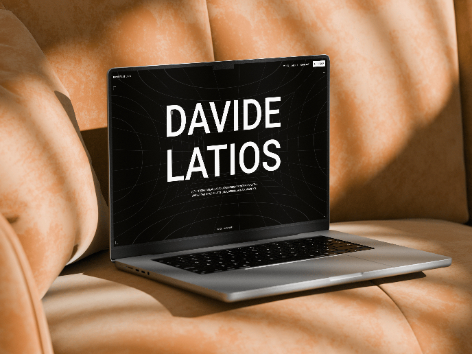
Latios - Free Portfolio Template for UX/UI Designers

Overview I built Latios because I kept seeing the same problem: designers with solid experience getting stuck trying to launch their portfol
Project
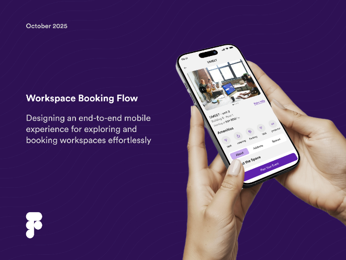
Workspace Booking Flow - UI/UX Design
Project
Responsive Main Screen

Popular Courses

Course
UX Design Foundations

Learn the essentials of UX design to build a strong foundation in core principles. Gain practical skills to support product development and create better user experiences.

Course
Introduction to Figma
Learn essential Figma tools like layers, styling, typography, and images. Master the basics to create clean, user-friendly designs

Course
Design Terminology

Learn UX terminology and key UX/UI terms that boost collaboration between designers, developers, and stakeholders for smoother, clearer communication.