Barça Bundle Checkout page

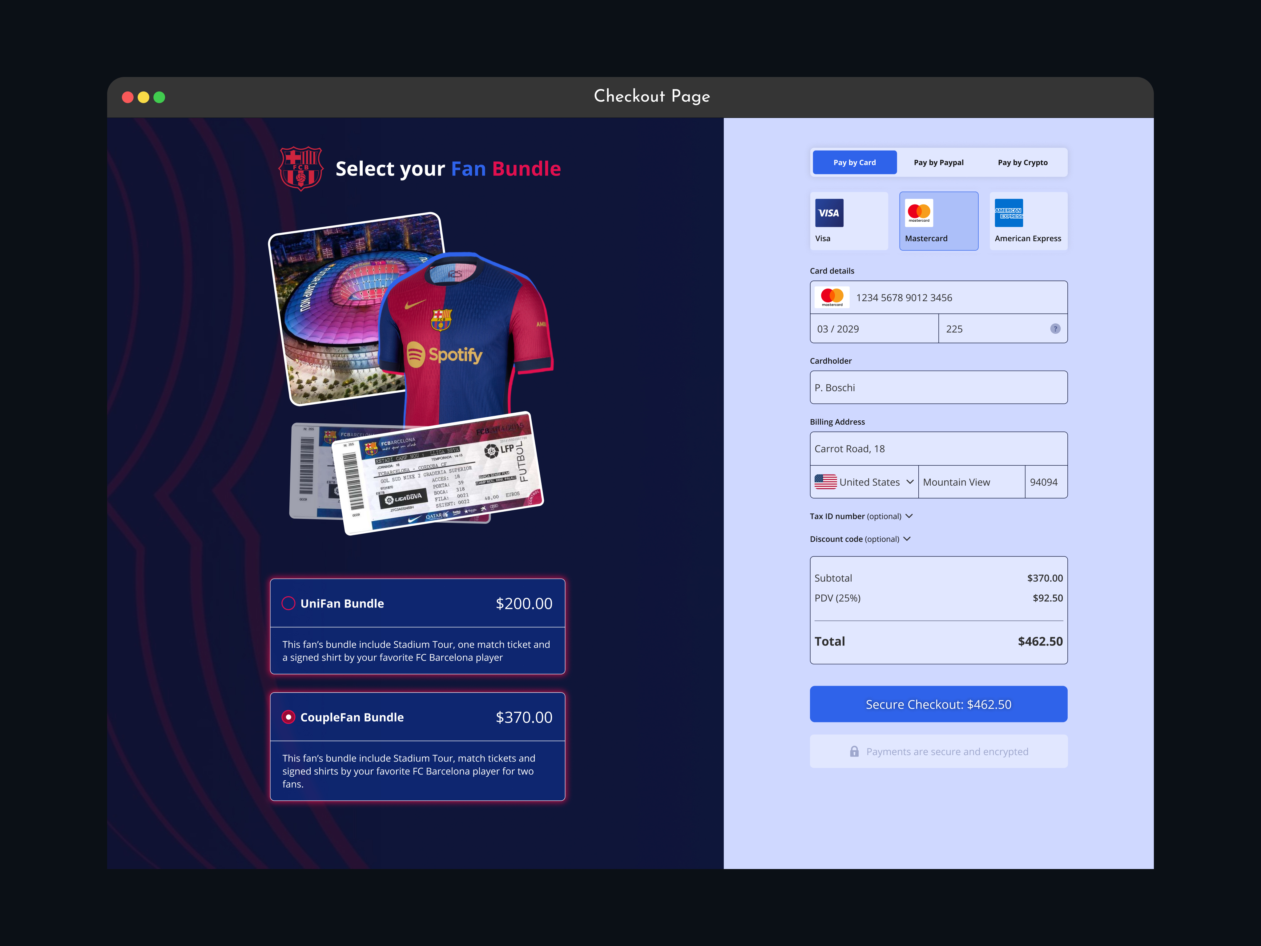
This checkout page design splits information into two columns, making it easier to understand. On the left, the user selects their preferred bundle option, and on the right, they complete the payment.
I ensure that all prices are clearly displayed, including the base bundle prices and the 25% tax added to the final price. The call-to-action (CTA) button clearly shows the total amount the user will pay.
The color palette and elements are designed to meet WCAG guidelines, ensuring accessibility for users with different abilities.
It is made clear that payments will be encrypted for security. Additionally, a bonus payment method (crypto) is included, which is not commonly seen but will be available soon.
Thank you for watching and reading.
Tools used
From brief

Topics
Share
Reviews
1 review

Your checkout page nails usability, accessibility, and conversion optimization. Here’s a breakdown of what works and what can be improved.
1. Layout & Information Flow
✅ Clear Two-Column Structure – Product selection on the left, payment on the right. Keeps things organized and easy to scan.
✅ Transparent Pricing – Subtotal, tax, and total are clearly displayed. No hidden surprises.
⚡ Improve Selection Feedback – The selected bundle needs stronger visual emphasis (highlighted background or bold border).
⚡ Add a Progress Indicator – A simple “Step 2 of 3” helps users know where they are in the process.
2. Payment Form & Trust Signals
✅ Multiple Payment Options – Credit cards, PayPal, and crypto give users flexibility. Smart move.
✅ Secure Payment Messaging – The "Payments are secure and encrypted" message builds trust.
⚡ Improve Form Usability – The billing address should be structured (Street, ZIP, City) for clarity. Hide the Tax ID field under an expandable section.
⚡ Inline Validation Needed – Errors should appear immediately, not after clicking “Pay.”
3. Accessibility & Mobile Experience
✅ Good Contrast & Readability – Dark background + light text = easy to read.
✅ Keyboard & Screen Reader Support – Works well if tab navigation and ARIA labels are implemented.
⚡ Better Focus Indicators – Ensure selected fields have a visible highlight for keyboard users.
⚡ Optimize for Mobile – The product selection should collapse into an accordion to reduce scrolling. Autofill support would speed up input.
4. Call-to-Action (CTA) Design
✅ Strong CTA Placement – The “Pay $462.50” button is clear and stands out.
⚡ Refine Button Text – Instead of “Pay $462.50,” use “Complete Your Purchase” or “Secure Checkout: $462.50” for better clarity.
⚡ Disable Button Until Form is Complete – Prevents errors and improves user experience.
This is solid, but small tweaks will make it even better. Want me to refine a wireframe with these updates?
You might also like

Smartwatch Design for Messenger App


Bridge: UI/UX Rebrand of a Blockchain SCM Product


Pulse Music App - Light/Dark Mode


Monetization Strategy


Designing A Better Co-Working Experience Through CJM


Design a Settings Page for Mobile
Interaction Design Courses

UX Design Foundations


Introduction to Figma

Design Terminology
