Aquaflow

I built this color system trying to keep it clear, functional, and visually balanced.
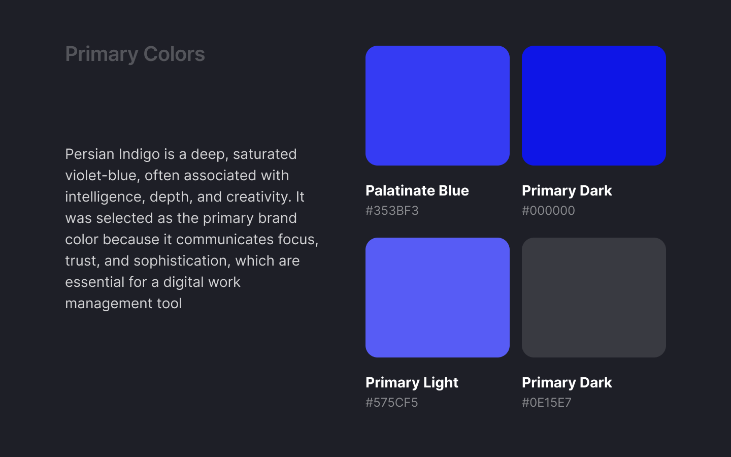
The primary colors set the tone. They give personality to the brand and shape how everything feels at a glance. I chose them to be bold but not overwhelming — something that feels modern, confident, and easy to look at every day.
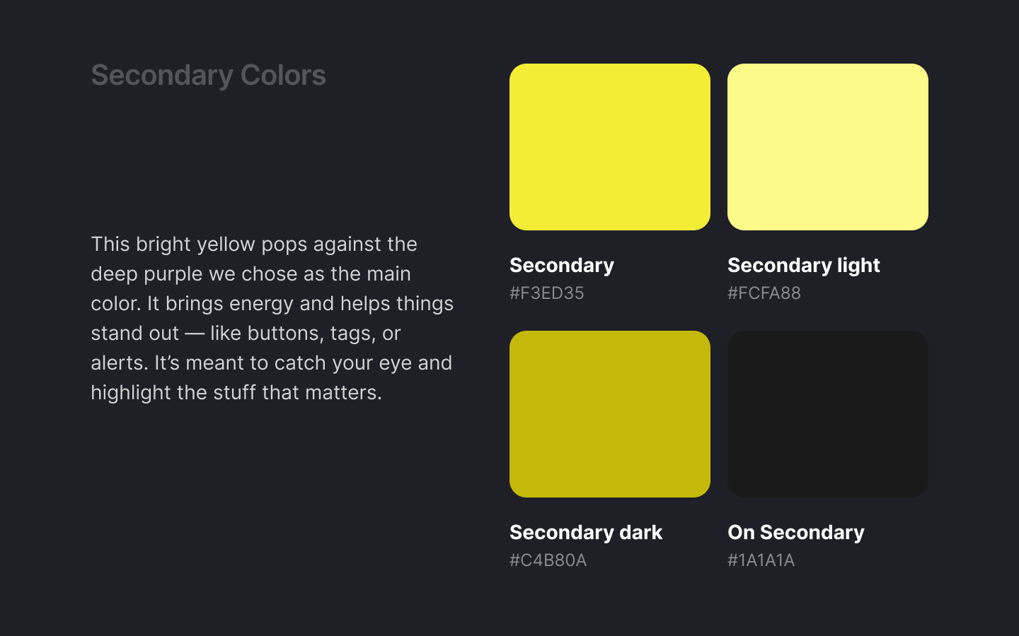
The secondary colors are there to help things stand out — like buttons, tags, or highlights — without clashing with the main colors. They bring energy and contrast.
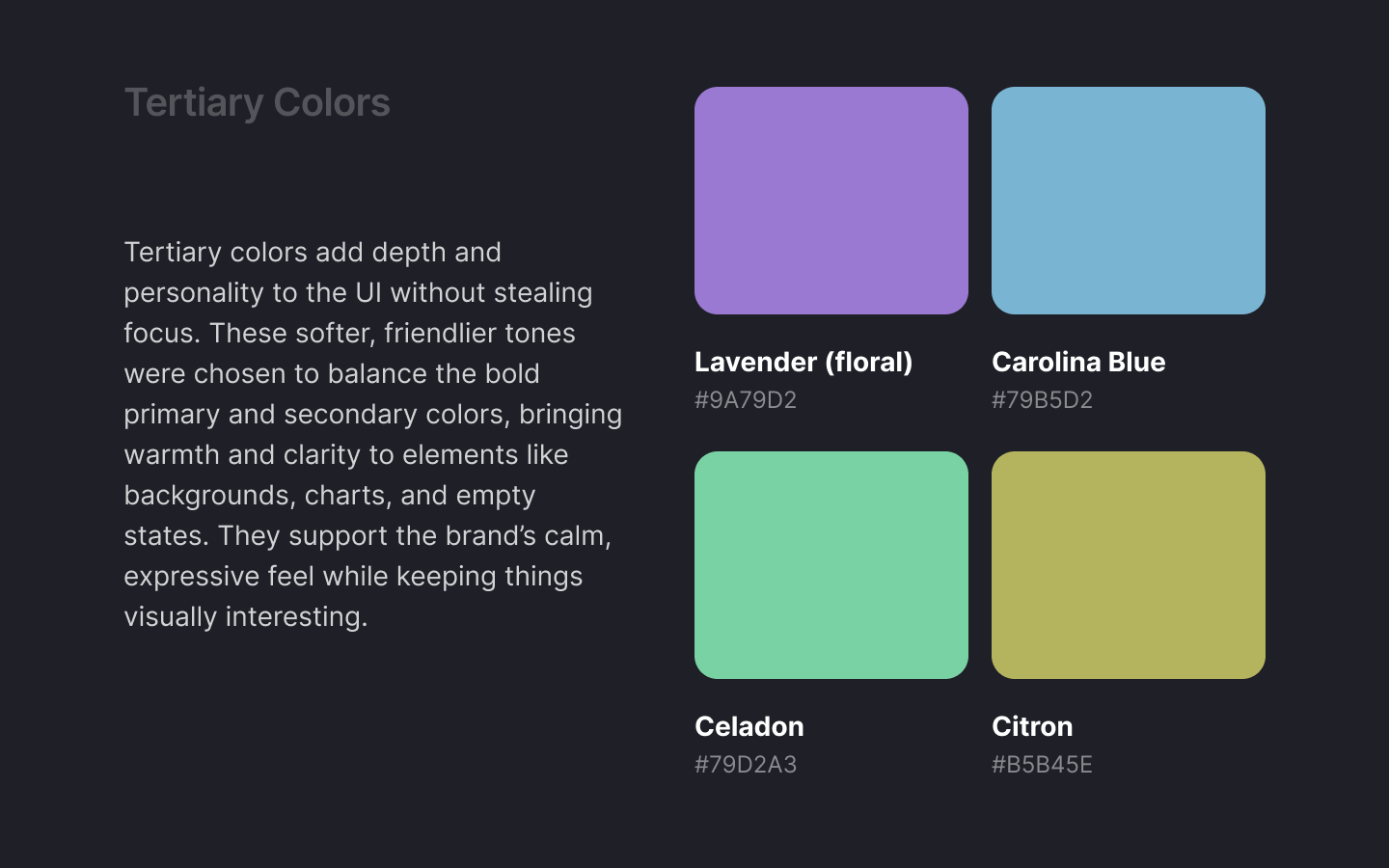
The tertiary colors give more flexibility. I use them when I need to add emotion, variety, or soft accents. They help break the monotony and keep the interface feeling more human.
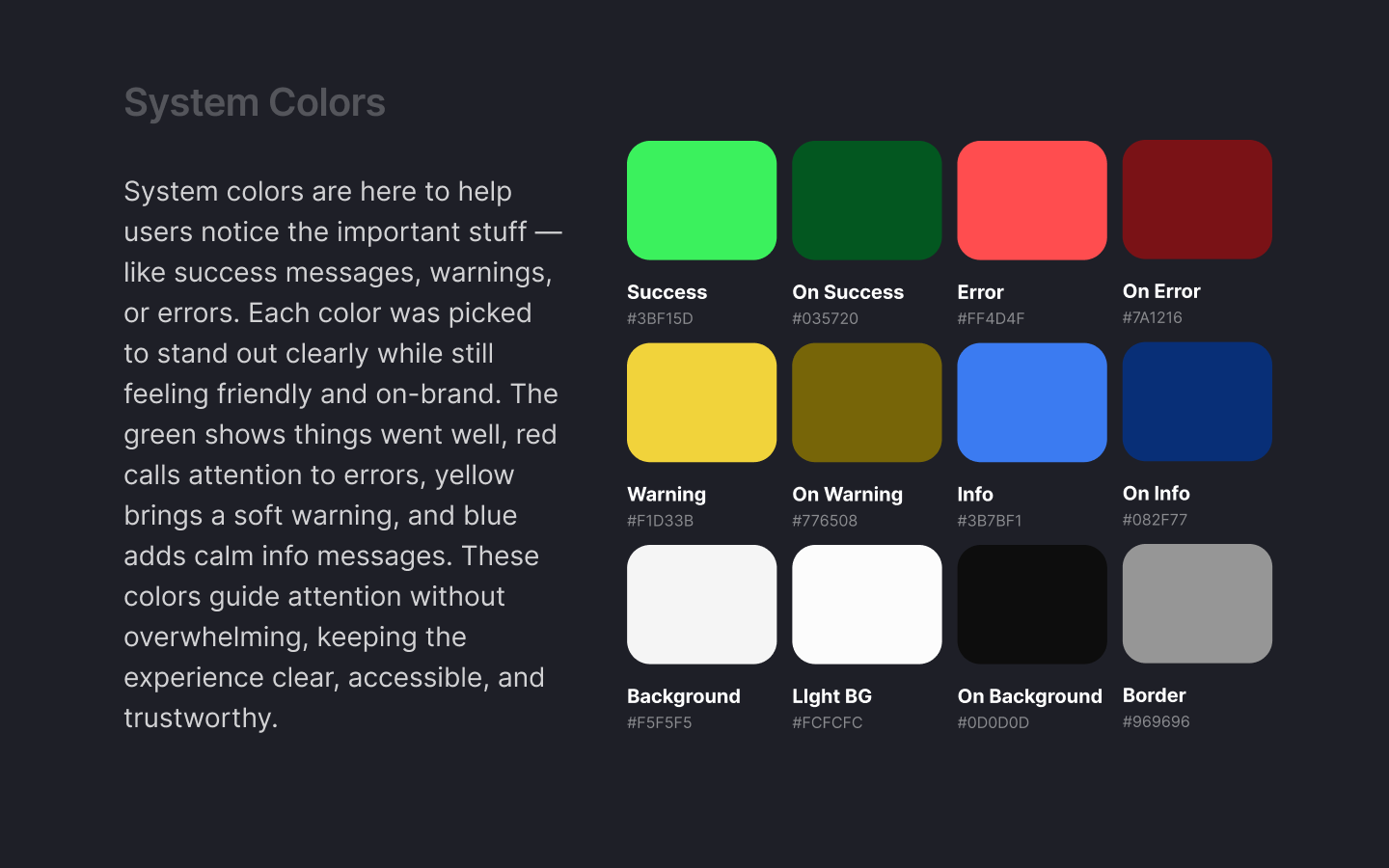
The system colors are all about communication. Success, error, warning, and info use clear, readable colors so feedback is instantly recognizable. I also picked background, light background, and on background color (mostly used for text) and border colors carefully — they set the foundation for the whole interface. They’re neutral but considered, making sure everything feels stable, readable, and easy on the eyes.
I kept everything intentional, simple, and useful. The goal was to create a system I can rely on — one that supports the product without getting in the way.
Tools used
From brief

Topics
Share
Reviews
4 reviews

Great job building a clear and thoughtful color system, adding a bit more context and usage examples would make it even stronger, and overall you’ve got a solid foundation to be proud of!

Hi Gabriel! Tudo bem?
I really enjoyed going through your color system. The presentation of the project was well done, with good explanations for each color chosen.
I think the design overall might profit from some more information- is there a product you are designing for? What is the purpose of the colors, and what color will text be? Adding additional details about your project will help ground the color system, especially as you have a great name and logo for your project. I'd love to learn more about it here!
Overall a really great start! Thanks for sharing this and I look forward to seeing more of your work.

Hey Gabriel,
Thanks for sharing your Aquaflow colour system. I see the thinking behind it is clear, and I appreciate the structured approach.
That said, I was left wondering: what exactly is Aquaflow? Is it a real product or a concept? Some quick context would help frame the design decisions better.
-
A few points of feedback:
Primary Colour Confusion
- You label the primary colour as Palatinate Blue with HEX #353BF3, but this value doesn't match the traditional definition of Palatinate Blue (commonly around #273BE2).
- Then, you describe Persian Indigo, but that colour is typically #32127A, again, not matching your HEX.
Secondary Colors
- The secondary yellow (#F3ED35) is quite bright and, from a UX/UI standpoint, raises accessibility concerns:
- It is very close to your warning colour #F1D33B, which may lead to user confusion, especially for quick-scanning interfaces.
System Colors
- Your info colour #3B7BF1 is very close in value to the primary colour #353BF3. This proximity could cause visual ambiguity when both are used in the same interface — e.g., as tags or badges.
Accessibility Contrast
- You only provide a contrast test check for white text on a primary background.
- All major colour combinations, especially background/text and alert states, should be tested for WCAG compliance.
- Also, consider testing how your neutral "on-background" text color performs on light and dark backgrounds.
While the written rationale is solid, the system would be greatly enhanced with UI previews:
- Examples of how the primary, secondary, tertiary, and system colours are used in components like buttons, alerts, cards, or navigation.
- This would clarify intent and show how the color system performs in actual interface conditions (e.g., hover states, disabled states, dark mode if applicable).
- Especially for the tertiary set, which is described well but lacks visual anchoring.
Good direction, just needs refinement and more context to fully understand and evaluate the system. Cheers and good luck!

Alex Sanchez
The information about colors and the need to separate the colors according to the use in the design was really helpful .
You might also like
SiteScope - Progress Tracking App


FlexPay


Mobile Button System


CJM for Co-Working Space - WeWork


Ubani Design System


Accessible Signup Form for SaaS Platform
Visual Design Courses

UX Design Foundations


Introduction to Figma

Design Terminology
