App Targeted at Lifestyle

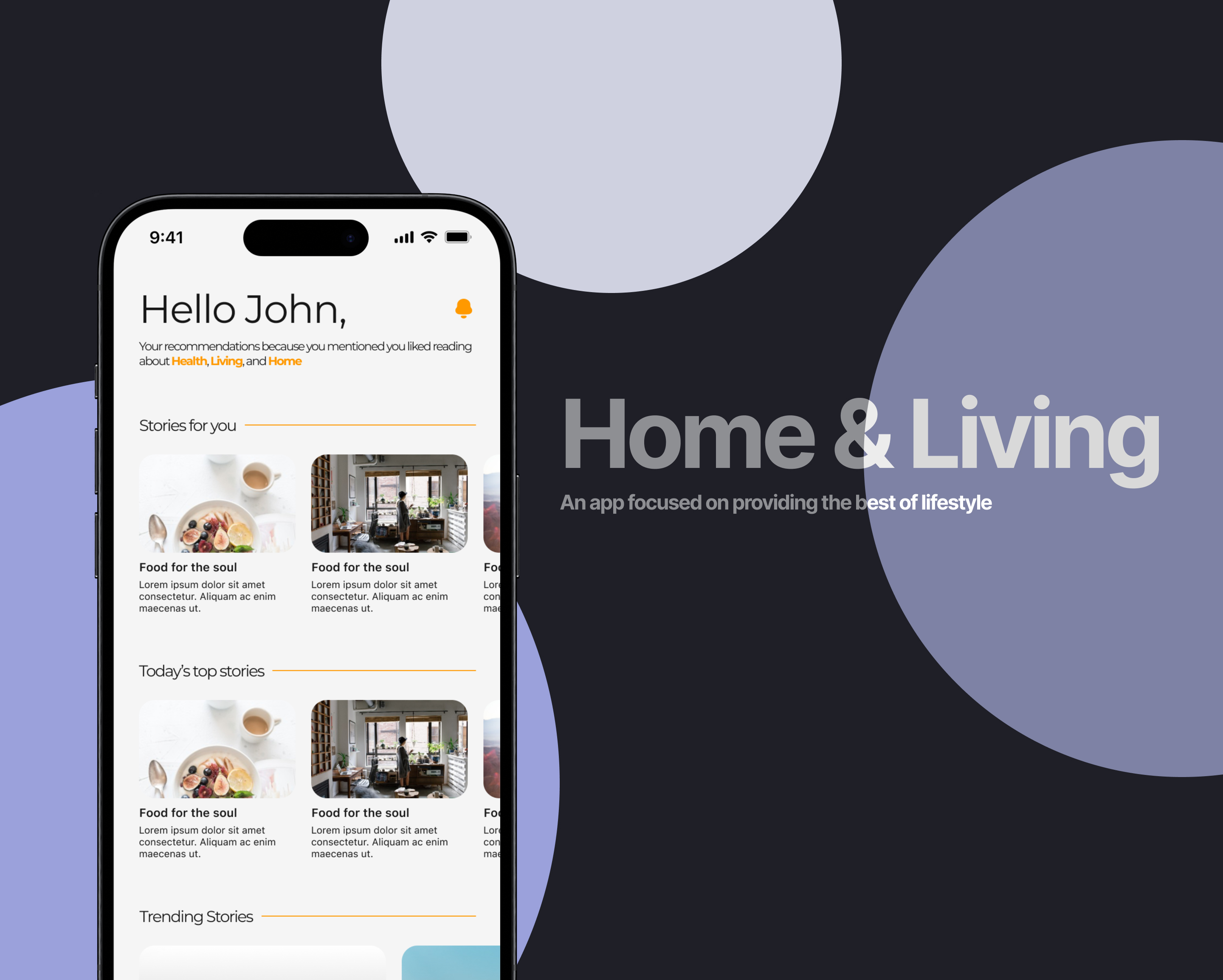
Reading App Targetted at Home & Living

Reviews
2 reviews

Hey Samuel,
Really like your presentation of your design!
I think overall you did a great job choosing colors and showing how they are used in a final product design.
Some feedback for you to consider:
- I think only sticking to one secondary color like your blue-ish purple should be enough. he lemon yellow may clash with the orange primary and it can also be hard to see against a white or off gray background. Consider the contrast depending on the elements you will use your colors with.
- I think you are on the right track with accessibility and I love to see it. You may want to consider your off gray to be slightly darker as it can be close to the white in terms of value. Also changing the text color to your black for the white background would help with readability :)
- Be careful with your yellow system warning as it could clash with your primary orange for some people.
Great work! Keep on designing!

image and text do not match and corner radius values are too much
8 Claps
Average 4.0 by 2 people
You might also like

Project
Pulse — Music Streaming App with Accessible Light & Dark Mode

Platform & DeviceFor this project, I designed Pulse, a mobile music streaming application for iOS devices (using the provided mobile templat

Project
Islamic E-Learning Platfrom Dashboard

Visual Language & Color I wanted the interface to feel like a quiet room you'd actually want to sit in and study. The warm neutrals - off-wh
Project
SiteScope - Progress Tracking App

🧩 Project OverviewThis project showcases the design of a mobile login and sign up experience for a construction progress tracking app. The

Project
Mobile Button System

As my first ever ux design attempt, I tried to go with a simplified approach with only a few button types and states. I kept the color palle

Project
FlexPay

The onboarding was designed to reduce financial anxiety, create a sense of instant reward, and encourage early action. Instead of overwhelmi

Project
CJM for Co-Working Space - WeWork

This project presents a customer journey map for WeWork, created to understand the end-to-end experience of a remote professional using a co
Visual Design Courses

Course
UX Design Foundations

Learn UX design fundamentals and principles that create better products. Build foundational knowledge in design concepts, visual fundamentals, and workflows.

Course
Introduction to Figma
Learn essential Figma tools like layers, styling, typography, and images. Master the basics to create clean, user-friendly designs

Course
Design Terminology

Learn UX terminology and key UX/UI terms that boost collaboration between designers, developers, and stakeholders for smoother, clearer communication.