Amazon Sign In SaaS redesign

This project is made around the Sign in page of the well known SaaS platform's Amazon.
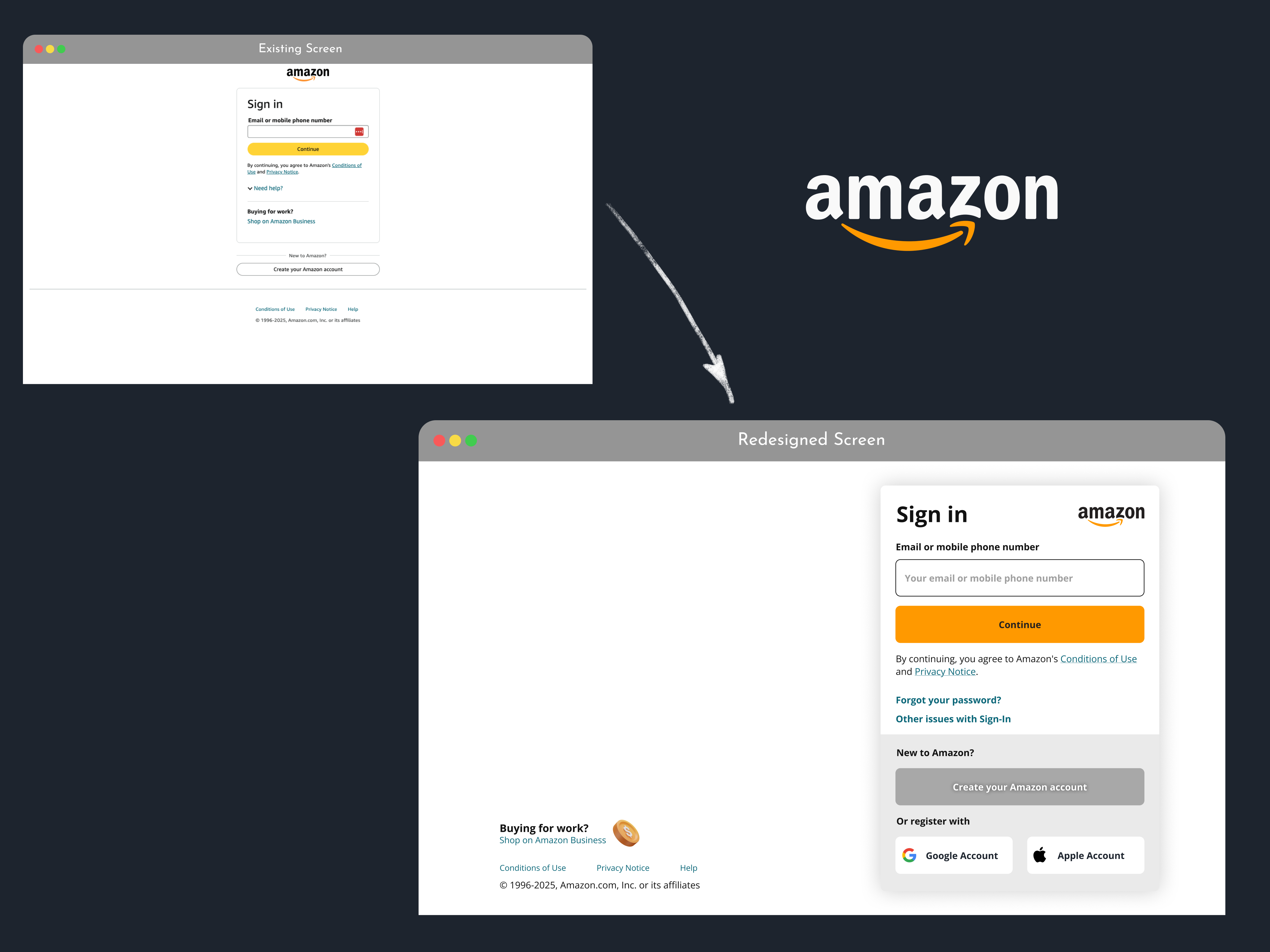
The focus has been set around the idea of improve the interface to make it more accessible and rule under the best practices.
Key Findings:
- Template Issue: The one column template make all the element too compressed (specially the buttons and legal texts)
- Input & Button shape inconsistency: The border radius are inequal between these two elements.
- Help options have been hidden because of the point one.
- Business options: These options has been set like something irrelevant are connected with Sign in form.
Solutions:
- Improve template: Redesign the 1 column original template in a two column template, to have more room to compensate elements.
- Reshape size and border radius: Both the input and the buttons must have the same size and border radius for the sake of consistency principle.
- Show up the Help options: With a new template (2 columns) set the help options open is possible.
- Set aside the Business & Legal Texts: With the new template set aside these elements allow us to have more space in the form to for example increase button size, show up the help options, etc.
Aditional Implementations:
- Add an icon aside the Business Option: To more catch the eye and set clear to the user that there are other relevant option that could be interesting to them (certain users interested in Business options).
- Improve the Continue Form Button's color: Even when the regular Amazon's button is yellow, I consider that the logo orange is more connected with the Brand's Palette.
- Improve the Create's Amazon Account: To make it more connected with the brand, the button has been made more relevant in the form.
- Add extra Registration options: As best practices give the user not only one registration option, here I add the option of register with Google account or Apple account.
Tools used
From brief

Topics
Share
Reviews
3 reviews

The new Amazon Sign-In design is a significant improvement! The two-column layout provides much-needed breathing space, and the use of brand colors for the “Continue” button ties everything beautifully to Amazon’s identity. Making the help links and business option more visible is a smart move, it feels more user-friendly overall.
That said, a few tweaks could make it even better:
- The two-column layout is great for spacing, but the business option feels like it’s competing for attention. Consider using smaller text or a subtler icon to keep the focus on signing in.
- The black “Create your account” button stands out, but it feels a little too bold and might confuse users about what to click first. A lighter style would make it less overpowering. Additionally, the font color on the “Continue” button doesn’t provide enough contrast—improving this could enhance accessibility.
- Adding Google and Apple sign-in options is a great idea, but they look a bit cramped at the bottom. Spacing them out and slightly reducing the size of the icons could make them easier to scan.
Overall, this is a big step forward, but with a few small adjustments, the design could become even more intuitive and polished. Great work!

Hey, Victor! Nice redesign! Social buttons are important, but you may need to adjust the icons inside the social buttons, since the padding and the size of the buttons and the gap inside the container may be disproportionate, if your icons are about 36-40px height, make it around 24px for better experience

nice work
You might also like

Bridge: UI/UX Rebrand of a Blockchain SCM Product


Pulse Music App - Light/Dark Mode


Monetization Strategy


Designing A Better Co-Working Experience Through CJM


Design a Settings Page for Mobile


Zoom Sign in Screen

Visual Design Courses

UX Design Foundations


Introduction to Figma

Design Terminology
