Accessible Signup Form for SaaS Platform
Redesigning one of my first projects ever
I decided to look back at my oldest projects. I opened a project that I've made few years ago when I first started my journey as UX/UI Designer. It was a design of a CRM platform, the design overall was really bad full of begginer mistakes, but the Log In/Sign Up form was baddest of them all.
The first version of the Log In/Sign Up page
Just a blank gray background with bad designed log in modal. When I saw it it hurt me in so many ways I can't even describe it. So I decided to see how I improved my skills since then and redesign it.
Here are the decicions I took:
• Keep the minimum number of fields.
• Add elements like a header, a forgotten password link, etc. that were missing in the first place.
• Improve inputs accessibility
• Add signing up or logging in with social media in order to speed up the login or registration process.
• Allow the user to switch easily from the Log In to Sign Up page.
• Make it more visually appealing overall
• Make the buttons bigger
Key Points
Before and After
Error Page (WCAG Compliant AA)
Check out the project link for more details!
Thanks for checking this out, Excited to see the feedback I receive, good or bad ✌️
Tools used
From brief
Topics
Share
Reviews
2 reviews
Hi, nice work, your progress is definitively visible.
I would work a bit more on type hierarchy using font weights.
This is a fantastic improvement over your previous design! The progress you've made is really impressive. A few areas to consider fine-tuning would be the sizing and spacing: ensuring all buttons are the same height and tightening up the vertical spacing in the form would help create a cleaner, more cohesive look. I’d also recommend revisiting the typography, as the headings could be strengthened to improve hierarchy and readability.
For the prototype, refining the interactivity would enhance the user experience. I know the challenge—I'm also transitioning to Figma from XD, so I completely understand the learning curve. One small detail to note is the wording on the social buttons; since this is a login page, "Sign up with…" may create confusion for users.
Overall, these tweaks would make your redesign even stronger. Great work, and keep it up!
You might also like
🖥 Desktop Checkout Flow Design
Website CRM Dashboard
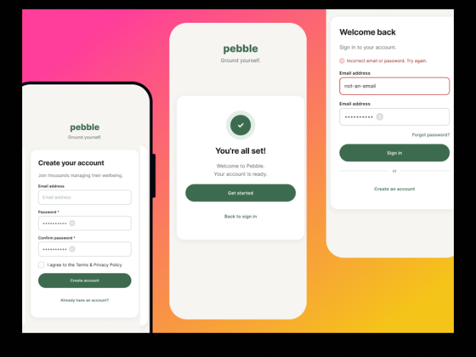
Pebble Accessible SAAS Signup Flow
Create a UX Research Survey
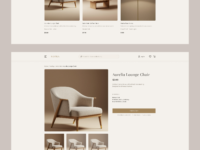
Nestra from homepage to checkout process

QuickScan Onboarding
Visual Design Courses

UX Design Foundations

Introduction to Figma


