Accessible Signup Form for SaaS

This project was focused around a hypothetical Bitcoin focused FinTech SaaS whose main mission would be to help beginners to Bitcoin understand what Bitcoin is and manage it themselves safely.
Built using ChatGPT as my "product manager" and Claude as my "developer". Interestingly enough, it took a few tries with each to get them to understand the importance of the accessibility standards I was aiming for, even with the clear project evaluation criteria provided.
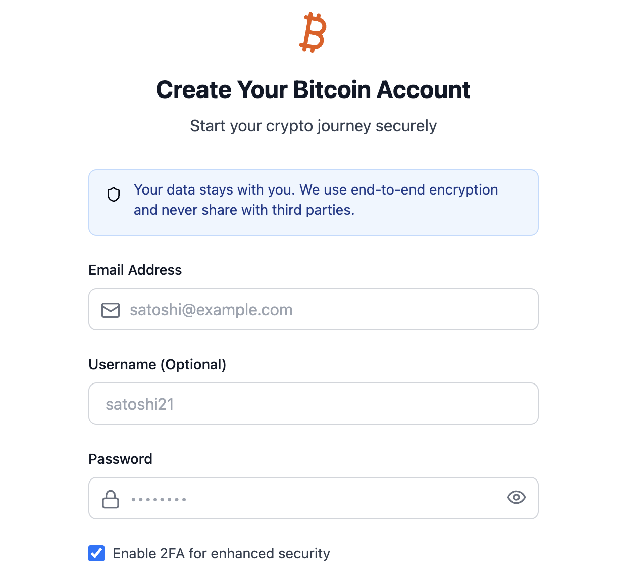
With those issues resolved, here are 5 key accessibility focused features for the signup/login page:
1. Color Contrast:
- Switched to a light theme with dark text for better readability
- Using blue as the primary action color with proper contrast ratios (4.5:1 for normal text, 3:1 for large text)
- Error states use a clear red color that meets contrast requirements
- All interactive elements have clear focus states
2. ARIA Attributes:
- Added proper
aria-invalidandaria-describedbyfor form validation - Decorative icons marked with
aria-hidden="true" - Clear error message associations with form fields
3. Visual Hierarchy:
- Clear distinction between interactive and static elements
- Consistent spacing and alignment
- Better form field grouping
- Clear visual feedback for all interactive states
4. Typography:
- Increased base font size for better readability
- Clear heading hierarchy
- Proper contrast for all text elements
5. Focus Management:
- Visible focus indicators for all interactive elements
- Logical tab order
- Clear button and input states

Reviews
1 review

Very nice submission, short and sweet!
Love the use of AI resources to work through the exercise. Although, don't forget the human touch! Many of my points below would have been flagged by a user testing this desing.
I would caution on the Username field you have in this form:
- A username is typically the identifier you use to log in. So there's a likely first confusion when you land in this form and see it as optional, and wonder what identifier will you need to use to log in, if left blank.
- Then, looking at the sign in screen, it becomes clearer that the email address was the only identifier all along and what you call "Username" is probably best labelled as an Account Name, Profile Name, Pseudonym, or similar.
- If that's the case, the field is misplaced: email and password should stay next to each other as there's a stronger coupling between them. Putting anything else in between is not a good practice
You should also consider that not everyone would be familiar with what "2FA" is or why ticking this checkbox is a security enhancement. You could:
- Be explicit about what the acronym means
- Add an explanatory tooltip, or a link to a help article
- Make it an opt-out instead of an opt-in (if a good security posture is what your target user expects)
Some other minor feedback I can offer:
- The subtitle "Start your crypto journey securely" adds nothing to the form. Instead, I would try bringing a value promise to this subtitle as a way to prompt action. Something like "sign up and start trading in less than 1 minute" or "get your secure wallet in less than 30 seconds".
- A clear statement of password requirements and a live password strength indicator are quite common elements a user might expect (which greatly improve the UX by getting the user ahead of validation errors).
- I would have loved to test the error states you mention, but wasn't able to make the Claude artifact work.
Keep it up, and thanks for sharing! ✨
You might also like

SONZ - Entertainment platform


Camp & Travel Explorer - App Design


Solar system Dashboard Utility

Uxcel Halloween Icon Pack


Color System

Duolingo Halloween Icon Pack

Visual Design Courses

UX Design Foundations


Introduction to Figma

Design Terminology
