Accessible Signup Form for Linkedin
Objective
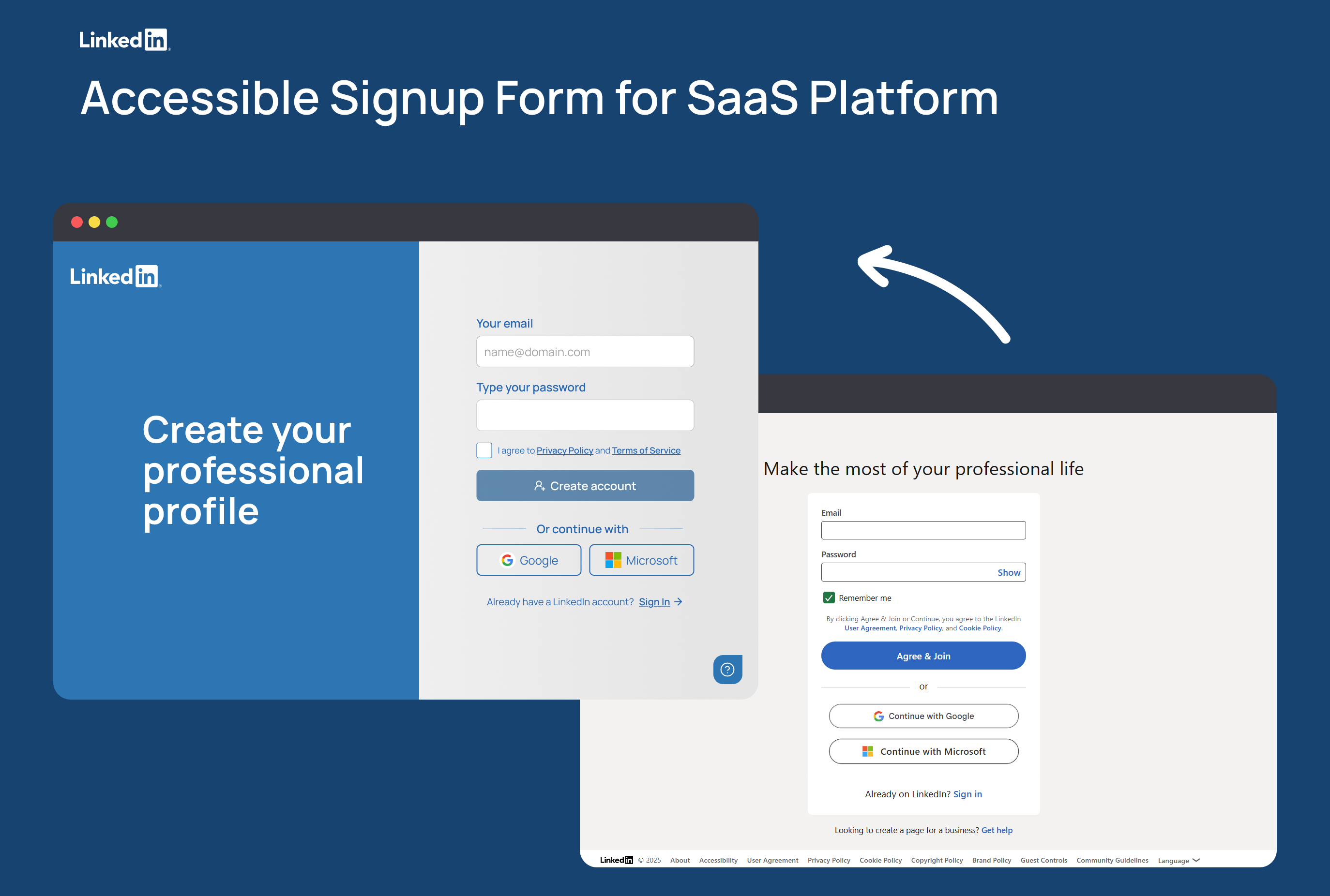
Analyze and enhance the existing registration flow for a SaaS product to make it as intuitive and accessible as possible, aligning with WCAG 2.2 AAA standards. The LinkedIn registration form was chosen as a baseline—a recognizable and widely adopted template. However, testing revealed accessibility and UX issues that could hinder users with diverse abilities from completing registration successfully.
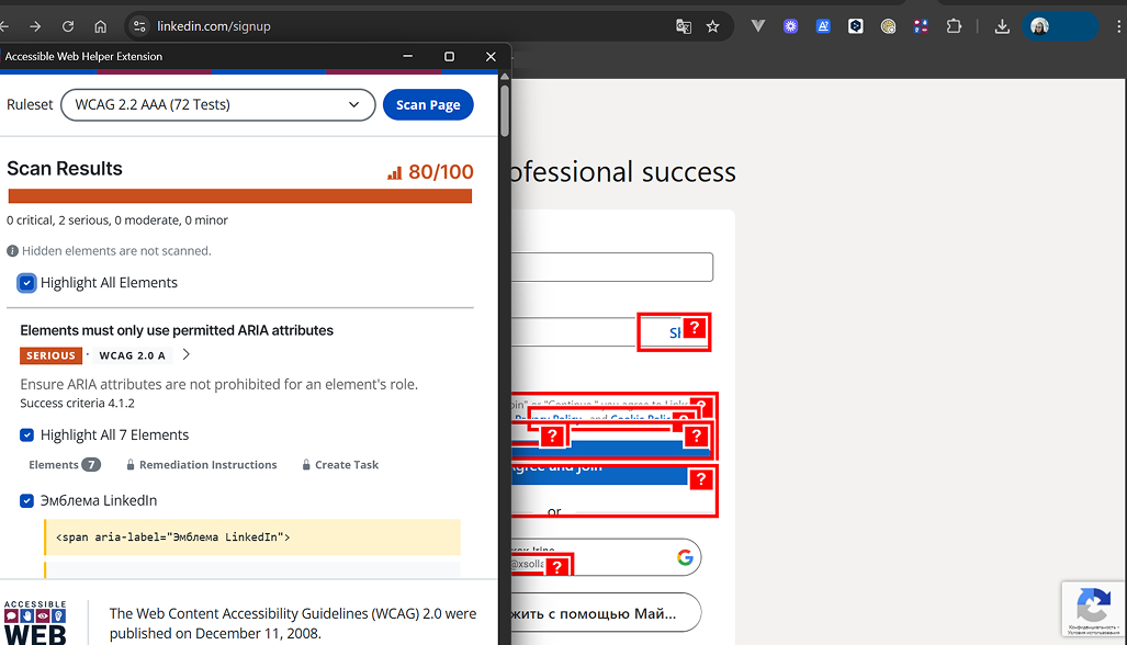
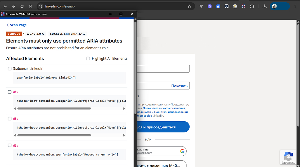
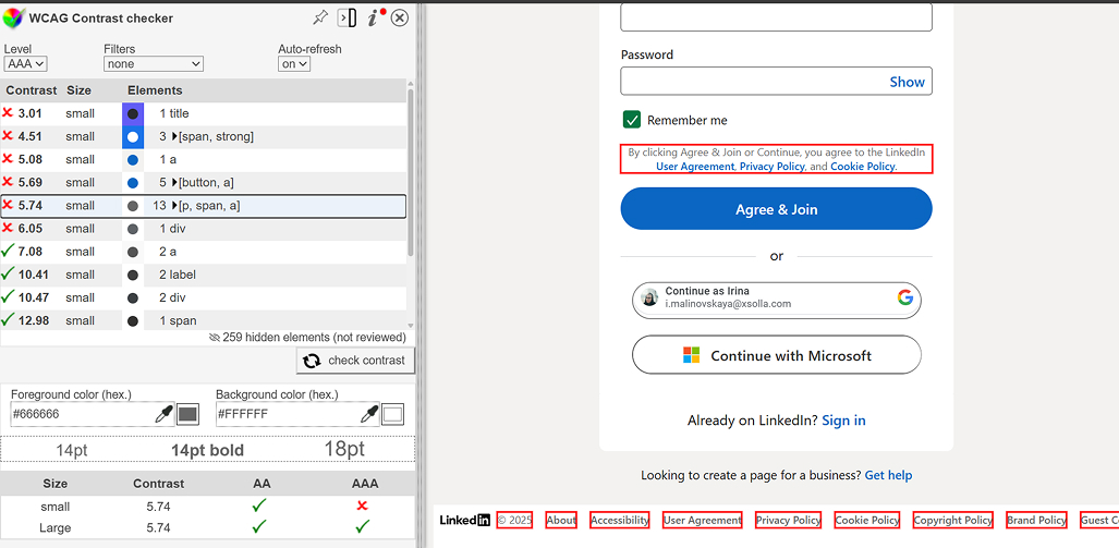
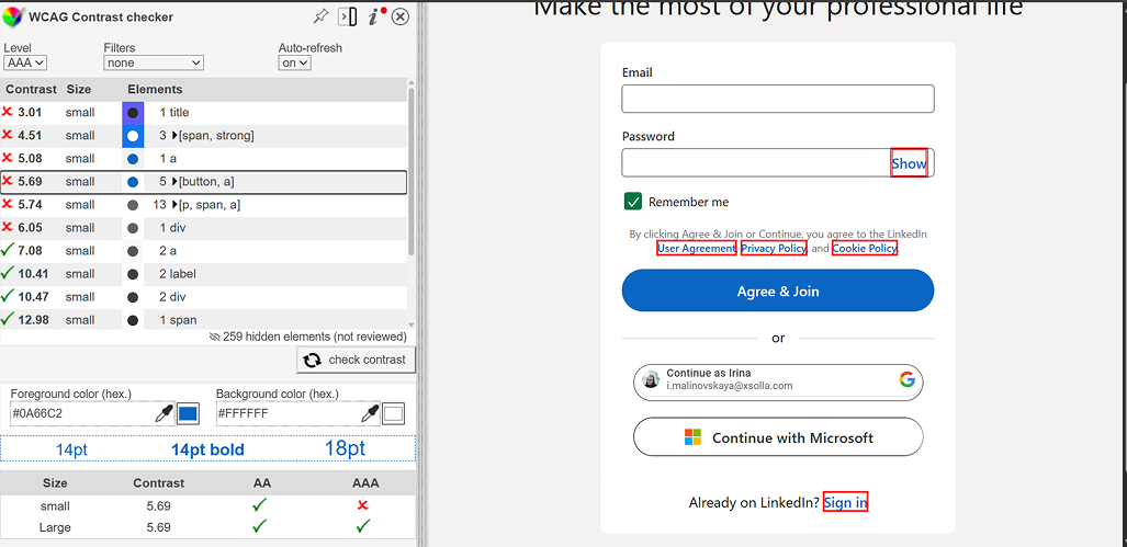
Tools Used for Evaluation: Accessible Web Helper, WCAG Contrast Checker, and Axe DevTools.
🔎 Key Findings
🧭UX Issues
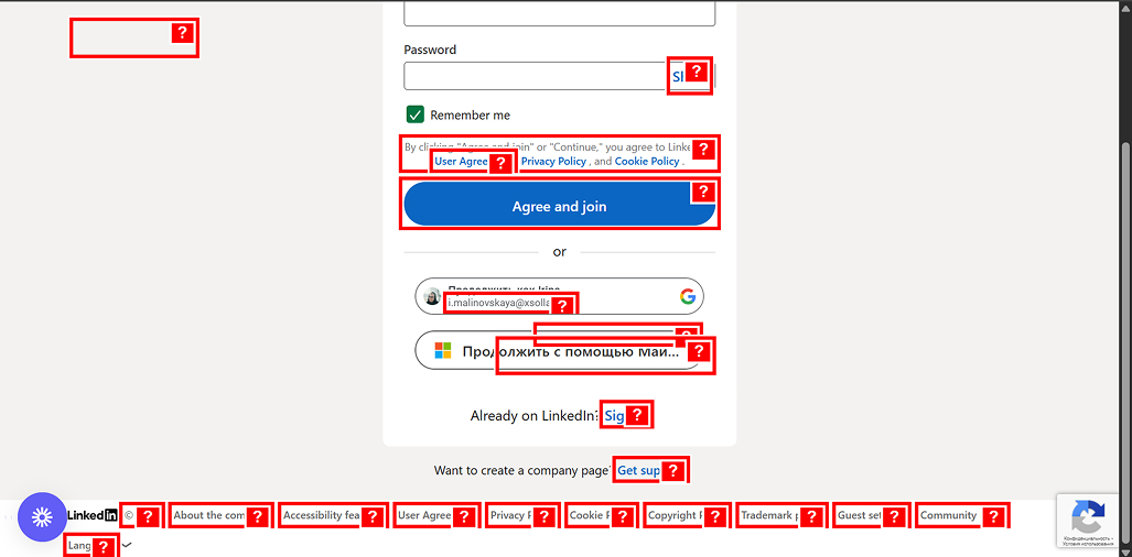
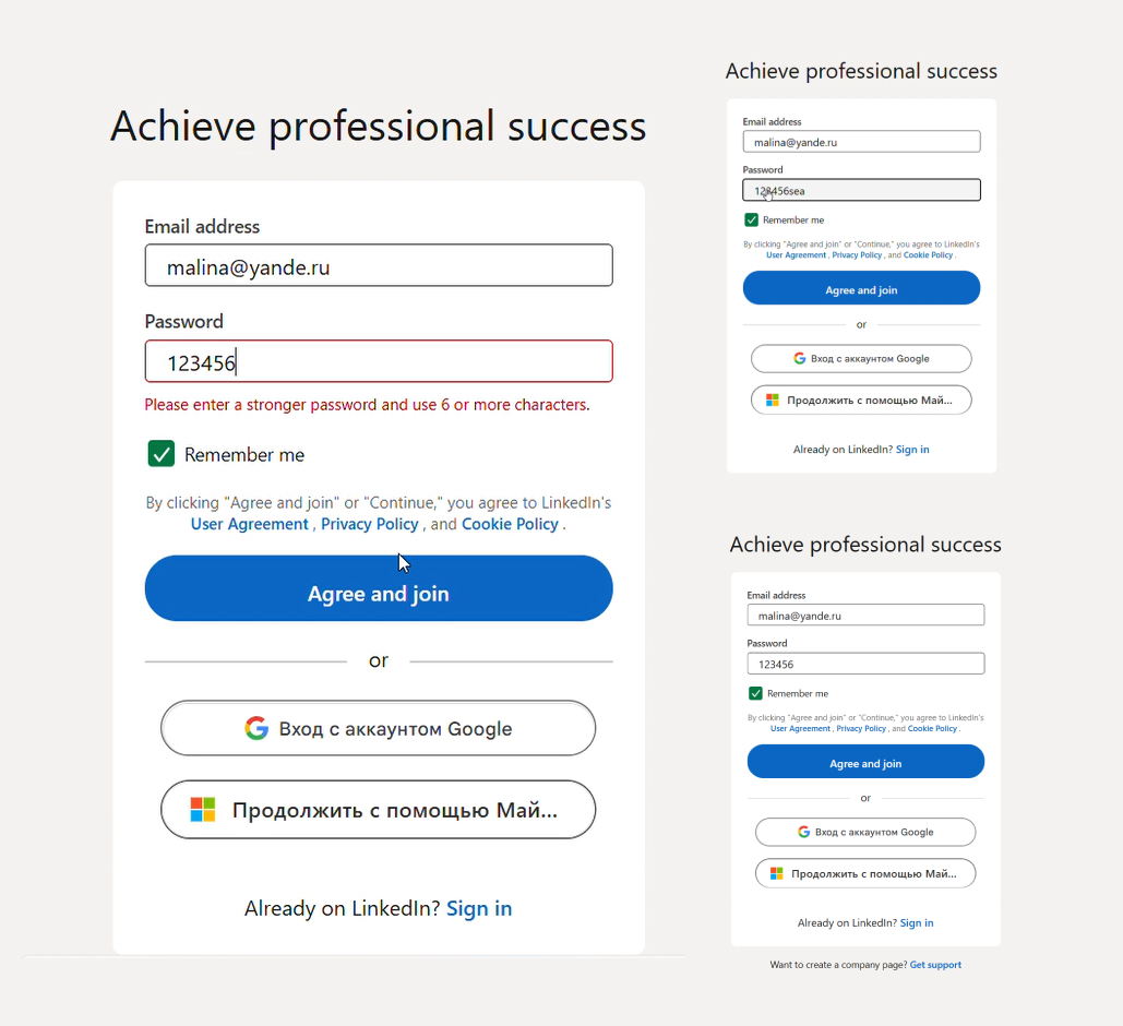
- The primary CTA button was labeled "Agree & Join", which misaligned with the first step of registration and caused confusion.
- Insufficient password guidance: No strength indicator or requirement list was provided, leaving users unclear about acceptable passwords.
- Missing support link: No option for users to seek help (e.g., "Need help signing up?").
💡Improvements
Clear and Natural Language
- Changed the button label from "Agree & Join" to "Create account" for clarity and logical flow.
- Error messages are now listed separately and structured for easier comprehension.
Support and Guidance
- Added a password strength indicator with visual and textual cues.
- Included a list of password requirements before form submission.
- Added a "Need help signing up?" link for users requiring assistance.
Control and Convenience
- Enabled autocomplete (
autocomplete="email",autocomplete="new-password"). - Added clear field and show/hide password buttons.
- Ensured full keyboard navigation—no mouse dependency.
Accessible Error Display
- Errors now include icons and text, not just color cues.
🎨 UI Issues
- Text contrast failed WCAG AAA standards, especially for gray text on white backgrounds.
- Errors relied solely on color (red), which is inaccessible to colorblind users.
- Lack of visual hierarchy: The slogan and form competed for attention.
- No separation between branded content and the form itself.
💡Improvements
New Layout and Screen Division
- Split the screen into two sections:
- Left: Branded area with a background and the headline "Create your professional profile".
- Right: Form on a light background.
- This creates contrast, visual balance, and improves focus on the action.
Contrast and Readability
- Adjusted text and background colors to meet WCAG AAA contrast (≥4.5:1).
- Errors are now highlighted with symbols/borders, not just color.
Hierarchy and Visual Rhythm
- Increased font sizes, line spacing, and margins.
- Established a logical order: headline → fields → button → alternative sign-in options.
- Larger buttons and fields for better mobile usability.
💻 Technical (Markup) Issues
- Incorrect ARIA attributes: Mismatched roles and element functions.
- Non-semantic markup: Missing
aria-describedby,aria-livefor dynamic messages. - Poor keyboard navigation: No visible focus states, incorrect tab order.
- Partial validation: Errors lacked explanations.
- Missing autocomplete attributes (
autocomplete="email",autocomplete="new-password").
💡 Recommendations
- Add
aria-liveregions for screen readers to announce errors automatically. - Semantic HTML Structure:
html
 Copy
<form role="form" aria-labelledby="signup-heading">
  <label for="email">Your email</label>
  <input
    type="email"
    id="email"
    autocomplete="email"
    required
    aria-describedby="emailHint"
  />
  <p id="emailHint">We’ll never share your email with anyone else.</p>
</form>
- Ensure proper ARIA roles, descriptions, and
label → inputassociations. - Avoid redundant ARIA attributes; prefer native HTML solutions.
- Keyboard Navigation:
- Set a logical
tabindexorder. - Make all actions keyboard-accessible.
- Set a logical
- Validation and JS Functionality:
- Implement client-side validation (HTML5 + JavaScript) with detailed hints.
- Validate dynamically during input.
📈 Results
- Accessibility score improved from 80/100 to 100/100 (WCAG 2.2 AAA).
- All serious and critical errors resolved.
- Form is fully accessible for screen readers and keyboard navigation.
- Users receive clear feedback and instructions.
- Enhanced contrast, readability, and visual focus.
Reviews
1 review
Although your written summary reads like an AI output in my opinion, you did well on covering password requirements, error messages, and contrast ratios. I also appreciate how you used existing tools to analyze accessibility methodically and I think that help button is a nice touch. Although I think that the prototype differs a bit from LinkedIn's branding style, you covered accessibility well.
If I was a stakeholder from LinkedIn I would like:
- The design to be more aligned with LinkedIn's brand
- A more personalized and human summary on the project
Great job overall Irina!
You might also like

Pulse — Music Streaming App with Accessible Light & Dark Mode

Islamic E-Learning Platfrom Dashboard
SiteScope - Progress Tracking App

Mobile Button System

FlexPay

CJM for Co-Working Space - WeWork
Visual Design Courses

UX Design Foundations

Introduction to Figma


