Accessible Sign-up Page for Heroku
This project aimed to enhance the accessibility and user experience of the Heroku sign-up page. The original design presented several challenges, including accessibility violations and usability issues that negatively impacted the user experience, particularly for individuals with disabilities.
Key Issues Identified:
- Accessibility Challenges:
- The page failed to meet WCAG standards, including missing labels for input fields, poor composition, and inadequate structural organization.
- Overcomplicated presentation of text and information further impeded accessibility.
- Excessive Information:
- A significant portion of the page was devoted to promoting Heroku's benefits, overshadowing the primary purpose of the sign-up process.
- Form Usability Issues:
- Required fields were unnecessarily complex, making the account setup process cumbersome.
- For example, asking users to repeat their email when no company name is provided added little value and increased friction in the process.
Improvements Implemented:
Accessibility Enhancements:
- Clear Input Labels: Labels are now positioned above input fields, ensuring users can quickly understand what information is required.
- Streamlined Fields: Fields such as "Company Name" and "Country" were removed to simplify the process. While these fields might serve internal purposes for Heroku, they are unnecessary at this stage. Additional information can be collected later, if needed.
- Alternative Sign-Up Options:
- Added support for signing up via Google or GitHub, enabling faster registration.
- GitHub integration is particularly advantageous, allowing repositories to sync seamlessly with Heroku upon account creation.
Content and Design Improvements:
- Simplified Content: Reduced the amount of on-page text by focusing on concise, key points that highlight Heroku's benefits without overwhelming users.
- Optimized Layout:
- Allocated more width to provide whitespace, enhancing readability and reducing visual clutter.
- Balanced the layout by giving the sign-up section equal prominence as the benefits section, emphasizing the page's primary goal: driving user registrations.
- Enhanced Branding: Incorporated more of Heroku's signature colors to create a cohesive and visually appealing design.
By addressing these issues, the revamped sign-up page now provides a more accessible, user-friendly, and visually balanced experience.
Tools used
From brief
Topics
Share
Reviews
1 review
Louis, great job on the redesign! The improved layout, simplified form, and clear value proposition on the left panel are definite upgrades. Social login options are a smart addition too! That said, consider balancing the form header & company logo spacing (since the form seems a bit too low & the logo too high), and maybe making the privacy checkbox more prominent. Overall, it's a clean, modern improvement—just needs a few tweaks to shine even more! 😊
You might also like
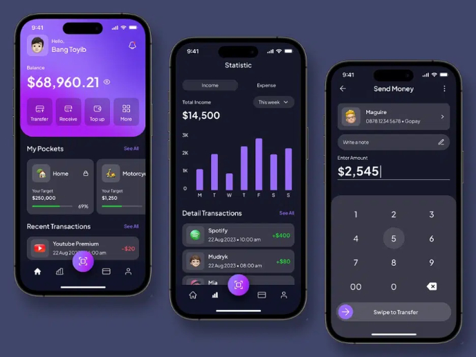
eWallet App Development Project
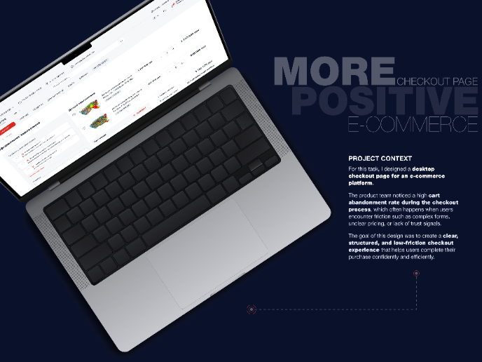
🖥 Desktop Checkout Flow Design
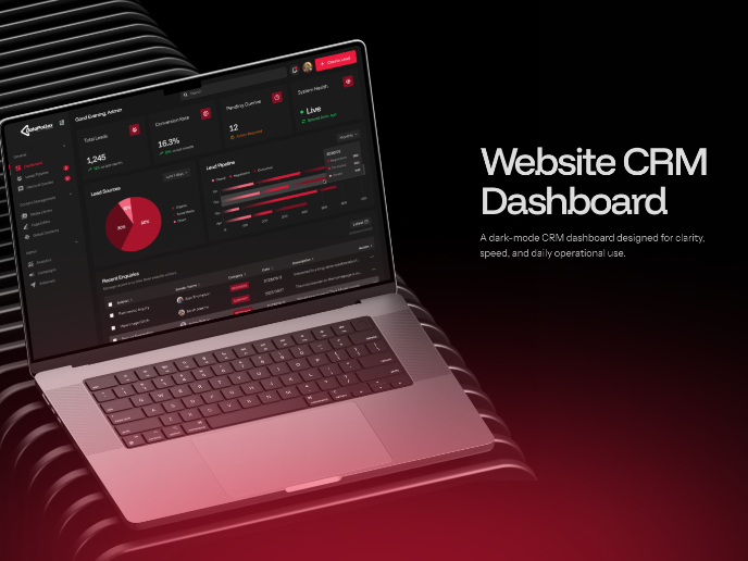
Website CRM Dashboard
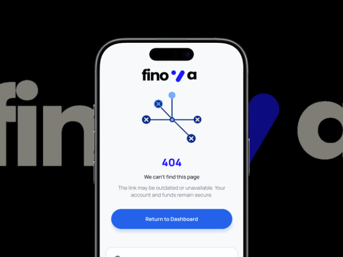
Helpful 404 Error Page for a Fintech Mobile App
TaskFlow Authentication Flow
Pebble Accessible SAAS Signup Flow
Visual Design Courses

UX Design Foundations

Introduction to Figma


