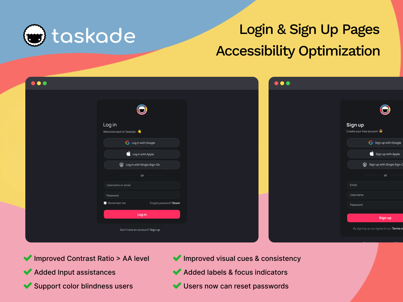
Accessibility optimization for Taskade's Sign Up & Login pages

Updates on 11 July 2024
- Error message in Sign-in flow is more specific.
- Border-color of Input field's focus stage is changed to brand color ( white -> pink )
=======
About Taskade: this is a collaboration platform designed to streamline teamwork and boost productivity. It combines task management, note-taking, and real-time communication in a unified workspace. Taskade helps teams organize ideas, track progress, and collaborate seamlessly on projects of any size.
Accessibility issues:
1) Insufficient contrast between text and background: The light gray text on the dark gray background does not meet the minimum contrast ratio of 4.5:1 for normal text, as required by WCAG . This can make it difficult for users with low vision or color blindness to read the text.
2) Missing Indicators:
- When inputting, there's no clear visual indicator to show which element is currently focused.
- Error / Warning messages don't have icon, this cause difficulties for color blindness users.
- No labels of the input fields. Placeholder text disappears when the user starts typing, which can cause confusion, especially for users with cognitive disabilities or memory impairments
3) No input assistance: There's no error handling or input assistance (e.g., password visibility toggle, password guides) to help users fill out the form correctly.
4) Blocks access for users who forgot their password: Users who forget their password are unable to recover their account and access the service without this feature.
5) Lack of clear visual separation between the two login options (3rd party accounts vs. Taskade account). This can lead users to accidentally choose the wrong login method, causing frustration and delays
How I address these issues:
- Increase Color Contrast to the minimum 4.5:1 contrast ratio
- Add visible focus indicators such as icons, thicken border in focus state.
- Make labels visible by positioning outside the input field when users start inputting.
- Provide Input Assistance includes:
- Better error messages and always display guidelines to prevent users enter incorrect info.
- Show password toggle
- "Remember me" feature
5. Allow users to reset password by adding a button in the login page
6. Use clear visual cues to group the two login options separately through: Spacing & Divider
Tools used
From brief

Topics
Share
Reviews
1 review
Great work on improving the accessibility of the login/signup form and presenting your work. I generally like all the changes you've implemented. Here are a few suggestions for improvement:
- Ideally, the error message should be specific to each field. Instead of saying "Email/username or password are incorrect," it should point out the exact error.
- Placing the error message above the fields might be okay for desktop, but on mobile, there's a high risk it won't be noticed. Even if you use a common error message for both fields, highlight the fields (usually in red) and consider adding an icon to indicate where the error is.
- You've applied this practice on the signup page by indicating mistakes in the email and password fields. Using different methods for showing errors can be inconsistent and confusing.
- Using a brand color for borders to show the active state of an input is a good practice. You've used white, which does grab attention, but I think using the brand color would make it more noticeable.
Overall, you've done a great job, and these adjustments could further enhance the user experience.
You might also like

Improving Dating App Onboarding: A/B Test Design

FORM Checkout Flow - Mobile


A/B Test for Hinge's Onboarding Flow


Accessibility Asse


The Fitness Growth Engine

Uxcel Halloween Icon Pack

Visual Design Courses

UX Design Foundations


Introduction to Figma

Design Terminology
