Prioritize button colors by importance
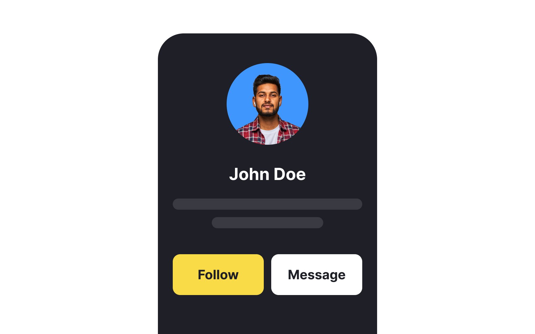

Color is more than a decoration tool. First off, when it comes to button design, color brings clarity and recognition. Secondly, it indicates the level of importance of an element. Users expect the brightest interactive element on the page to be the primary button — the tool that helps them achieve their main goal and complete a task. That's why you should carefully choose colors to help users identify buttons and interpret their purpose with no difficulty. Button color should also define your brand and/or product personality.
When it comes to the Call-to-Action button, it should carry a strong visual weight, stand out among surrounding elements, and encourage users to interact with it.
Secondary buttons like Cancel or Back should be less prominent — it will reduce the risk of confusing them with primary buttons. Avoid making secondary buttons too pale, as users may think they are disabled.
In addition, color helps users understand the button's state. Hover/tap and active states should be distinct enough from the default or disabled state.
