User Onboarding
Explore the best practices to onboard users in an intuitive and helpful way
If you want people to become devoted users of your product, the last thing you should do is leave them to figure out how to use it on their own. Onboarding is the process of guiding new users through a series of interactions and instructions to help them get familiar with the product.
By following onboarding best practices, you'll have users who are more engaged and eager to use your product again, instead of being confused about what it can do for them.
Walkthroughs are a standard way to introduce apps to new users, typically through swipeable static screens. But, they're not without their pitfalls. Primarily, they hinder immediate
To enhance the effectiveness of walkthroughs, here are some key tips:
- Focus on necessity: Avoid using walkthroughs to explain the app's value proposition. Users downloading the app usually have a grasp of its benefits.
- Keep it brief: Ideally, use a maximum of three slides. This helps in retaining user attention without overloading them.
- Engage with animation: Introduce animation to make walkthroughs more dynamic and engaging.
- Empower user choice: Always include a 'Skip' button, allowing users to opt out and explore the app directly.
Pro Tip: If screens are visually appealing, users are more likely to complete the onboarding. Nevertheless, give users the option to skip it.
Interactive tours in user
Here are some tips for crafting interactive tours:
- Trigger contextually: Initiate tours at relevant points in the user journey for maximum relevance.
- Encourage active participation: Let users complete tasks themselves for better engagement and understanding.
- Mimic real tasks: Ensure the tasks in the tour reflect real actions users will perform, aligning the onboarding experience with practical use.
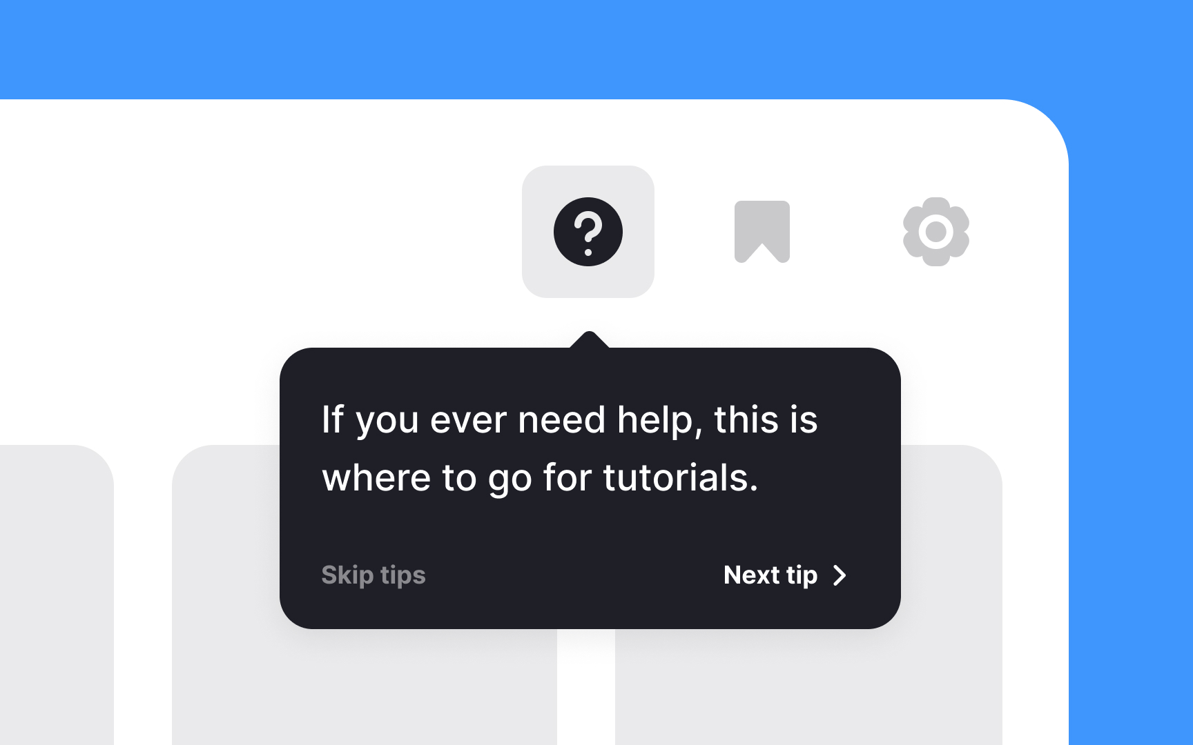
Contextual tips in user
Here are a few tips for effectively using contextual tips:
- Less is more: Avoid cluttering the screen with tips for every action. Too many tips can be counterproductive, distracting, and overwhelming.
- One at a time: Show only one tip at a time to keep the user focused and avoid information overload.
- Intuitive design first: If your product requires numerous tips, it might be time to reconsider the UI design. Aim for an intuitive interface that minimizes the need for explanatory tips.
- Make it relevant: Ensure that each tip is contextually relevant to the user's current action or screen. Irrelevant tips can confuse rather than help.
Pro Tip: Too many tips can overwhelm and annoy users, so avoid using them for obvious functions.
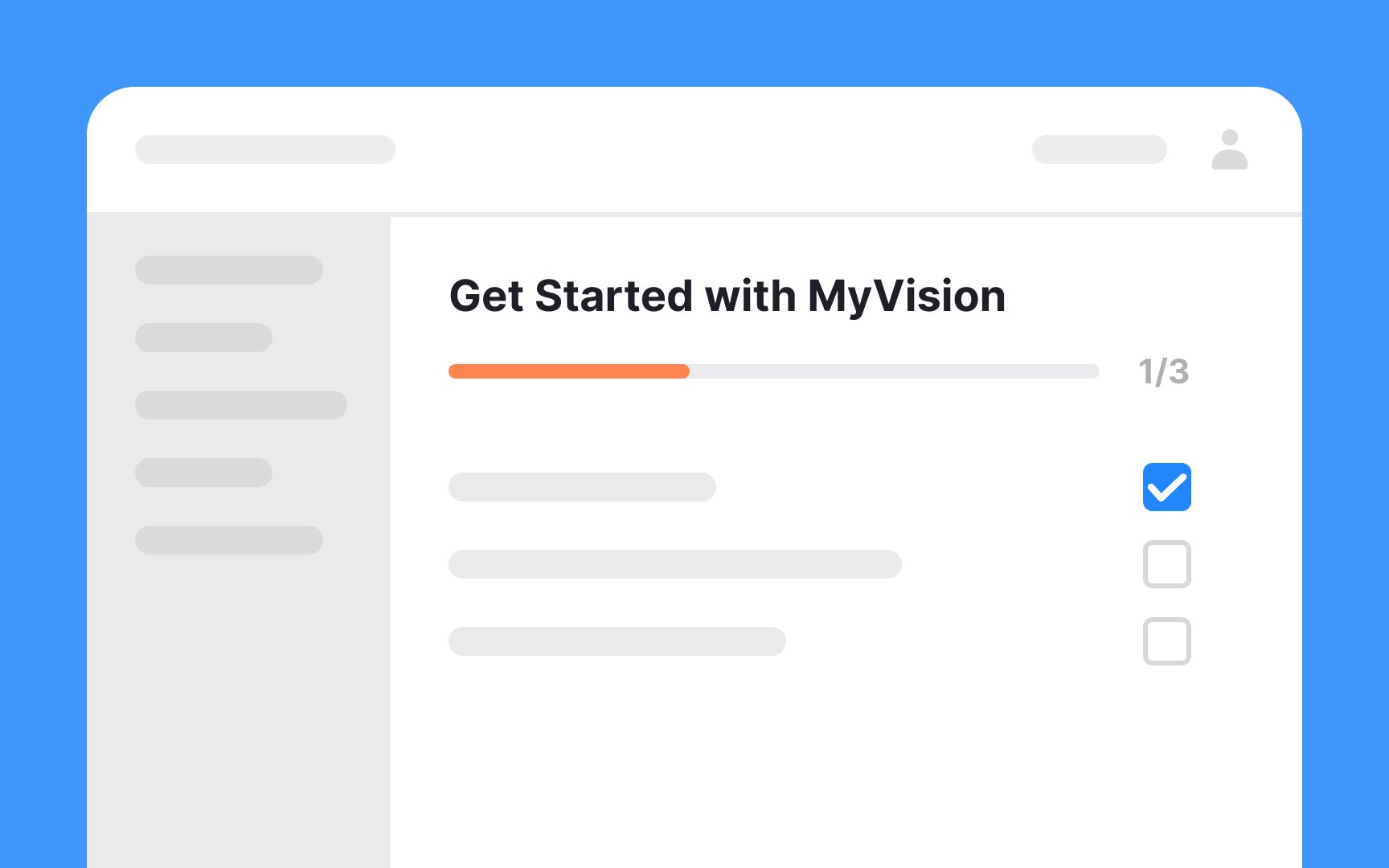
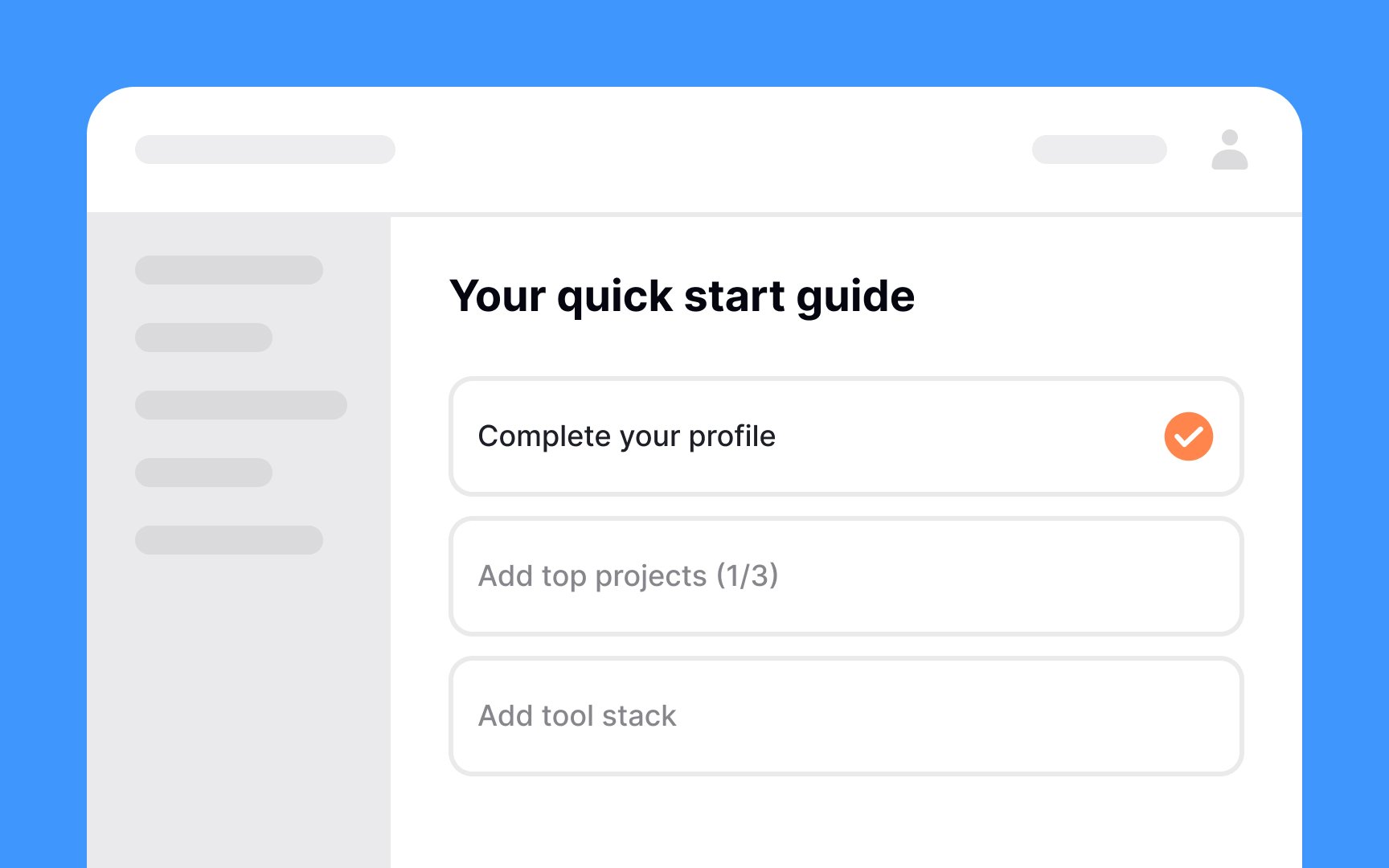
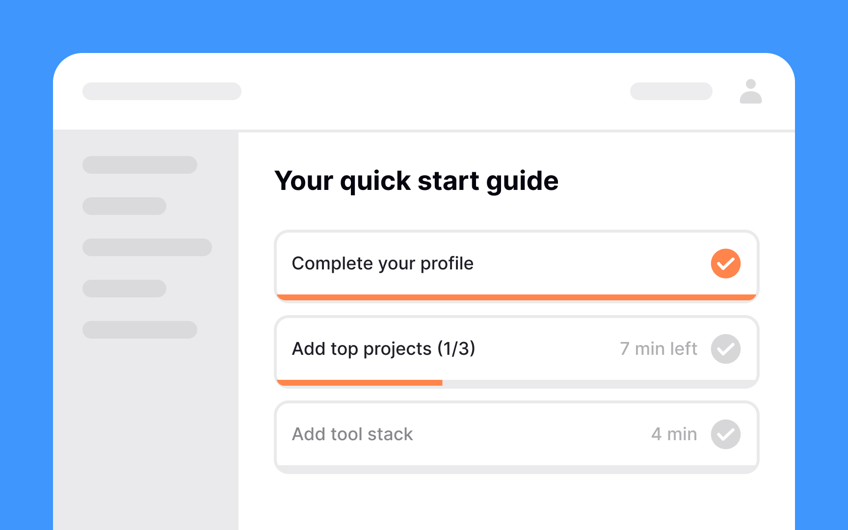
A checklist walkthrough is a user
It's best used when introducing users to essential features, guiding them through key functionalities, and ensuring they understand the product's
Pro Tip: Keep walkthrough checklists short as they can appear achievable and gently nudge users.
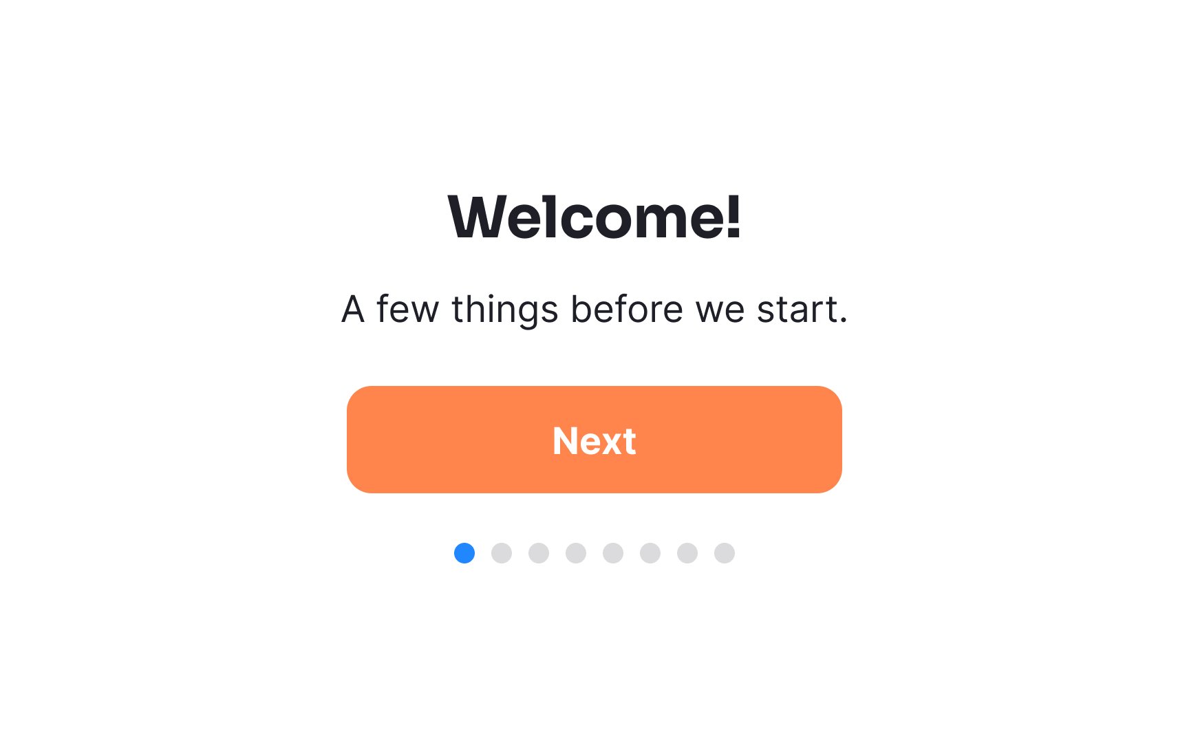
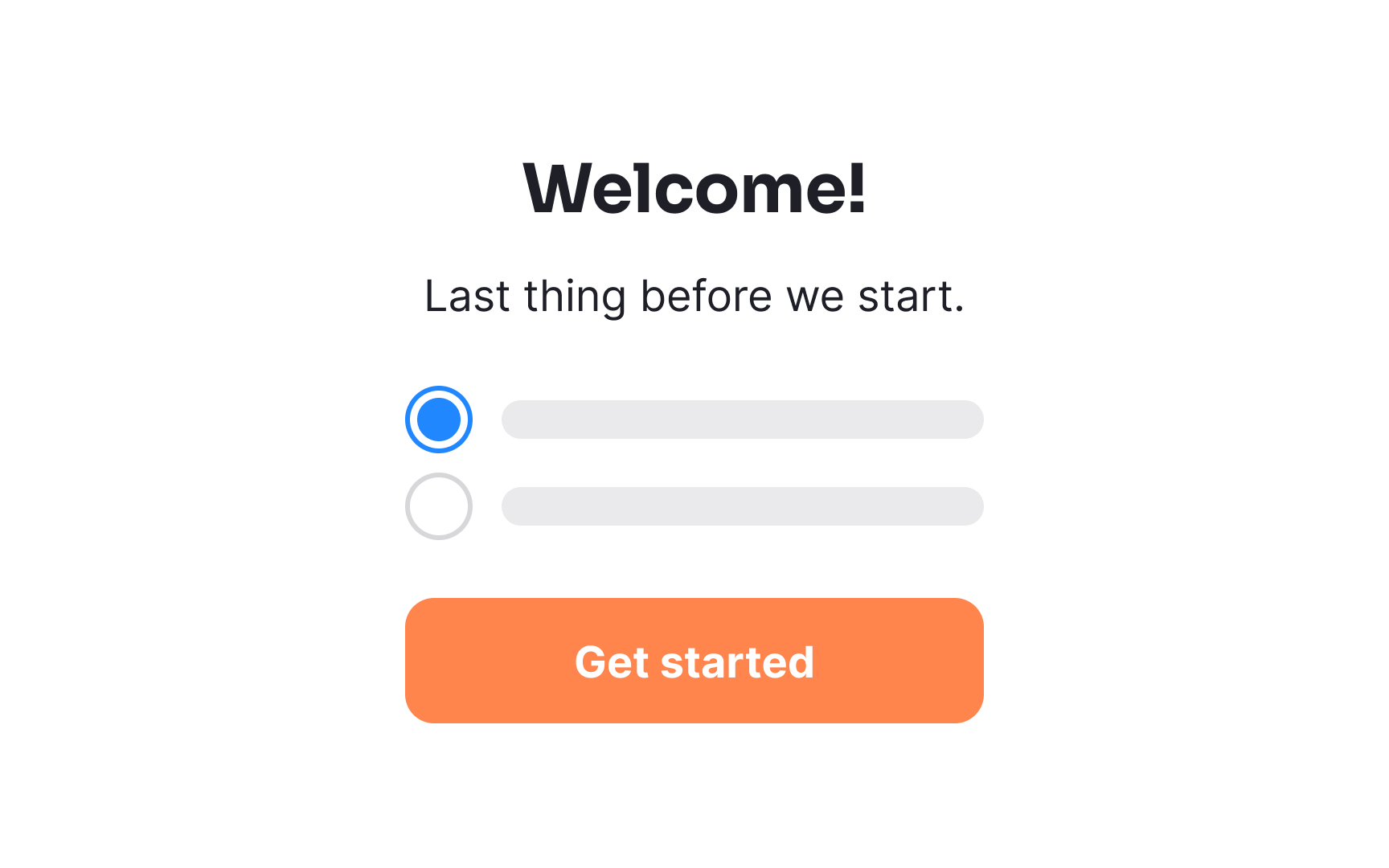
Don’t bombard new users with a ton of questions when you start
Pro Tip: Be sure to give users the option to close or skip onboarding questions.
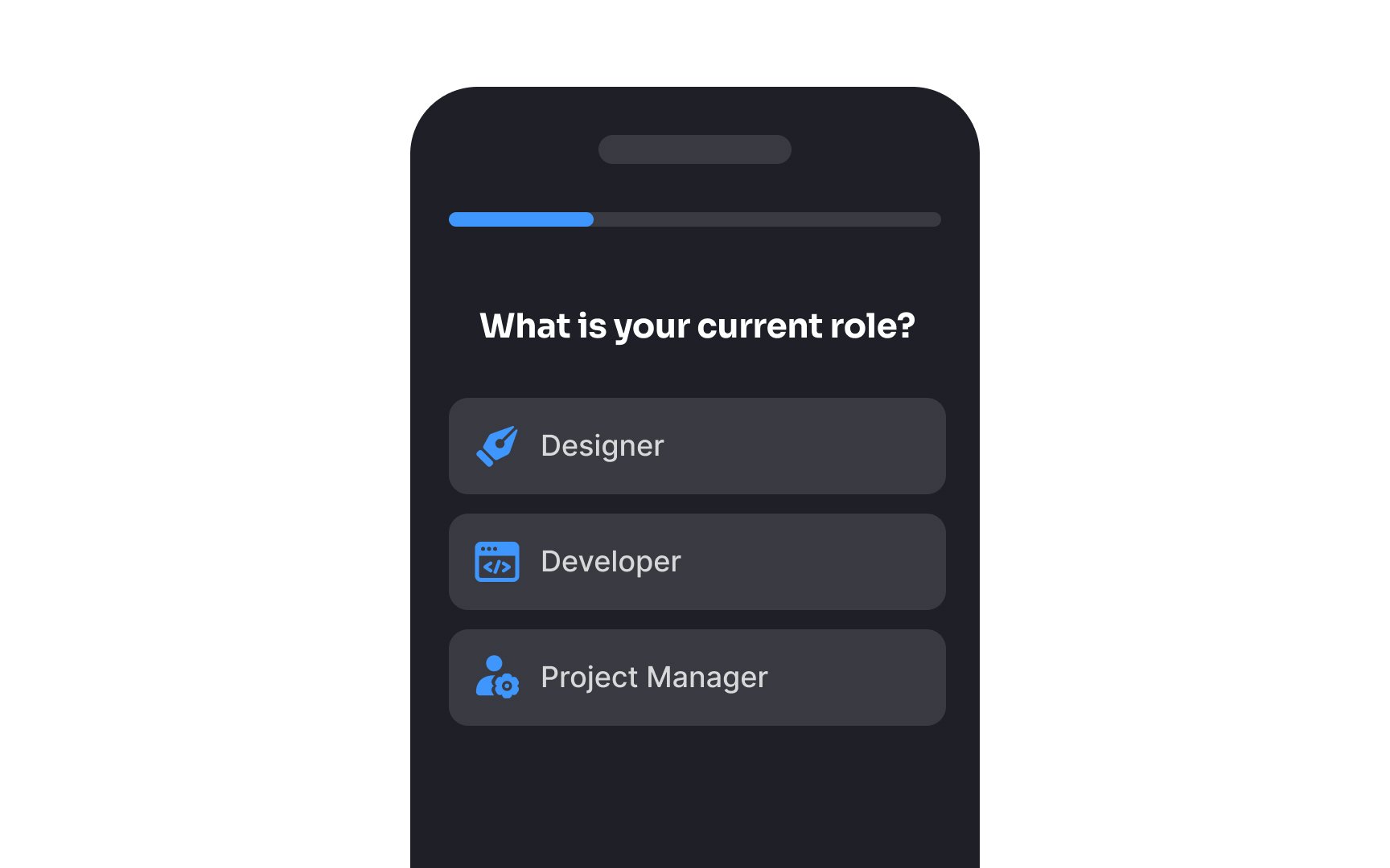
If you’ve created a product that could be used by different personas, it’s important to get an idea of which persona each of your users fits into. This allows you to optimize their experience, thereby turning them into more loyal users.[2]
For example, imagine you've created a project management tool that caters to both individual freelancers and large-scale enterprise teams. Through persona-based
What best describes your role or work setup?
A) Freelancer or solo contributor
B) Team member or manager in a company
What is the size of your typical project team?
A) 1-3 members
B) 4 or more members
Based on their responses, you can then tailor the onboarding process accordingly.
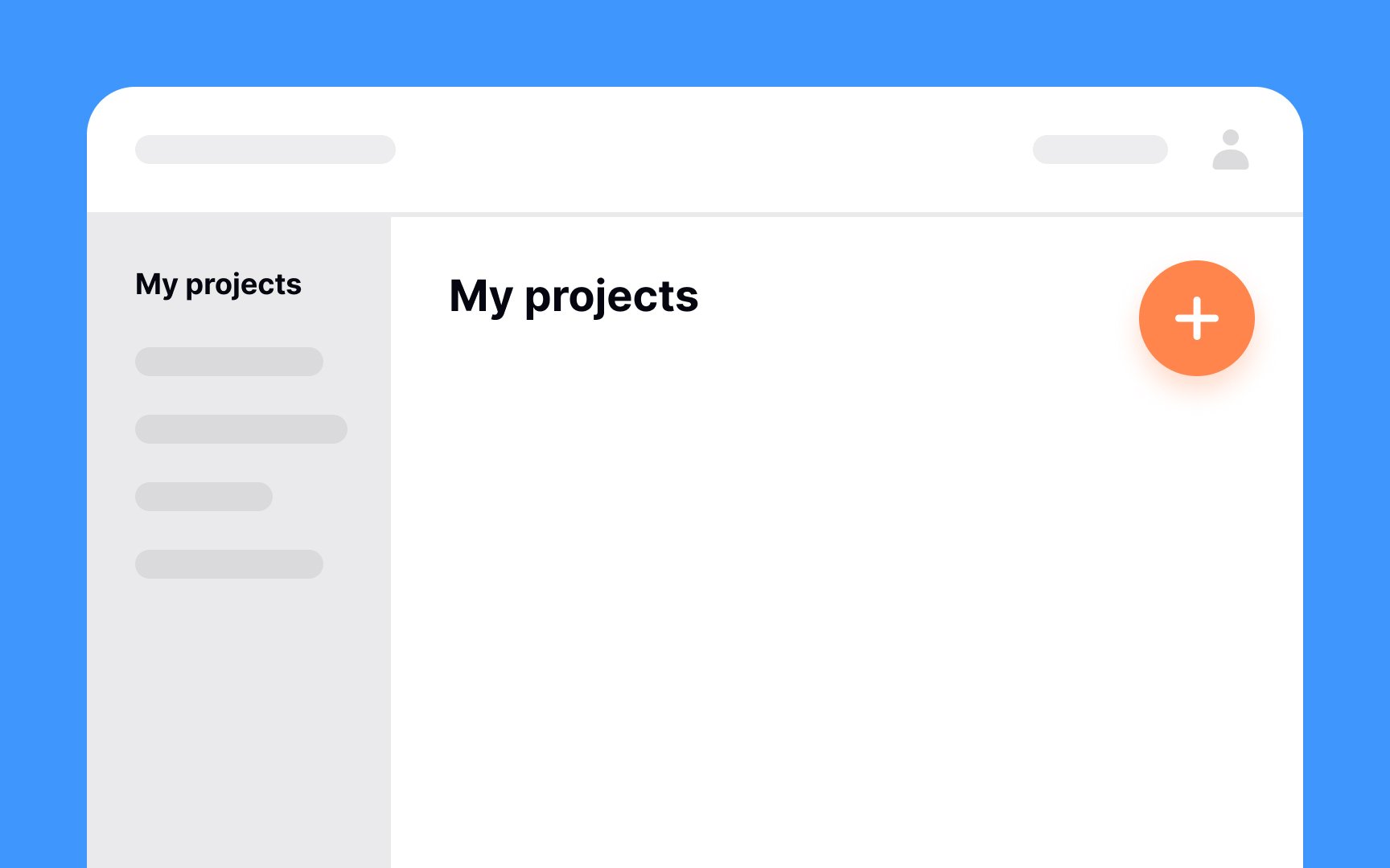
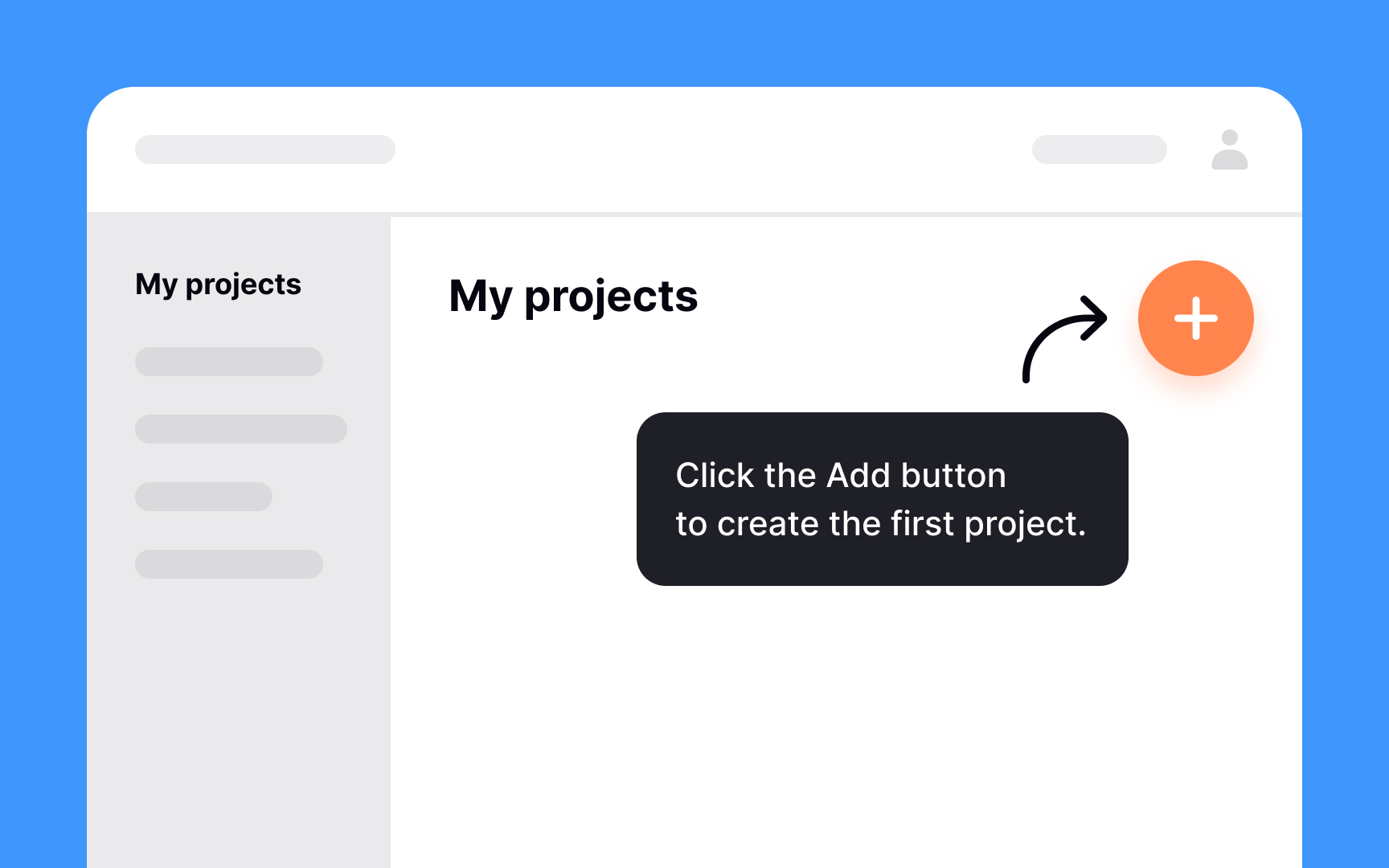
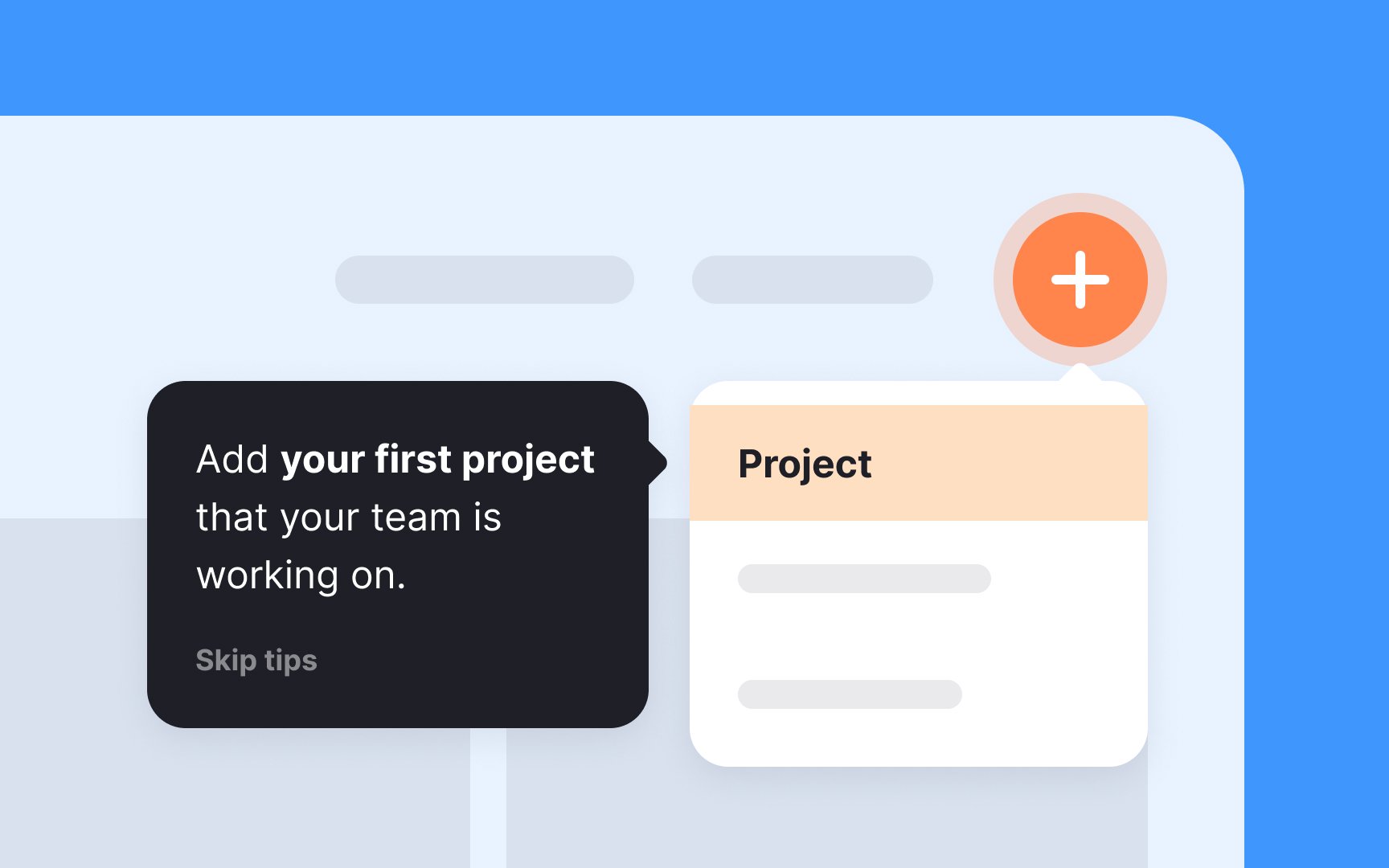
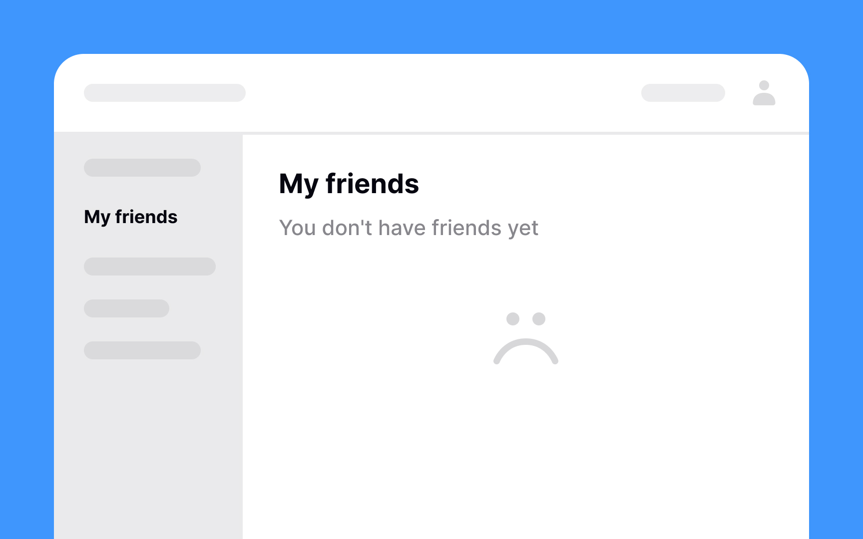
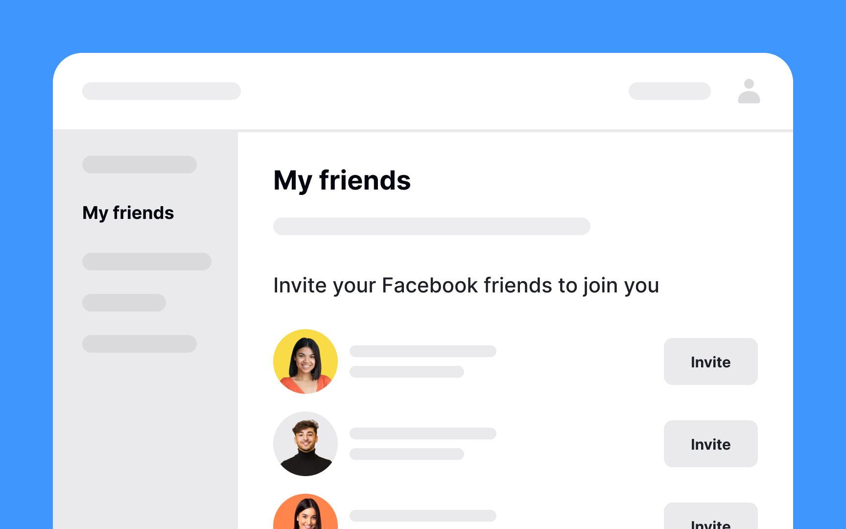
Empty states can be confusing to users, especially if there’s no indication of what they’re supposed to do to fill those screens. Use this opportunity to guide users and help them complete a task, such as setting up their first project. If this is the first time they’re using your product, adding a quick tutorial or a short video creates a better user experience.
If you’ve ever tried to build a new habit like jogging daily or eating more vegetables, you know how much effort it can take. Occasionally nudging users to interact can turn using your product into a habit. Engage them to invite friends, reward them for daily usage, or notify them about updates and new content. These actions will reinforce the habit and keep them coming back.

If your
According to a study, a majority of users believe that the onboarding process should take 60 seconds or less.[3] Otherwise, they get bored and tend to leave.
Let users know how many steps the
References
Top contributors

Topics
From Course

Share


Similar lessons

Login & Signup Flows

Requesting User Permissions
