Principles of Design Composition
Explore the foundational principles of design composition to craft compelling and harmonious compositions that leave a lasting impact
Understanding the basic principles of design composition helps you solve design problems, whether you want to help users complete a task, purchase a product, or both.
The way a design is composed has a strong influence on the way it’s perceived by users. Different types of compositions can have dramatically different effects on those viewing the composition, in both positive and negative ways.
Design
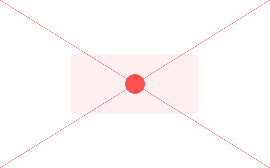
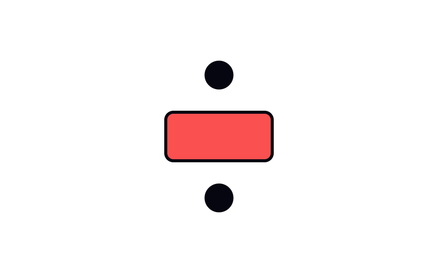
Every shape has a geometric center. For basic shapes — like rectangles, ovals, and squares — it’s the point where the axes of symmetry meet. For a circle with an infinite number of symmetry axes, a center is a point equally distant from all edge points. Placing vital elements in a geometric center makes for the easiest, although not the most imaginative
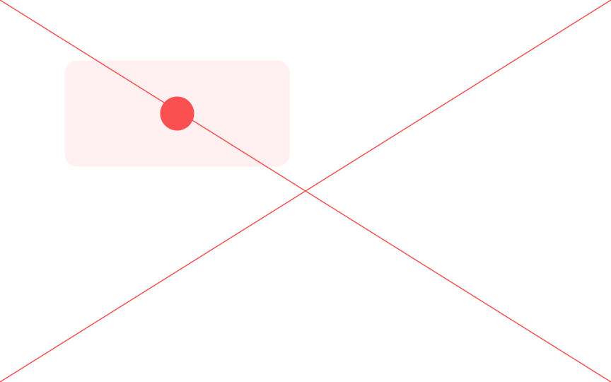
The geometric center of your design will always be in the same place. The compositional center, however, is located based on how your design is organized. It could be a point, several points, or a line along which you place elements.
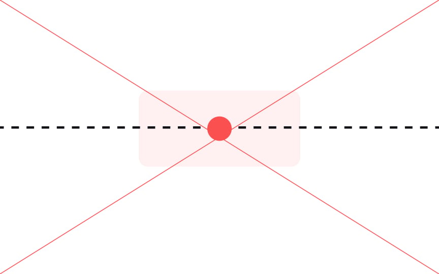
If you ask someone to point to the center of a shape, they’ll generally point to a spot slightly above the geometric center. Because of the emphasis we place on the top of a
In design, that means that if we place elements at the geometric center, they can actually appear to be unbalanced and slightly too low. Placing elements in the visual center gives a more balanced and harmonious look to your designs.
Pro Tip: Balance elements around the visual center instead of the geometric center to draw more attention to your subject.
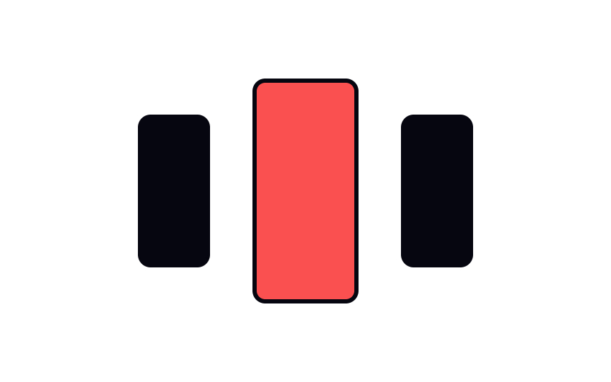
In many compositions, one element will dominate over the others, through some combination of size, shape, color, texture, or space. This dominant element carries more visual weight and gets noticed first. Think of it as the entry point to your design or the starting point for the story you’re telling.
When designing a
Pro Tip: The dominant element should emphasize the most critical information as it might be the only thing users will see.
The perceived weight of a visual element is called its visual weight. A
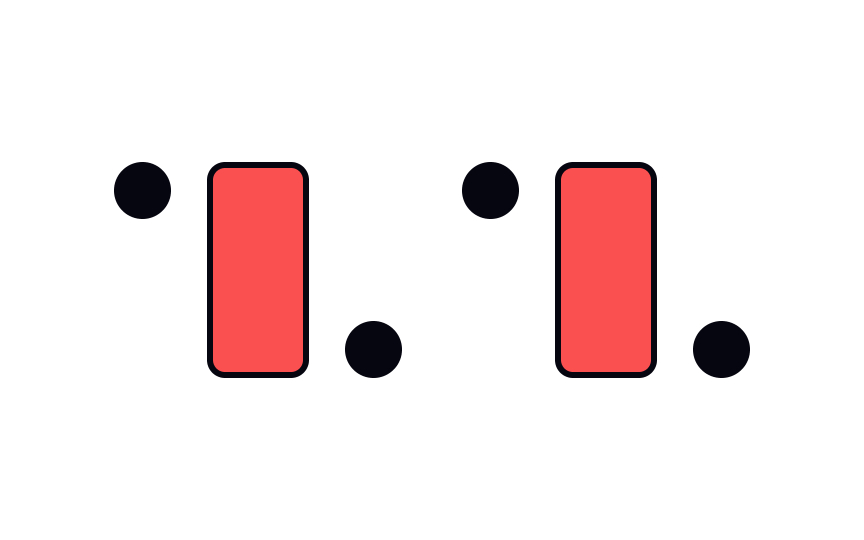
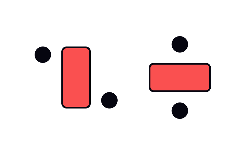
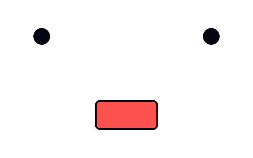
Asymmetry occurs when there's unequal visual weight on each side of the
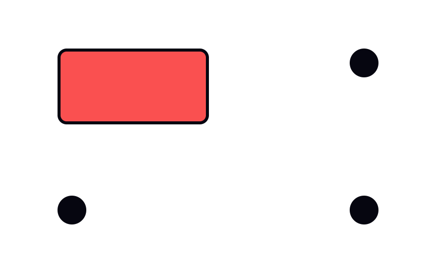
A closed
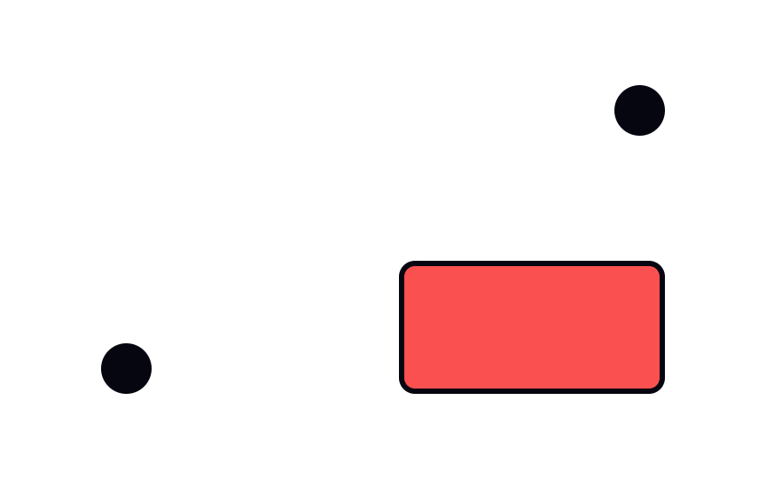
Open compositions encourage the eye to move from one area to the next. They create a feeling of movement and, unsurprisingly, a sense of openness. Elements in open compositions do not form a frame, giving the impression that the
Pro Tip: Try closed and open compositions to see what works best for different situations.
Static
Dynamic compositions feel energetic and exciting — there’s an illusion of movement, activity, or even conflict. To achieve this effect, use open
Balanced
References
- Principles of design | InVision | InVision
- Design Principles: Visual Weight And Direction — Smashing Magazine | Smashing Magazine
Top contributors
Topics
From Course
Share
Similar lessons

Intro to Design Layouts

Intro to Design Grids

