CSS Width & Height
Learn how to precisely control and adjust the size and dimensions of elements, enhancing your design flexibility and responsiveness
Content is the information users see on the page — text, images, videos, etc. The content area is the innermost box in the element's box model. The CSS width and height properties control the area and its behavior — how it changes depending on the screen size and the content's dimensions.
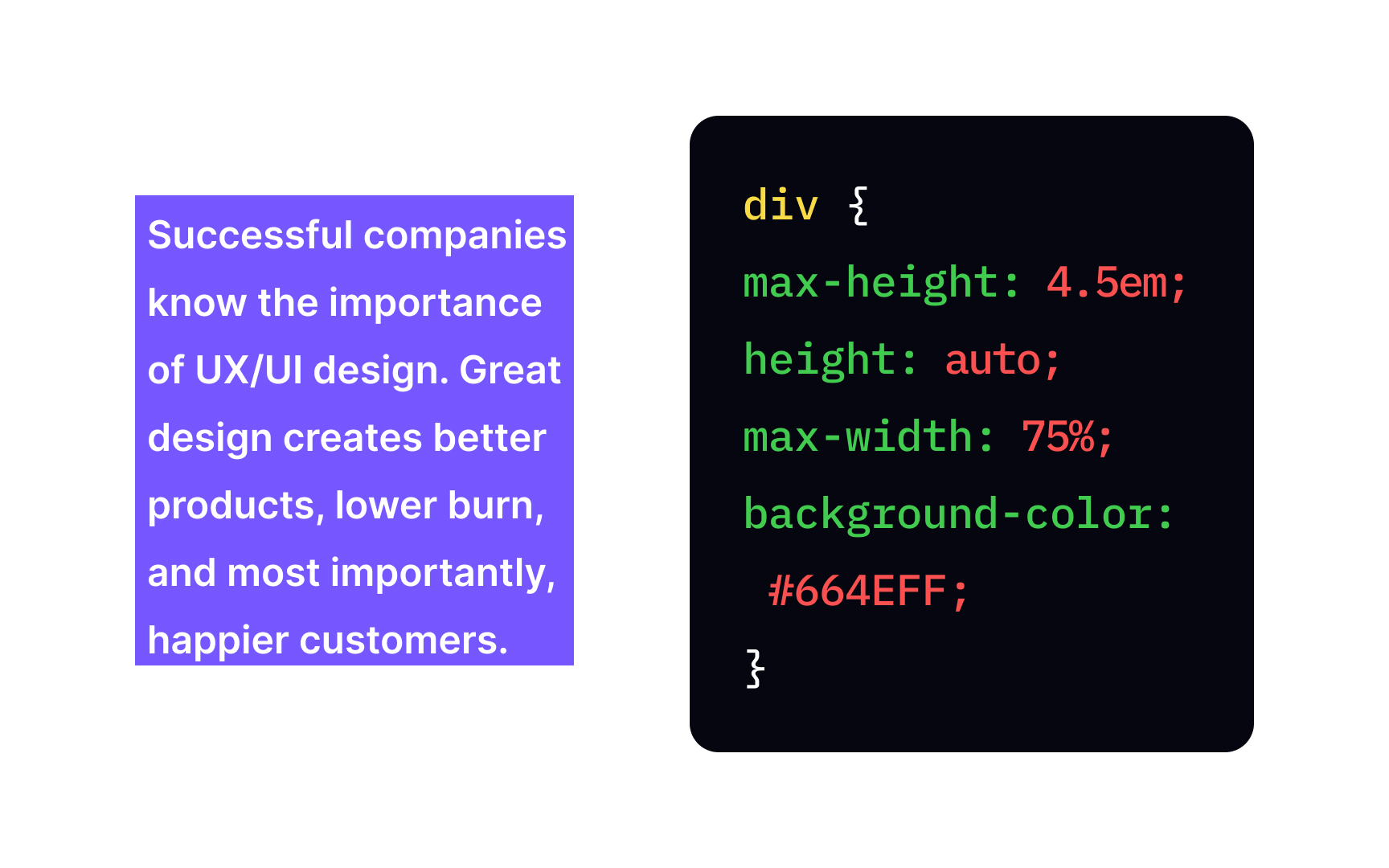
Knowing this information is important when creating the layout, especially if the page's content is going to change. For example, if you're designing a page for a client who'll fill it with content later, setting width and height correctly will ensure that the layout won't mess up when the content is added.

The width width property doesn't include padding, borders, and margins.
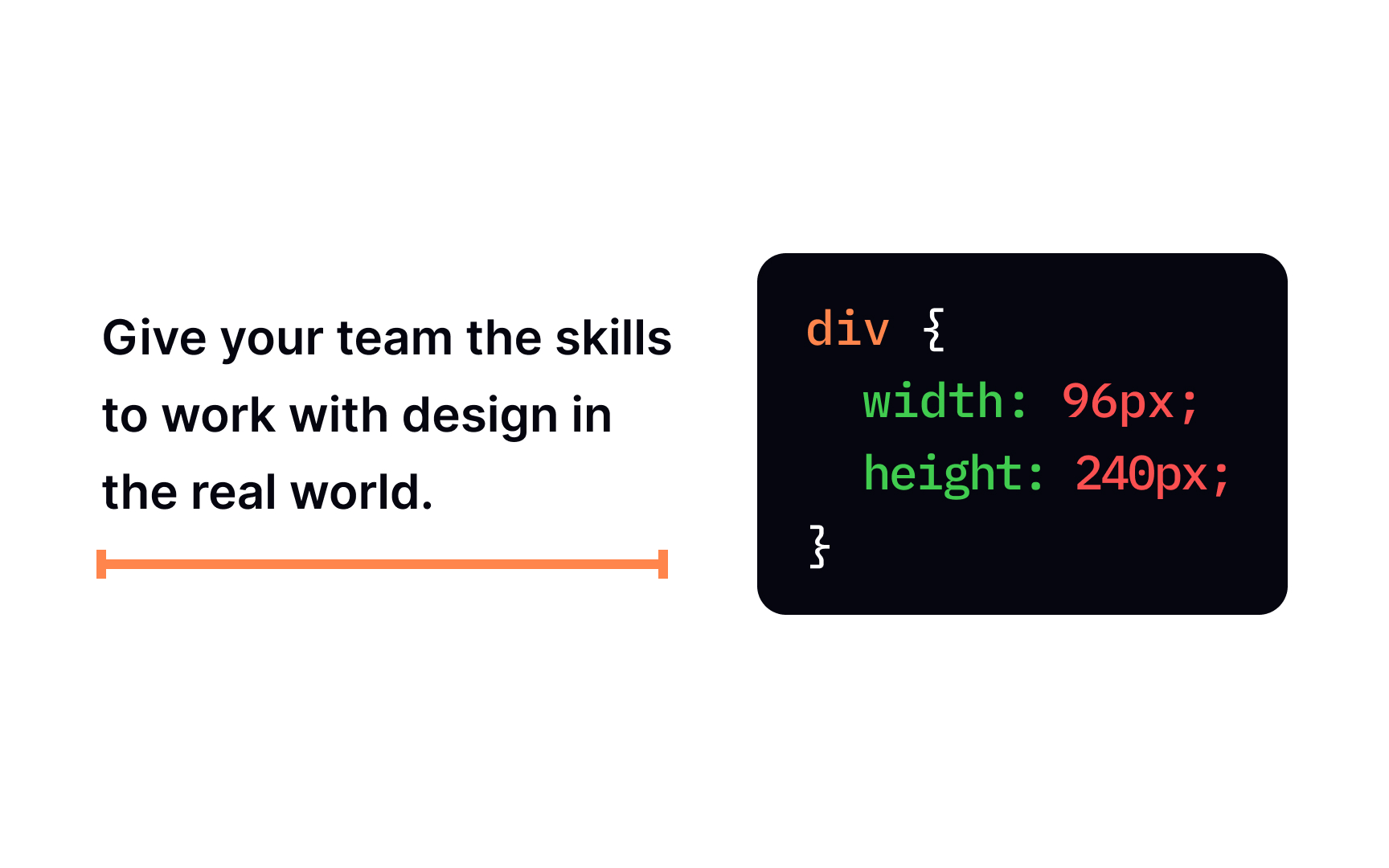
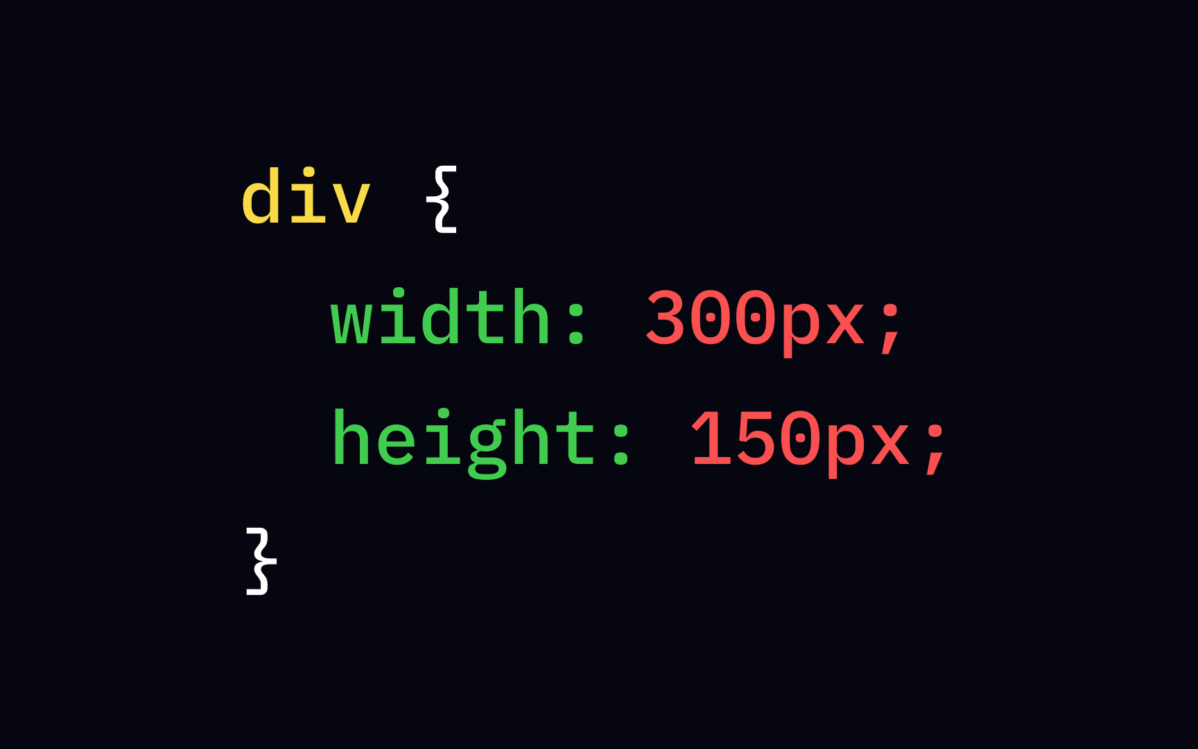
Let's say there's a section of content <div> with width: 240px;. It means that the text inside this section will take up exactly 240px horizontally. However, keep in mind that the actual size of that element will include padding, border, and margins on both sides. If their values aren't 0, the total size of the element will exceed 240px.
Pro Tip: Typically, when you create a block element, such as <div>, <p>, etc., the browser automatically sets its width to 100% and its height to whatever is needed to show all the content.
The height property sets the element's height. Same as width, its value doesn't include <div> with height: 96px; will take up exactly 96px vertically. However, to calculate the total size of the element, you'd need to add
Pro Tip: Avoid setting fixed width and height unless necessary.
By default, if not specified, a block-level element will fill in the max-width
For example, adding the declaration max-width: 200px; to a section will ensure that it won't stretch longer than 200px horizontally, even on a wider screen. If the
Pro Tip: The max-width property overrides the width property — an element cannot be wider than the max-width value.
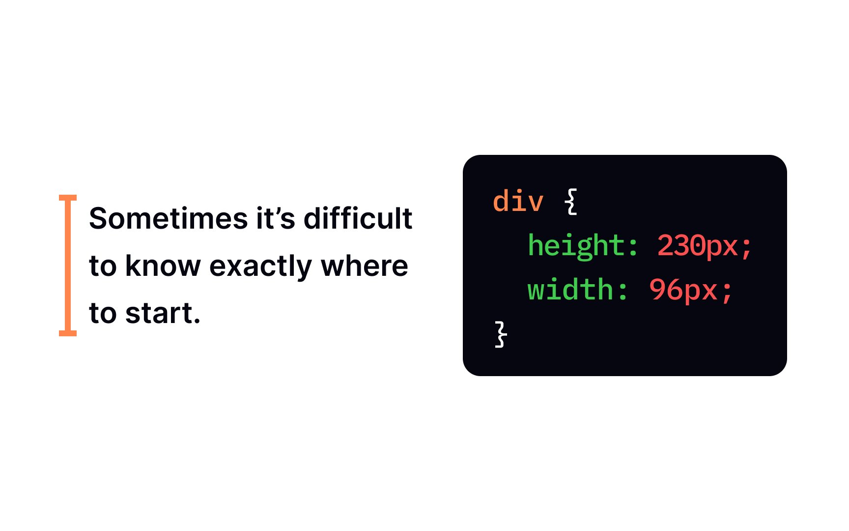
Sometimes it's useful to constrain the size of an element in min-width property limits how much an element can shrink horizontally. Practically, it means that if you set the min-width of an element to 400px, it won't shrink smaller than that even on smaller screens, even if there's no
Pro Tip: The min-width overrides the width and max-width properties. The width can't be smaller than the min-width value, and if the min-width value is greater than max-width, the min-width value is applied.
The max-height max-height property has no effect.
Pro Tip: The value of the max-height property overrides the height property, preventing the height from becoming larger than max-height.
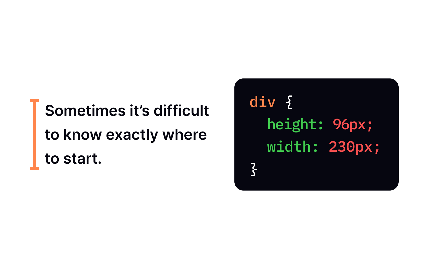
The min-height min-height of an element is 108px, it won't become smaller even if the min-height property has no effect.
Pro Tip: The min-height overrides the height and max-height properties.
The width and height properties can take different types of values:
- Length specifies a width or height in px, em, rem, pt, cm, etc
- Percentage specifies a width in percentage (%) of the width or height of the containing element
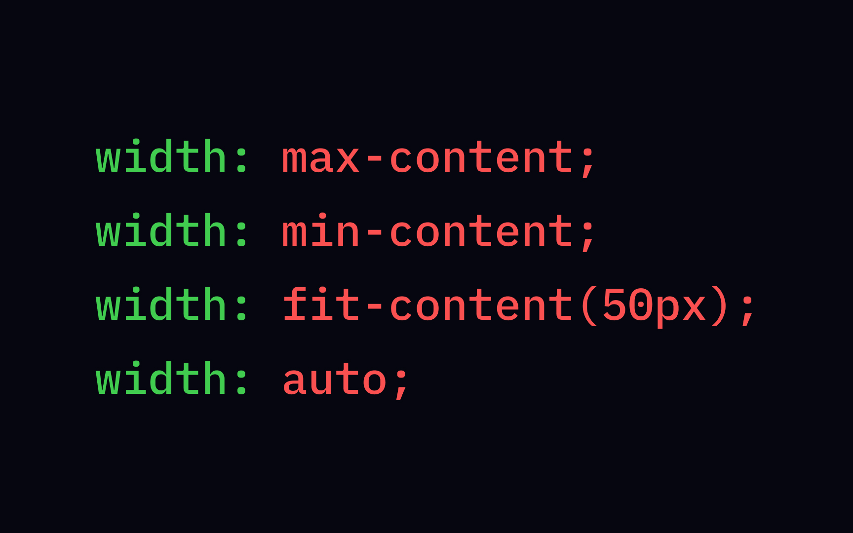
- Keyword values max-content, min-content, fit-content, and auto
- Global values inherit, initial and unset
You can't specify negative values to the width and height
Length values use distance units. If you want a box to be 50px, set its value, and it will always be 50px on all devices. As with all
Pixels are one of the absolute length units you can use to set an element's dimensions — and the most common one. Technically, you can set values in inches and centimeters, although it's not very common.
Relative length units are relative to something else. For example, the most commonly used are rem and em, which are calculated based on the font size of the root and parent element, respectively. There are over 20 possible length units.[2]
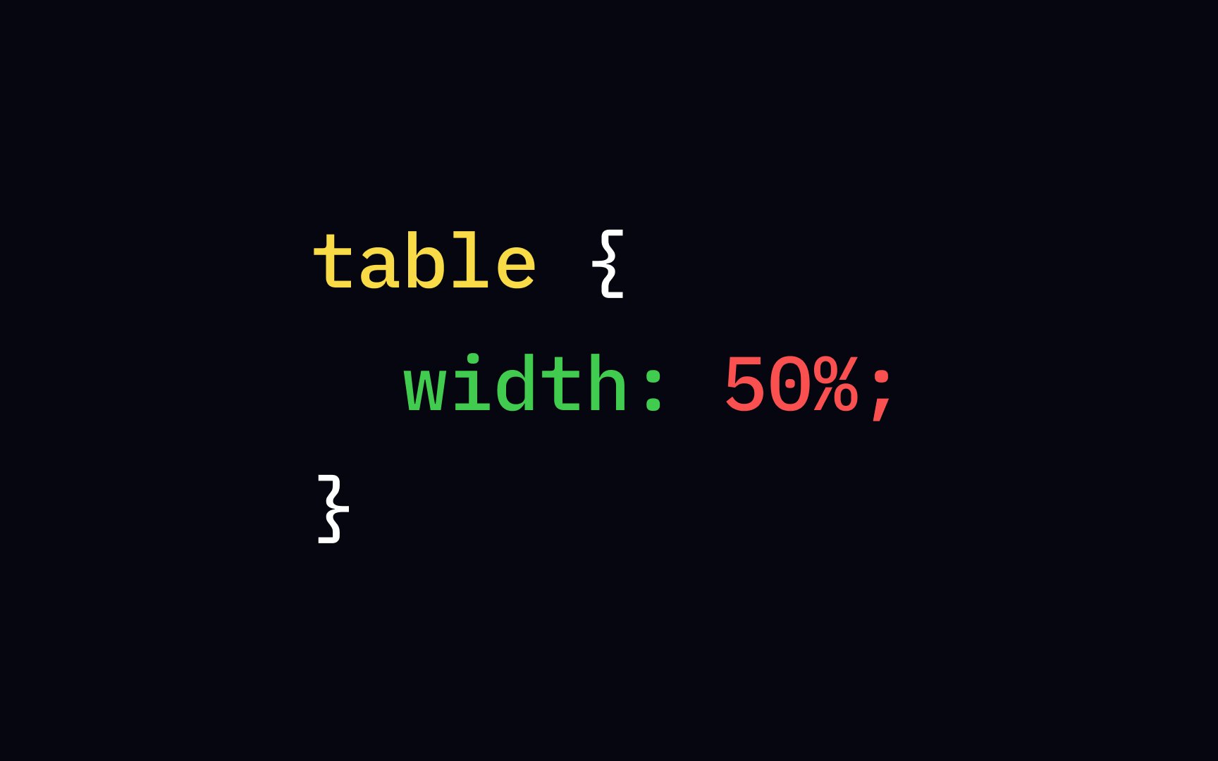
Percentage values are better when creating responsive designs. Different devices have different dimensions. Setting dimensions in percentages instead of absolute units allows the
A percentage value defines the size of the elements relative to the element's parent. For example, with the following code, the table's contents will take up 50% of the space of the <body> element that it's most likely nested in, regardless of users' screen size:
table {
width: 50%;
}
Keyword values leave it to the browser to decide how to size the
• max-content sets the intrinsic preferred width or height. For example, adding a declaration width: max-content; will set the length of the element to the length of the longest line.
• min-content sets the intrinsic minimum width or height. A paragraph with the declaration width: min-content; will have the width of the longest word.
• fit-content allows the element to use all available space but never less than the min-content and never more than the max-content.
• auto lets the browser calculate and select a width for the specified element.
The auto value has several uses. It's the default value for a lot of box model width and height. It means that if you don't explicitly specify width and height values, the browser will automatically calculate them.
For example, the <h1> element doesn't extend past its content. But if we add more text, the area is recalculated. If we decided to make the text even longer, the content area would fill the width of the
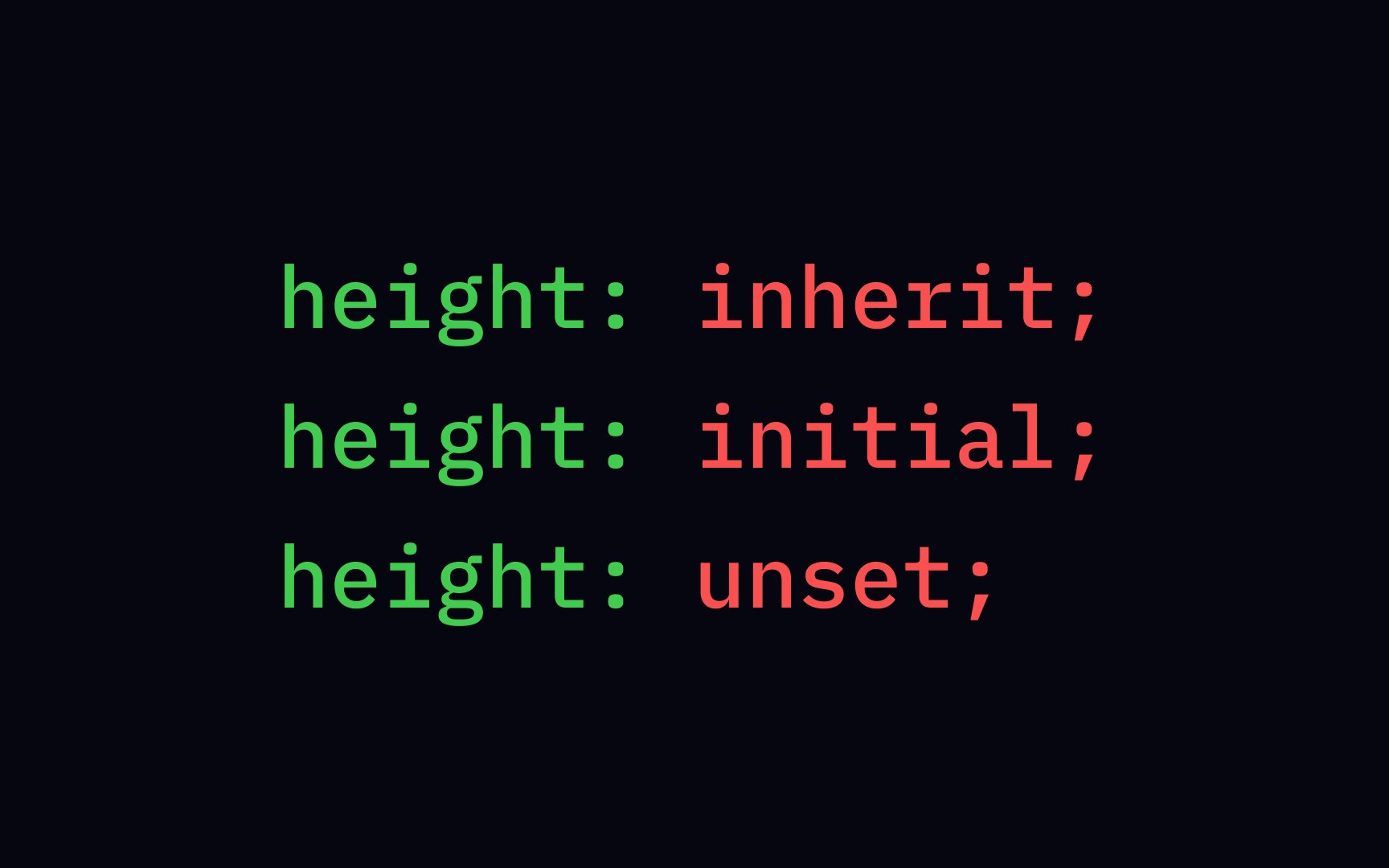
Global values can be used for any CSS property and on any HTML element:
initialresets all properties to their default value. For example,color: initial;will set the text color to black as it's the default.inheritspecifies that aproperty should inherit its value from its parent element. An element withcolor: inherit;declaration will have the same text color as its parent.unsetworks the same asinheritfor inherited properties types and asinitialfor non-inherited properties.[3]
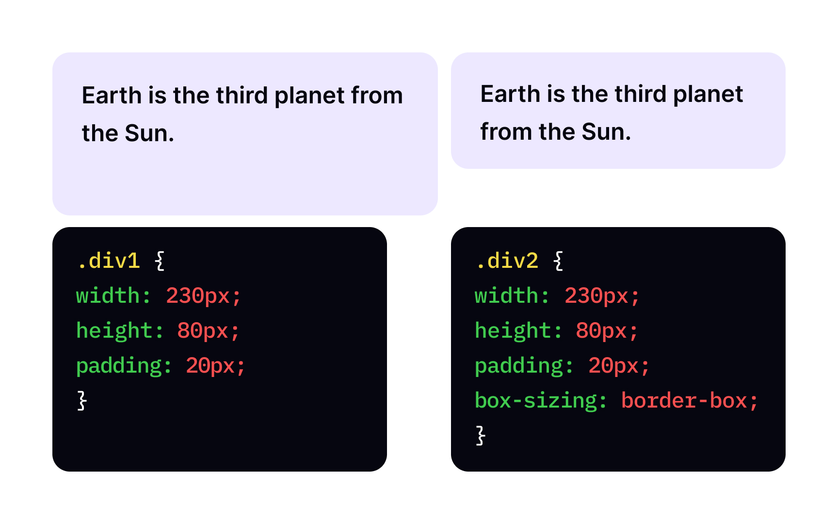
By default, the width and height properties only define the size of a box's
div {
width: 300px;
border: 15px solid green;
padding: 50px;
margin: 20px;
}
The total width of the element will be: 300px + (15px x2) + (50px x2) + (20px x 2) = 470px.
This happens because, by default, the box-sizing content-box. Wouldn't it be cool if we could set the total width of the element with one setting? That's what most developers think. These days, the best practice is to use box-sizing: border-box; — it includes the padding and border in an element's total width and height.
The width box-sizing property).
The most common types of values for this property are length values in px or percentage values.
The height box-sizing: border-box; declaration to the element for height and width values to include padding and border.
References
Top contributors


Topics
From Course

Share


Similar lessons

CSS Basics

Introduction to CSS for Designers
