<?xml version="1.0" encoding="utf-8"?>

Knowing how to add drop shadow effects with the CSS syntax and style text and elements the way you like allows you to make your designs more realistic.

When an object, like a tree or building, obstructs a light source, it creates a shadow. Likewise, an element on a page casts a shadow, giving the impression that it's raised above other elements behind it.

A raised button, for example, signals that the element is interactive, and users can click it. Above all, shadows indicate the hierarchy of elements and make designs look more natural and aesthetically appealing.

Exercise #1

CSS text-shadow property

CSS text-shadow property Bad Practice
CSS text-shadow property Best Practice

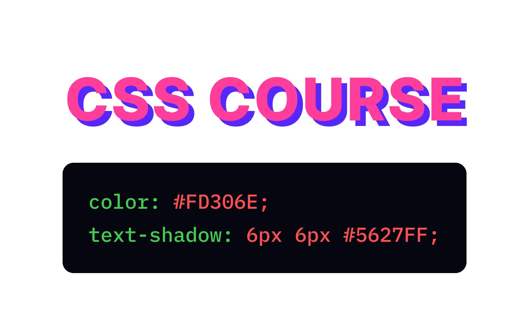
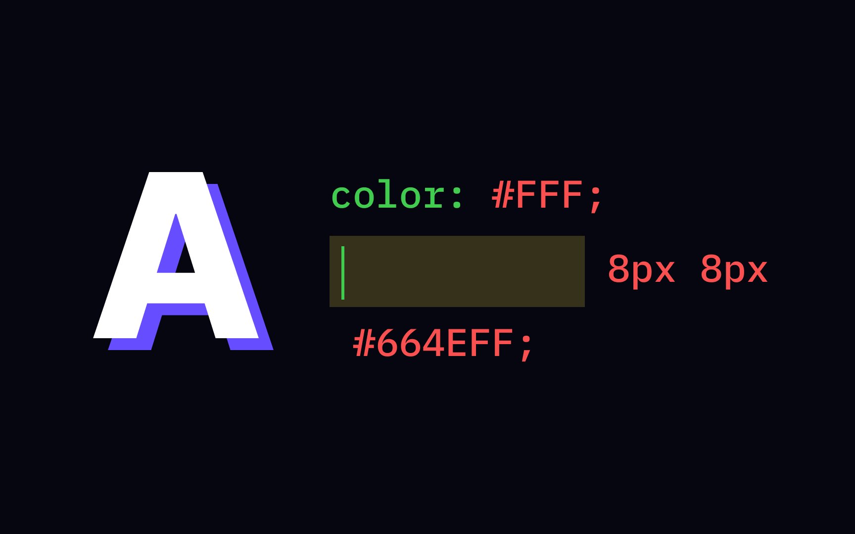
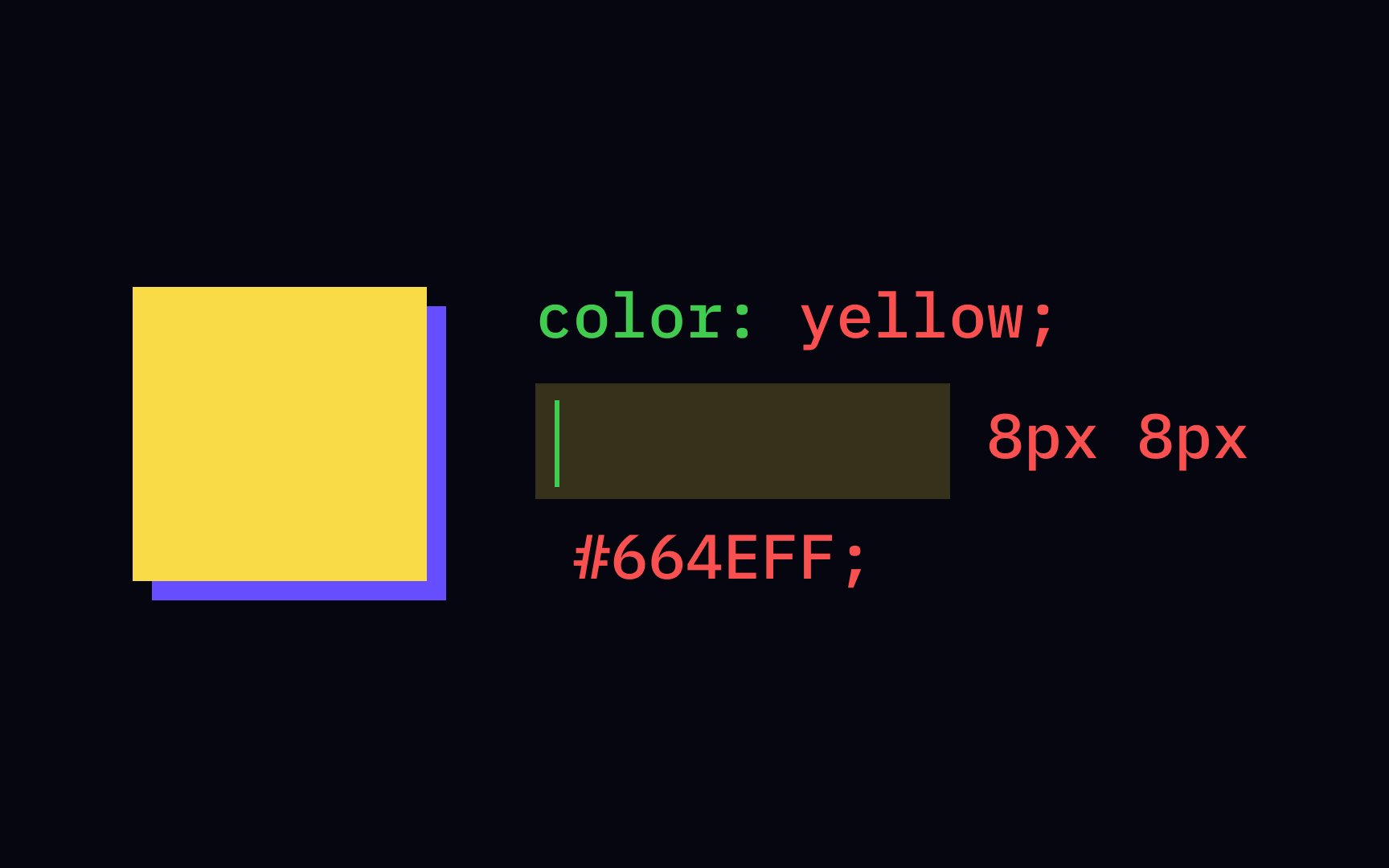
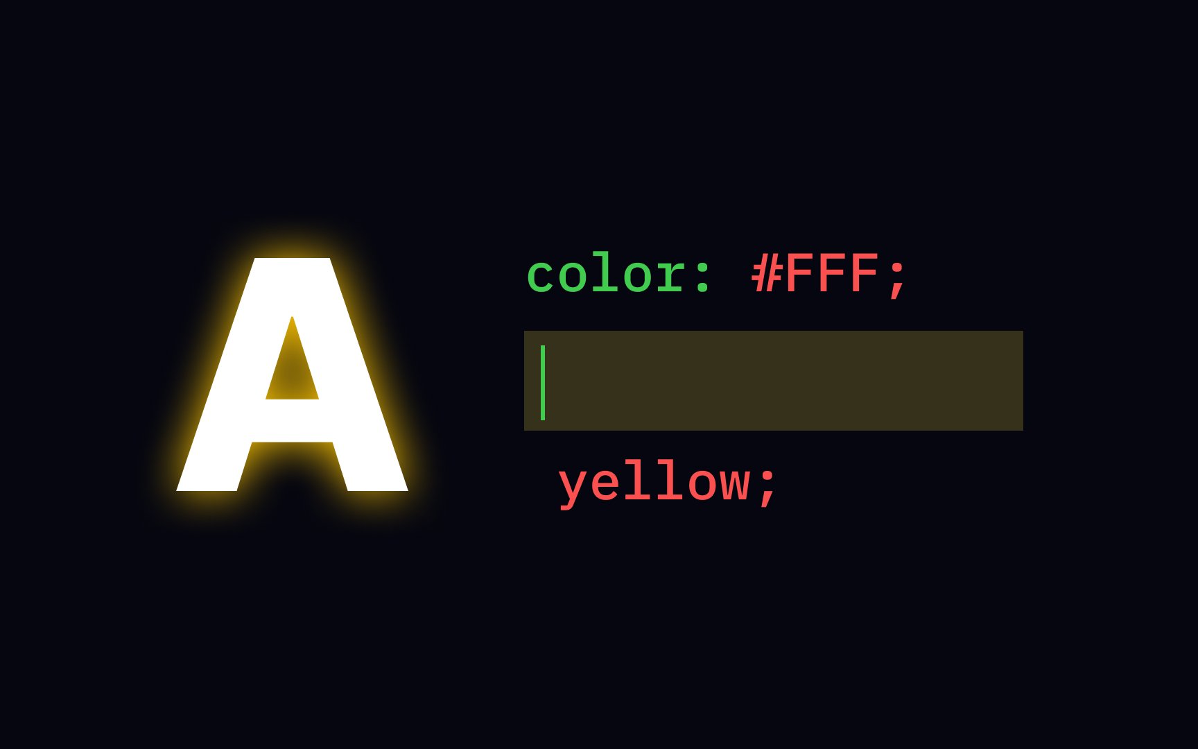
The text-shadow property allows us to add one or several shadows to the text, separated by commas. The horizontal and vertical shadow's positions require property values that you can express in pixels, centimeters, inches, points, etc. We also use values of blur radius and color to add some shadow effects.

Exercise #2

CSS box-shadow property

CSS box-shadow property Bad Practice
CSS box-shadow property Best Practice

With CSS properties, you can also apply shadow effects to an element's container. Like the text-shadow property, the box-shadow property adds one or several shadows and includes the required horizontal and vertical shadow positions. The basic syntax also specifies the blur radius and color.

Keep in mind that the order of values matters: offset-x offset-y blur-radius color. Otherwise, the browser won't apply the shadow.

Exercise #3

CSS box-shadow property with the color value

CSS box-shadow property with the color value Bad Practice
CSS box-shadow property with the color value Best Practice

The color value is optional when specifying shadow parameters with the box-shadow property. However, if you omit this value, the browser will use the text color (color property value) for your shadows.

To specify the color value, you can use multiple options:

  • HEX colors
  • RGB/RGBA colors
  • HSL/HSLA colors
  • Predefined color names
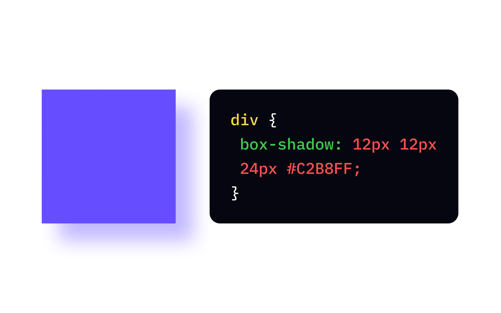
Exercise #4

CSS box-shadow with the blur-radius value

CSS box-shadow with the blur-radius value Bad Practice
CSS box-shadow with the blur-radius value Best Practice

Shadow blur is a technique to disperse the shadow's borders and blend them with a background element. Designers use this tool for creating more natural soft shadows. The blur-radius value of the box-shadow property defines how far the blurring spreads, and the larger the blurring, the more prominent it gets.

The blur radius can be specified in different length units, like pixels, inches, centimeters, etc., and can't take a negative value.

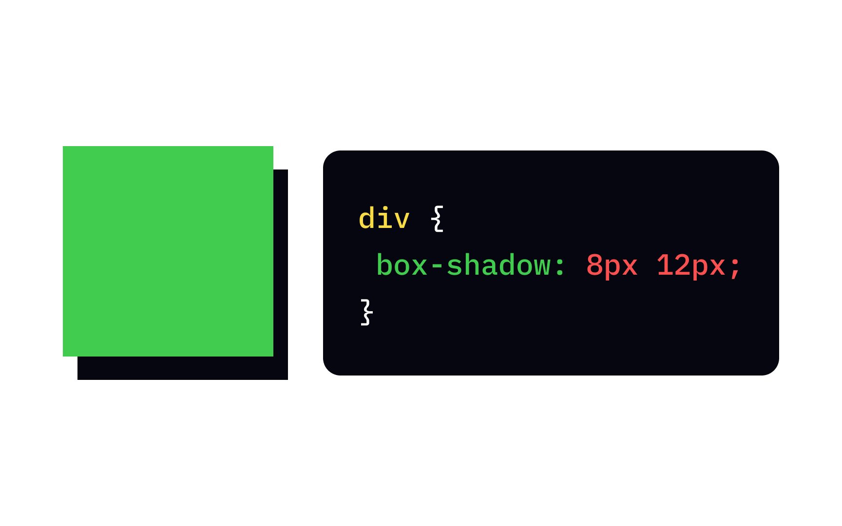
Pro Tip: If you omit the blur-radius value or set it to 0, the shadow edges will be sharp.

Exercise #5

CSS box-shadow property with the offset values

CSS box-shadow property with the offset values Bad Practice
CSS box-shadow property with the offset values Best Practice

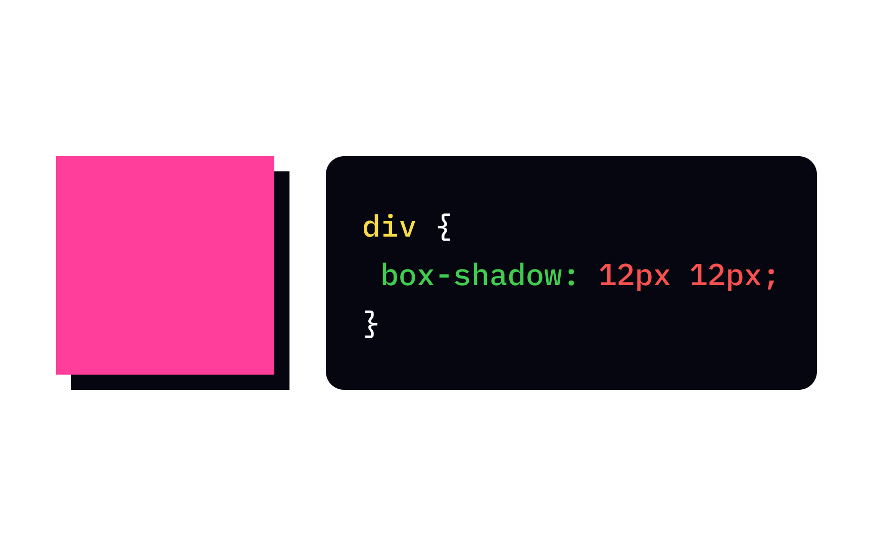
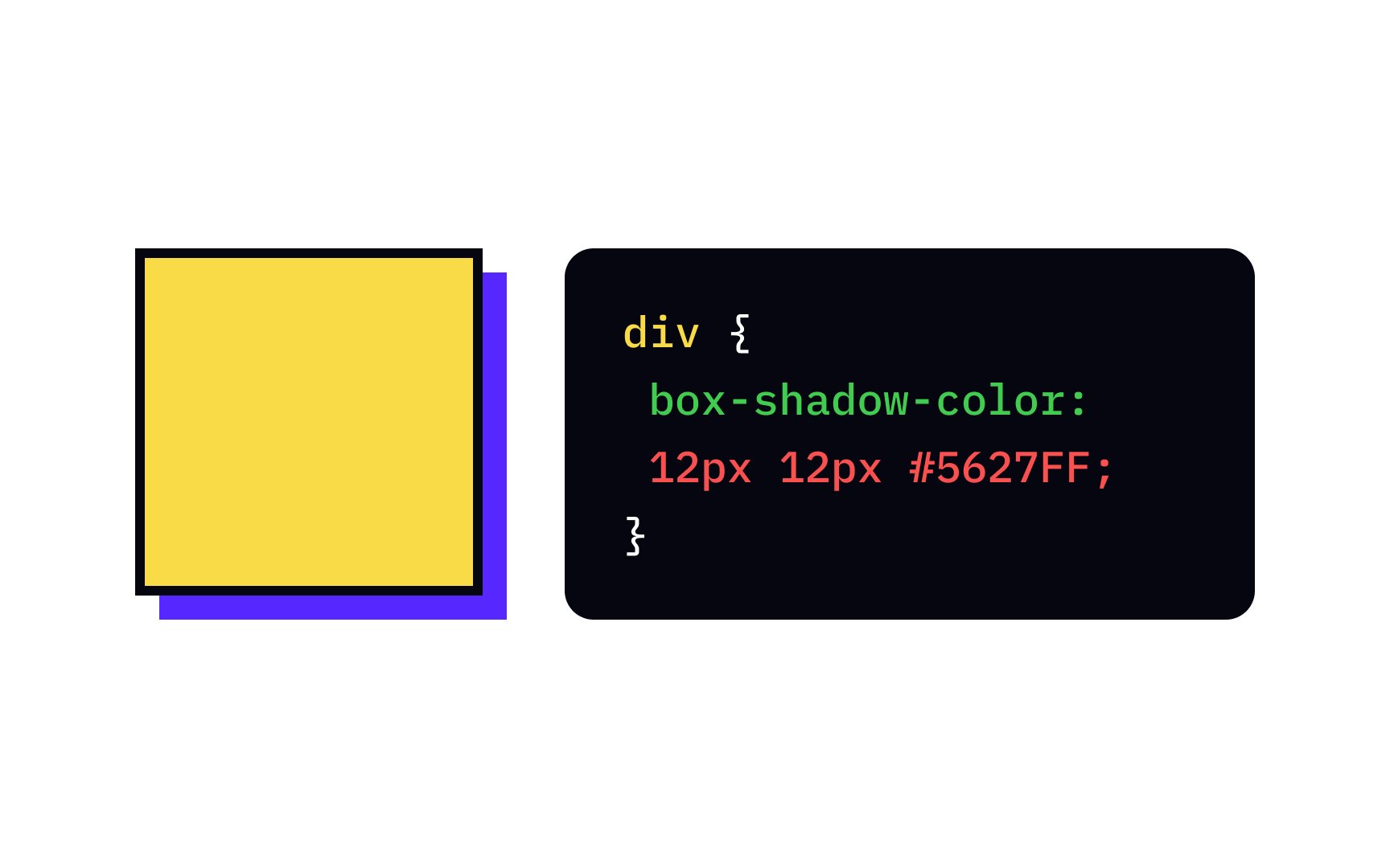
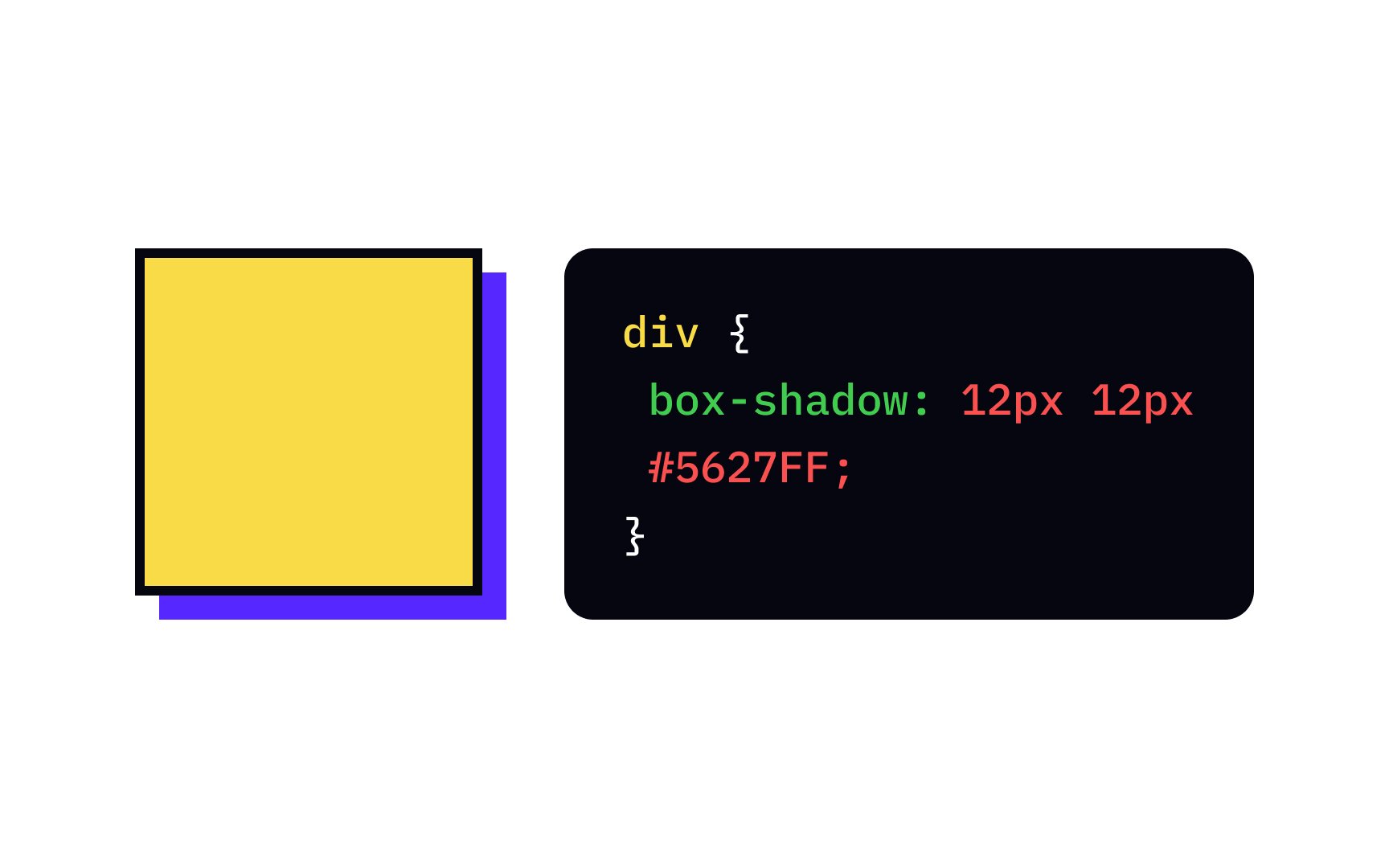
Horizontal and vertical offset values of the box-shadow property specify the position of a shadow and can be both positive and negative.

  • The horizontal offset — the x-axis value — can be positive, and the shadow will be on the right of the box. A negative offset value puts the shadow on the left of the box.
  • The vertical offset — the y-axis value — can be positive, and the shadow will be below the box. A negative value sets the shadow above the box.
Exercise #6

CSS text-shadow property

CSS text-shadow property

The correct property name is text-shadow. Like other CSS properties, it requires a semicolon at the end of the line. If you decide to add another shadow or a couple of shadows, put a comma each time after the color property, e.g.:

{

text-shadow: 1px 1px 2px red, 0 0 4px blue, 2px 2px 6px yellow;

}

Exercise #7

CSS box-shadow property

CSS box-shadow property

The correct answer is the box-shadow property. In design, we often apply shadows to buttons and cards to add depth, increase the element's position in a visual hierarchy, and indicate its interactivity. Besides, shadows add a natural aesthetic to the design.

Exercise #8

CSS text-shadow property

CSS text-shadow property

The first two values of the text-shadow property— the x-offset and y-offset — specify the shadow's distance from the text. The third value — the blur-radius — defines how far the blurring spreads. The bigger the blur, the wider, lighter, and more natural a shadow gets.

Top contributors

Marek Lukowski

Topics

From Course

Share

Complete this lesson and move one step closer to your course certificate