CSS Display
Learn basic CSS display properties to create balanced compositions that guide users throughout the website and make content easy to consume
The secret of good and successful design depends on many factors: typography, color palette, visual hierarchy, consistency, etc. And page layout is one of the primary things to consider. It helps you group related items and create balanced compositions that guide users throughout the website and make content easy to consume.
If you're a designer, knowing CSS is essential as it allows you to take control of the page layout and achieve the desired visual result. CSS for designers offers a wide range of possibilities to arrange and position elements on a web page in creative and visually appealing ways. By learning CSS properties such as display, flex, and visibility, designers can create balanced compositions that guide users throughout the website and make content easy to consume.

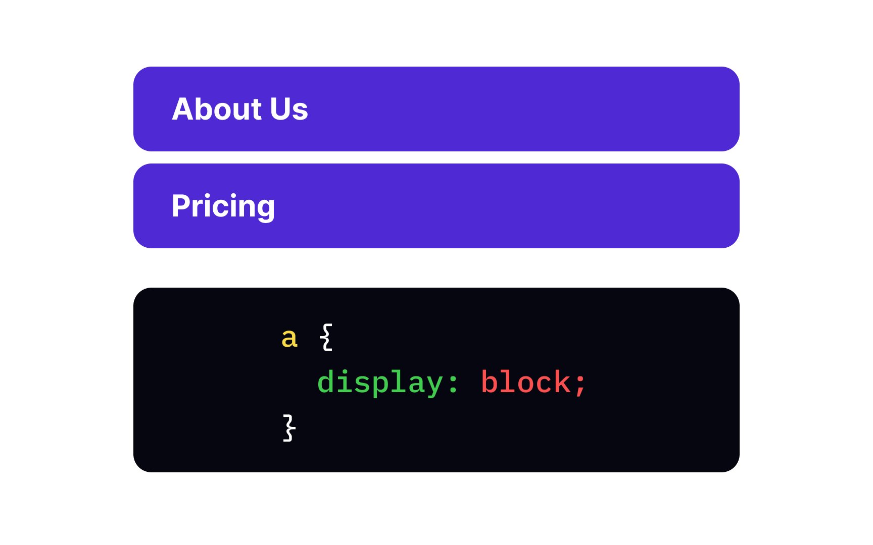
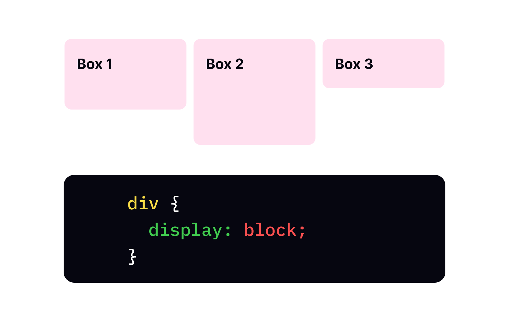
By default, each <div>, <h1> to <h6>, <p>, <form>, <header>, <footer>, and <section> by default behave like block-level elements. This means they block the entire width available, with a line break before and after the element. In other words, block-level elements don't welcome any "neighbors" in the same area with them.
To set the block display for elements with other default values, you should use the display property with the block value.
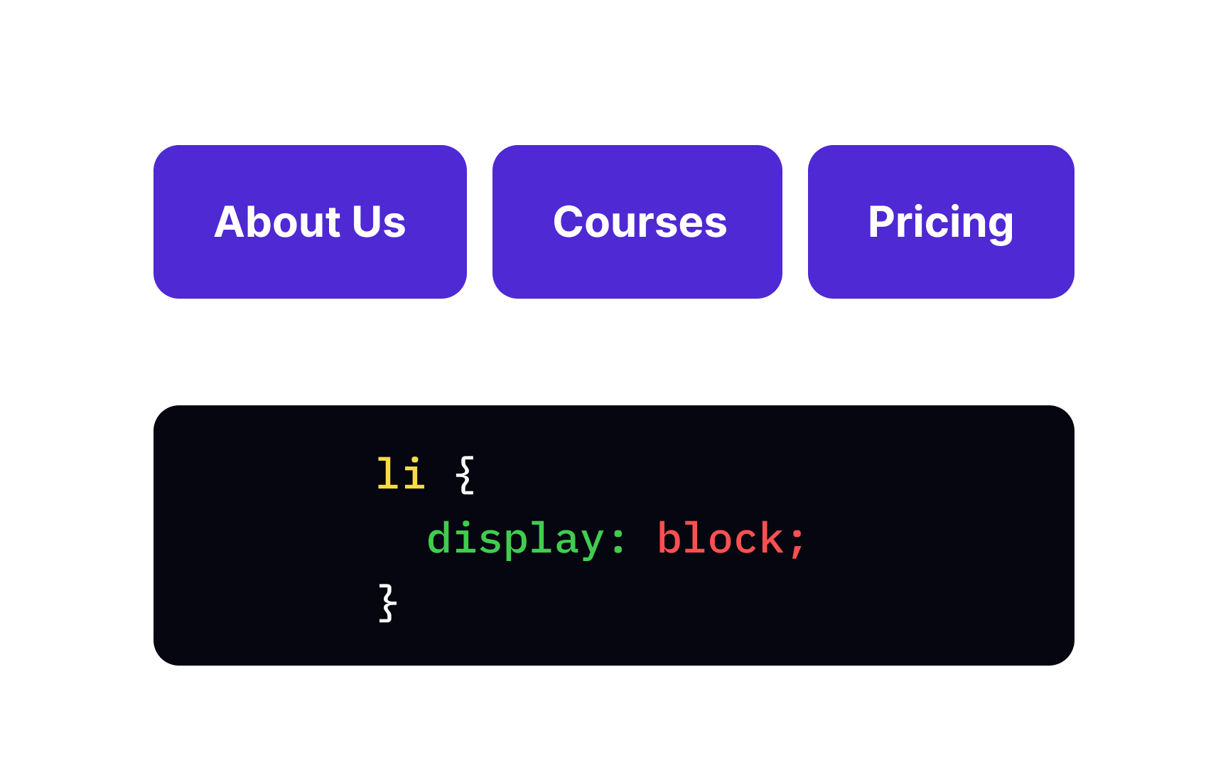
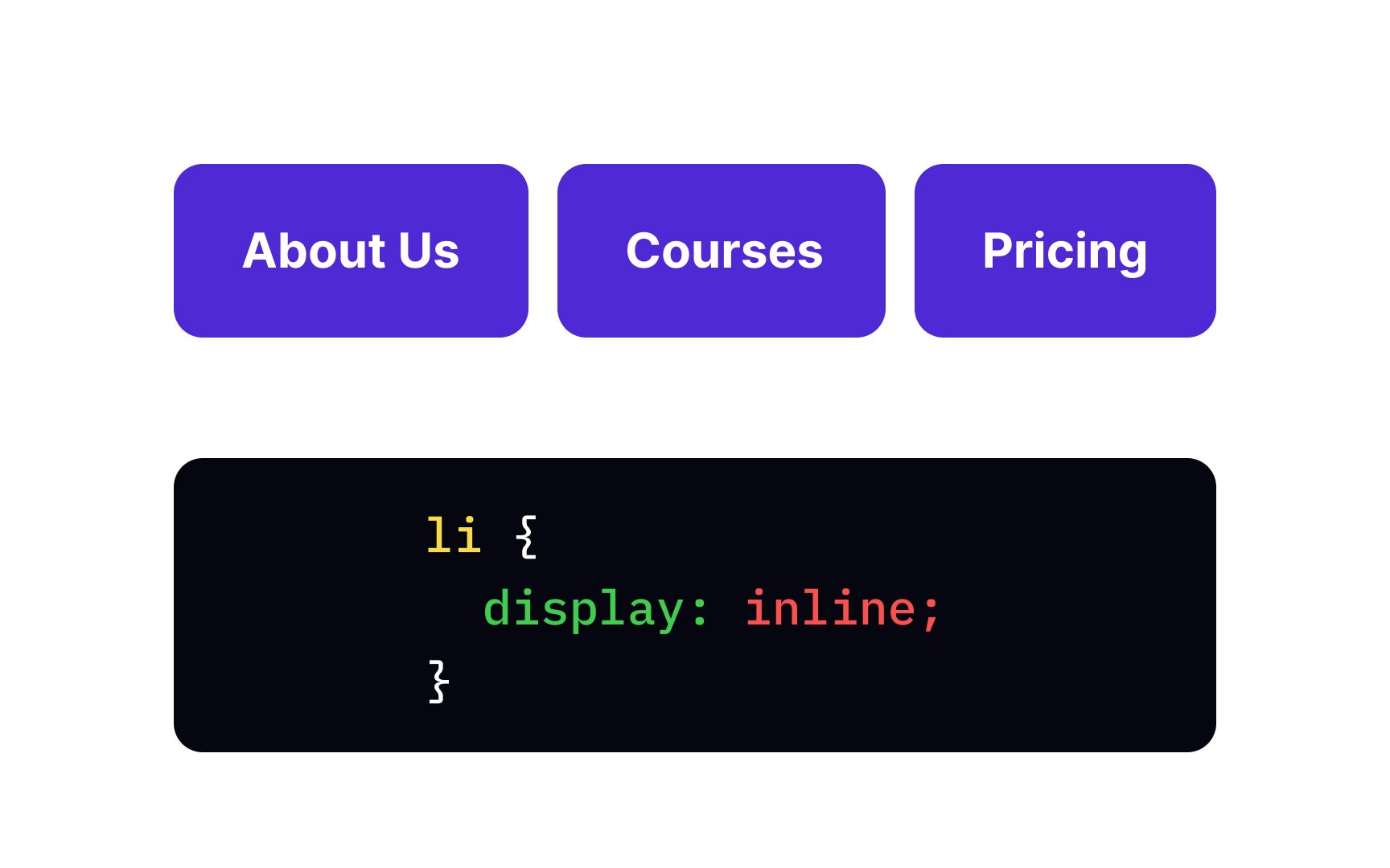
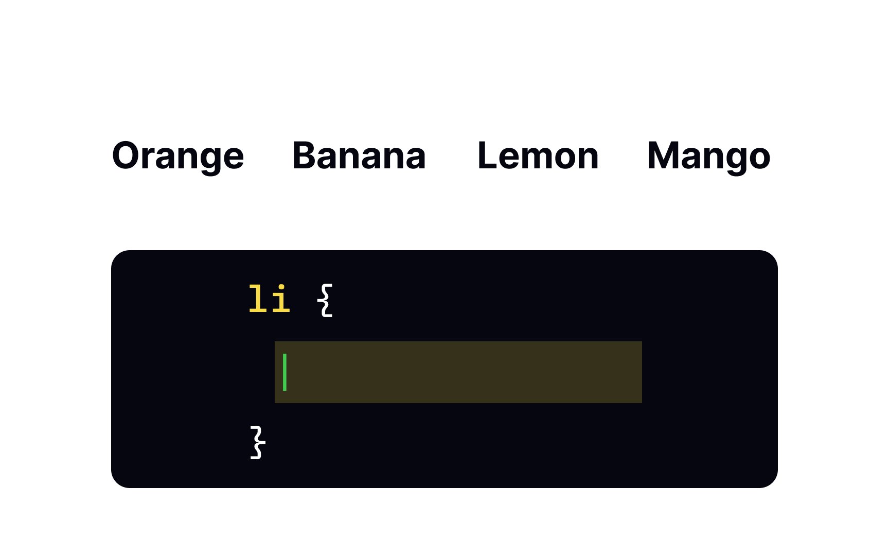
Inline-level elements are modest "guests": they take only as much space as they need and don't force a line break. Inline elements flow horizontally, and in contrast to block-level elements, you can't adjust their width and height. Typical inline elements are <span>, <a>, <img>, etc.
To make elements behave like they are inline, you need to specify the inline value of the display
The display property with the none value makes sure the element doesn't create any boxes. When do we need this behavior? Web developers often use this
Like how our parents' behavior impacts our habits and beliefs, the none value of a father element affects its children. Child elements don't form any boxes either, even if their display property is something different than none. The element has a none value by default.
When arranging elements on a
The tool name explains itself as it allows you to:
- Arrange elements both vertically and horizontally inside the container
- Spread elements over the container
- Shrink elements to fit into small space
- Make all columns in a multi-column
layout of the same height even if they contain a different amount ofcontent
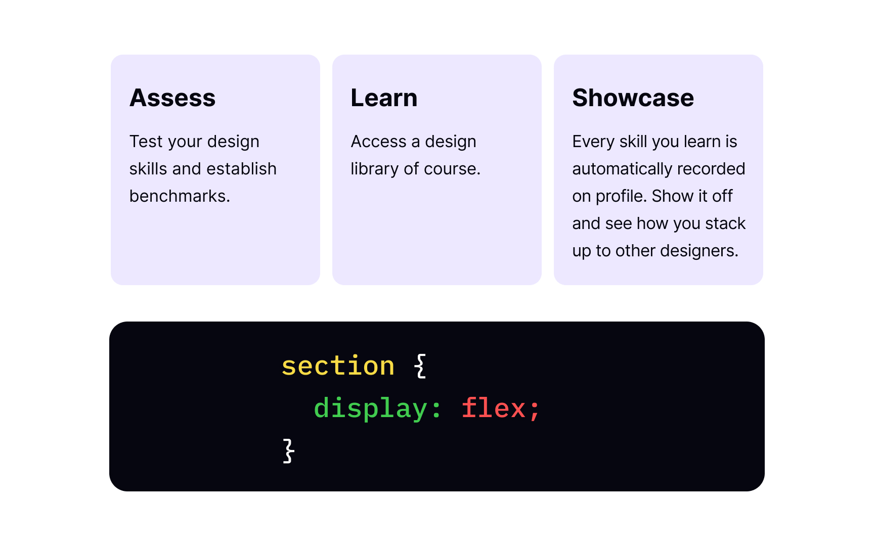
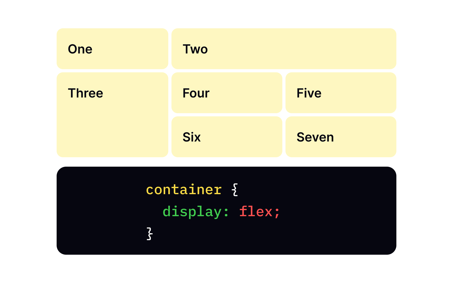
First, you need a parent element, like <section>, and children elements that will be laid out as flexible boxes. Then, we take a familiar display property with a special value of flex and apply it to the parent element. As a result, the <section> element becomes a flex container, and its children behave like flex items.
With one single display:flex; declaration, we have a multiple-column layout with equal-sized columns. Besides, an element with this value behaves like a block-level element, meaning no other content is allowed here.
Pro Tip: We use display:inline-flex when we want the whole flex container to behave like an inline-level element, while its children continue acting like flex items. The inline container takes as little space as possible while its inner items adapt and shrink to fit a smaller box.
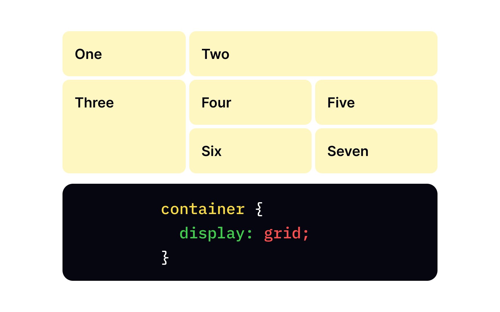
Like the flexbox, the grid is a
When you use the grid layout, you first create a layout and then put items into
Like the flexbox, the display:grid; declaration consists of a parent element and its child elements.
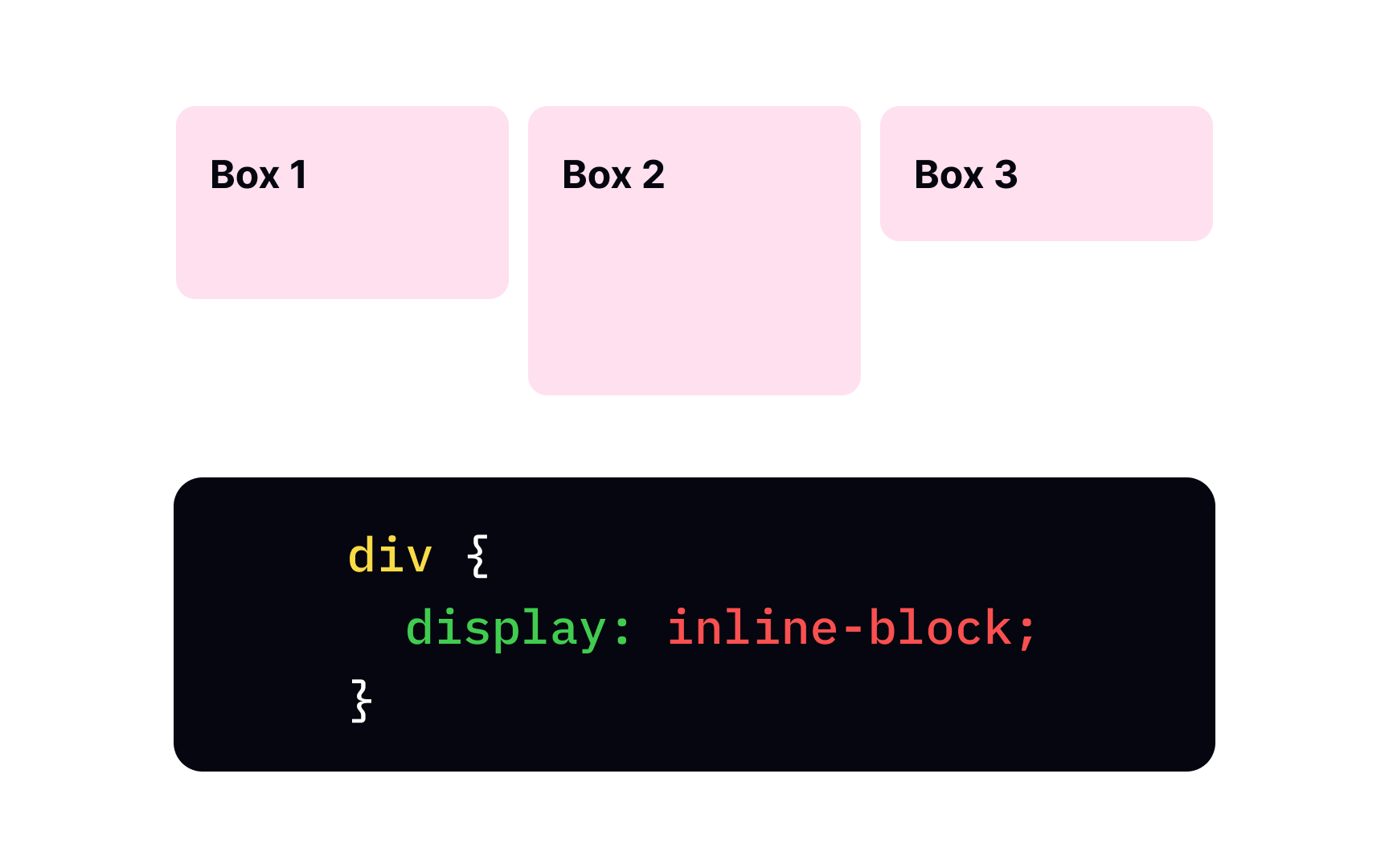
Inline-block elements took the best of two worlds. On the one hand, they behave like inline elements and can appear next to each other. On the other hand, inline-block elements form a box, and you can adjust their width and height, like block-level elements. The basic
{
display:inline-block;
}
The display:inline-block and display:inline-flex are quite similar declarations, but they have one distinct difference. Flex items don't behave inline — the whole
The inline value of the display
The display:none; is correct as once the element is hidden, the
Top contributors

Topics
From Course

Share


Similar lessons

CSS Basics

Introduction to CSS for Designers
