Types of Charts & When to Use Them
Match your data to the chart format that communicates it most clearly
Data alone doesn't tell a story. A spreadsheet full of numbers requires interpretation. Charts transform raw data into visual patterns that users can grasp quickly, revealing trends, comparisons, and distributions that would be difficult to spot in a table. But not all charts work for all data. A pie chart shows parts of a whole but falls apart with too many slices. A line chart tracks change over time but misleads when applied to unrelated categories. A scatter plot reveals correlations between variables but confuses users expecting a clear trend line.
Choosing the right chart means understanding what you're trying to communicate. Are you comparing quantities? Showing composition? Tracking trends? Revealing relationships? Each question points toward different chart types.
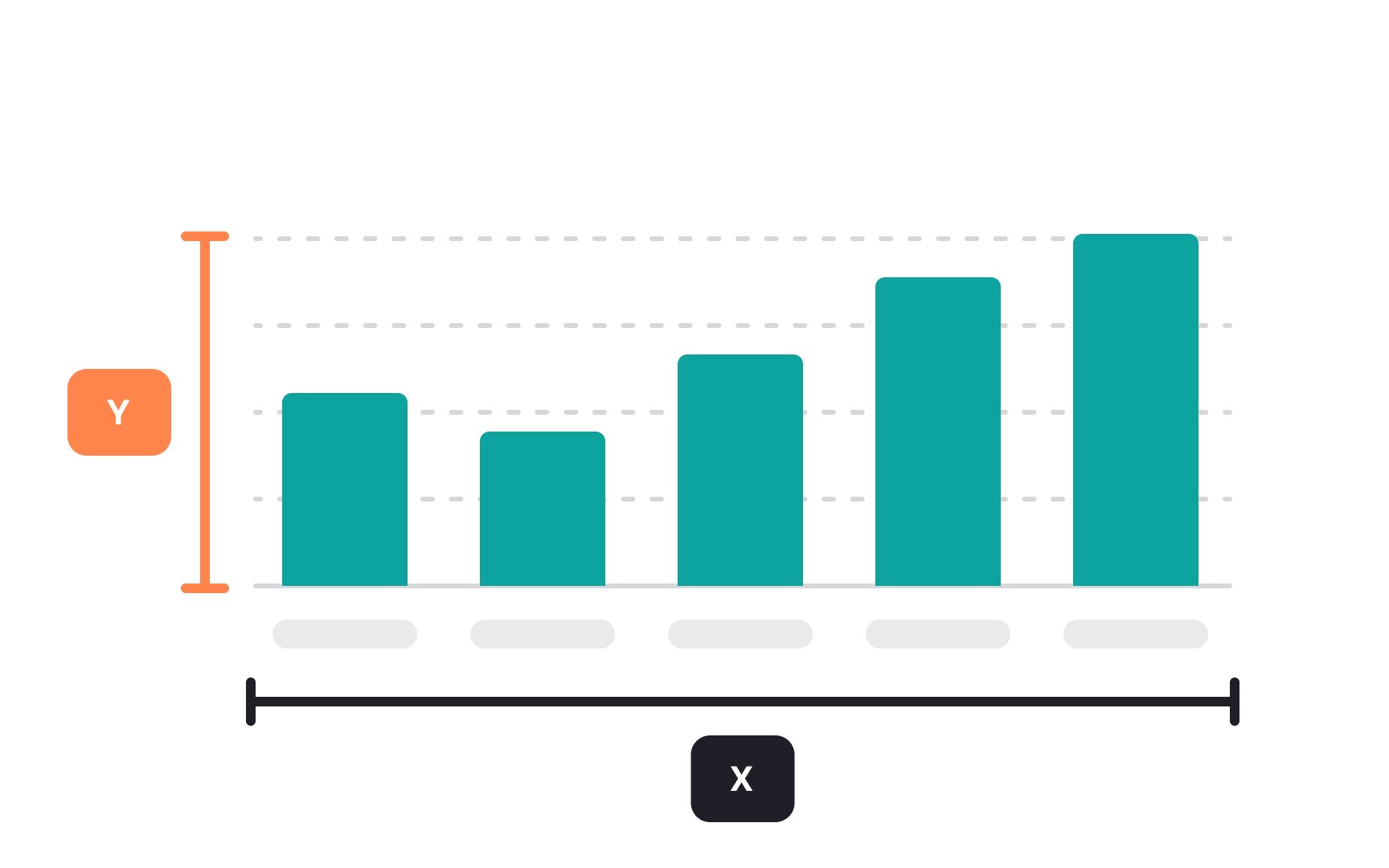
The X and Y axes are the two reference lines on a graph or
Together, these axes form a grid where data points can be plotted, allowing us to see patterns, trends, or relationships within the data. They are fundamental in understanding how one variable may affect another and in making comparisons clear and easy to analyze.
Pro Tip: Use the y-axis to represent quantities.
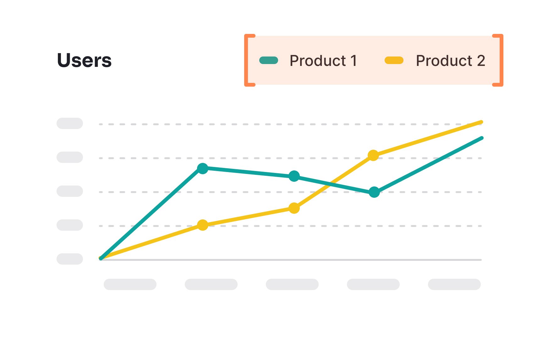
A legend in a
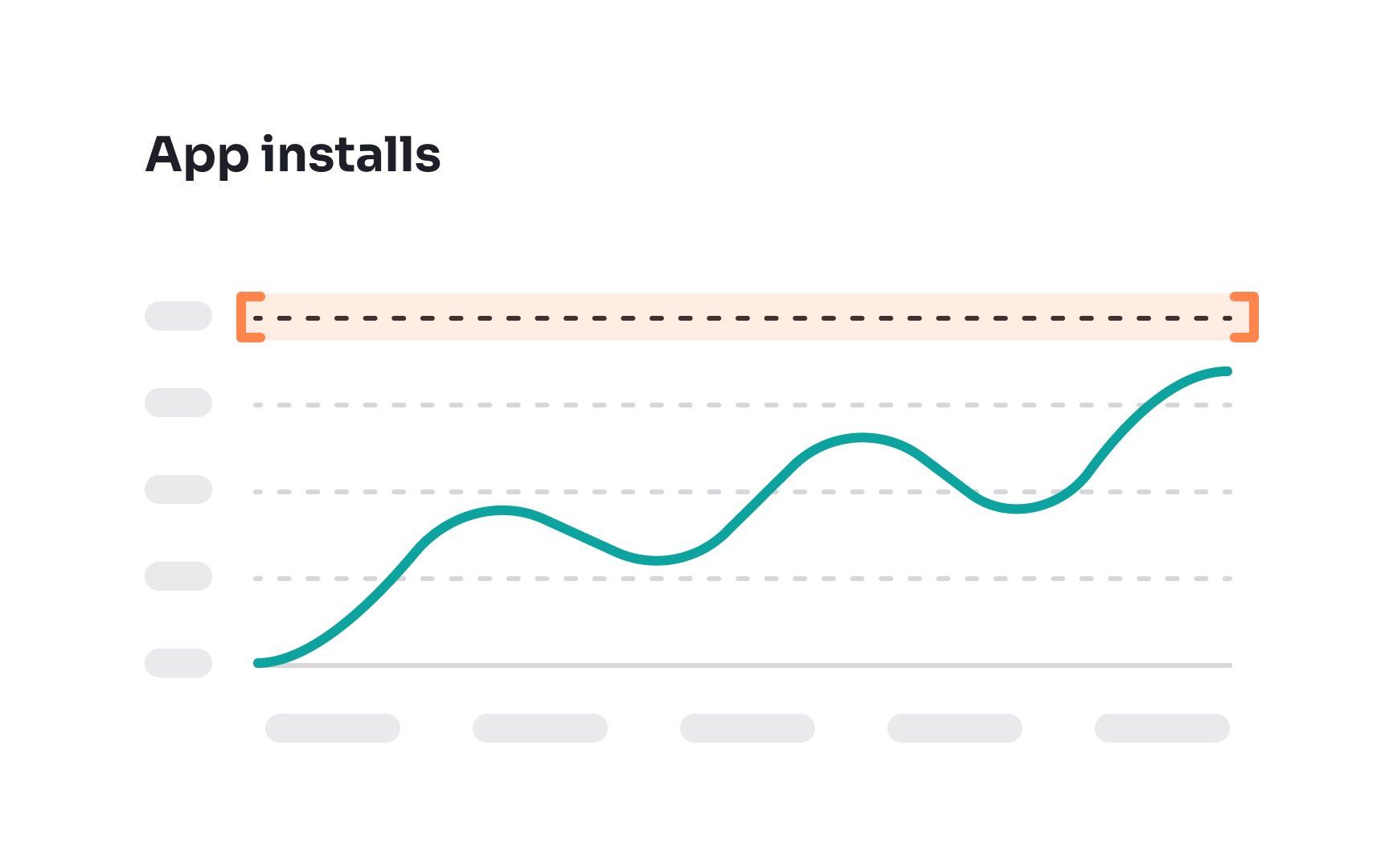
Gridlines in
While not always necessary, gridlines can significantly enhance a chart's readability, especially when dealing with large sets of numbers or complex data.
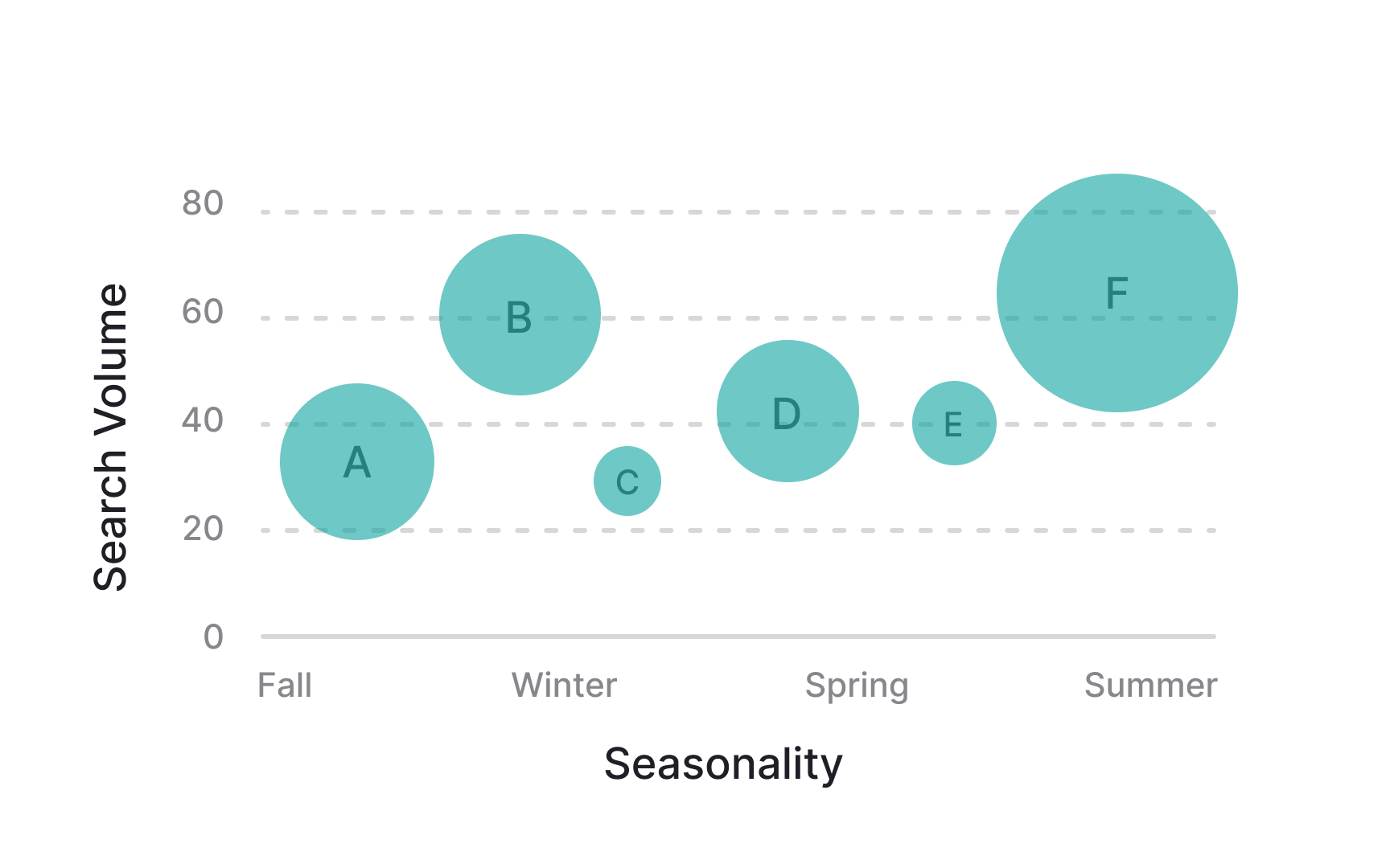
Bubble
These charts are great for visualizing complex relationships between numerical variables. For example, you might use a bubble chart to compare movies by showing their worldwide grosses through bubble size, with the year of release on the X-axis and production budget on the Y-axis.
However, bubble charts can become cluttered and confusing when there is too much data or when the data doesn't fit well into 3 dimensions.
Pro Tip: Always mention in the legend what different bubble sizes mean.
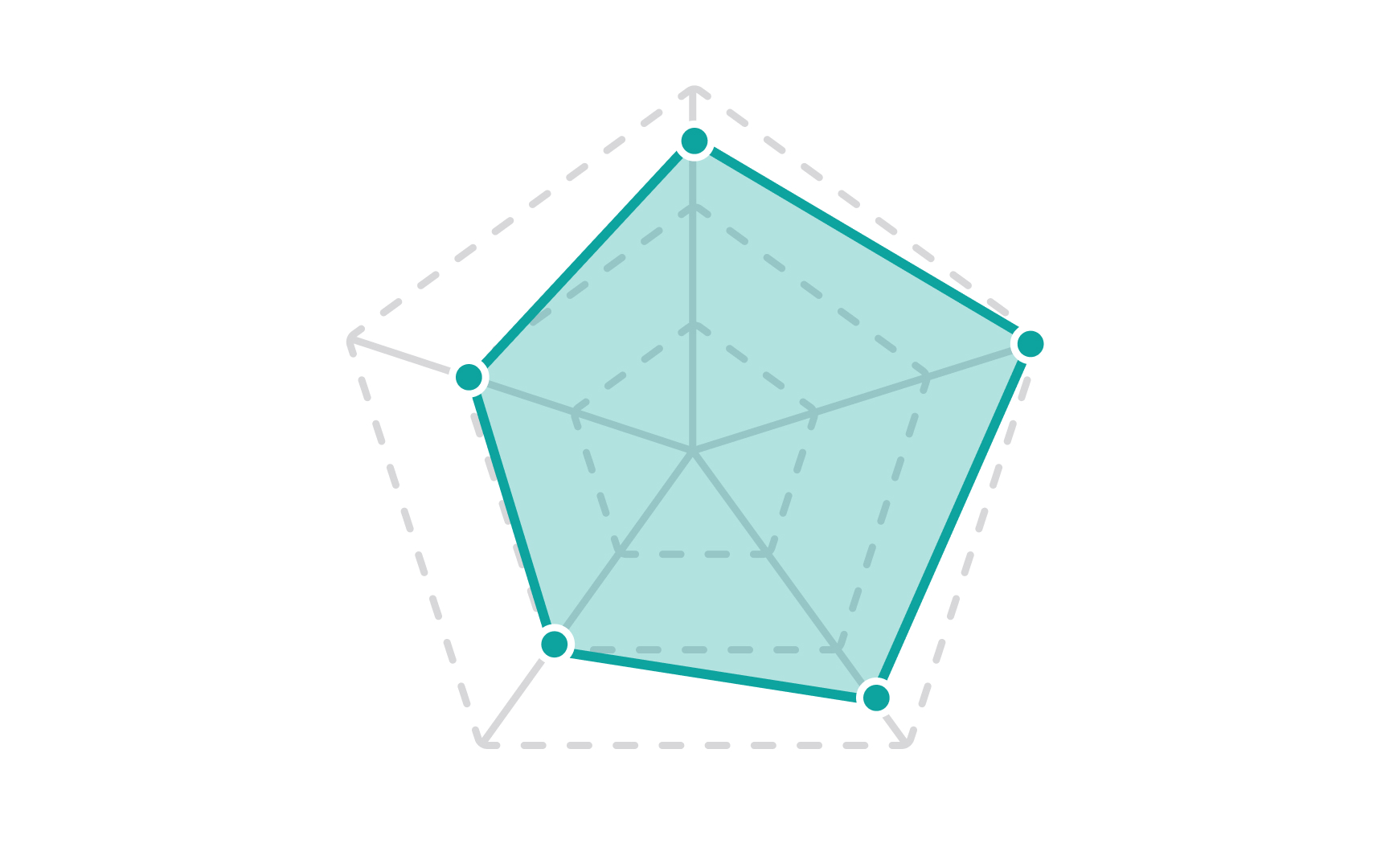
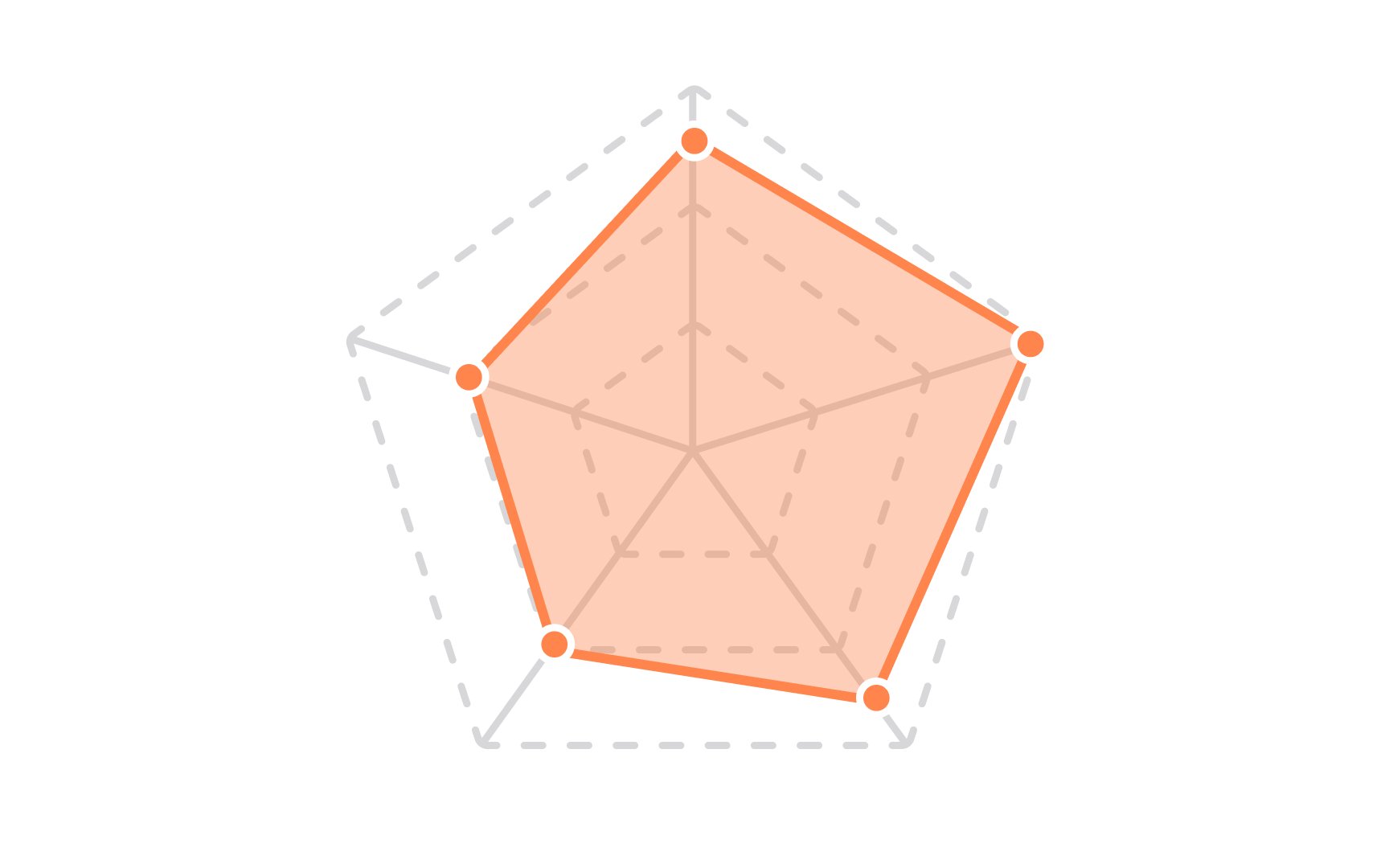
Radar
While radar charts are a good choice for comparing multiple variables, they may be hard to interpret if you use too many or too distinctive variables or have multiple color-filled polygons in one radar chart.
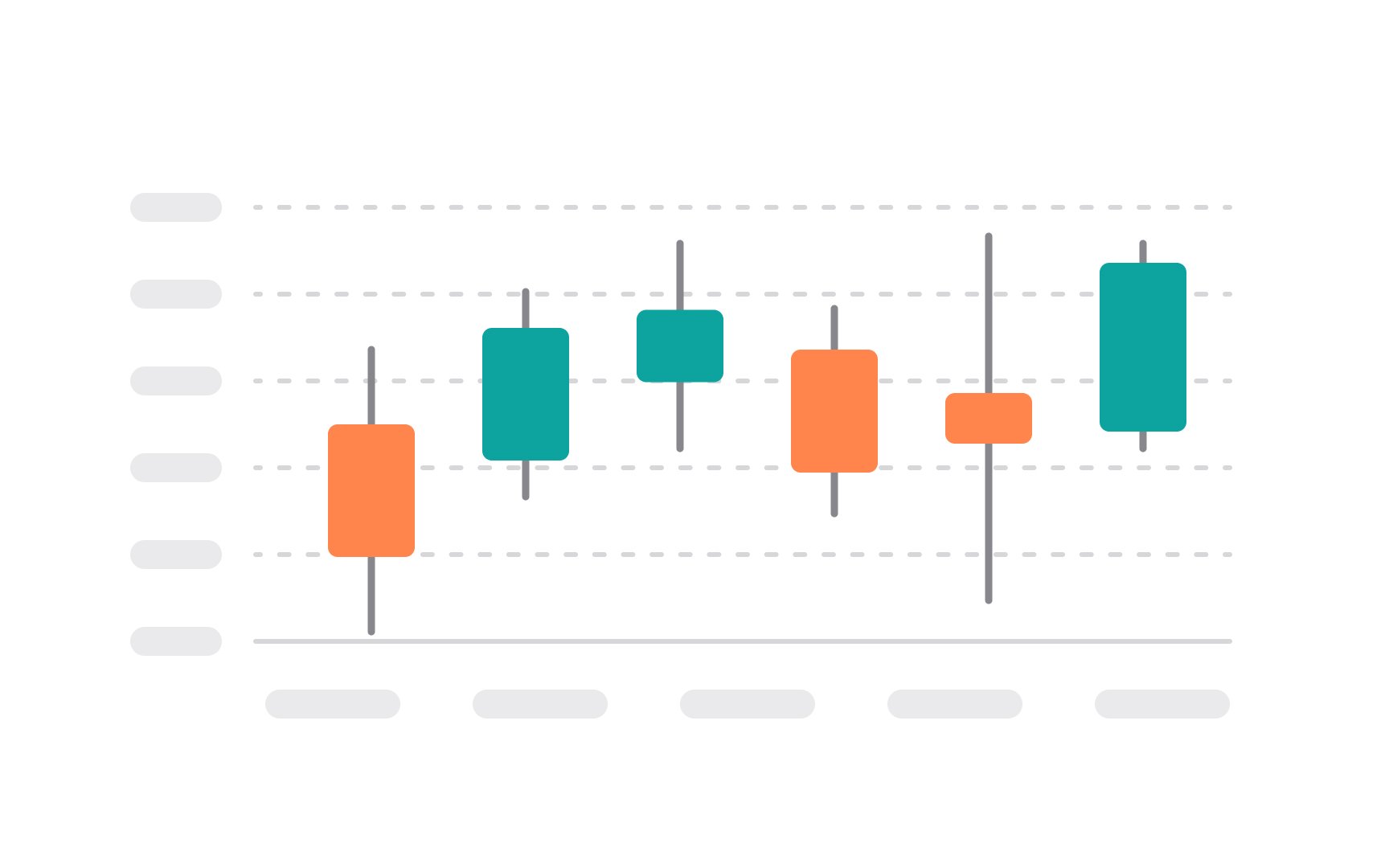
A candlestick chart is a type of financial chart used to describe the price movements of a security, derivative, or currency over time.
The main part of the candlestick is the "body," which represents the range between the opening and closing prices. If the closing price is higher than the opening price, the body is often white or unfilled, indicating a price rise. Conversely, if the closing price is lower, the body is usually black or filled, indicating a price drop. Thin lines called "wicks" or "shadows" extend from the body's top and bottom to show the period's high and low prices. These provide additional information about price variability within the trading period.[1]
Candlestick
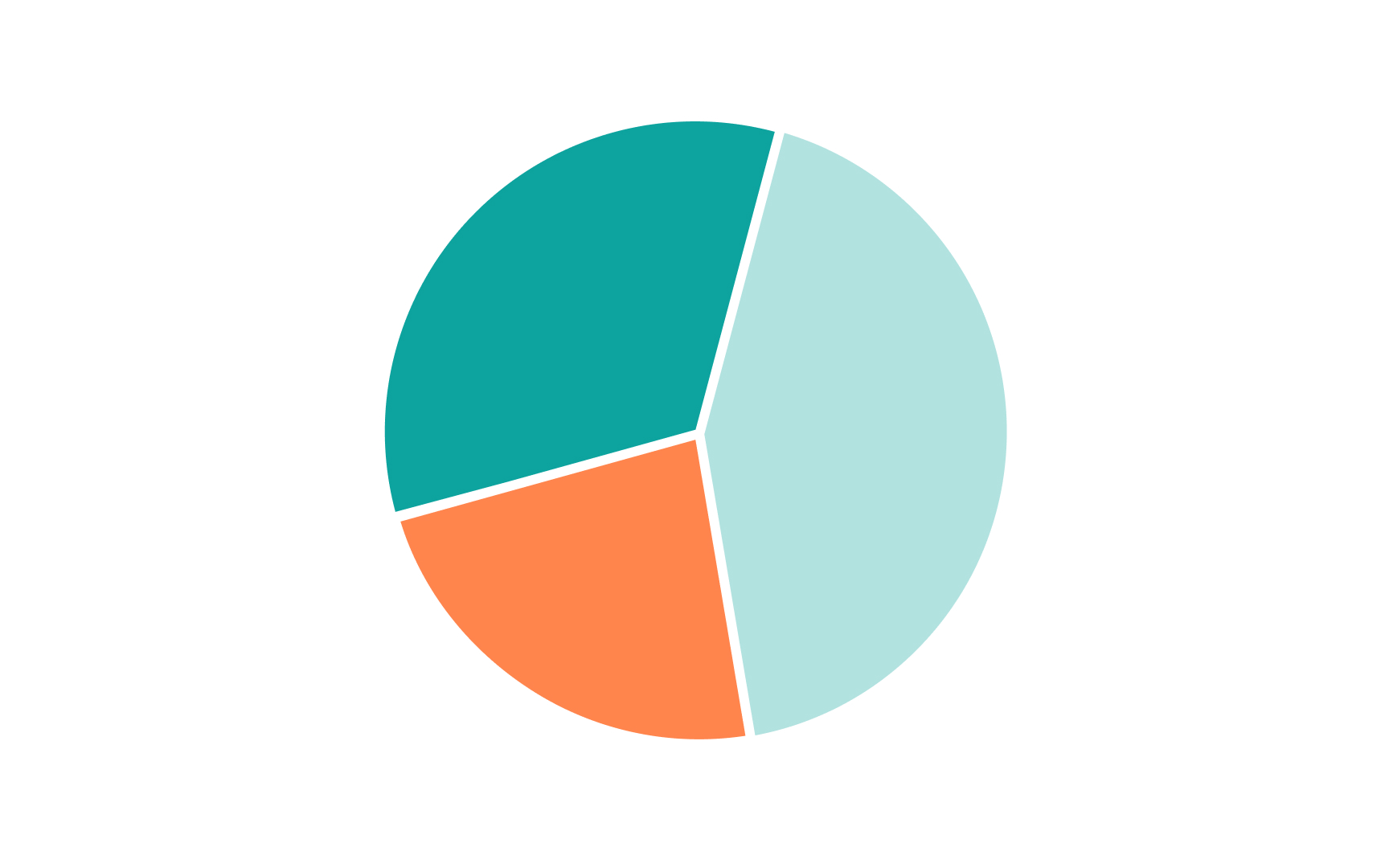
A pie chart is a circular graphic divided into slices to show numerical proportions. Each slice represents a different category, with the entire circle representing the total data set. The size of each slice is proportional to its quantity.
Pie
Pro Tip: Consider using other types than a pie chart if you want to compare categories to each other rather than each category to a whole.
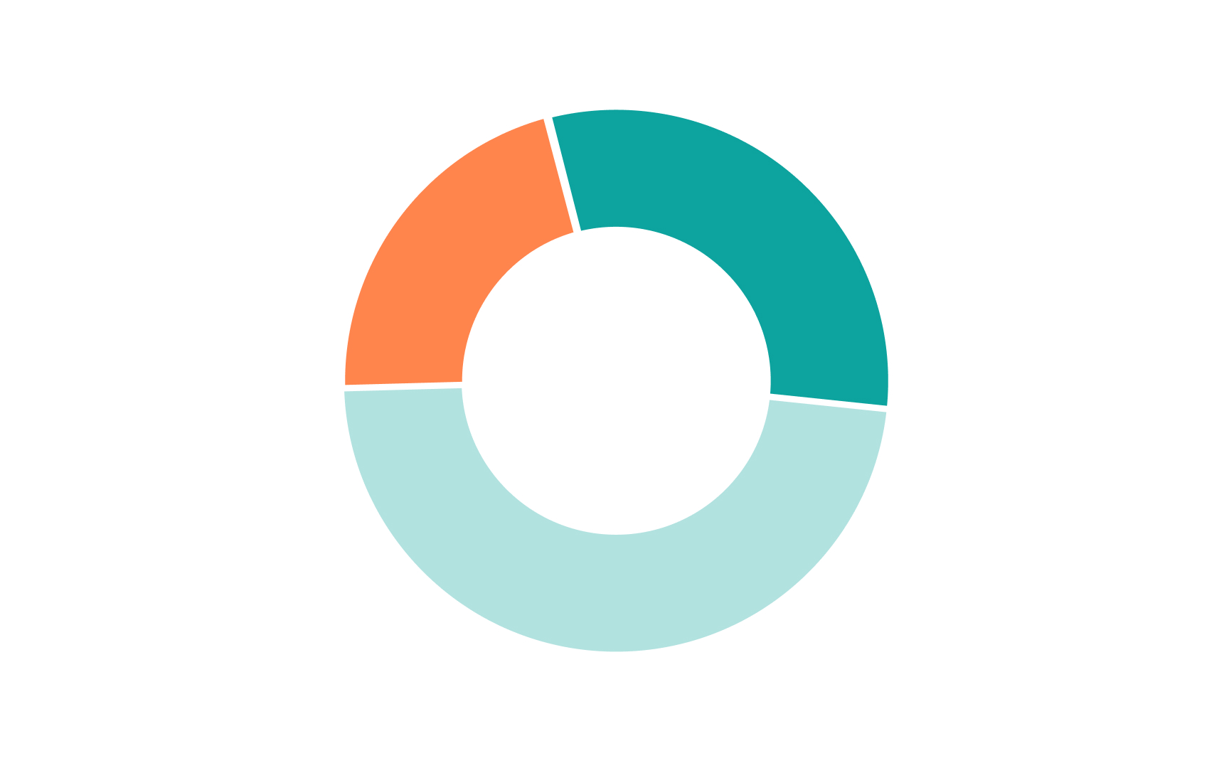
A donut chart is similar to a pie chart but has a blank center, creating a ring shape rather than a solid circle. This central space can be used for additional information or simply to make the chart more visually appealing. The main difference from a pie chart is aesthetic, but this hole in the middle can sometimes make it easier to read, especially when comparing multiple
When choosing between a donut and a pie chart, consider the complexity of your data. Donut charts can be more effective when you have a large number of categories or when the differences between them are subtle.
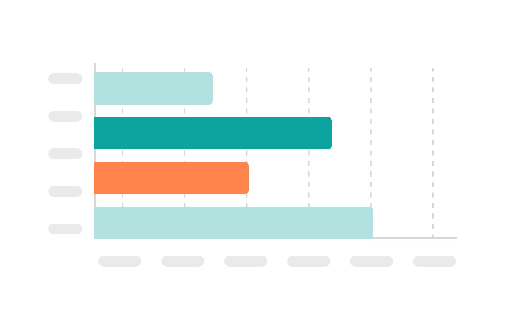
Bar
Bar charts are particularly useful for comparing discrete categories or groups. For instance, they can be used to compare the sales of different products, the population of different cities, or the scores of different groups. They can also show changes over time if the categories are different time periods.
They can be displayed horizontally or vertically. Horizontal bar charts are a good option when you have long labels — for example, feature names or task descriptions.
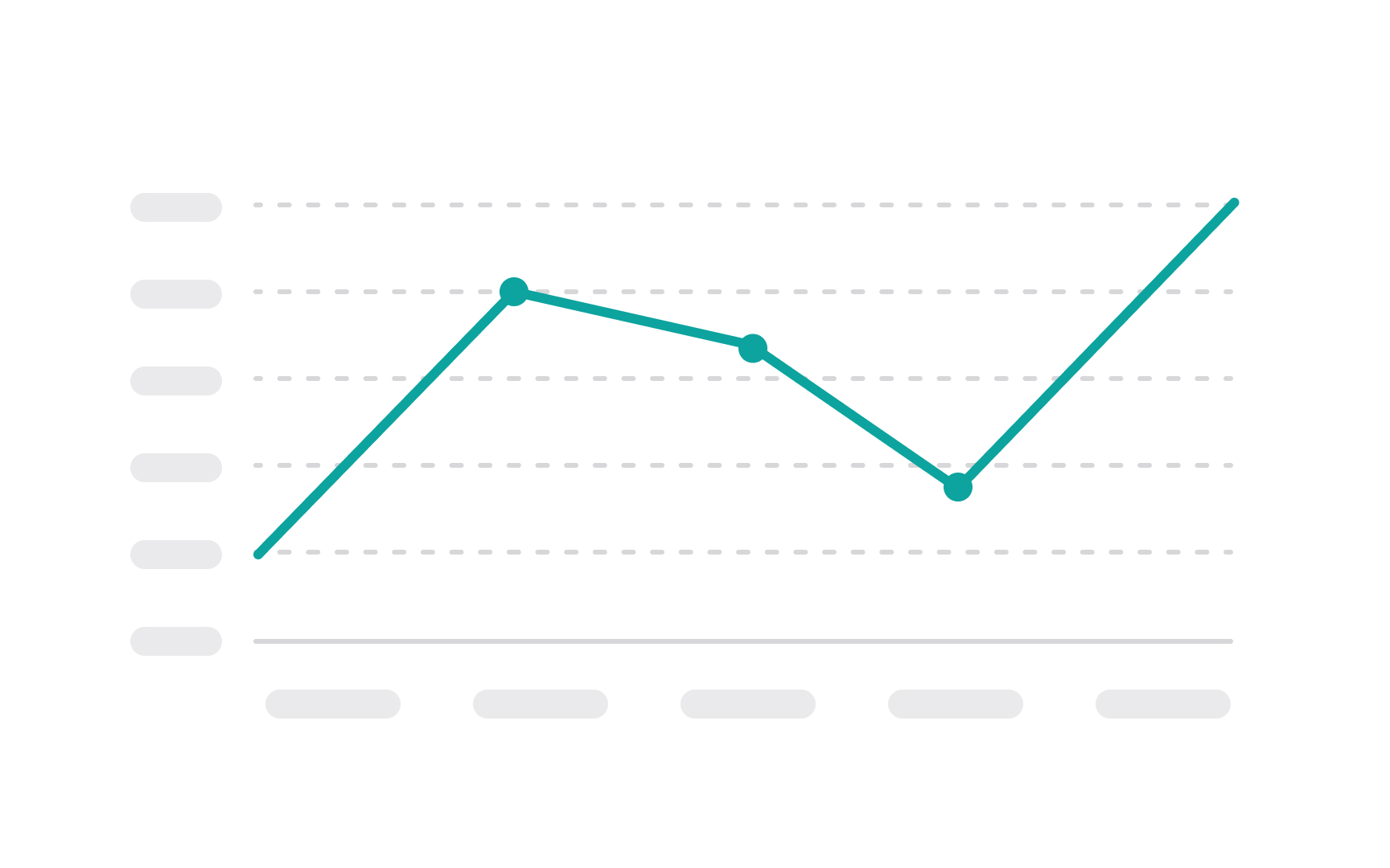
A line chart is used to display information as a series of data points, known as markers, connected by straight line segments. It's one of the most basic and commonly used chart types, typically used to show trends over time or continuous data.
In a line chart, the X-axis often represents a time interval or a sequence of values, while the Y-axis represents the scale of the values being measured. Each data point on the chart corresponds to a specific value on each axis. When the points are connected by lines, they show the rate of change between the data points, making it easy to see increases and decreases, patterns, or trends.
In contrast to bar
If you take a line chart and
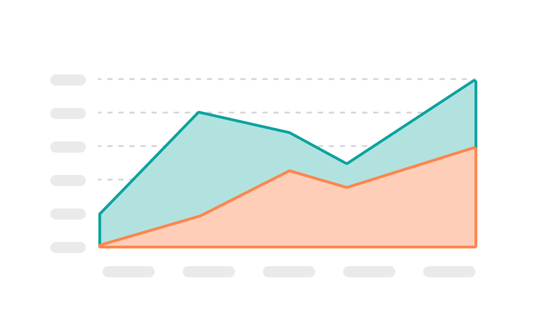
Generally, when we say "area chart," we imply the stacked area chart, where each region illustrates its contribution to the total. For example, you can use stacked area charts to display the number of active users who have a free plan, a basic plan, and a premium plan. Overlapping area charts allow us to compare the values between groups. They can be quite confusing to read if you have more than two areas.
To help users read area charts with less pain, it's a good idea to select the right order of areas. Usually, the most stable and large ones should lay the foundation, while the most variable or smallest groups should go on top.
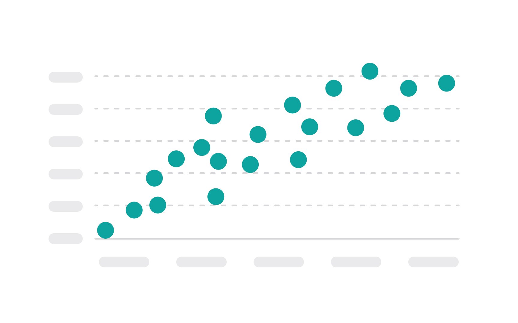
A scatter plot uses dots to represent the values obtained for two different variables — one plotted along the x-axis and the other plotted along the y-axis. Each point on the scatter plot represents an individual data point.
The main purpose of a scatter plot is to show how much one variable is affected by another, or to show the distribution trends. It's a valuable analytical tool in statistics and data analysis for identifying correlations between variables, spotting outliers, clusters, and trends. For example, in a scatter plot comparing the relationship between exercise and weight loss, each point would represent a different person, with their amount of daily exercise on the x-axis and their weight loss on the y-axis.
Patterns in the scatter plot might reveal correlations, such as whether more exercise generally leads to more weight loss. Keep in mind that plotting too many data points can result in overlapping, making it hard or even impossible to identify relationships between variables.[4]
References
- What Is a Candlestick Pattern? | Investopedia
- A Complete Guide to Line Charts | Chartio
- Chart Types: Area Charts, Stacked Area Charts, and 100% Stacked Area Charts | Spreadsheet.com Support
- Scatter Plot | Corporate Finance Institute
Top contributors


Topics
From Course

Share


Similar lessons

Common UI Components Part I

Image Terminology
