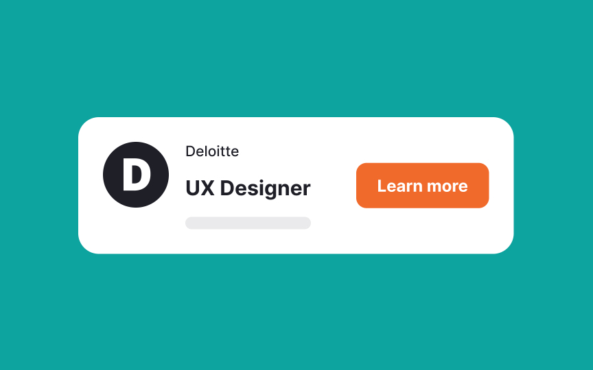
CTA button microcopy
CTA buttons are usually the most noticeable elements on a page, designed to grab attention and encourage users to take action, like signing up, buying a product, subscribing, or booking a demo. On some pages, writers can get creative with CTA labels. For example, Airbnb’s "I'm flexible" lets users explore accommodations without choosing a specific location.
However, on pages like checkout or payment, simplicity is key. Clear labels like "Confirm payment," "Place order," or "Submit purchase" ease concerns about spending money or making errors.
The best practice for CTA copy is to focus on user needs and expectations. Avoid overly creative labels that might confuse users. For instance, "Let's start the adventure" for cloud storage plans feels vague, while "Find a plan for you" is much clearer.


