Deceptive Patterns
Practice identifying and avoiding deceptive design patterns to build user trust
Deceptive patterns, also known as dark patterns, are design tactics that manipulate users into actions benefiting the company, often at users' expense. Designers sometimes use these unintentionally, aiming to boost engagement or sales without realizing the ethical implications. For example, a reminder email for an abandoned cart can ethically nudge users to complete a purchase by including helpful details or a discount.
Conversely, a deceptive pattern might automatically add items to the cart or hide the "unsubscribe" option. These tactics pressure users into unintended actions, eroding trust. This lesson will teach you how to draw the line between helpful guidance and unethical tactics to build user trust and ensure a positive experience.
Deceptive patterns are design tricks that manipulate users into taking actions that benefit a company, often at users' expense. These patterns deceive, mislead, or obstruct users from making informed choices.
These deceptive practices harm users in several ways such as:
- Financial loss, such as unwanted charges from hard-to-cancel subscriptions.
- Loss of privacy when users unknowingly share personal data due to unclear opt-out options. Vulnerable users, like those with limited digital literacy or busy schedules, are particularly at risk.
Using deceptive patterns damages trust. When users feel tricked, they lose confidence in the service and are unlikely to return.
Deceptive patterns are common in digital design and web practices. A study from 2019 by Princeton University and the University of Chicago revealed that over 10% of 11,000 popular e-commerce sites used deceptive design patterns.[1]
The widespread nature of deceptive patterns can be attributed to two main factors:
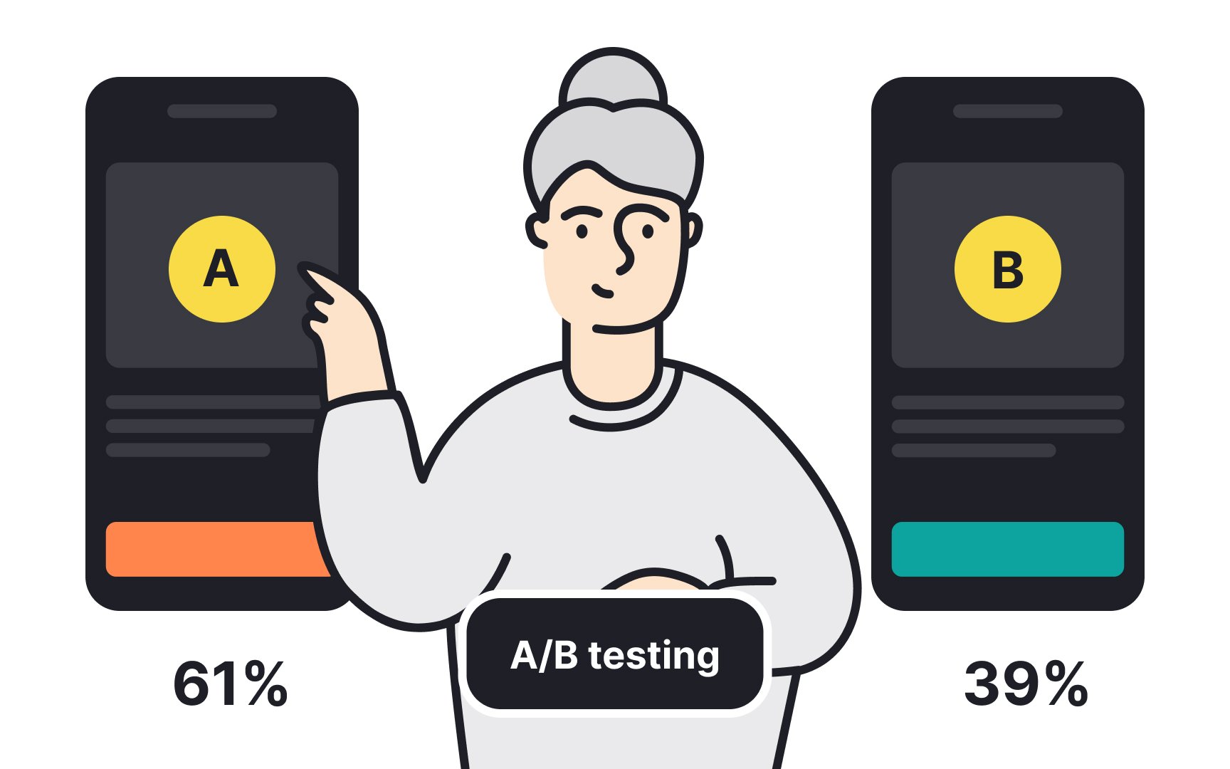
- A/B testing and conversion focus: With the rise of A/B testing to optimize conversions, many companies use deceptive design tactics to boost immediate results. For instance, a service might hide the Cancel
Subscription button while highlighting the upgrade option, pushing users to make a choice that benefits the company. - Copycat designs: Companies often replicate competitors' designs, which can lead to the spread of deceptive practices. For example, if a well-known retailer uses misleading sale countdowns to create false urgency, other retailers might adopt the same strategy, believing it's an industry norm.
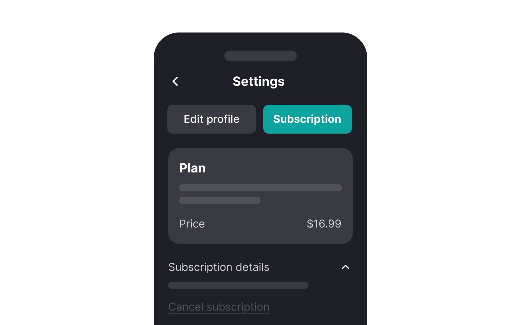

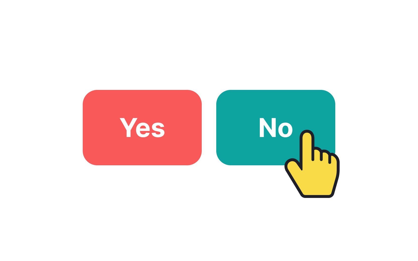
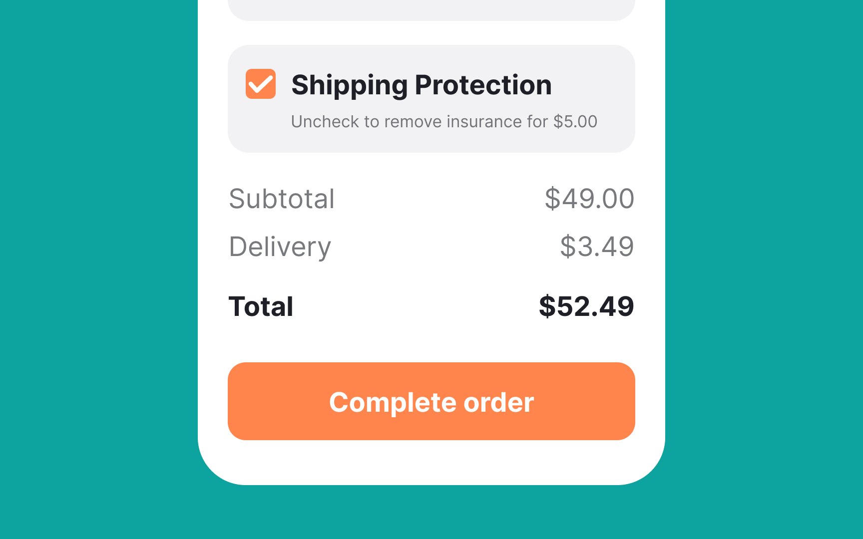
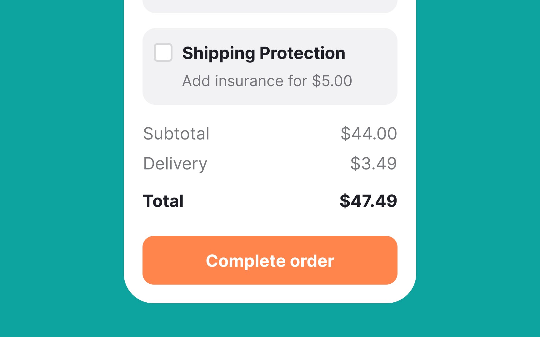
Obstruction is a deceptive pattern where companies make it hard for users to make choices that don’t benefit the company. This is done by increasing the effort needed to find important information or perform specific actions. A common obstruction tactic is hiding exit options. Also known as the roach motel pattern, this tactic makes it very difficult to cancel a service. For example, an automated monthly
Visual or wording tricks in design exploit the limits of human cognition, taking advantage of cognitive biases or breaking common
Here are a few common examples:
- Tricky language: Some products use confusing language to compel users into buying or subscribing to something they don't want. For example, a
subscription service might have a checkbox that says, "Uncheck to avoid subscribing to our newsletter," which can easily confuse users. - Misdirection: This involves using design elements to distract users from what is really happening. An example would be a flashy banner promoting a discount that overshadows a small note saying the discount applies only after enrolling in a monthly plan.
- Hidden information: Sometimes, critical information is hidden in places where users are unlikely to look. For example, hiding cancellation fees or renewal terms in small print at the bottom of the page makes it hard for users to make informed decisions.
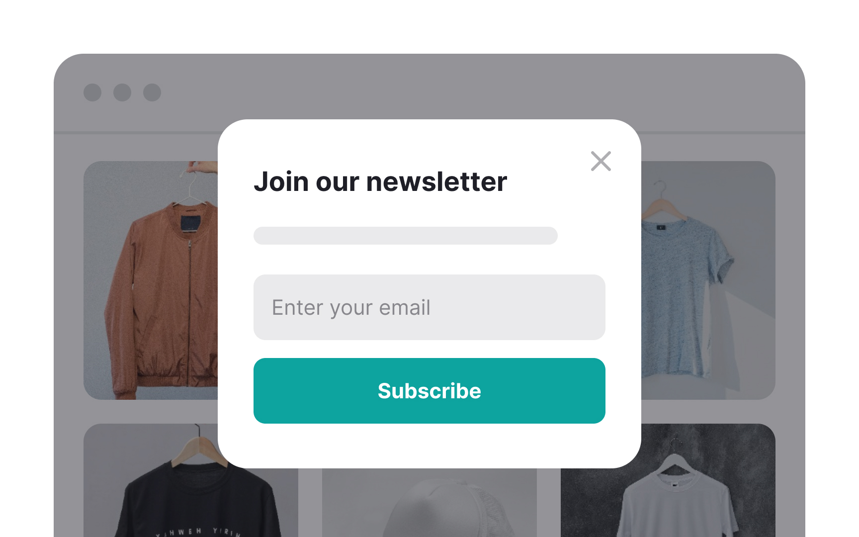
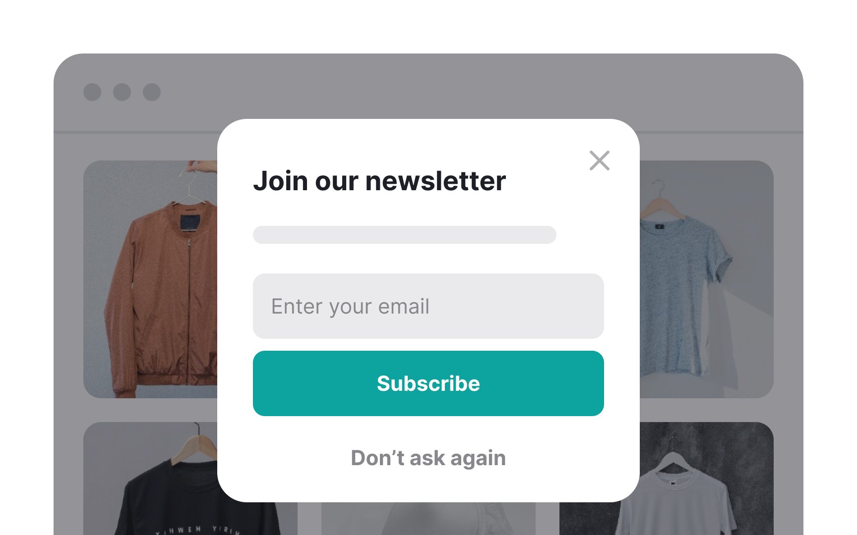
Nagging is a deceptive pattern where users are persistently pushed to agree to something, even if they have already declined the request. This tactic wears down users, making them more likely to give in out of frustration. For example, a website that repeatedly shows pop-ups asking users to sign up for a newsletter. Even after closing the pop-up several times, it reappears on every visit, interrupting the browsing experience.
This persistent nagging can lead users to subscribe just to avoid the constant interruptions.
These nagging tactics are not only frustrating but also undermine trust. Users feel pressured and manipulated, which can lead to a negative perception of the brand.
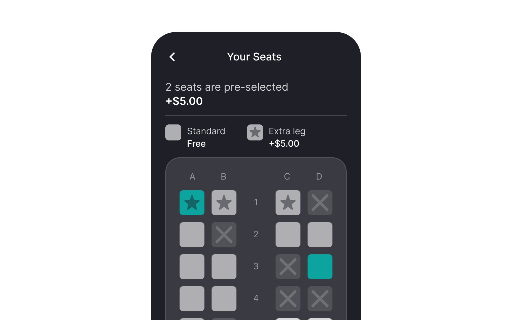
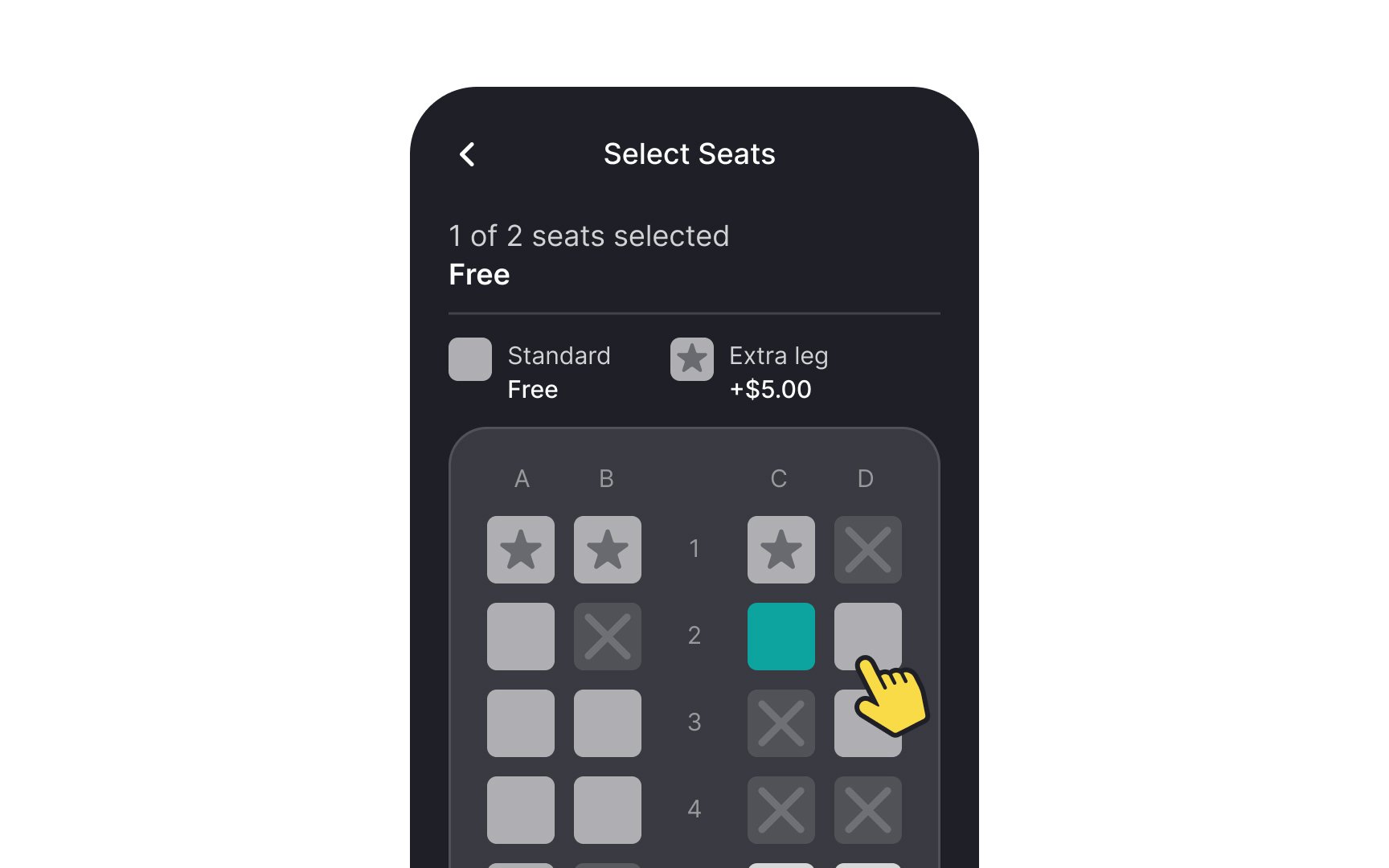
Sneaking or preselection is a deceptive pattern where additional items or options are automatically added to users' baskets or preselected during the purchase process. This tactic relies on users not noticing these extras, leading them to make unintended purchases. For example, imagine a
These sneaking tactics can frustrate users and erode trust, as they feel tricked into paying more than they intended.
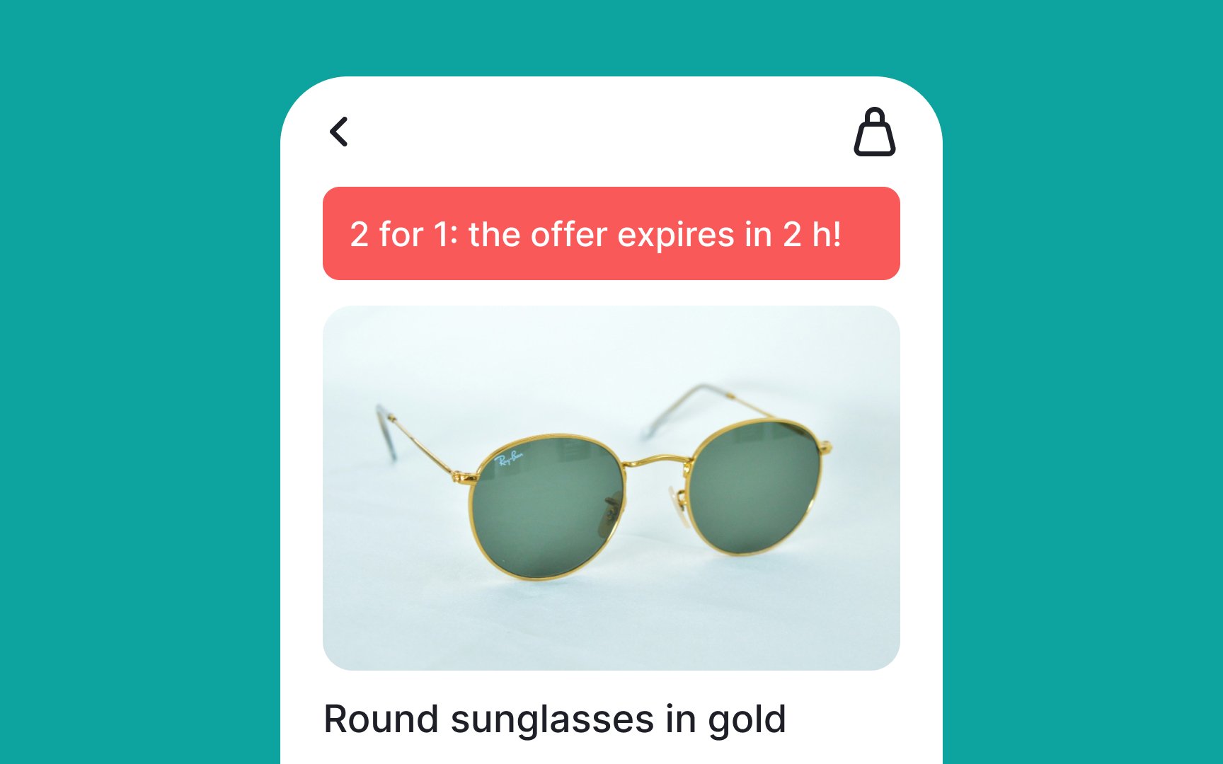

Imposing the fear of missing out (FOMO) is a deceptive pattern that exploits users' anxiety about missing out on something valuable or limited. This tactic creates a sense of urgency, pushing users to make quick decisions without fully considering their options. For example, an e-commerce site might display a countdown timer on a product
These FOMO tactics can lead to regretful purchases and diminished trust. Ethical design should focus on providing accurate information and allowing users to make decisions at their own pace, without artificial pressure.
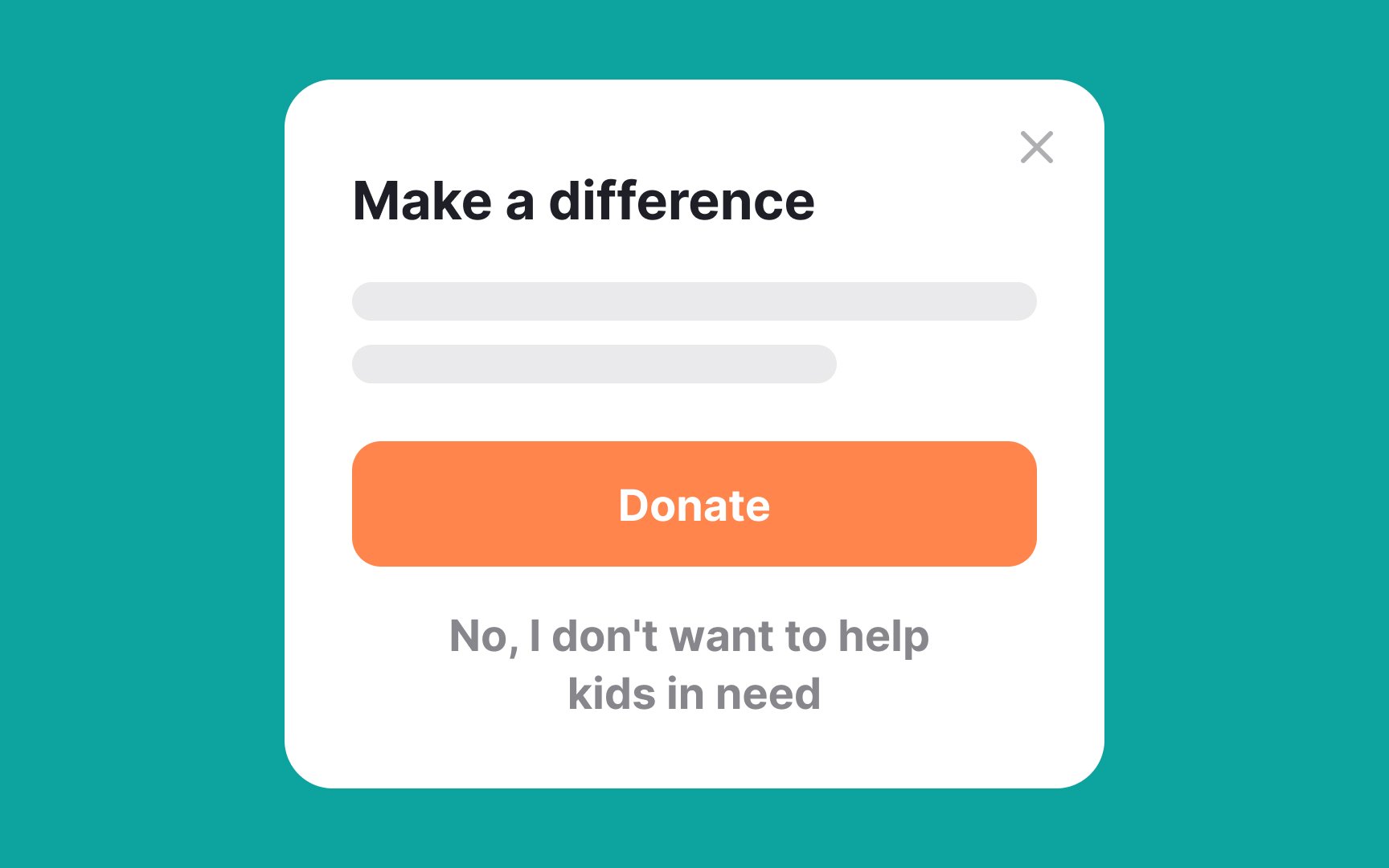
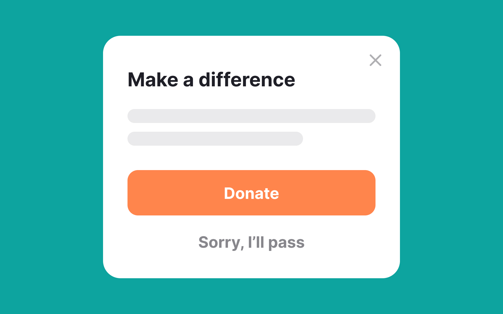
Imposing guilt is a deceptive pattern where users are made to feel bad for not taking a certain action, often through the use of shame-inducing language. This tactic, known as confirmshaming, aims to manipulate users into complying by making them feel guilty or ashamed for opting out. For example, a fitness app might use an opt-out
Shame is a powerful emotion that can make users uncomfortable and even trigger stress and anxiety. It's important to avoid using guilt as a motivator in design. Instead, focus on positive reinforcement, such as highlighting the benefits of taking an action without making users feel bad for opting out.
Here are some practical steps to ensure your designs are ethical and user-friendly:
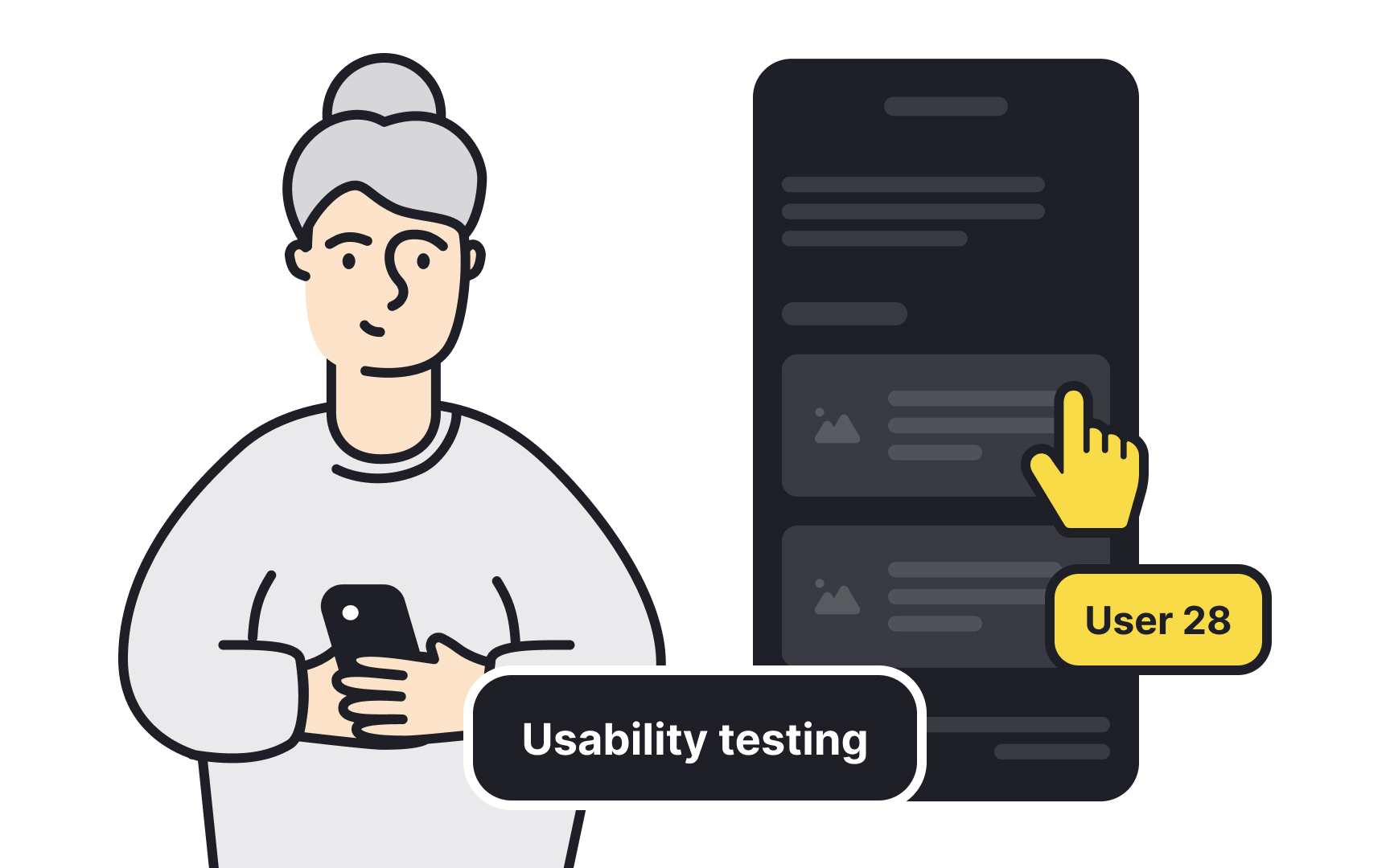
- Regular user testing: Regularly testing your designs with users can help identify any issues or deceptive patterns. Users often react negatively to obvious deceptive patterns, expressing anger or frustration.
- Amended cognitive walkthrough: Conduct a cognitive walkthrough of your design by asking key questions to identify potential ethical issues. Could users spend more money or provide more personal data than intended? Is the exchange fair when users consent to something for a benefit? Are users rushed or emotionally manipulated into decisions?
- Transparency and honesty: If a
subscription service includes additional fees, these should be disclosed clearly and early in the process. Avoid using tricky language that might mislead users into unintended actions.
References
- Deceptive Patterns in UX: How to Recognize and Avoid Them | Nielsen Norman Group
Top contributors

Topics
From Course

Share


Similar lessons

Cognitive Biases

UX Laws
