Make buttons easy to tap
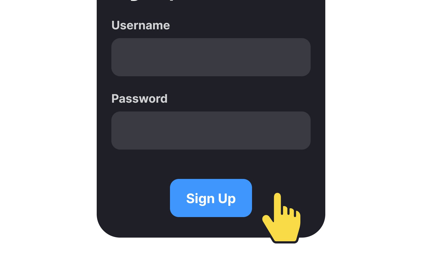
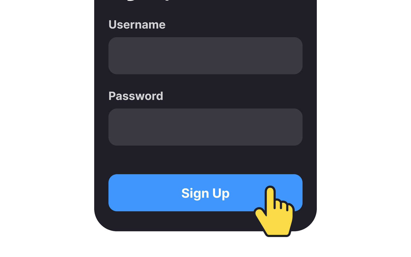
Primary buttons should lure users in and encourage them to interact. For that purpose, buttons with large touch areas are easier to catch user attention, look more engaging, and seem less error-prone.
The minimum touch target area is 1x1 cm (approximately 38px).[1] It leaves some room for error even when users are moving or holding the phone and typing with one hand.
Having the same button width as the form inputs is a matter of taste, but it makes the design more balanced and consistent.
