Fit a label into a single line
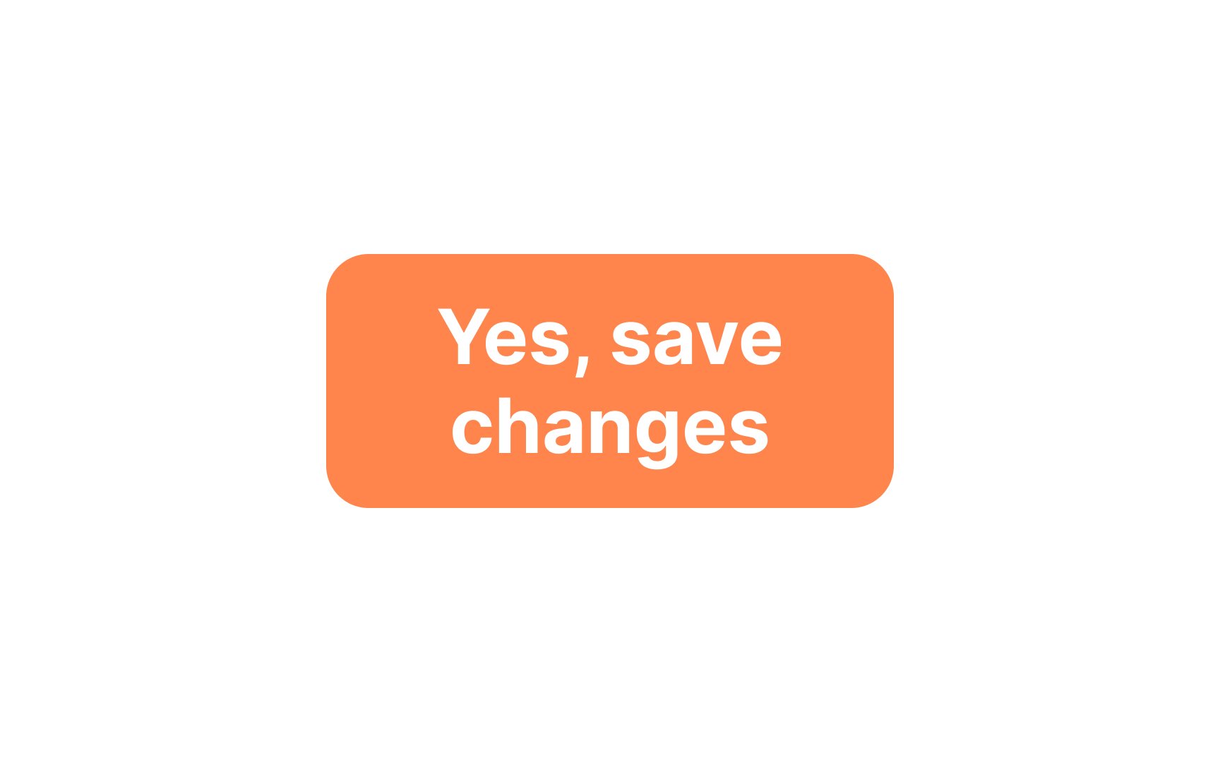
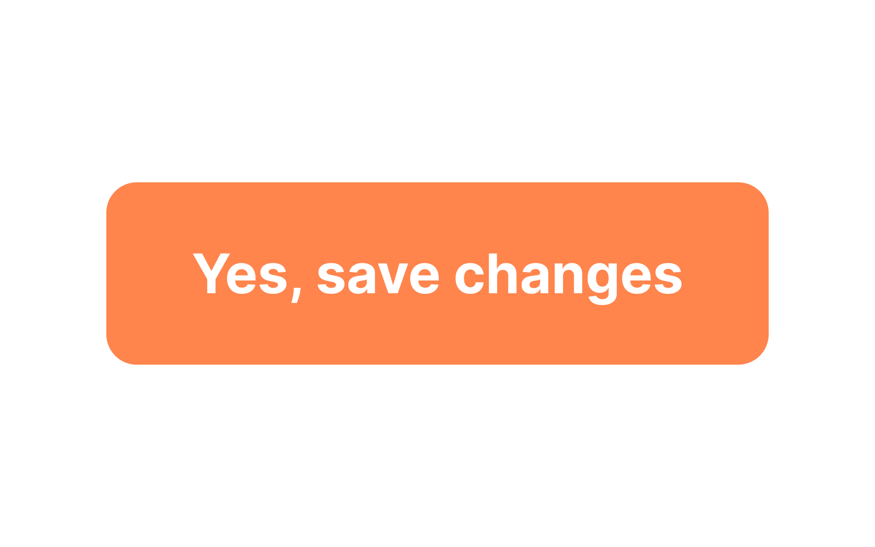
Breaking a button label into two lines usually creates confusion for users, making them more likely to choose the wrong action. To maintain user-friendly design, it's advisable to fit your button labels into a single line whenever possible.
However, exceptions do exist. For instance, some specialized call-to-action buttons may have secondary text situated above or below the main label. If you decide to take this approach, always remember to conduct A/B tests to gauge the button's effectiveness. Importantly, the primary action the button serves should remain clear and confined to a single line for the sake of readability.[1]
