Use legible typefaces
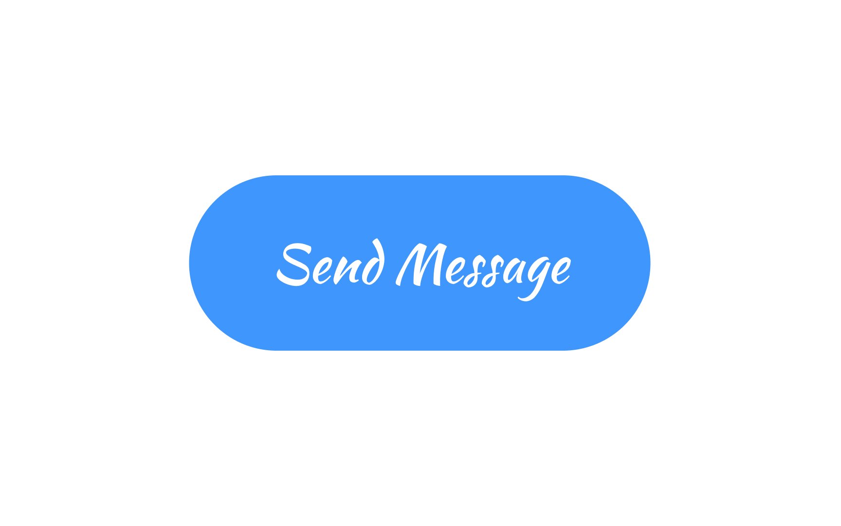
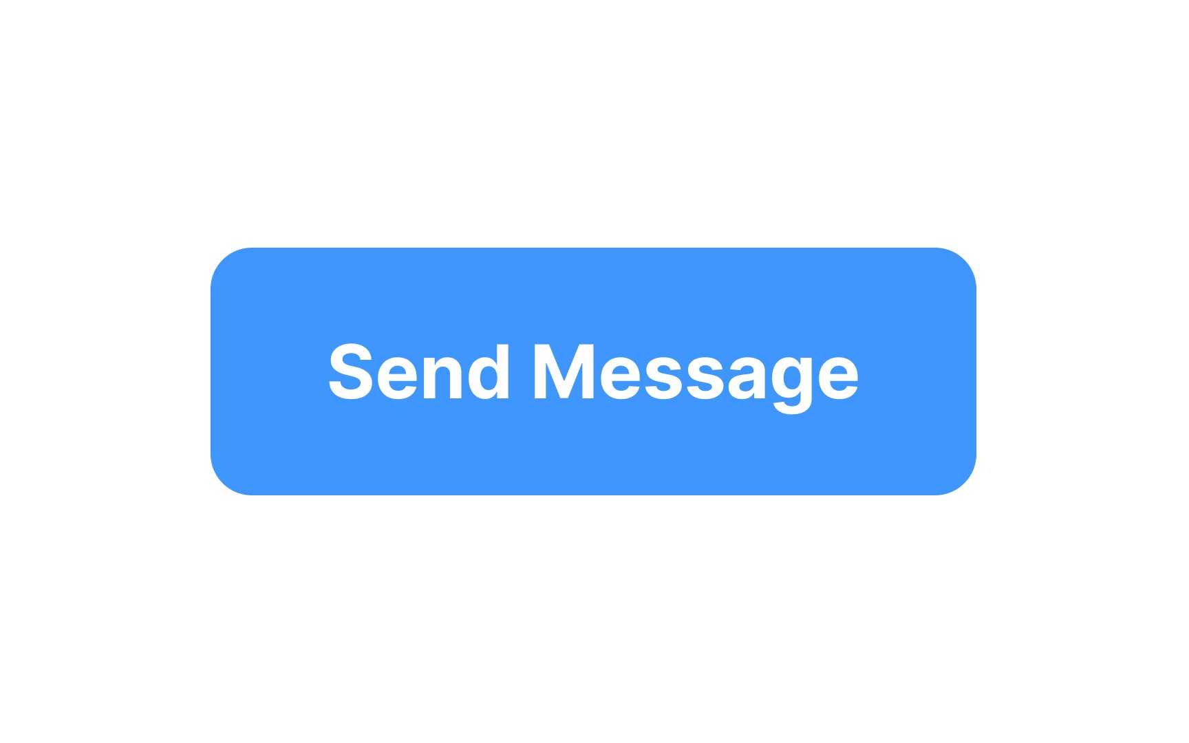
While it's fun to let your creativity flow, it's essential to exercise caution when it comes to button design. The key is balance. You want your buttons to both catch the eye and serve their function seamlessly.
3 golden rules to keep in mind:
- Make sure it looks like a button: Users should instantly recognize it as something they can interact with.
- Keep it readable: No matter how stylish your font or how unique your color scheme is, users must be able to quickly read the label.
- Stick to conventions: Creative colors, shapes, and fonts are okay in moderation, but going too far off the beaten path can lead to user confusion.
Feel free to push boundaries, but always prioritize user experience and usability over aesthetic experiments.
Pro Tip: Try A/B testing new button designs against more tried and true styles to gather feedback.
