Don't overload the header
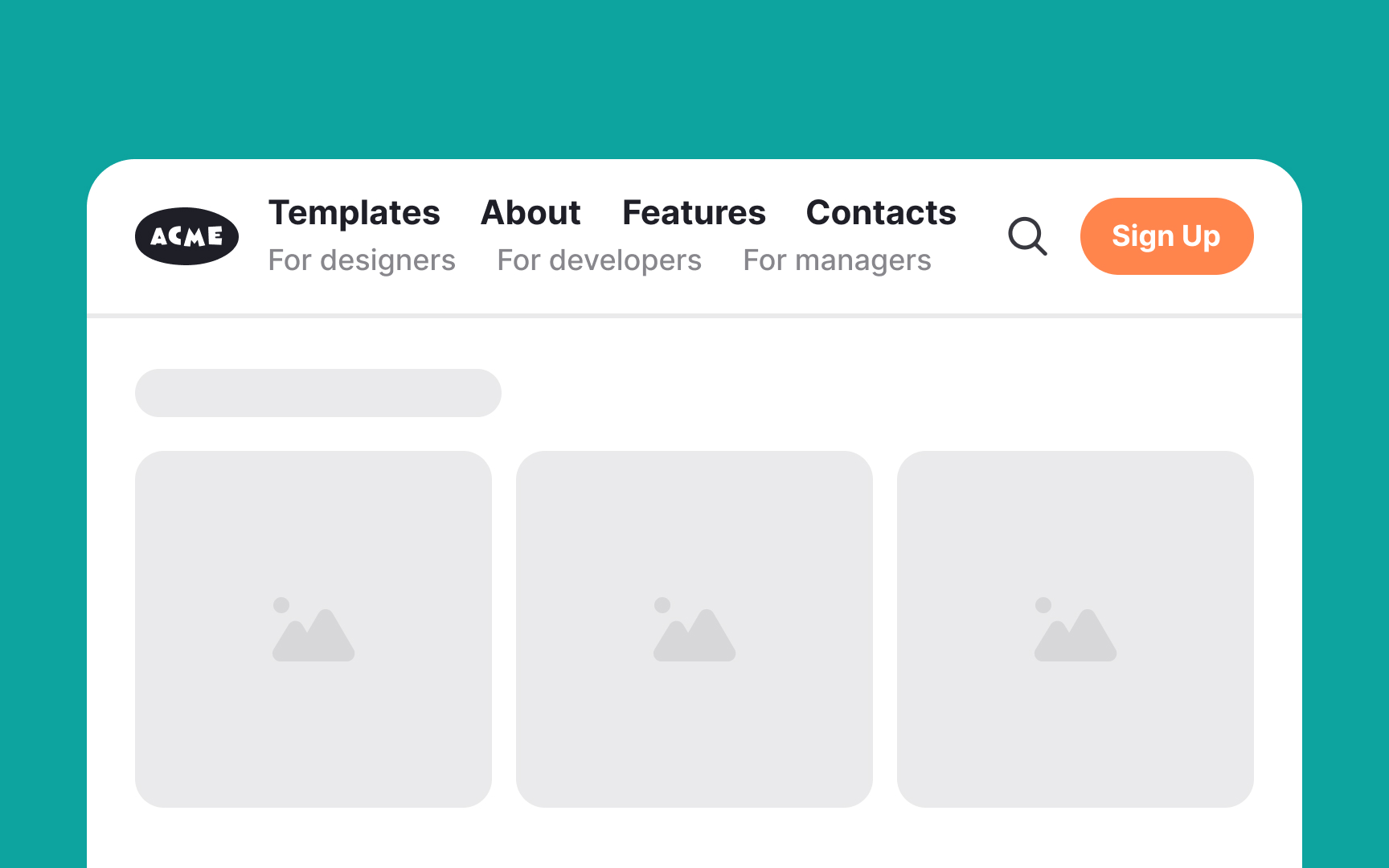
Overloading a header with too much text can create confusion and disrupt the visual flow of a website or app. Common mistakes to avoid include cramming in too many navigation links, overloading it with large chunks of text, and including unnecessary details like lengthy descriptions or multiple calls to action.
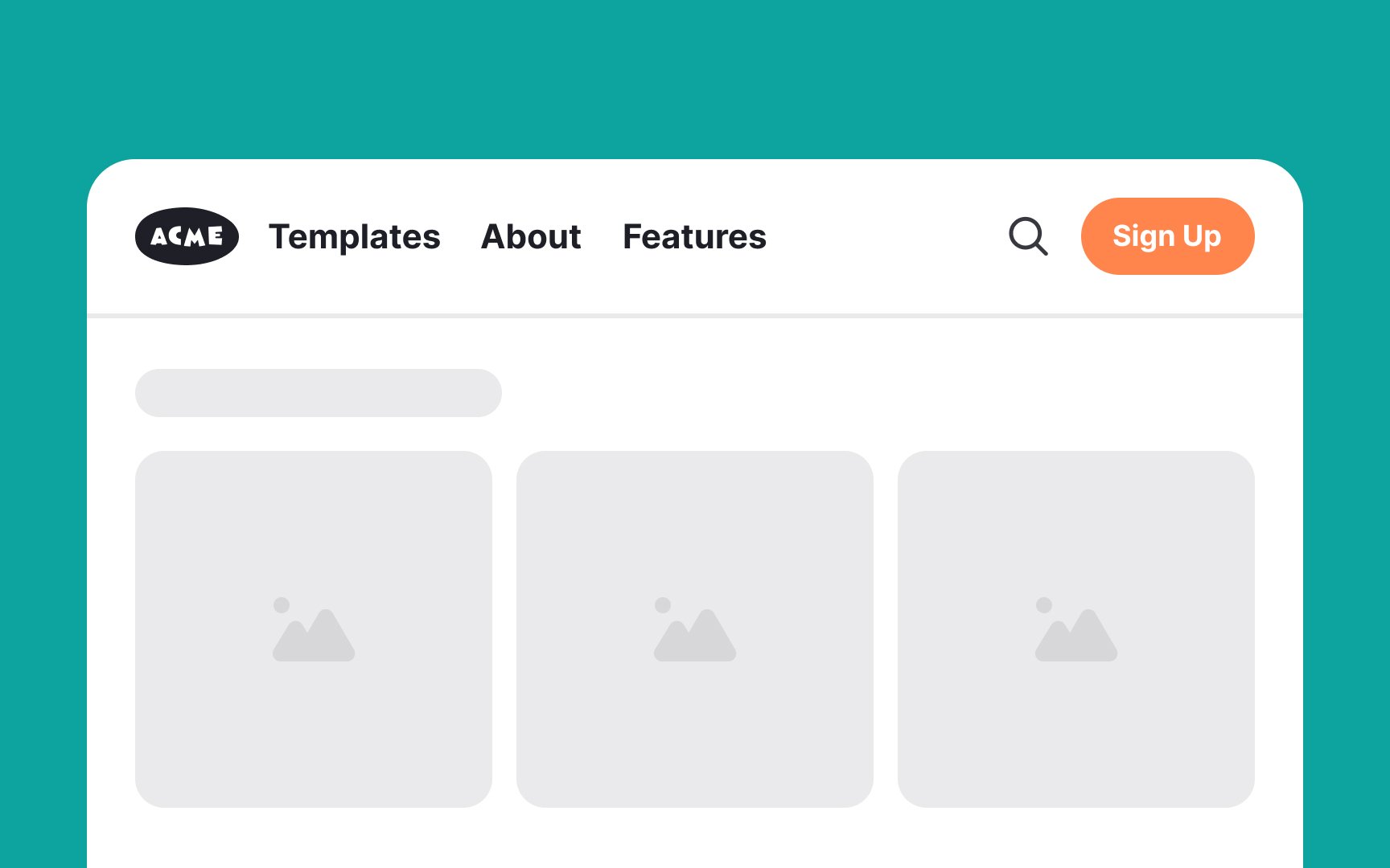
Instead, focus on the basics — a clear and concise menu, a recognizable logo, and perhaps a search bar or a simple call to action. This approach helps users scan the header quickly and move on to the content they're interested in without feeling overwhelmed.
