Add enough white space
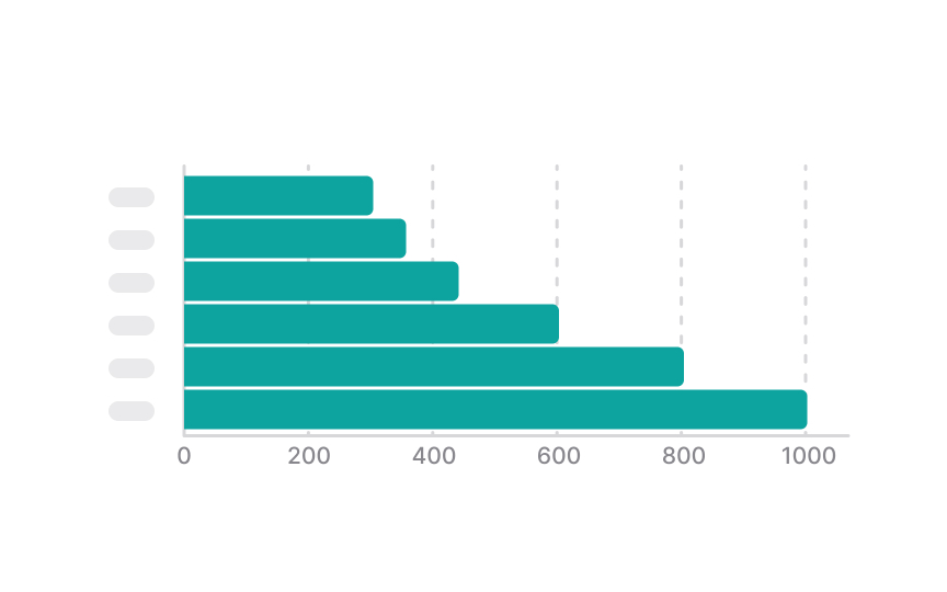
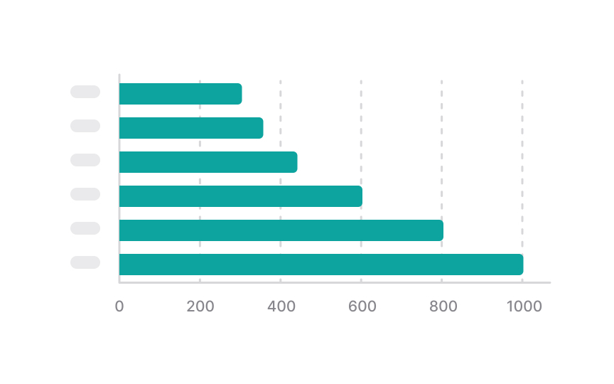
White space helps distinguish between the chart elements: the label, the legend, and the chart itself. It adds balance to charts and makes it easier to scan and comprehend information.
If you have multiple charts on a dashboard, add enough space between them and even place them each within a container so that users can easily distinguish different groups.
Make sure to use white space wisely. Adding too much space between elements of one group can mislead users and make them believe they're unrelated. That's one of the fundamental Gestalt principles of proximity.[1]
References
- The Principle of Common Region: Containers Create Groupings | Nielsen Norman Group


