Add visual hints
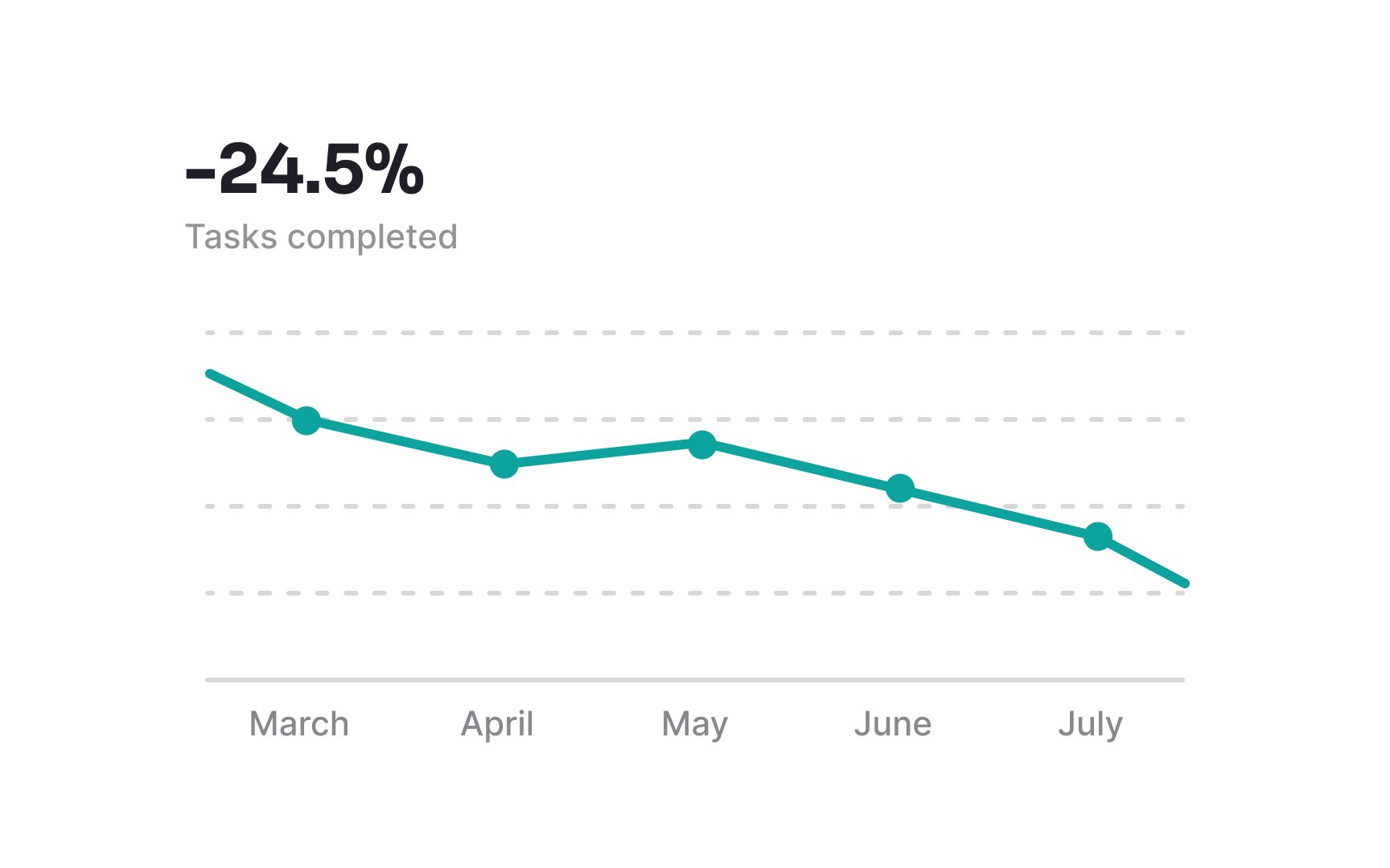
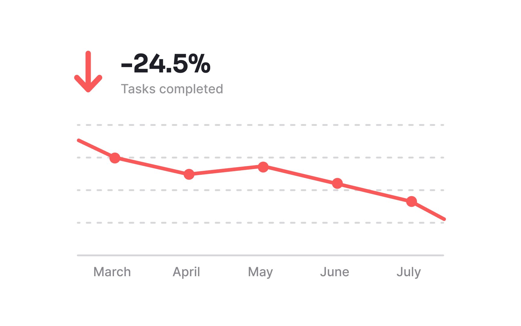
To make analyzing a chart simpler and more intuitive, it's helpful to add visual hints. For instance, you might use a green arrow pointing upward to show that a value is increasing, and a red arrow pointing downward to indicate a decrease.
However, it's important not to rely solely on color. Instead, complement colors with additional indicators like icons or shapes. This way, everyone can understand the trends and changes in your chart, making the data accessible and easy to interpret for a broader audience.
