Tables
Users encounter tables when dealing with pricing plans, financial statements, flight timetables, feature comparisons, technical specifications, or other types of textual and numeric data presented in the form of columns and rows. Some tables need to be read row by row, while others require vertical scanning.
Ideally, users should be able to comfortably read and interpret tables from their normal position without changing their rotation or scrolling endlessly.
So what makes tables readable?
- Don't set a fixed width: Table columns should adapt to the width of content automatically. Otherwise, some columns will look too empty, while others squeeze data making the table hard to read.
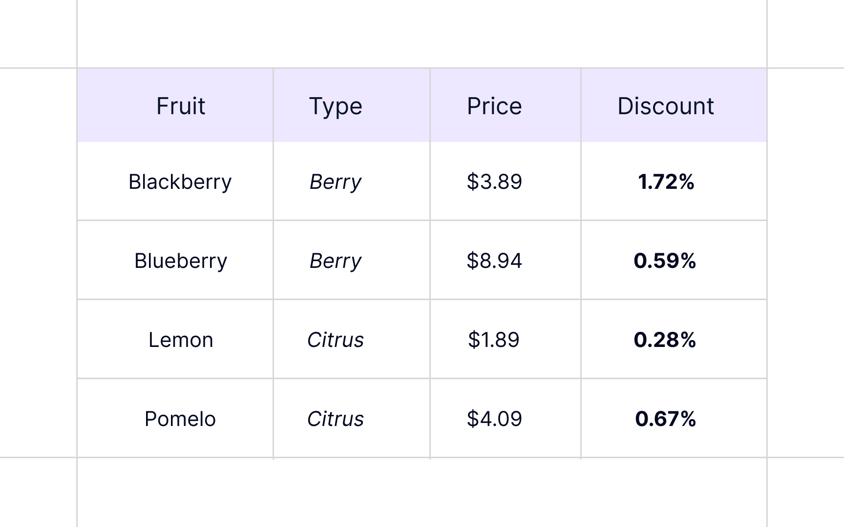
- Avoid using too many fills and borders: The core focus of any table is to present data. Get rid of everything, like zebra striping, tints, fills, and italics that serve only decoration purposes, distract users, or make it harder for them to compare or interpret information.
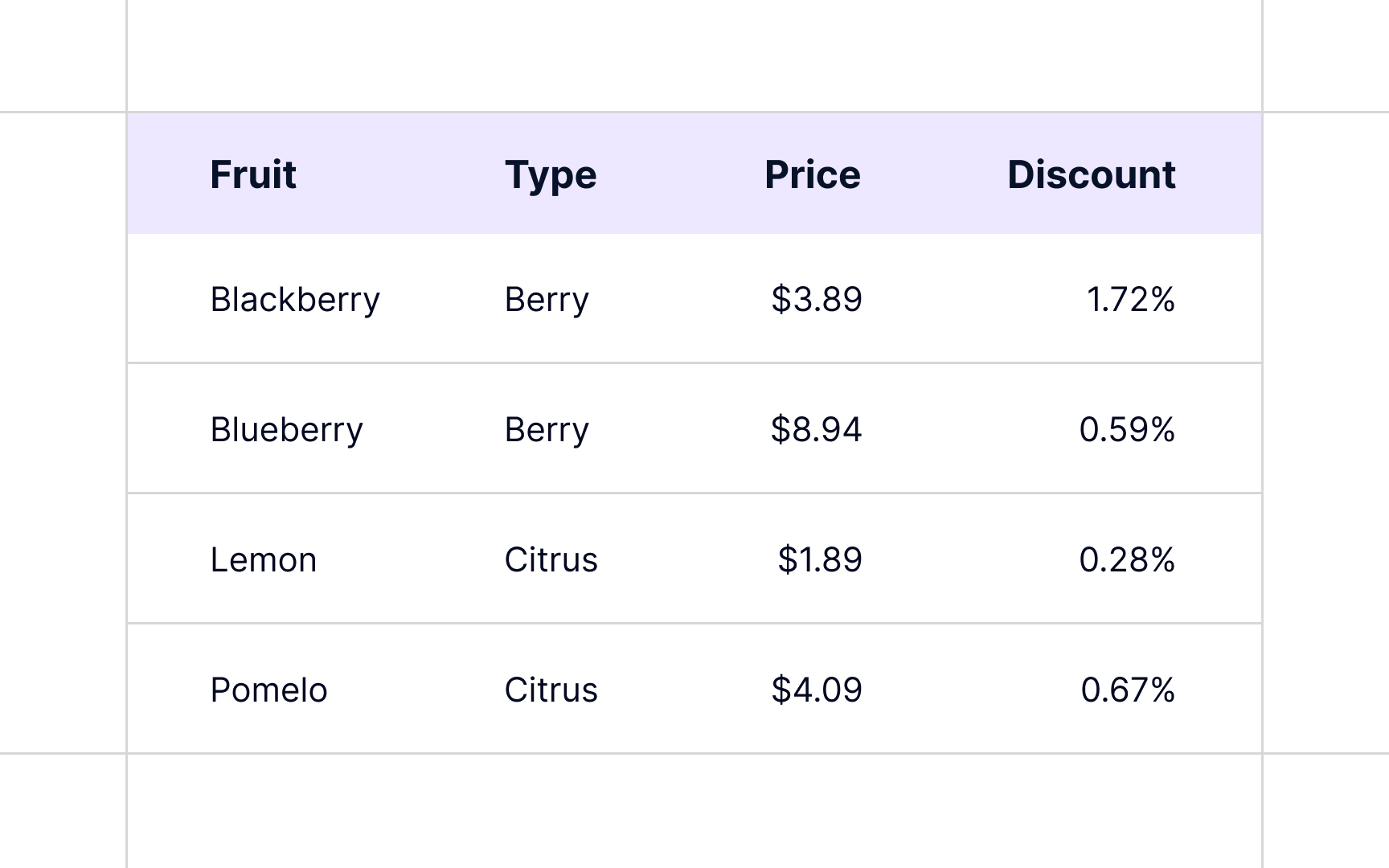
- Apply proper alignment: Good alignment and white space can set a nice stage for tables. Sometimes, it's more than enough. The rule of thumb is to left-align text, right-align numbers, and align column headings with data.
- Use tabular numerals: Digits that occupy the same width make it much easier to scan tens, hundreds, and thousands aligned vertically in columns. Those are called tabular numerals, and they are generally found in monospaced typefaces. However, many proportional typefaces have an additional set of monospaced figures, so you don't need to put extra effort into combining typefaces.[1]
References
- Web Typography: Designing Tables to be Read, Not Looked At | A List Apart
