Charts
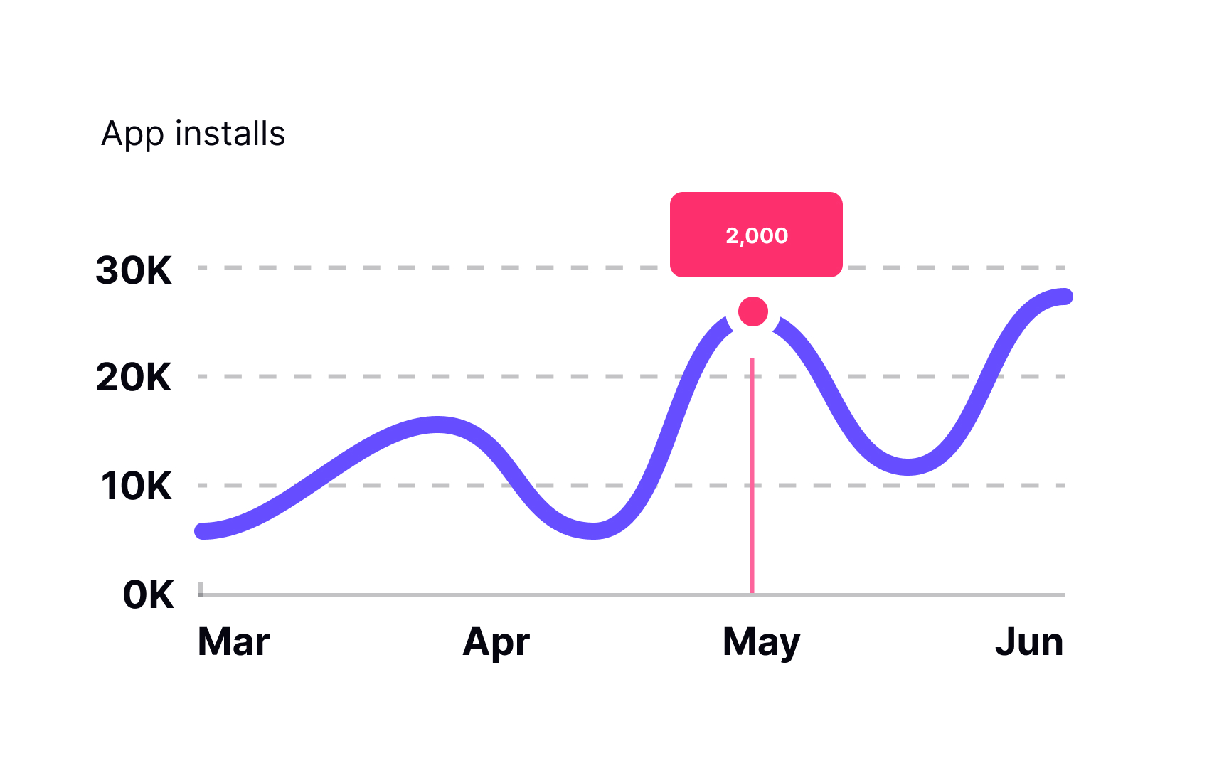
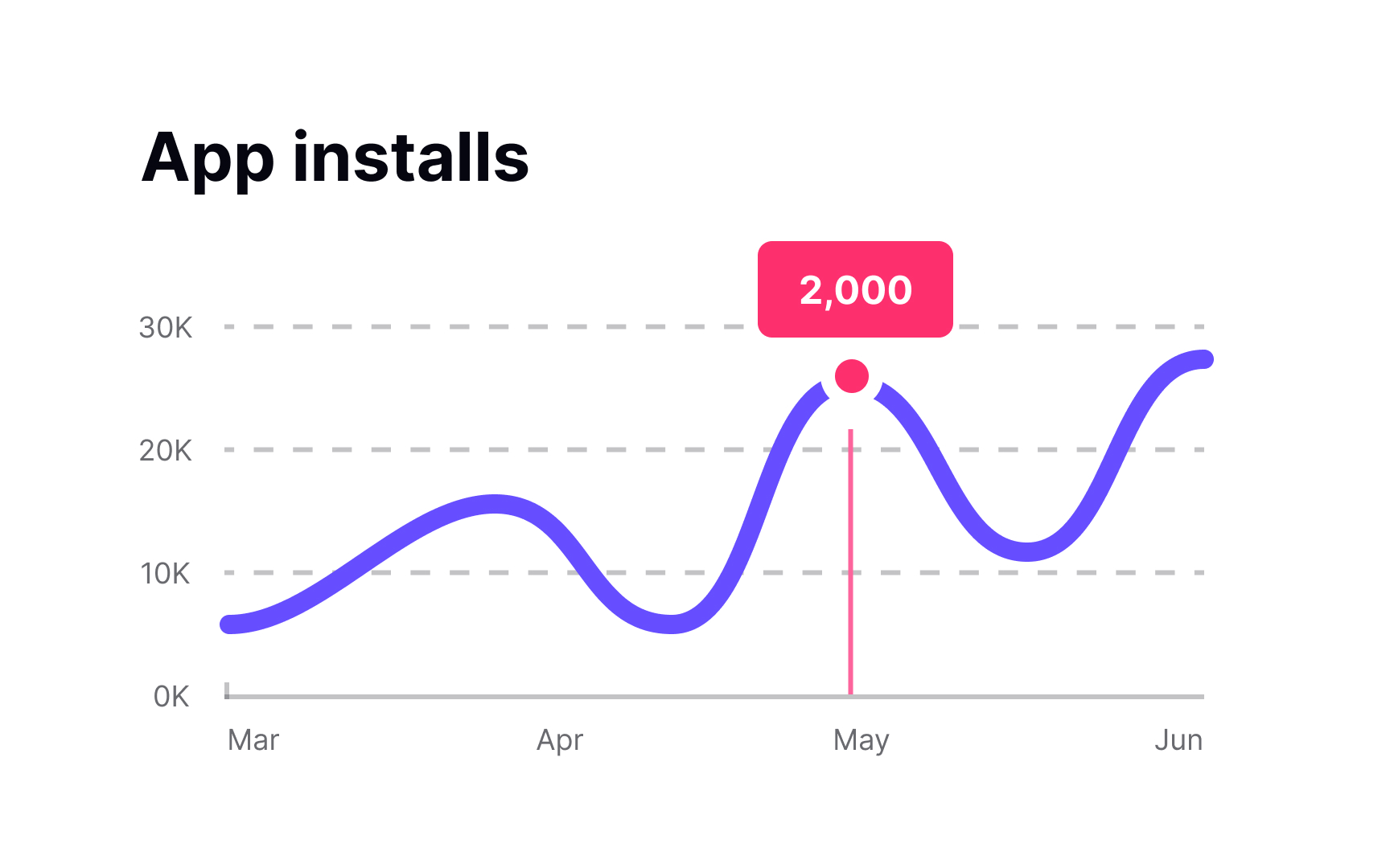
Bar charts, line charts, pie charts, donut charts — no matter how they look, their main goal is to present data efficiently. All charts provide a set of numerical or quantitative data in a way that users don't need to waste time figuring out what it means.
Like large blocks of text, charts contain vast quantities of information presented in an easier-to-perceive form. The title is one of the most important parts of a chart. It usually sits above the main graphic and provides a concise description of the graph topic.
Each indicated position of a graph usually has a label that identifies the value. Using vertical or diagonal text labels might be tempting, but it decreases readability. Orient labels horizontally, just like you would with most other text.
When the data in a chart is complex, there's usually a legend — a list of all variables on a chart and symbols representing each variable. What is obvious to you may not be that obvious to your users. Plus, providing a chart description and duplicating chart data in a table can help users understand the data and enhance accessibility.
Establish the visual hierarchy of a chart by placing text in the back seat — this complements and clarifies visuals by playing a supporting role.
