Mapping Influence, Impact, and Interest
Visualize how power, impact, and interest shape stakeholder relationships and project success.
Stakeholder maps turn abstract relationships into a clear visual story. They reveal who holds influence, who is most affected, and where collaboration or caution is needed.
Mapping is more than plotting names on a grid. It’s a strategic lens that helps teams anticipate reactions, balance priorities, and communicate with purpose. Whether it’s a startup planning a product launch or a public project navigating diverse communities, these maps make invisible forces visible.
From classic power–interest grids to multi-dimensional influence–impact models, mapping methods show where engagement efforts matter most. By seeing these dynamics, teams gain foresight to manage expectations, prevent conflicts, and build support before problems arise. Understanding influence patterns helps align decisions with both organizational and human realities, turning complex networks into actionable insight.
Stakeholder maps turn abstract attributes such as influence, impact, and power into something that can be seen and compared. In this context, power refers not only to formal authority but also to informal influence that comes from expertise, reputation, or relationships. Each axis or dimension on a map represents one of these attributes. For example, a power–interest
This visual structure helps teams move beyond written lists or assumptions. Seeing stakeholders positioned in relation to one another reveals proportional differences that may not be obvious in text. Some maps also include additional dimensions such as impact or criticality, allowing a more detailed view of how strongly each stakeholder is affected by project outcomes. By connecting these dimensions visually, teams gain a more accurate understanding of where influence meets consequence and where communication efforts should concentrate.[1]
Pro Tip: Visualizing attributes on a grid helps reveal hidden gaps between influence, impact, and interest.
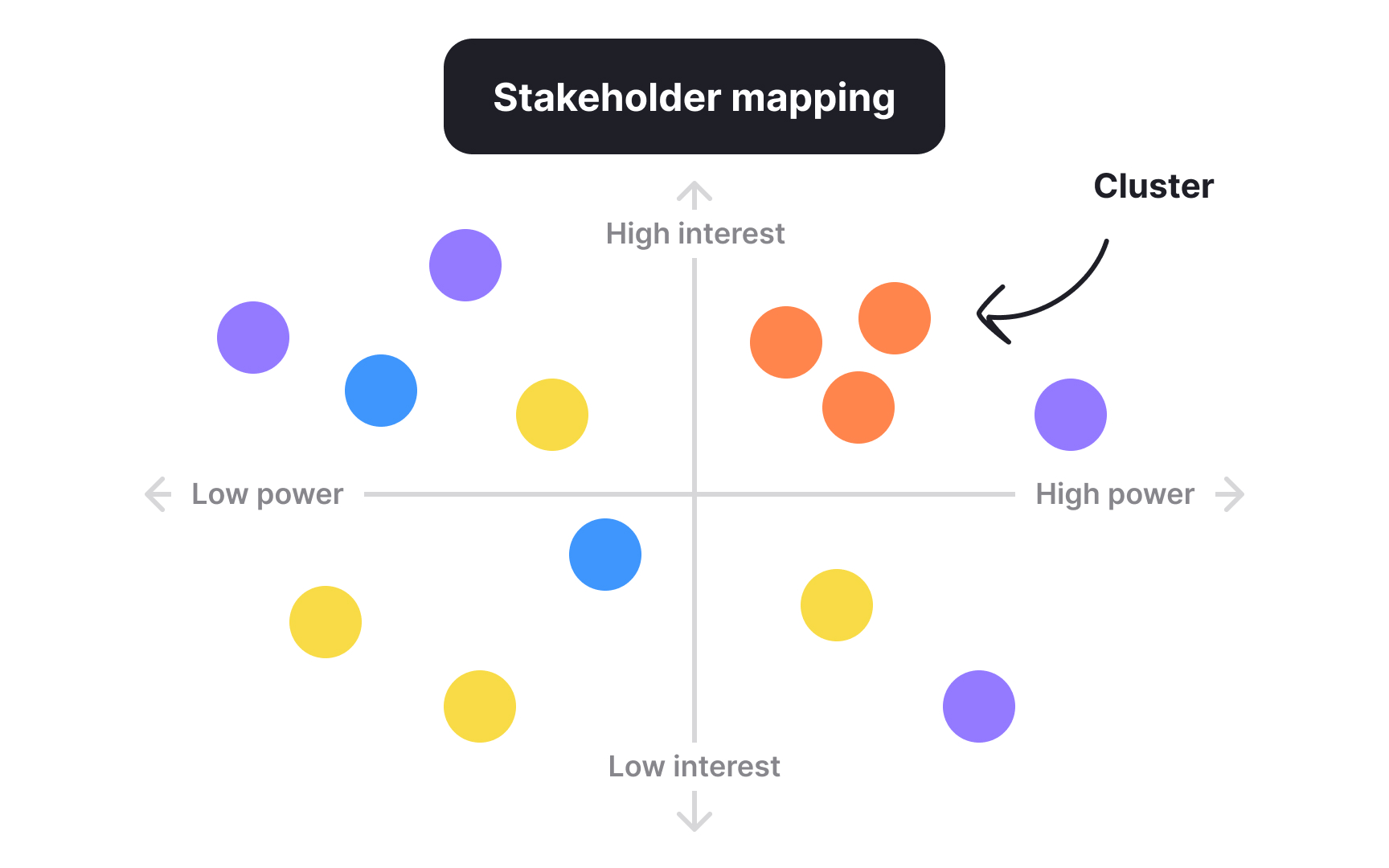
Once stakeholders are plotted, their positions begin to show patterns that describe how power and communication flow. Groups that sit close together may share interests, values, or dependencies. A dense cluster might indicate a community or department with collective influence, while isolated points can show individuals with unique perspectives or limited engagement. Recognizing these patterns helps uncover alliances, potential conflicts, and missing links between groups.
Relationship maps and influence–impact matrices expand this view by showing how stakeholders interact, not only where they stand individually. Lines or proximity on these maps often represent the strength of collaboration or the direction of influence. Reading these patterns allows teams to spot connectors who bridge groups or bottlenecks that slow decision-making. Understanding such structures turns the map into a living system of relationships that can inform every step of stakeholder engagement.[2]
Pro Tip: Look for clusters and connectors on the map as they often reveal how decisions truly move through a project.
On a stakeholder map, power and impact reveal different but connected realities. Power shows how much a stakeholder can shape decisions, while impact indicates how much a stakeholder is affected by those decisions. When plotted together, these dimensions make inequalities visible. Groups with low power but high impact, for example, often face the most change yet have the least voice in shaping it. In
The visual comparison of these dimensions supports fairer and more strategic engagement. It draws attention to stakeholders who might otherwise be ignored in favor of formal decision-makers. By identifying where power and impact diverge, teams can design communication that both respects authority and amplifies the perspectives of those most affected. This dual awareness helps prevent conflicts and promotes decisions that are balanced and informed.
Pro Tip: Use the contrast between power and impact on your map to uncover who influences change and who feels it most.
Stakeholder mapping relies on different models to make complex relationships visible. Each model highlights unique dimensions of influence, helping teams understand where to focus their attention. The most widely used methods include:
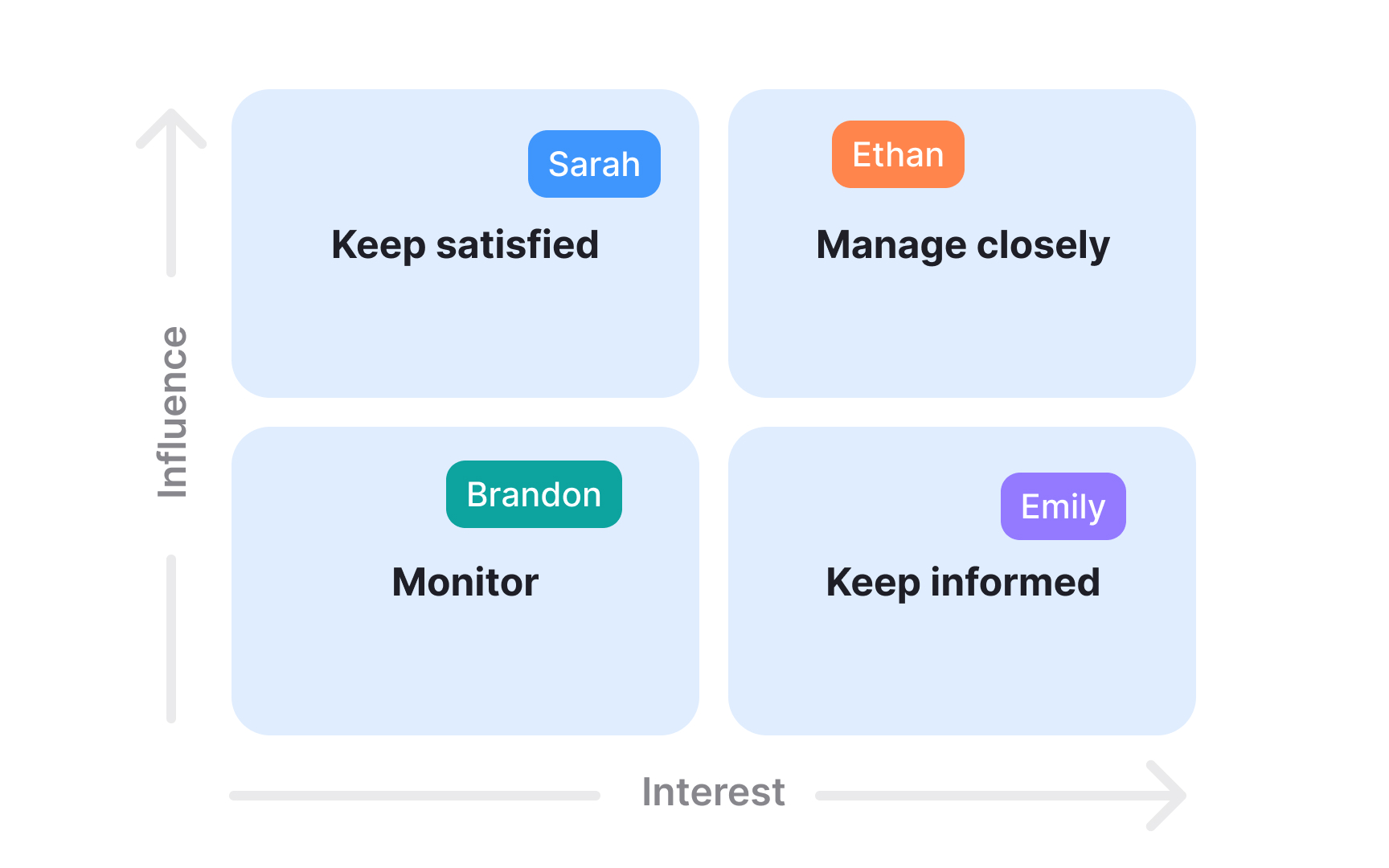
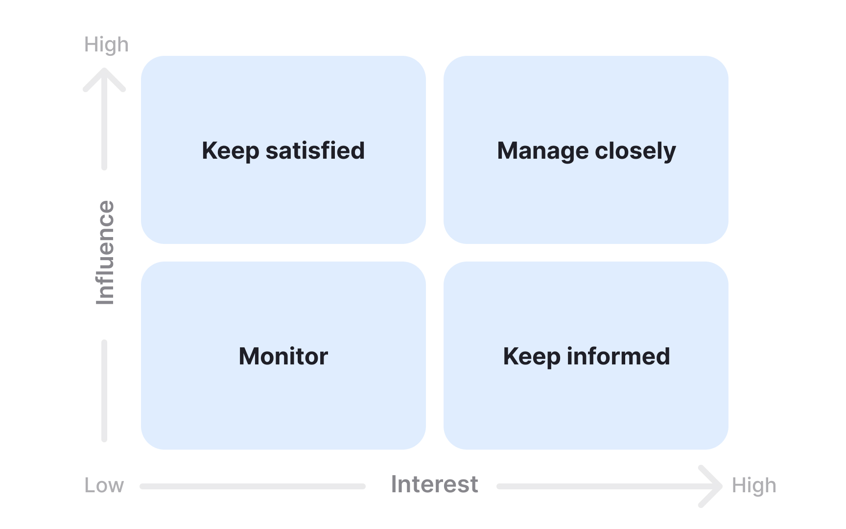
- Power–interest grid: plots stakeholders by how much influence they hold and how much they care about the project. It helps define who to manage closely, who to keep informed, and who to monitor.
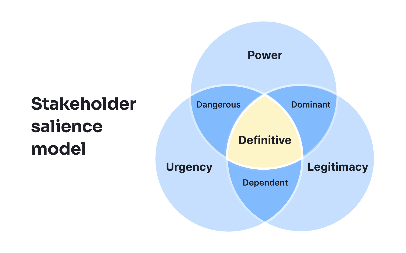
- Salience model: adds legitimacy and urgency to the analysis, showing which stakeholders’ needs deserve priority when time or authority conflicts arise.
- Influence–impact matrix: compares how much a stakeholder can affect a project with how much they are affected in return, revealing where interdependence or risk is strongest.
Each model serves a different purpose at various stages of work. The power–interest
Pro Tip: Choose the mapping model that fits your project’s complexity. Simple grids clarify priorities, while multidimensional ones reveal hidden dependencies.
The power–interest
- High power, high interest – Manage closely: These stakeholders have strong influence and active involvement. Regular communication and trust-building are essential to maintain their support.
- High power, low interest – Keep satisfied: They can shape outcomes but may not be engaged daily. Provide concise updates that align with their priorities without overloading them with detail.
- Low power, high interest – Keep informed: These stakeholders are often enthusiastic or affected by results but lack control. Keep them updated to ensure transparency and inclusion.
- Low power, low interest – Monitor: They require minimal effort but should remain visible on the map in case their status changes.
This grid helps teams allocate time and resources efficiently. It transforms general stakeholder awareness into an actionable plan that matches effort with influence. As projects evolve, stakeholders may shift quadrants, so revisiting the grid ensures decisions remain aligned with current dynamics.
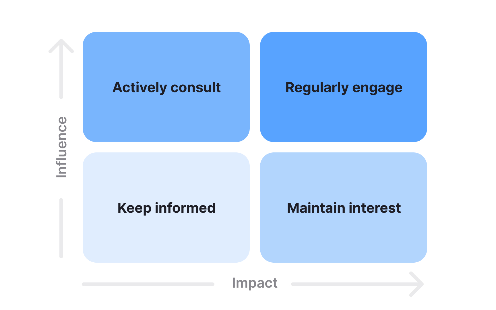
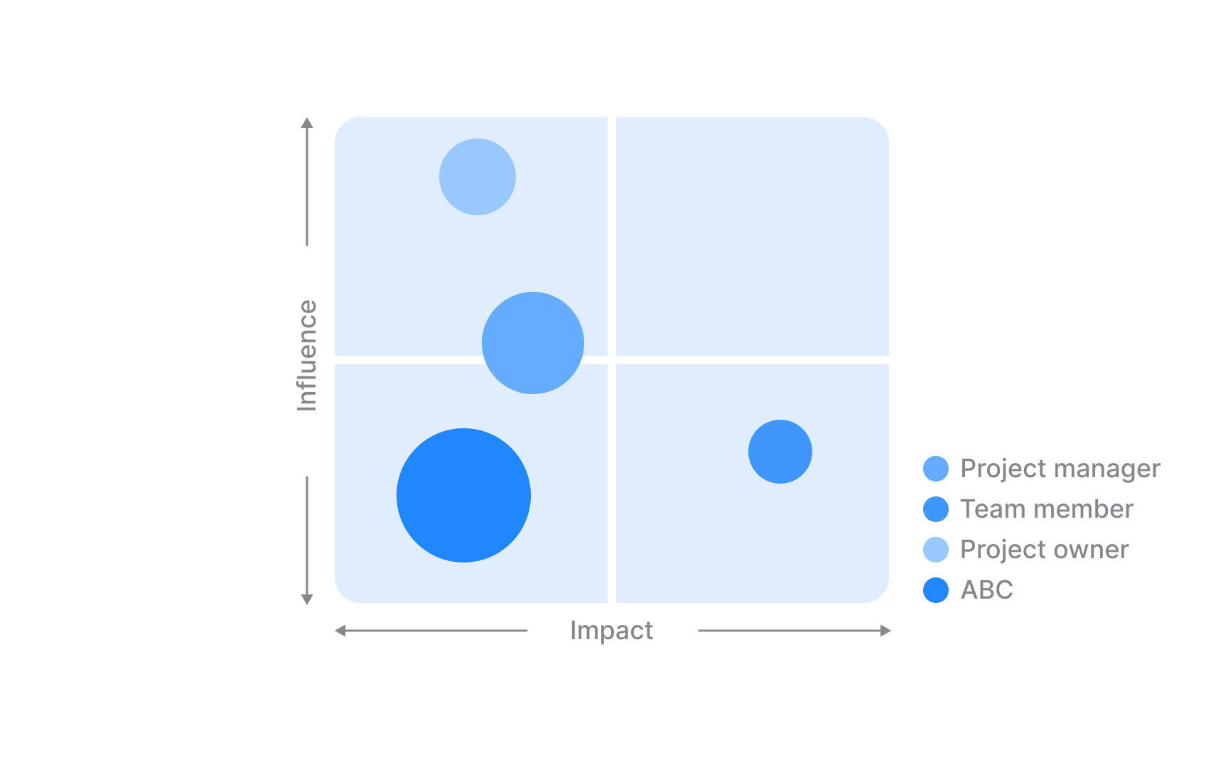
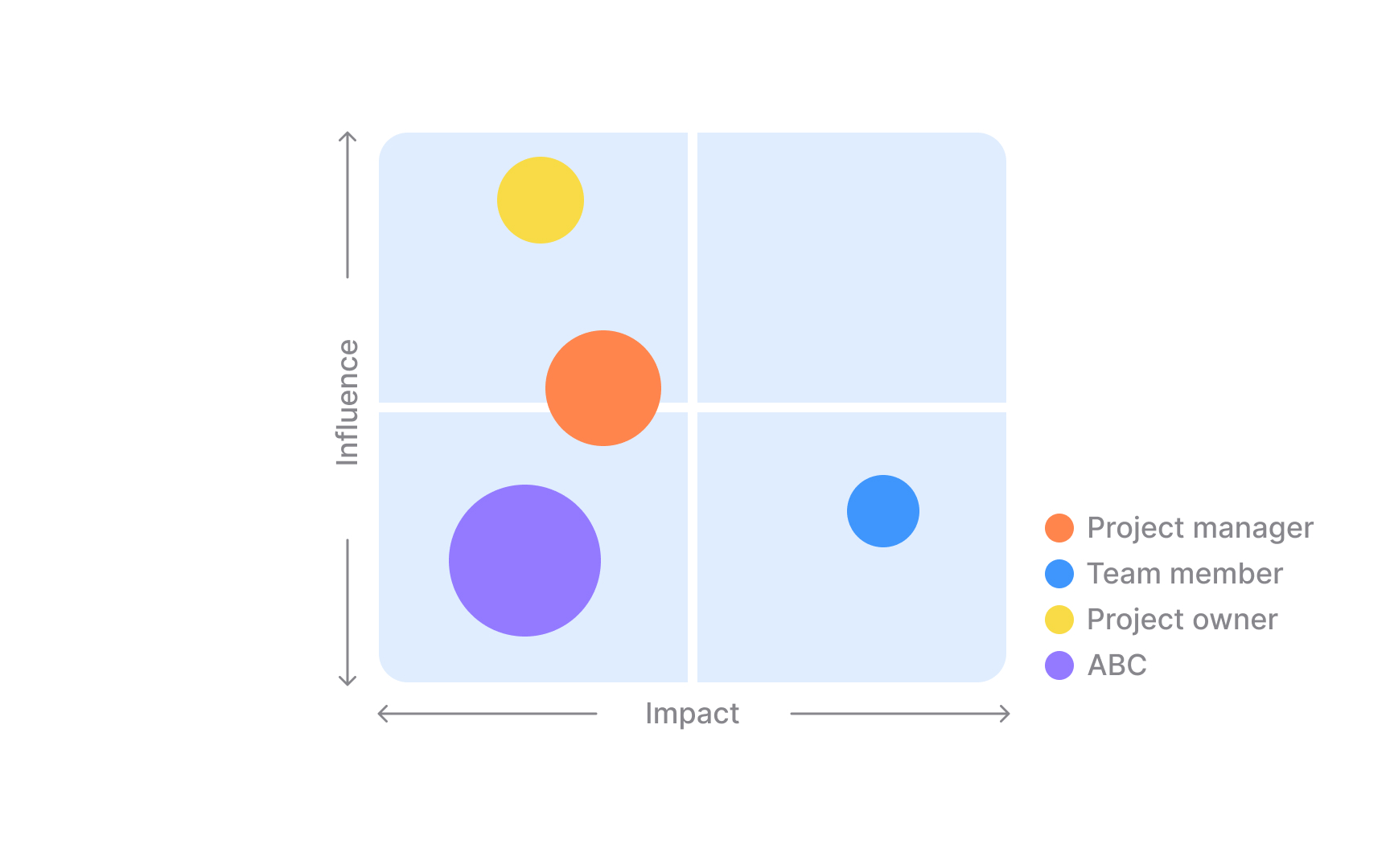
The influence–impact matrix expands stakeholder analysis by adding a third dimension to what the power–interest
Each quadrant of the matrix suggests a different engagement approach:
- Stakeholders with high influence and high impact often require regular engagement
- Stakeholders with high influence but with lower impact are best consulted on key decisions
- Stakeholders with a strong impact but limited influence should be kept informed
- Stakeholders with lower scores on both dimensions can be maintained through occasional updates.
The matrix often reveals groups that deserve more attention than their formal role suggests. For example, users or community members might have little influence but experience strong effects from decisions. Including them in discussions early can prevent resistance and strengthen long-term support.
Pro Tip: High-impact but low-influence stakeholders often hold critical insights. Include them early to surface risks and unmet needs.
Mapping helps transform abstract lists of names into a visual story of priorities. Once stakeholders are plotted, teams can use clustering, color coding, or labels to highlight who requires immediate attention, consistent updates, or light monitoring. This visual hierarchy clarifies where energy and time will have the greatest effect. It also helps reveal gaps where stakeholders who might not appear central but influence decisions indirectly through alliances or shared interests.
Visual prioritization tools make it easier to communicate engagement plans across teams. Instead of debating opinions, members can rely on clear visuals that show the logic behind each decision. Adjusting the visual markers as the project evolves also supports transparency, allowing everyone to see when influence, interest, or engagement levels change. A well-maintained visual map becomes both a planning guide and a record of how stakeholder dynamics develop over time.
Pro Tip: Color coding adds an instant layer of clarity. Use consistent shades for influence or impact to make patterns stand out at a glance.
Once stakeholders are mapped, the real value comes from interpreting what the picture tells you about engagement. A power–interest
Multi-dimensional maps add further insight by combining attributes such as influence, impact, criticality, and position toward the project. Seeing these values side by side helps reveal patterns like highly impacted groups who are not yet supportive, or influential stakeholders whose position is shifting over time. These signals guide teams in adjusting messaging, choosing channels, and deciding where early engagement can prevent conflict or delay. A map that is read thoughtfully becomes a practical guide for who to involve, when, and on what terms.
Pro Tip: When reviewing a map, pay attention to stakeholders whose position has recently shifted because such changes often reveal new risks or emerging support.
Stakeholder maps can exist as static snapshots or as living tools. A static map often starts on a whiteboard or poster with sticky notes. It captures who matters at a specific moment, which can be useful for a workshop or kickoff meeting. The limitation is that once the session ends, the map tends to stay frozen even as stakeholders’ power, interest, or impact change with new decisions, markets, or regulations.
Living maps are maintained in digital tools that allow teams to revisit and update stakeholder positions as the project evolves. Online workspaces support real-time collaboration, voting, and visual changes without redrawing everything from scratch. More advanced tools connect maps to stakeholder records so that any update to attributes like influence or sentiment is reflected automatically in charts and diagrams. This turns the map into a monitoring instrument that tracks trends over time, supports reporting, and keeps engagement plans aligned with reality instead of outdated assumptions.
Pro Tip: Treat your digital stakeholder map like a dashboard and update it after key milestones so it always reflects current influence, impact, and relationships.
Stakeholder maps become strategic when they shape decisions rather than just describe them. By visualizing who is influential, who is most affected, and how different groups relate, teams can design engagement plans that support project goals and social obligations. Maps help identify which stakeholders must be consulted to maintain a social license to operate, where communication gaps could create resistance, and which relationships are critical for long-term success.
These visuals also strengthen planning and reporting. Teams can use mapped attributes such as influence, impact, and effort to segment audiences, select appropriate channels, and decide how often to engage each group. Over time, changes in the map provide evidence that stakeholders have been considered and engaged in a structured way. This supports internal alignment between product, leadership, and communication roles and makes it easier to explain engagement choices to external parties who expect transparency and accountability.
Pro Tip: Reuse the same stakeholder map in planning sessions and progress reviews to keep every team aligned around the same visual view of the stakeholder landscape.
References
- Best Stakeholder Mapping Methods: Choose the Right Strategy | Simply Stakeholders
Topics
From Course

Share


Similar lessons

Stakeholder Management

Stakeholder Communication
