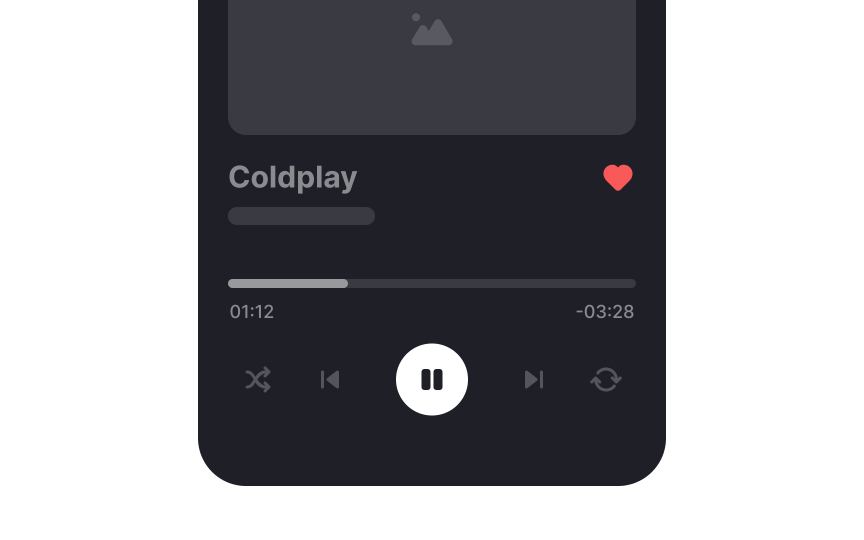
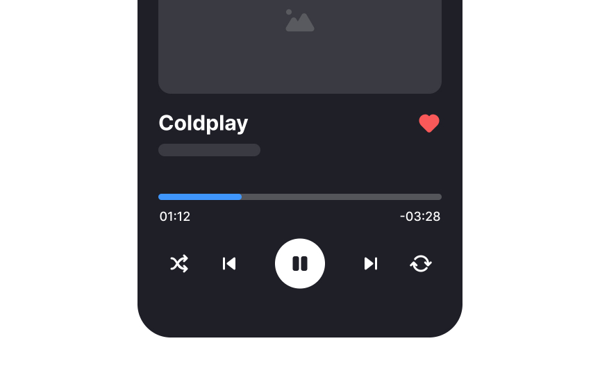
Maintain sufficient color contrast
Creating sufficient color contrast is vital in mobile design. Unlike desktops, smartphones and tablets are more often used outdoors or in poor lighting conditions: on planes, trains, or buses, for example. As designers, we should ensure that the UI has clear visibility in all these settings.
While the Web Content Accessibility Guidelines are written mostly with desktops in mind, their color contrast recommendations still work well for mobile. They recommend a contrast ratio of at least 4.5:1 against the background for small text and 3:1 for large text. For icons, the contrast ratio should be 3:1 or higher.


