Consider hand positions
When creating mobile layouts, we should consider how users interact with their devices — especially their hand positions. People use smartphones on the go — when walking, standing, in transport, etc.
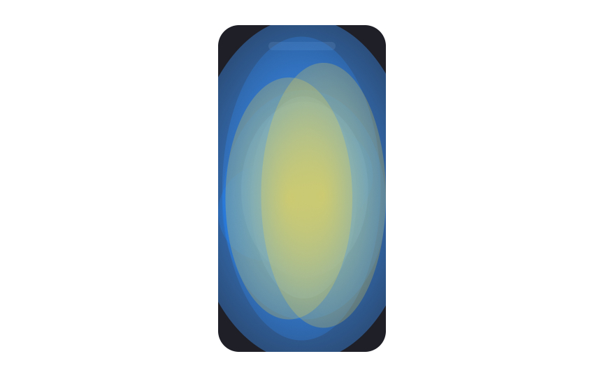
Research shows that people hold their phones in many ways while shifting their hold a lot. However, they prefer to view and touch the center of the screen.[1] Another fact is that hands aren't transparent — they can obscure the interface.
What does this mean in terms of layout?
- Primary content placement: Place the primary content at the center of the screen, put secondary actions along the top and bottom edges, and hide tertiary functions behind menus.
- Scrolling: To improve readability and focus, allow users to scroll content to the center of the viewport. You can do this by adding extra space or padding at the bottom of the page, enabling content to align naturally with the center of the screen.
- Touch target size: Touch targets in corners should be larger than those in the screen center. Aim for at least 7mm for central touch targets and 12mm for corner targets.
- Selectable items: Make selectable items large enough to clearly indicate a successful tap. People should be able to see what they're tapping.
- Margin size: Create reasonable margins. Most users gesture at the side to scroll while avoiding obscuring content.


