Use instant validation
The only thing users hate more than forms are forms that wait to validate inputs until after the user clicks the Submit button. Inline validation evaluates filled-in data immediately after users finish typing and removes focus from the input.
One of the main perks of inline validation is that users instantly notice errors and spend less time fixing them. As a result, such forms require less cognitive load and have higher conversion rates.[1]
Other things to consider when implementing inline validation:
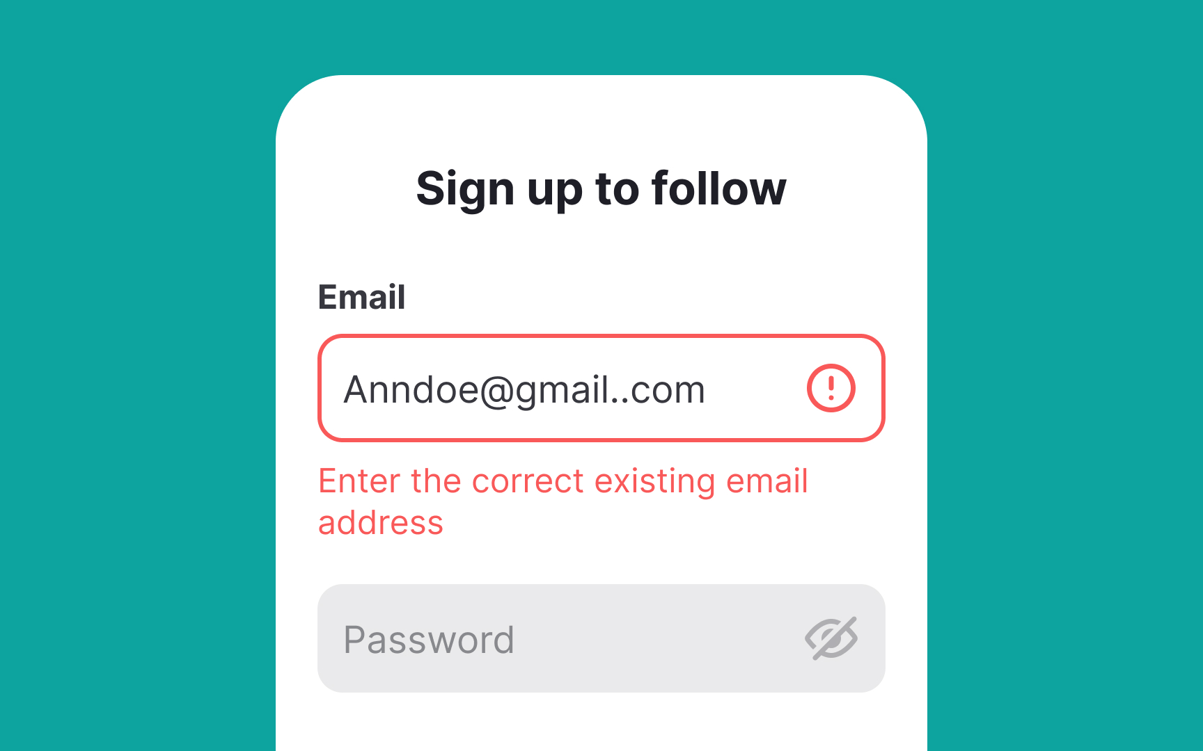
- Make sure that the validation result is displayed next to the input field. It helps users identify erroneous information faster.
- Use the right visual indicators. For example, the color green and the checkmark icon are good for indicating success. The color red and the cross icon are standard for showing failure.
- Avoid premature inline validation that instantly checks an input when users start typing. An exception to this is when users are inputting their password, as it can let them know which requirements are still missing from their input (such as special characters or capital letters).
Pro Tip: Use clear, concise, and conversational language for error messages.
References
- Usability Testing of Inline Form Validation: 40% Don’t Have It, 20% Get It Wrong | Baymard Institute
Top contributors