Designing Mobile Logins, Signups, & Other Forms
Discover what goes into creating short and clear login/signup forms
A Log In or Sign Up page is usually the first step of a user journey within your app. If something goes wrong here, you risk losing your users before they learn how amazing and functional your app is.
It may seem like a fairly easy task to design logins and signups — what could possibly go wrong? Redundant questions, disappearing placeholders, unclear password instructions, an ambiguous password recovery process, or the inability to log in via a Google account are just some of the issues your users can experience if your forms are poorly designed.
Short and clear login/signup forms are forms of art. Their best practices are suitable for other forms too. Ultimately, all forms should follow the principles of simplicity and clarity to fulfill users' needs.
Users expect login/signup forms to take only a few minutes to complete. When they encounter forms asking for irrelevant information, they leave. Additionally, ambiguous input labels and general error messages reduce the likelihood of form completion.
How can designers simplify login/signup forms on mobile? Limit questions to only the most relevant ones. Too many obstacles can discourage users from exploring the app. Let them enjoy the app first, then ask for details at a more appropriate time.
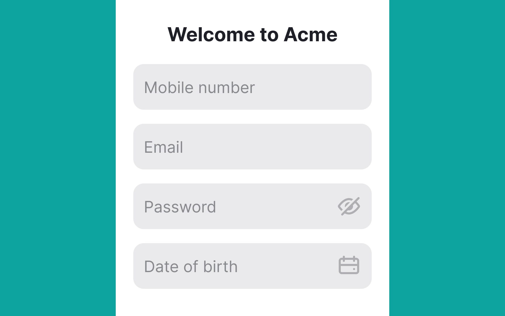
Sometimes, apps need more data to unlock full functionality. To prevent abandonment, here are tips to make long forms less overwhelming:
- Use smart defaults that match most users' preferences.[1]
- Automatically prefill data based on permissions, like location or personal info.
- Implement input masks to reduce cognitive load and adjust input formatting automatically.
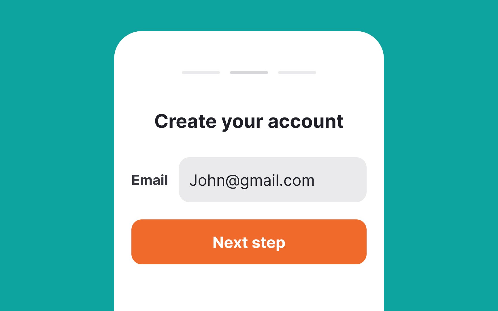
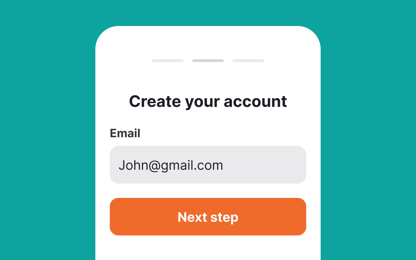
With desktop forms, you have more freedom with space and can place
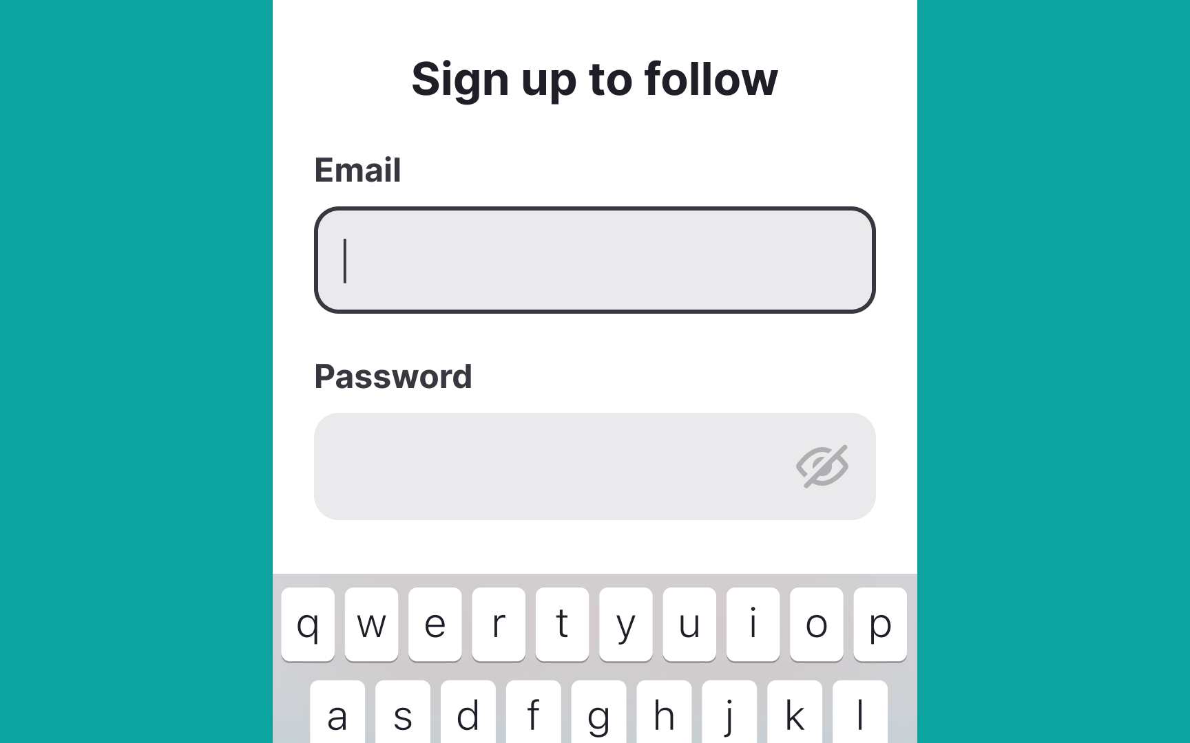
Additionally, top-aligned labels always stay visible when an onscreen keyboard is activated, taking up a large portion of the screen. Users don't need to strain their memory to remember what type of information they're asked to type in.[2]
In space-limited designs, placing
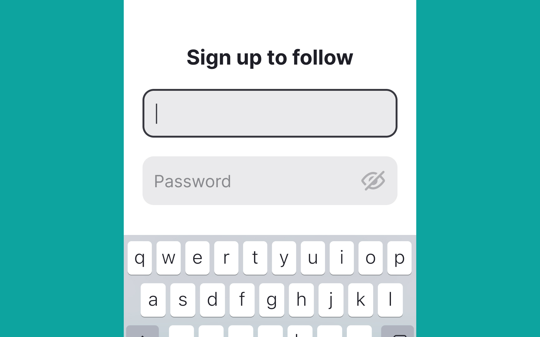
Using placeholders instead of labels isn’t ideal. When users click an input, the
Floating labels address this issue. They move above the input when users click it, keeping the label visible at all times without adding extra steps or causing confusion, even if users leave and return to the
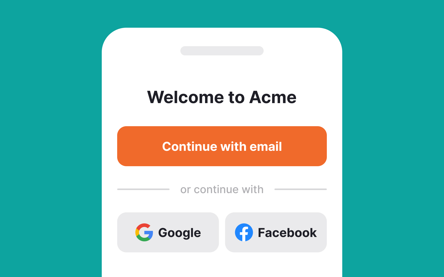
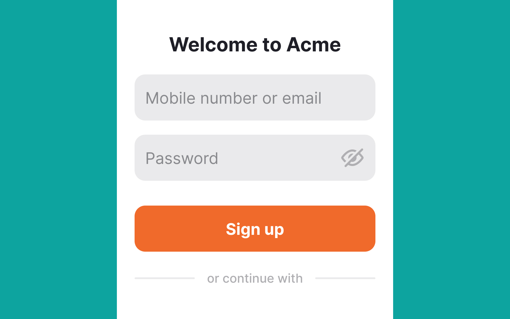
Social login/signup or third-party login/signup is a simplified method to log in or join an application. Instead of creating a new account, it uses existing
This technique has other advantages too:
- Reduced interaction cost: Instead of typing their email or phone number and creating a
password , users just need to press one button with the desired social network provider. - You don't need to verify emails: Users tend to provide fake emails when registering on apps. Social login protects your app from unverified data because social network providers verify users' email addresses. Additionally, the providers handle the password recovery process.[3]
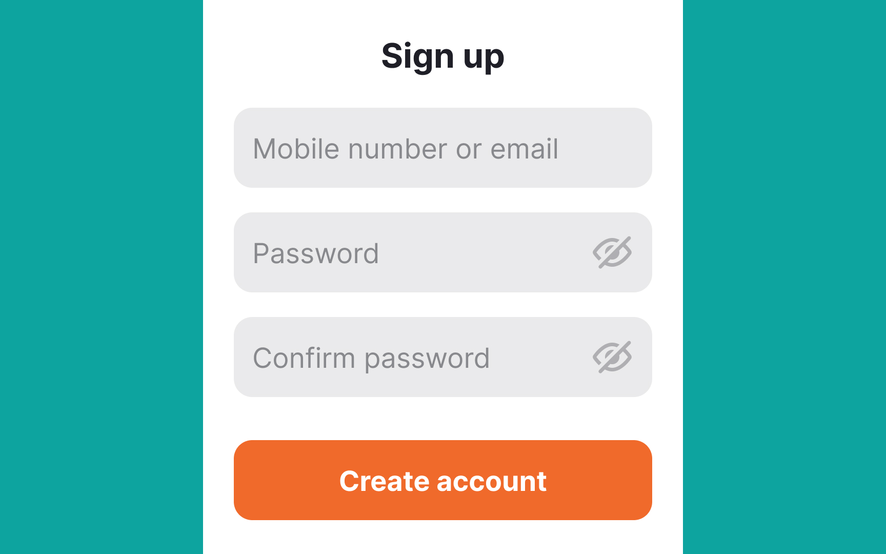
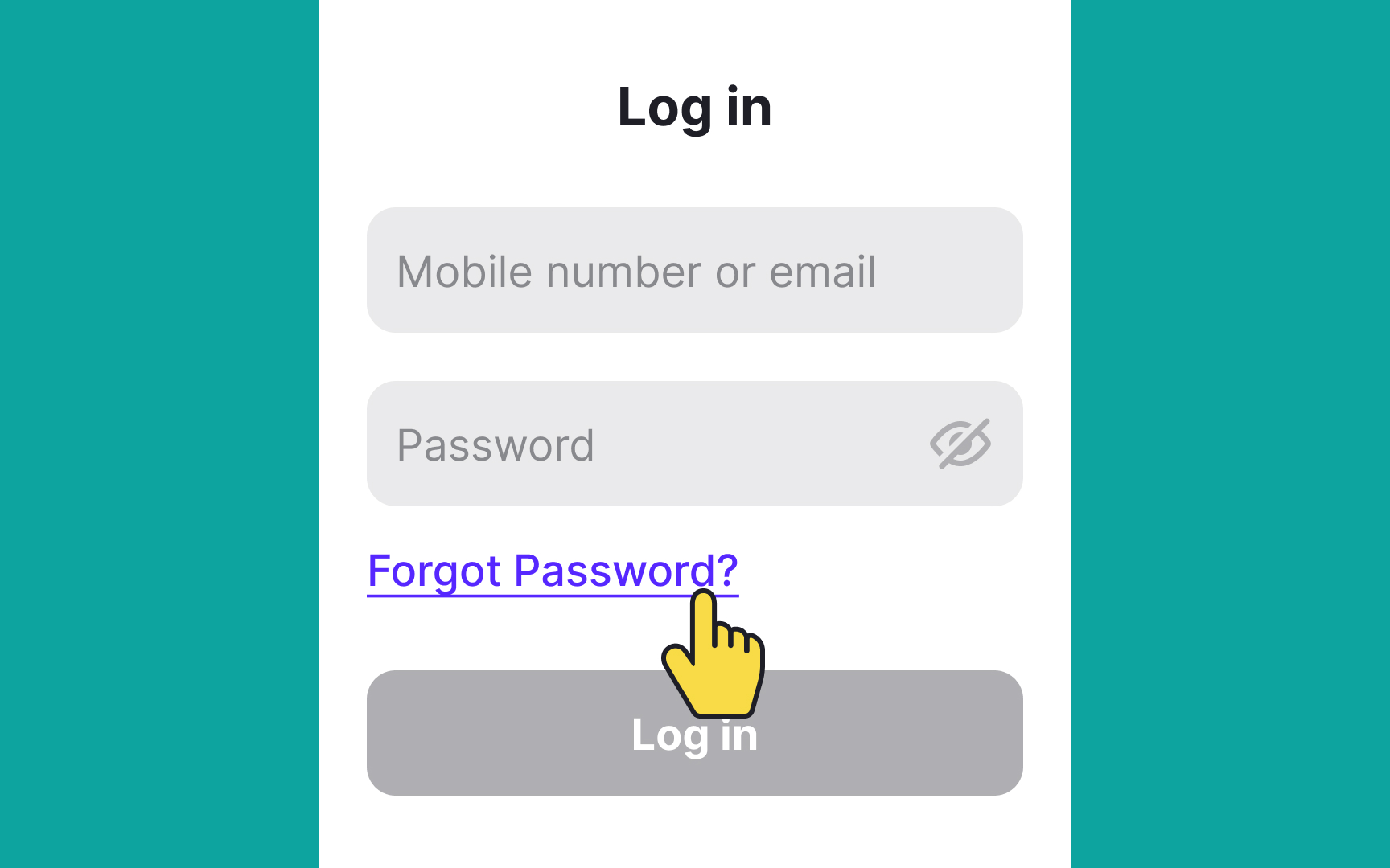
Commonly,
Adding a tiny eye icon keeps the form minimalistic and reduces interaction cost. Plus, users feel more in control when they can view the otherwise-hidden data they provided and check its correctness. No need to mention that
Pro Tip: Hide passwords by default.
Keeping users logged into an app for convenience might seem like a good idea, especially since mobile users are often multitasking and switching between apps. Asking them to enter their credentials every time they open the app can be frustrating. However, this needs to be balanced with security, especially for apps that deal with sensitive information.
For example, banking apps usually log users out after a period of inactivity to protect their data. Many apps set a timeout period, often around 10 minutes, after which users are automatically logged out if there’s no activity.[4]
To keep the app secure, consider these steps:
- Biometric authentication: Use fingerprint scanning or facial recognition for quick, secure
login . - Strong password policies: Require users to create strong, secure
passwords . - Session monitoring: Alert users if they log in from a new device, so they can spot any unauthorized access.
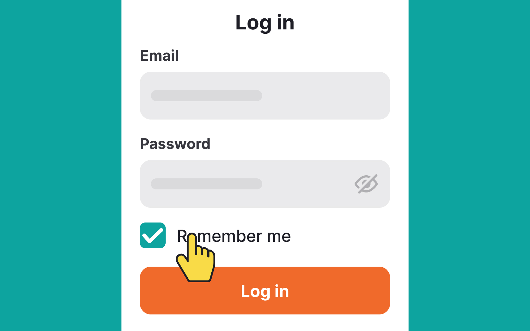
Whenever users open a banking app or another app that stores their confidential data, they expect that it's safe and compliant with all security standards. Nevertheless, entering credentials each time they open an application is a huge pain in the neck.
To make their experience less tedious, offer them the Remember Me option. Instead of keeping users logged in forever, it remembers their username or
In apps that don't require higher security, the Remember Me function is sometimes used to save users' password, and may even log them in automatically when they open the app. However, it's better to use a "Keep me logged in" option to make it clear that this is the behavior users should expect.
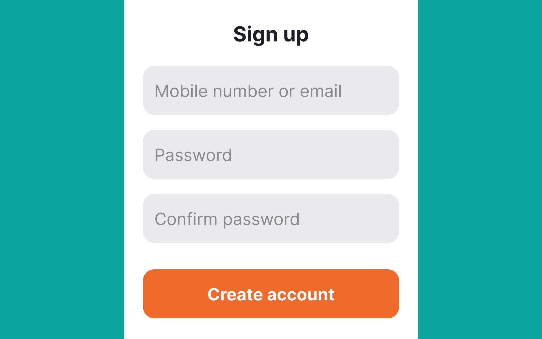
Social network apps often ask users to create a unique username as they help users identify themselves among others. Beyond that, are usernames necessary at all? Login/signup forms that ask for a username create an extra
Provide alternative ways to log in using their emails or phone numbers. These are easier to remember. Plus,
On average, users open around 9 apps in a day and 30 apps in a month.[5] Some of these apps contain sensitive data and require users to enter their credentials each time they enter an app.
Even though users generally ignore security recommendations and use the same
Forgetting a password is a stressful experience, and not understanding the next steps can worsen it. By letting users reset their passwords, you demonstrate empathy and give them hope that they can restore access to their accounts.
Provide a few password recovery options via
Pro Tip: Once a user clicks the Forgot Password button, ensure they can view clear and direct instructions on what to do next.
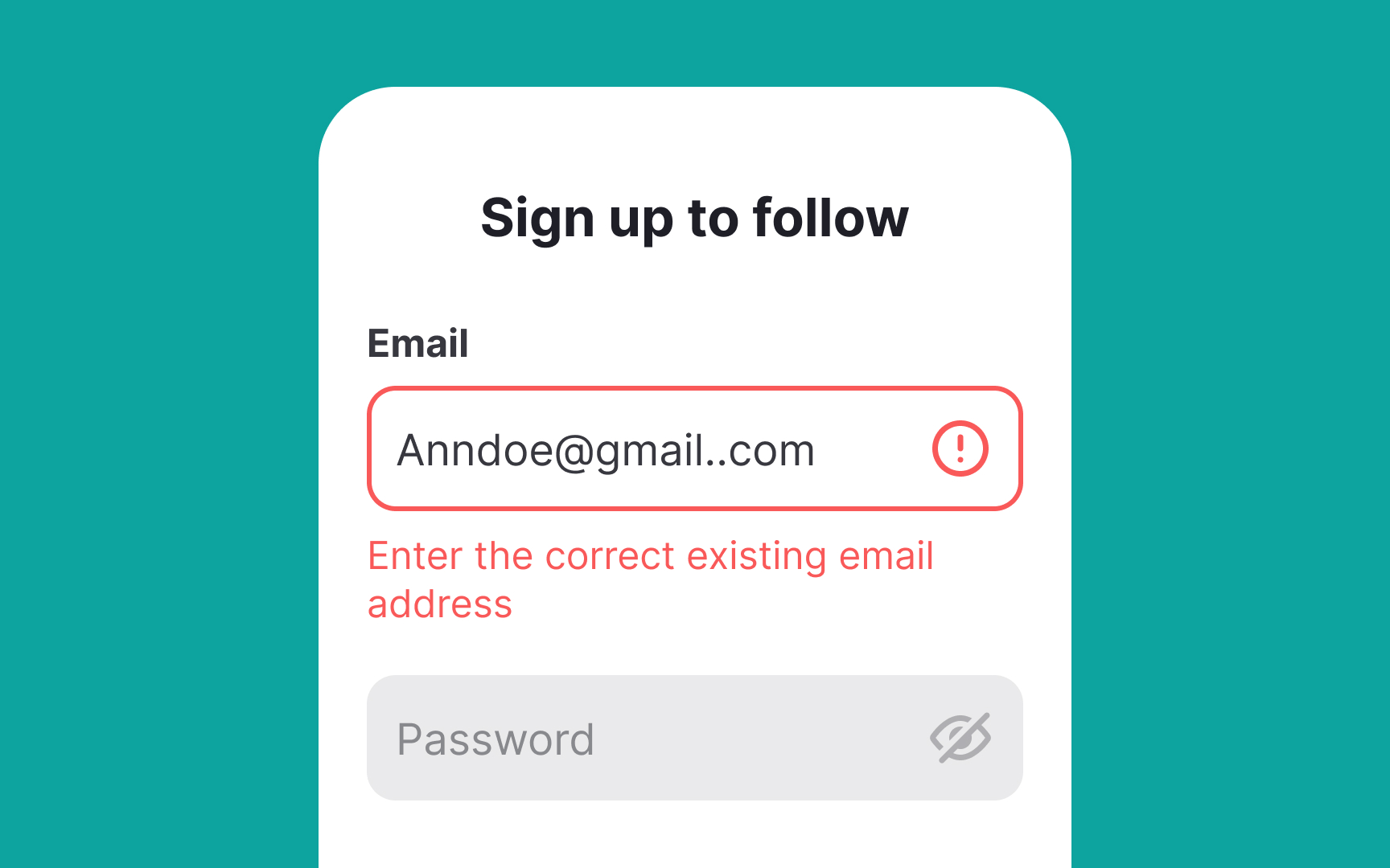
The only thing users hate more than forms are forms that wait to validate
One of the main perks of inline validation is that users instantly notice
Other things to consider when implementing inline validation:
- Make sure that the validation result is displayed next to the input field. It helps users identify erroneous information faster.
- Use the right visual indicators. For example, the color green and the checkmark
icon are good for indicating success. The color red and the cross icon are standard for showing failure. - Avoid premature inline validation that instantly checks an input when users start typing. An exception to this is when users are inputting their
password , as it can let them know which requirements are still missing from their input (such as special characters or capital letters).
Pro Tip: Use clear, concise, and conversational language for error messages.
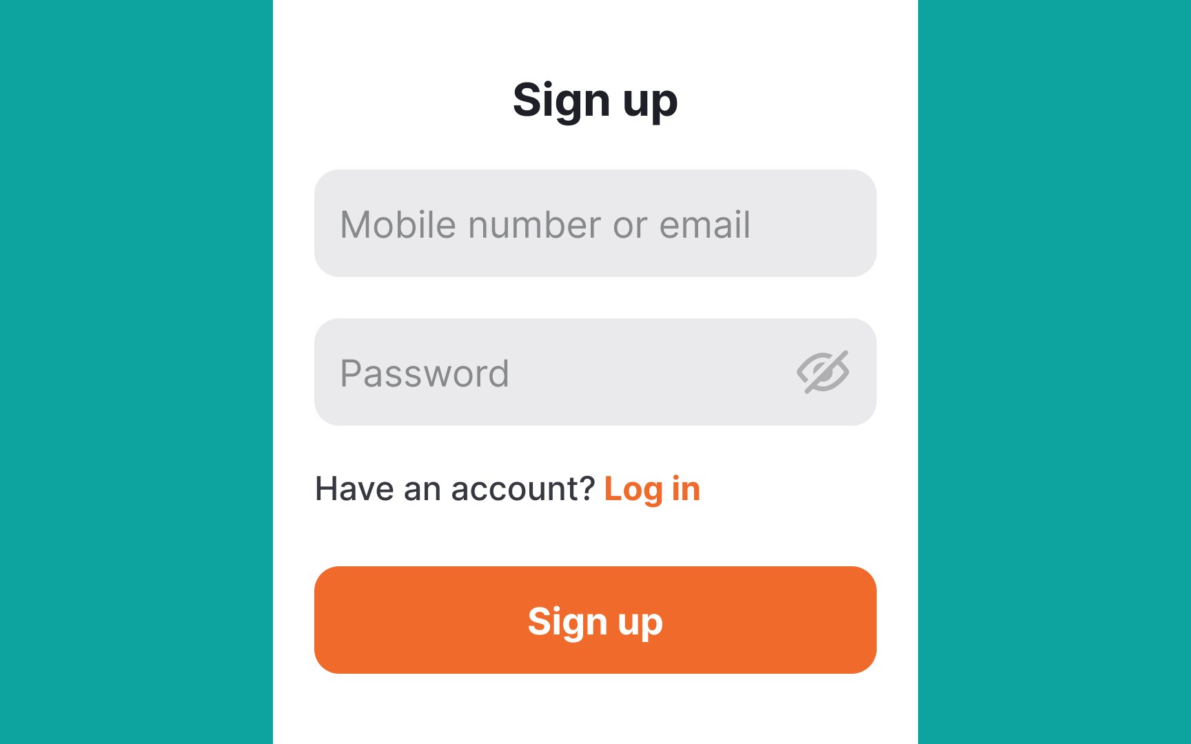
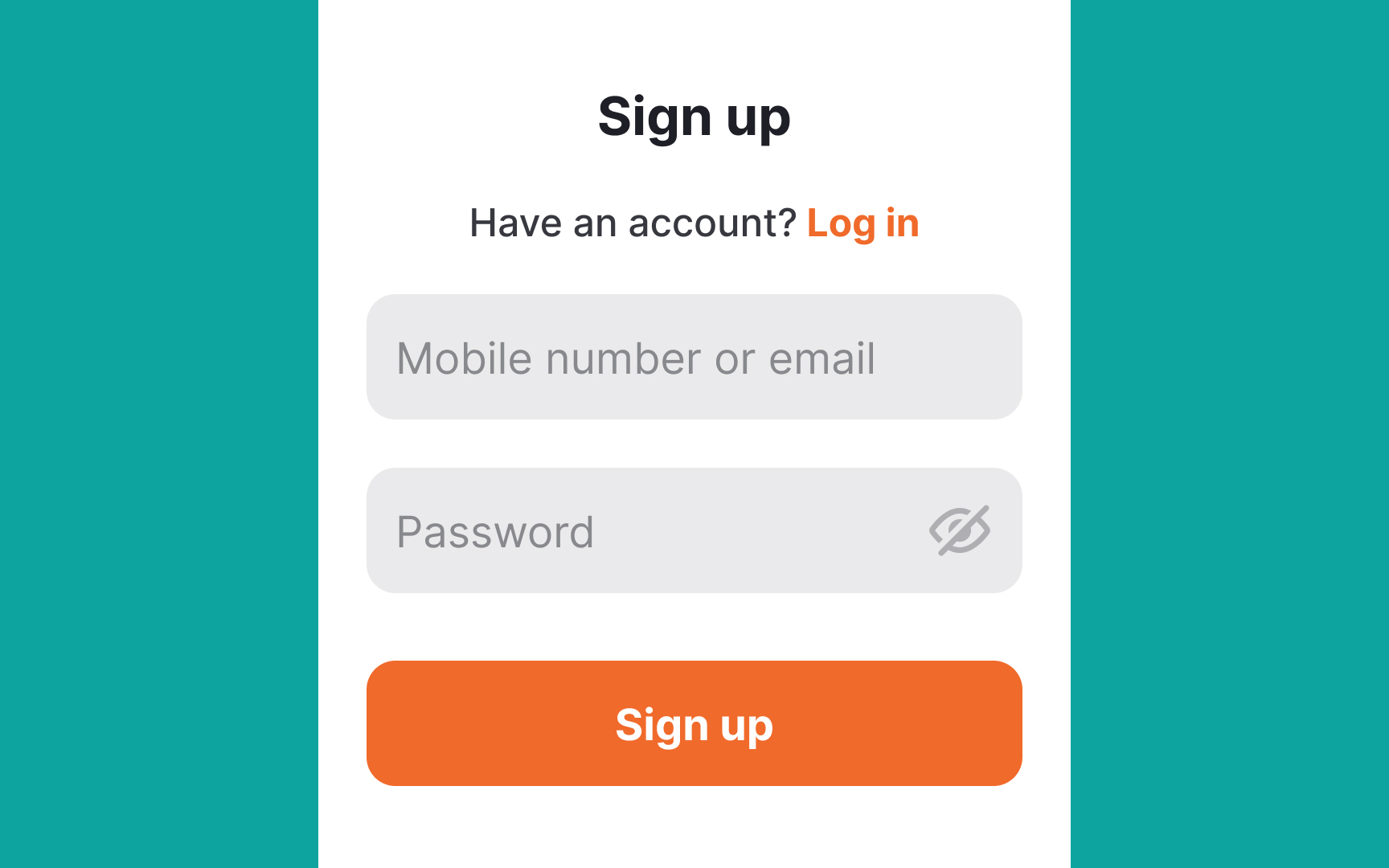
Log In and Sign Up pages may sometimes resemble each other. Your job is to help users switch between pages as quickly and easily as possible if they accidentally land on the wrong
To allow easy switching between Log In and Sign Up pages:
- Use titles to indicate the current page clearly.
- Place the
link redirecting to the login/signup page where users expect to encounter it. Usually, it should sit above theinputs . - Use clear language that eliminates any guesswork on what happens after users click this link.
- Third-party
buttons allowing log in or sign up with Google, Facebook, Twitter, or other social media accounts should be present on both Log In and Sign Up pages.
Pro Tip: Alternatively, you can create two tabs to switch between the Signup and Login pages.
References
- Usability Testing of Inline Form Validation: 40% Don’t Have It, 20% Get It Wrong | Baymard Institute
Top contributors


Topics
From Course

Share


Similar lessons

Designing for Mobile Interfaces

Responsive vs. Adaptive Design
